This content originally appeared on Laura Kalbag’s Blog Posts and was authored by Laura Kalbag
I’ve always been a kind-of arty person. I took Art at school, did an Art Foundation and a Graphics degree. I totally loved art when I was small, but as I’ve got older, and more technology and web-obsessed, a lot of the old media went a bit out of the window.
Though I was still loving wireframing and taking notes by hand, I just threw all the paints out in frustration at how slow and difficult they were.
I’d seen the iPad apps available before launch, and Autodesk’s SketchBook Pro caught my eye. The idea of drawing on-screen is pretty appealing (I never really got the hang of the chunkiness of the Wacom tablet) and SketchBook Pro is better than I expected.
This is my most recent drawing:
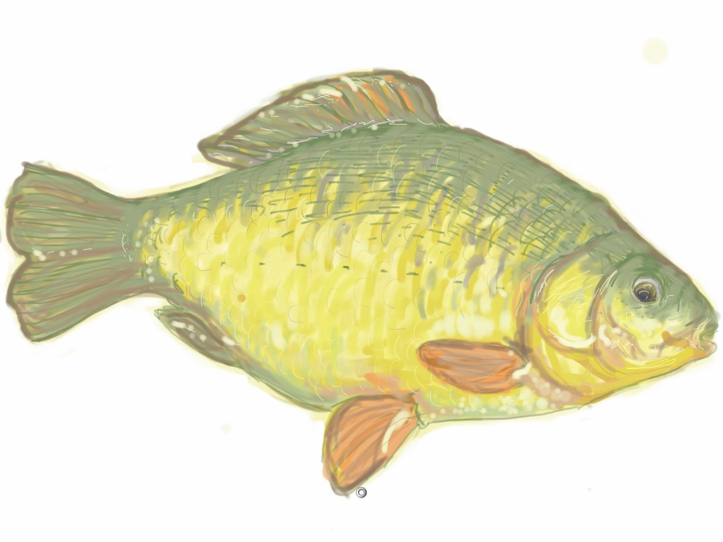
I was sitting at the fishing lake at Longleat, sketching from a photo in Matt’s fishing magazine whilst he fishes. (And using the WordPress app for writing this, but that’s a story for another time.) Asides from the sunlight making it a bit tricky to see anything other than my greasy fingerprints, it felt incredibly natural painting with my finger. Some clever person has probably come up with a way of using a stylus but I think that might spoil some of the charm. Finger painting is a bit thick, blobby and impressionist. I’m actually surprised by how much this looks like if I’d painted it in acrylics.
SketchBook Pro uses gestures as naturally as any native iPad app. You use 3-finger tap to open the tools, 2-finger pinch and drag for resizing and moving the canvas on the screen (so you can zoom for the fiddly bits) and a 3-finger left-to-right drag to undo your last marks (and right-to-left for redo.) I’m usually a bit rubbish at remembering all these kind of gestures but they just feel so right that it’s easy.
The capabilities of the tools are just amazing for an iPad app.
The Brushes palette
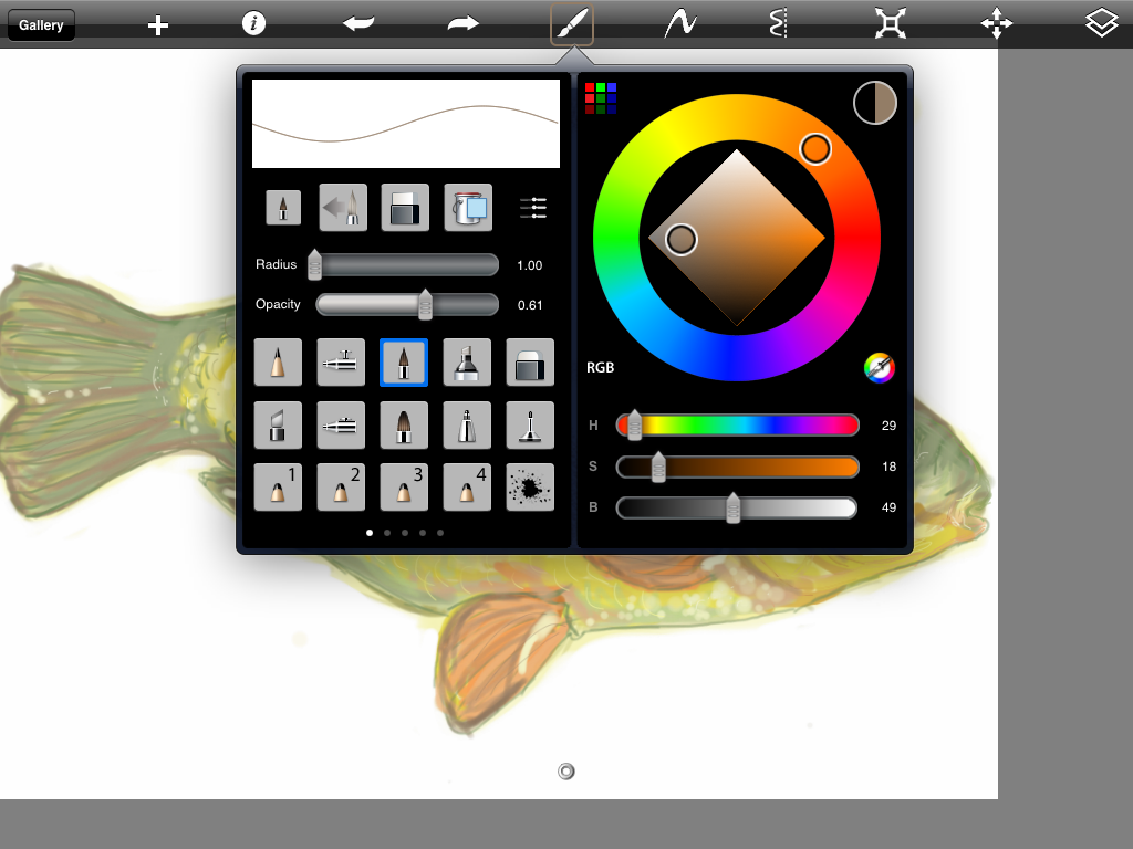 The amount of elements you can combine to create your own style and perfect the texture and colour you want are just incredible. I’ve not even tried everything yet, but some of my favourite elements are:
- Radius—for going from the rough fat splodges to the tiniest little pixels, this gives you very fine-tuned control though it can be tricky to accurately choose the right radius with the small slider (despite my little fingers)
- Opacity—opacity of your brush. I reckon it’s best used at less than 100% to give a more realistic painting effect, the more solid your brush, the more it’ll look like an old-school MS Paint picture!
- Type of brush—I’ve been sticking with this fine paintbrush style for now. It’s a very predictable, softish round brush.
- Colour palette—colour selection that beats Photoshop. It’d be great to have an interface this good for Photoshop. You can be so specific in your colour choices and easily change by Hue, Saturation or Tone which is great if you’re creating gentle gradations.
The incredible Layers feature
You can only have five layers, but you can merge your layers together when you’ve used all five to give you more control over editing work on a new layer.
In my fish picture, I started with some basic line-drawing and blocking out colour. Then on a layer above, I gave it a wash of light yellow with a big fat, mostly transparent, brush and set that layer to 50%. This made that wash more subtle, then I merged the layer down (I knew I wouldn’t need to finely edit this rough stuff later) to make my basic base layer.
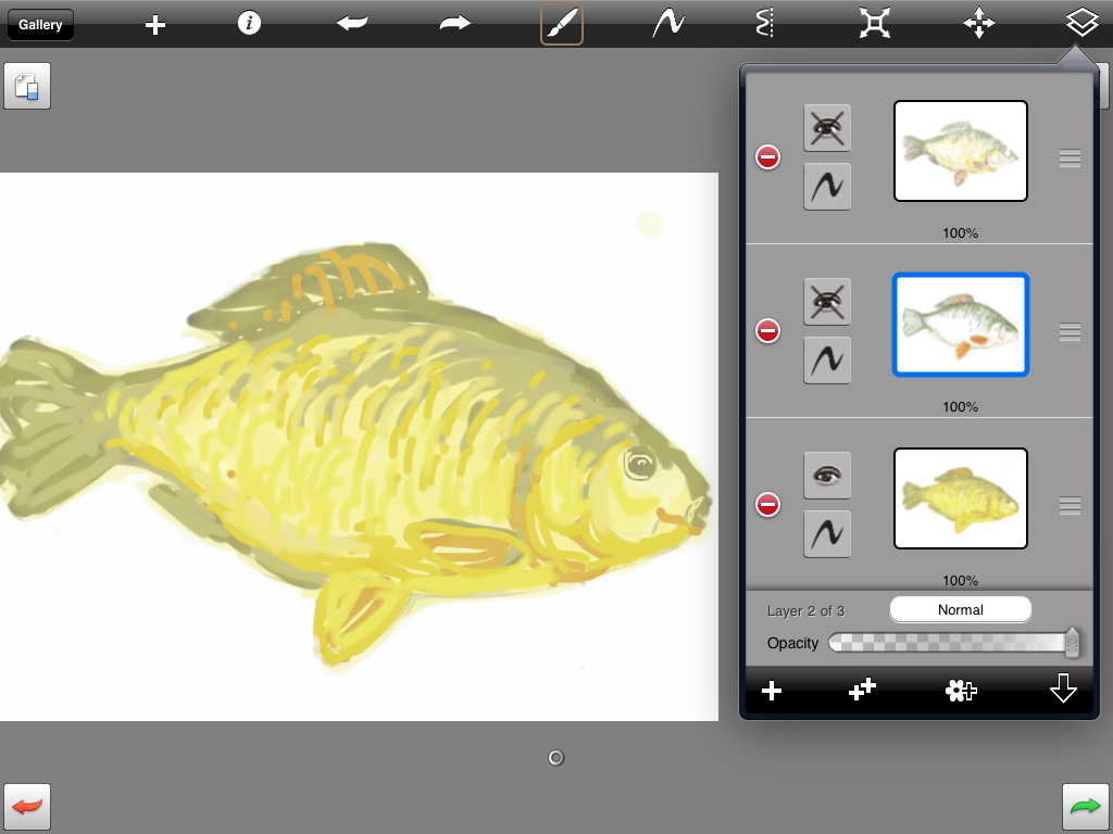
The next layer I used to add some more fiddly detail and shadow. I kept this separate from the layer below for if I wanted to go back and erase parts without wiping my base layer.
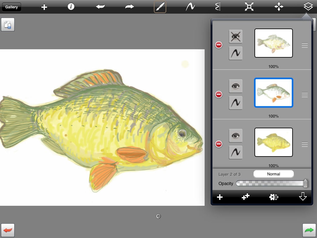 Then over the top, I tried to make the detail a bit more subtle and give the fish a slightly more realistic 3D multi-coloured appearance.
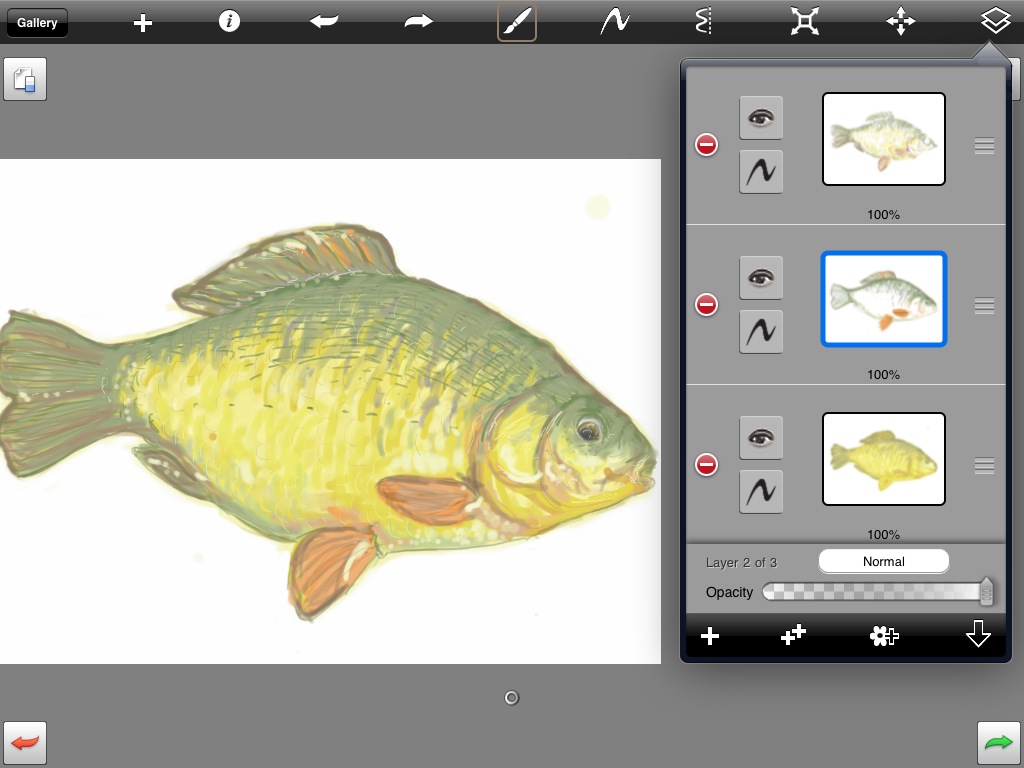
I’m pretty pleased with the overall effect and I’ll definitely keep trying to practice drawing and sketching.
There are other features of SketchBook Pro as well! My sister liked the mirrored setting and another friend made a great landscape using textured brushes for plants and flowers. I’ll also be looking out for further Autodesk apps as they seem to have the iPad interface totally nailed.
If you fancy getting a bit creative on the iPad, go download SketchBook Pro from the App Store. At £4.99 it’s a steal. The amount of thought and skill gone into the user experience of the app makes it worth far more, and undoubtably more than many higher-priced apps.
2 comments
-
Wow –; I am always in awe of people that can produce pictures that look both detailed and pleasing. It’s a real gift. And to produce something that looks so like a drawing on a screen if amazing, you are so talented. I know a lot of artists shrug off what they do, but to a non-artist, this sort of thing seems like a mystical magic.
-
What a lovely tutorial, i stumbled over this looking for help with fonts but i’m so glad I did. Very well written and illustrated. I also am an artist and recently got an iPad and you have inspired me so thank you. I need to get back into my art and you have given me that push :)
Read the original post, 'Autodesk SketchBook Pro'.
This content originally appeared on Laura Kalbag’s Blog Posts and was authored by Laura Kalbag
Laura Kalbag | Sciencx (2010-06-19T13:19:16+00:00) Autodesk SketchBook Pro. Retrieved from https://www.scien.cx/2010/06/19/autodesk-sketchbook-pro/
Please log in to upload a file.
There are no updates yet.
Click the Upload button above to add an update.
