This content originally appeared on Laura Kalbag’s Blog Posts and was authored by Laura Kalbag
There’s something that’s been bothering me lately. It seems to be some kind of form interface trend where the labels for text inputs are placed inside the fields themselves.
Example:

There might be some pros
Admittedly, this makes an interface slicker. It saves space where you’d usually have a label, then some padding, then the input field and probably a load of padding around the lot.
But what you’re gaining in a clean look, you’re completely losing through a total lack of usability.
So, I’m an interface idiot
You know the lowest common denominator, idiot users that we design easy interfaces for? The ones that need to be led by the hand, step by step, across your design to get to the call-to-action?
That’s me, that is. I am an incredibly naïve user. I skim read, I’m forgetful, I barely pay attention and when I do I’m easily confused.
This is what I see
Here’s an example from a site that is otherwise a shimmering beacon of awesomeness over the wasteland that is the web:
Project Noah
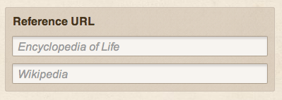
As part of Project Noah, you upload photos of nature. The aim is to identify the creature or plant in your photo, and part of that is providing the relevant links to that species’ page on Wikipedia and the Encyclopedia of Life.
 Then I have this thought:
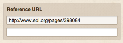
Did I put the URL in the right box? Is Encyclopedia of Life the top input or the bottom input? How do I find out?!
It seems pedantic, but I genuinely do get this sense of panic that I’m entering it wrong and there’s no way to check that I’m doing it right. I have to click back outside the input box, so it no longer has focus, to check what the label was again.
WordPress
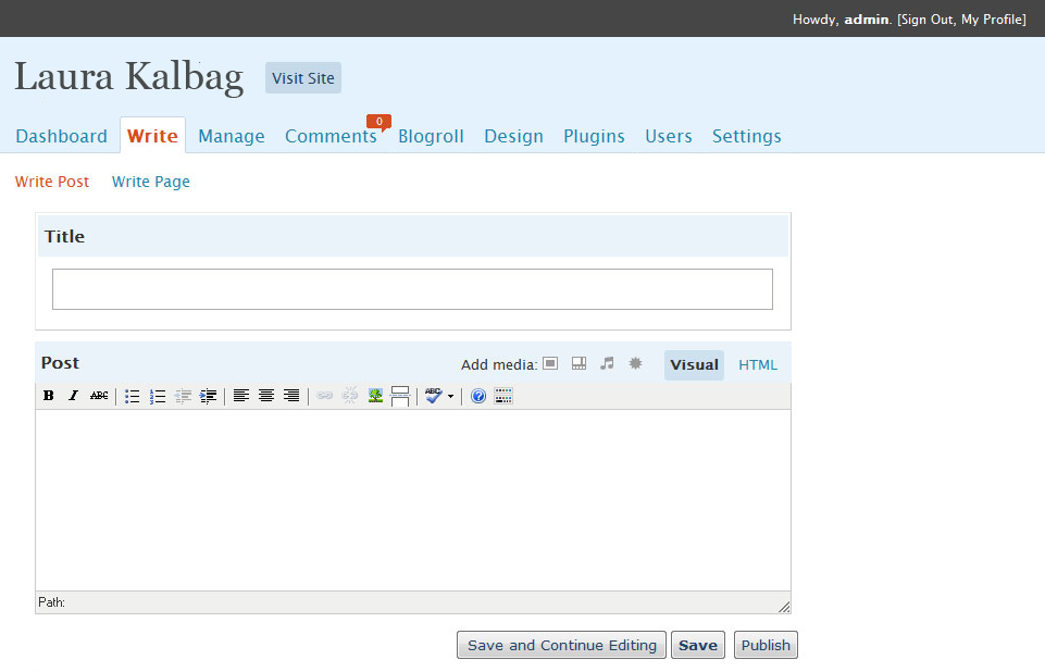
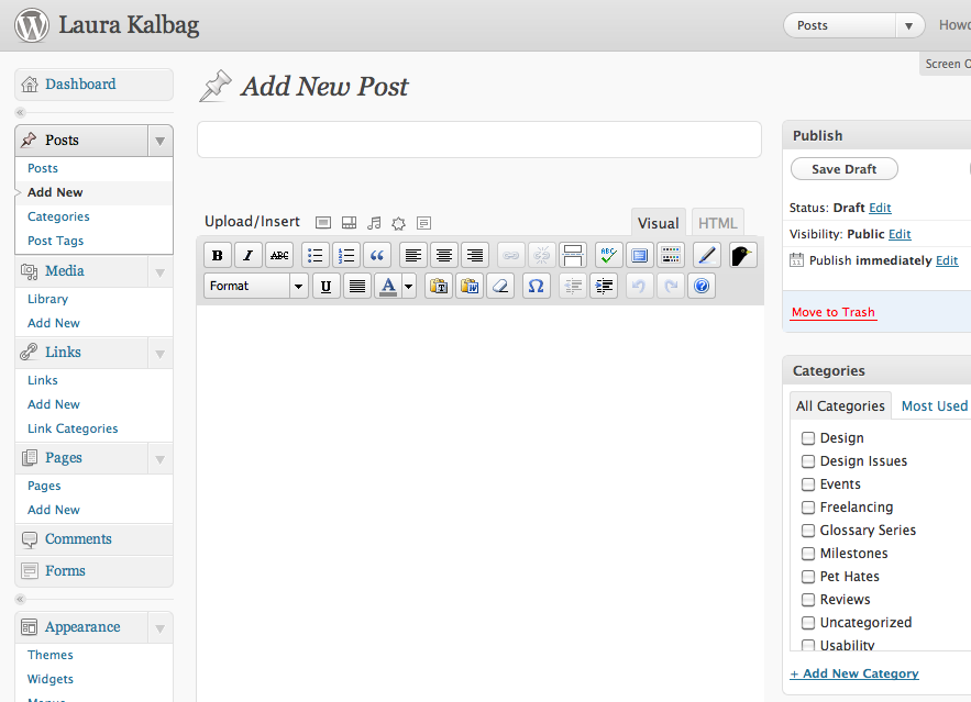
Another example from an interface that I use on a regular basis and generally love. In the 2.8 redesign of the WordPress admin, which is generally a huge amount better than before, the post editor title lost it’s label.
Before:
 After:
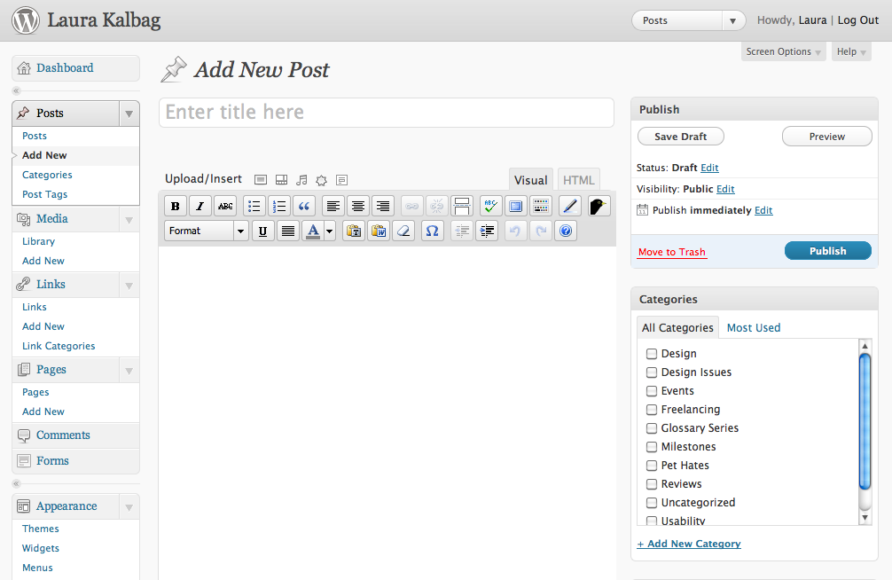
The problem is that the first input box you’ll click into is the top title input. It actually auto-focuses, and some clever script means that it puts the label back in after the auto-focus, but then the second you start typing you’ve lost that label. If you start typing, then backspace because you made a mistake, you’ve lost that label:
Designers often make assumptions
It’s all very well to assume that the user will remember that the title belongs in that box, but what if it’s somebody has cognitive difficulties? What if it’s someone that’s just an idiot like me who clicks into boxes without paying attention to the label first?
It started as an example
Originally we used pre-entered text in an input field as an example, to help users understand the input required. WordPress itself has a great example of this on the Writing Settings page in the WordPress admin:
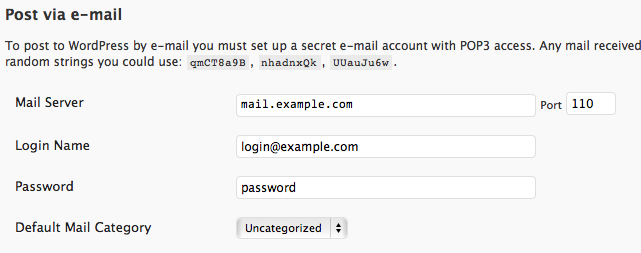
These fantastic triggers mean that users who aren’t necessary technically minded can see the type of input that’s required to set up post via email, match that to the information they have and easily enter it into the boxes.
When did these useful triggers become a way to hinder users, instead of help them?
The rise of the HTML5 placeholder leaves room for abuse
HTML5 has a fantastic new form input attribute for adding placeholder information into the input boxes so that you can easily give your users cues without the need for JavaScript or CSS hacks:

Edit: “name” should actually be “id” here in the text input, I always get those two mixed up! (Thanks Mike, for the heads up)
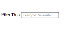
I’m concerned that people will misuse or misunderstand the placeholder attribute as a way to replace form labels
But it’s not the same thing!
A label tells you what a form input requires, a placeholder gives you an example of the input required.
I’m no accessibility expert, but I can imagine the loss of a label isn’t going to help with screen readers. Forgetful people and people with cognitive disabilities will also struggle.
Please think of daft people like me
It might beautify your interface and make you look modern and cool, but a label isn’t the same as a prompt. We need to keep our forms as clear as possible and not let cool technology take over the understanding of basic user behaviour.
I don’t know if I’m alone in struggling with using these inputs, but I’d love to know everybody else’s opinions.
48 comments
Read the original post, 'Labels in input fields aren’t such a good idea'.
This content originally appeared on Laura Kalbag’s Blog Posts and was authored by Laura Kalbag
Laura Kalbag | Sciencx (2011-05-27T17:52:37+00:00) Labels in input fields aren’t such a good idea. Retrieved from https://www.scien.cx/2011/05/27/labels-in-input-fields-arent-such-a-good-idea/
Please log in to upload a file.
There are no updates yet.
Click the Upload button above to add an update.

Not everything is obvious to everyone. Even though the design could look nicer without labels, a true designer will find a way to make them work visually.
The current solution to the “activated, anonymous” problem involves standard HTML features, with a dash of jQuery to smarten things up.
1. Layout your form with paired label and input combinations as normal.
Use a safe offscreening technique on your labels to maintain accessibility and satisfy your visual requirements.
Add the label text to each input as a ‘title’.
Add a class of “hint” to each input.
Use a bit of jQuery that, on load:
a) sets the “value” of all your “hint” inputs to their title text,
b) adds a class of “hinted” for that light grey text effect,
c) set the “focus” event to remove the “hinted” class and clear the “value” if it’s the same as the title on focus,
d) set the “blur” event to reinstate both the “hinted” class and the “title” as value only if the value is empty.
It’s a little bit of faff, but I think it’s worth it for the experience benefits. If your user mouses over an input, they’ll get a tool tip (because of the title). And if they click out of the input without entering anything, they’ll get the hint back again.And, for an added nicety, you could set a corresponding icon as a background on each input on focus, too –; particularly effective if you need to have several hinted fields close together.
Anyway, hope some of all that is of use. :)
Hi Laura,
I’m passionate about accessibility and usability, and I agree completely; this trend for ultra clean interfaces is causing problems for people who might struggle with this thing called the web.
These days some of the newest users are those who have been reluctant to do this “internet thing” because it is “complicated and scary”. We shouldn’t be making it any harder than it is. There is huge value in keeping things familiar, especially when it requires non-trivial interaction from the user.Thanks for raising the subject, it’s important not to forget the user in the pursuit for beauty!
Mike
The
forattribute of thelabelcan only take anidas a value. But the correspondinginputdoesn’t have anid. See the [HTML5 specification](http://www.w3.org/TR/html5/forms.html#attr-label-for" rel="nofollow).name=instead ofid=. Always get those two mixed up :sI checked the WordPress example you mentioned, and they do include the input element which is good. In fact it looks like quite a clever implementation. The label element is actually absolutely positioned on top of the text input, rather than text written to the input’s value property. Then when you click on the label it focuses you into the input.
Having said that it looks like they handle the no JavaScript situation less well. The label element is hidden and there is no visual hint as to what the field is for at all. I tried it with Voice Over switched on and it does read the label for the title input which is good, but then there is no label at all associated with the textarea for the body of the post, and the screen reader is completely lost.
Putting help-texts or labels INSIDE the texfields,
either with HTML5 placeholder, or some hack,
is F useless and should NEVER be used.
I have never EVER ever seen it done in a way that doesn’t break when you fill a field by drag&drop.Example:
The help text in the field says “Name”.
You select the text “Smith” somewhere and drag it and drop it in the field.
It now says “NaSmithme” or similar.
I guess you could build something that makes the field transparent , puts the help-text under (lower z-index), and then hides the help-text when the user start to fill it out.But NEVER actually put the help-text inside the field itself, like its always done now .
This madness must be stopped!
One other thing missing is the ‘affordance’ of the field –; during scanning behaviour.
For example, adding text into a search box simply makes it less visible on the screen so you’re hobbling your interface discoverability.
We’ve found the best balance is out of field help text –; supporting but not interfering with people’s ability to evaluate the size, information required and type from the input box itself (seen in eye tracking + see [http://www.lukew.com](http://www.lukew.com” rel="nofollow) work).
I think that if you test this stuff, you’ll find all sorts of problems. Visual clarity in the designers eyes does not translate to usability or conversion in a product –; this stuff often looks nice and clever but can suffer from interrupting already known patterns for using an interface that people look for (e.g. an empty bloody box, not something filled with text).
I had a similar discussion regarding phone formatting recently –; splitting it all into nice little boxes for USA phone numbers looks pretty but imposes work and friction on the viewer –; regardless of your design intentions. In that case, lots of clicks and eye focus work would have been imposed on the user, even though it looked ‘nice’.
C.
Great post. I’d be interested to hear what your point of view would be regarding the use of tool tips to display the form label in the event that the placeholder label is either replaced with input text or removed as in your WordPress example?
Hi Blair,
you also mean this tooltip is available to keyboarders using CSS or JS (in the case of IE and similar)?
Excellent article!
Forms are always a struggle. I’ll keep this in mind when making one.
Thank you :)
I think this is a review of unfinished or undersigned examples. Or they are just buggy, and those bugs are the problem, not the design. Here’s why: * When I focus on the field, this should not make the label go away, the label should go away only when I start typing.
*After not entering any text in that field and removing the focus, the label would remain, according to the above. Thus confusion cleared.
*This design will obviously be not a good idea where all the fields look the same and there are plenty of them. It works best on login forms, where you can save some space and make people feel great about using your app.
To sum it up, if the bugs are fixed and this concept is not over abused, it is a good idea :)Include labels for accessibility reason, but visibility of them isn’t necessary if you’re using the placeholder attribute. The placeholder text is preset on :focus, but hides after you start typing.
A few weeks ago something similar happened to me and I just had to refresh the page to double check that I knew what was going on.
I agree with you 90%. The label is a much needed element that seems to be missing from a lot of web content. However, I would also like to comment that I think there are cases in which a label is not needed. For example, if a search field has a “search” placeholder and a search icon, a user will know what they’ve typed in there even once the placeholder text is gone. This would be similar to anytime a form contains icons.
Another example is when the fields are very straightforward. For example, the contact form on my site has name, email, message. Once a user types in their name, for example, they would remember and know that the field was their name.
I totally agree with the sentiment of your article that form labels are still needed and shouldn’t be removed just for aesthetics. Hope you don’t mind my devil’s advocate comment. :)
Well, thank you! Finally, someone writes it down, as simple as it should be.
Win! :)
I wrote a jQuery plugin that I think largely solves this problem. It works by dropping the label down below the field after it has focus or a value so the label is still visible, while maintaing the clean look of placeholders before the form is used.
You can find it here along with a demo: http://jacware.github.com/fancyplaceholder/
Let me know what you all think!
I really like the aesthetic of having the label inside the input field –; just don’t hide it on focus. Here’s an example of how I implemented it on one of the projects I worked on: goo.gl/pzdkg