This content originally appeared on Hugo “Kitty” Giraudel and was authored by Hugo “Kitty” Giraudel
The following is a guest post by Ana Tudor. She is passionate about experimenting and learning new things. Also she loves maths and enjoys playing with code.
I had no idea how powerful CSS gradients could be until late 2011, when I found the CSS3 Patterns Gallery made by Lea Verou. The idea that you can obtain many shapes using just gradients was a starting point for many CSS experiments I would later do.
Recently, while browsing through the demos on CodePen, I came across a CSS3 Color Wheel and thought hey, I could do it with just one element and gradients. So I did and the result can be seen here. And now I’m going to explain the reasoning behind it.

Breaking it down
The wheel - or you can think of it as a pie - is first split horizontally into two halves and then each half is split into five slices, so there are ten slices in total. Which means that the central angle for each slice is 360°/10 = 36°.
The pen below shows graphically how to layer the multiple backgrounds. It also has a pause button so that the infinite animation doesn’t turn into a performance problem.
For both the original pen and this helper demo, the interesting part is this one:
background: linear-gradient(36deg, #272b66 42.34%, transparent 42.34%),
  linear-gradient(72deg, #2d559f 75.48%, transparent 75.48%),
  linear-gradient(-36deg, #9ac147 42.34%, transparent 42.34%) 100% 0, linear-gradient(
      -72deg,
      #639b47 75.48%,
      transparent 75.48%
    ) 100% 0,
  linear-gradient(36deg, transparent 57.66%, #e1e23b 57.66%) 100% 100%, linear-gradient(
      72deg,
      transparent 24.52%,
      #f7941e 24.52%
    ) 100% 100%,
  linear-gradient(-36deg, transparent 57.66%, #662a6c 57.66%) 0 100%, linear-gradient(
      -72deg,
      transparent 24.52%,
      #9a1d34 24.52%
    ) 0 100%, #43a1cd linear-gradient(#ba3e2e, #ba3e2e) 50% 100%;
background-repeat: no-repeat;
background-size: 50% 50%;
We first specify the nine gradient backgrounds, their positioning and the background-color using the shorthand background syntax.
The background shorthand
For anyone who doesn’t remember, the background layers are listed from the top one to the bottom one and the background-color is specified together with the bottom layer. A background layer includes the following:
If the background-position is not specified, then the background-size isn’t specified either. Also, since background-origin and background-clip both need the same kind of value (that is, a box value like border-box or content-box), then, if there is only one such value, that value is given to both background-origin and background-clip. Other than that, any value except the one for background-image can be missing and then it is assumed to be the default.
Since we have nine background layers and we want to have the same non-default values for background-repeat and background-size for all of them, we specify these outside the shorthand so that we don’t have to write the same thing nine times.
In the case of background-size, there is also another reason to do that: Safari doesn’t support background-size inside the shorthand and, until recently (up to and including version 17), Firefox didn’t support that either. Also, two values should be always given when the background-image is a gradient, because giving it just one value is going to produce different results in different browsers (unless that one value is 100%, in which case it might as well be missing as that is the default).
The background-color is set to be a light blue (#43a1cd) and then, on top of it, there are layered nine non-repeating (background-repeat: no-repeat for all) background images created using CSS gradients. All nine of them are half the width and the height of the element (background-size: 50% 50%).
The bottom one - horizontally centred (50%) and at the bottom (100%) - is really simple. It’s just a gradient from a firebrick red to the same color (linear-gradient(#ba3e2e, #ba3e2e)), so the result is simply a solid color square.
The other eight are gradients from transparent to a solid color or from a solid color to transparent. Four of them look like double slices, having a central angle of 2*36° = 72°, but half of each such double slice gets covered by another single slice (having a central angle of 36°).
A few things about linear gradients
In order to better understand gradient angles and how the % values for color stops are computed, let’s see how a linear gradient is defined. Hopefully, this demo that lets you change the gradient angle helps with that - just click the dots.
The gradient angle is the angle - measured clockwise - between the vertical axis and the gradient line (the blue line in the demo). This is for the new syntax, which is not yet supported by WebKit browsers (however, this is going to change). The old syntax measured angles just like on the trigonometric unit circle (counter-clockwise and starting from the horizontal axis).
Note: coming from a mathematical background, I have to say the old way feels more natural to me. However, the new way feels consistent with other CSS features, like rotate transforms, for which the angle values are also clockwise.
What this means is that we (almost always) have different angle values in the standard syntax and in the current WebKit syntax. So, if we are not using something like -prefix-free (which I do almost all the time), then we should to be able to compute one when knowing the other. That is actually pretty simple. They are going in opposite directions, so the formula for one includes the other with a minus sign. Also, there is a 90° difference between them so this is how we get them:
newSyntax = 90° - oldSyntax;
oldSyntax = 90° - newSyntax;
Note: if no gradient angle or destination side is specified (for example, linear-gradient(lime, yellow)), then the resulting gradient is going to have a gradient angle of 180°, not 0°.
All the points on a line that is perpendicular on the gradient line have the same color. The perpendicular from the corner in the quadrant that’s opposite to the quadrant of the angle is the 0% line (the crimson line in the demo) and its intersection with the gradient line is the starting point of the gradient (let’s call it S). The perpendicular from the opposite corner (the one in the same quadrant as the gradient angle) is the 100% line (the black line in the demo) and its intersection with the gradient line is the ending point of the gradient (let’s call it E).
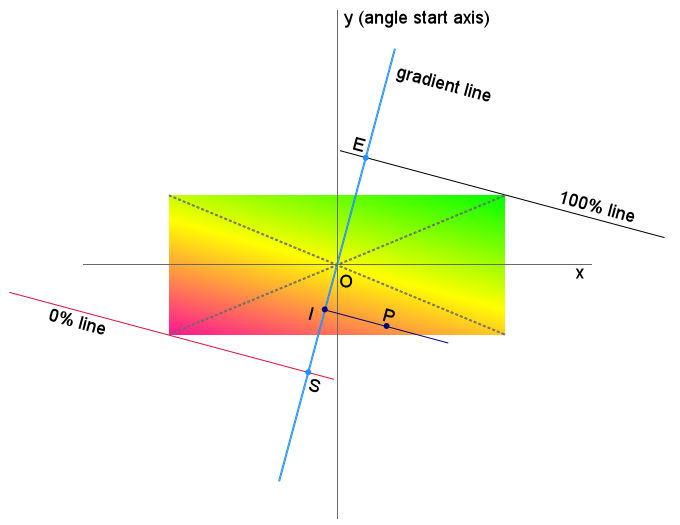
In order to compute the % value of any point P, we first draw a perpendicular on the gradient line starting from that point. The intersection between the gradient line and this perpendicular is going to be a point we’ll name I. We now compute the ratio between the lengths of SI and SE and the % value for that point is going to be 100% times that ratio.
Putting it all to work
Now let’s see how we apply this for the particular case of the rainbow wheel.
Let’s first consider a gradient that creates a single slice (one with a central angle of 36°). This is a square image (see below), with a blue slice having an angle of 36° in the lower part. We draw the horizontal and vertical axes through the point O at which the diagonals intersect. We draw a perpendicular from that point to the line that separates the dark blue part from the transparent part. This is going to be the gradient line. As it can be seen, there is a 36° angle between the vertical axis and the gradient line, so the angle of the gradient is 36°.
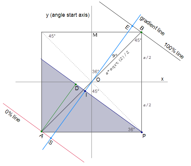
We now draw a perpendicular from the corner of the square in the quadrant that is opposite to the one in which the gradient angle is found. This is the 0% line. Then we draw a perpendicular from the corner of the square in the same quadrant (Q I) as the gradient angle - this is the 100% line.
The intersection of the diagonals of a square splits each one of them into two, so AO and BO are equal. The BOE and AOS angles are equal, as they are vertical angles. Moreover, the BOE and AOS triangles are right triangles. All these three mean that the two triangles are also congruent. Which in turn means that SO and EO are equal, so the length of SE is going to be twice the length of EO or twice the length of SO.
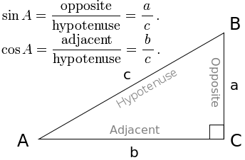
Note: before moving further, let’s go through a couple of trigonometry concepts first. The longest side of a right-angled triangle is the one opposing that right angle and it’s called the hypotenuse. The other two sides (the ones forming the right angle) are called the catheti of the right triangle. The sine of an acute angle in a right triangle is the ratio between the cathetus opposing that angle and the hypotenuse. The cosine of the same angle is the ratio between the adjacent cathetus and the hypothenuse.
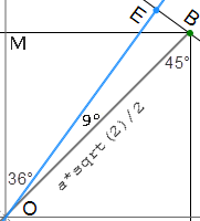
Computing the length of EO in the right triangle BOE is really simple. If we take the length of the side of the square to be a, then the length of the half diagonal BO is going to be a*sqrt(2)/2. The BOE angle is equal to the difference between the BOM angle, which is 45°, and the EOM angle, which is 36°. This makes BOE have 9°. Since BO is also the hypotenuse in the right triangle BOE, the length of EO is going to be (a*sqrt(2)/2)*cos9°. Which makes the length of SE be a*sqrt(2)*cos9°.
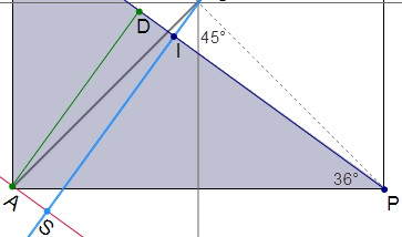
We now draw a perpendicular from A to the PI line. ASID is a rectangle, which means that the length of SI equals the length of AD. We now consider the rectangular triangle APD. In this triangle, AP is the hypotenuse and has a length of a. This means that AD is going to have a length of a*sin36°. But SI is equal to AD, so it also has a length of a*sin36°.
Since we now know both SI and SE, we can compute their ratio. It is sin36°/(sqrt(2)*cos9°) = 0.4234. So the % value for the color stop is 42.34%.
In this way, we’ve arrived at: linear-gradient(36deg, #272b66 42.34%, transparent 42.34%)
Computing the % values for the other background layers is done in the exact same manner.
Automating all this
By now, you’re probably thinking it sucks to do so many computations. And it must be even worse when there are more gradients with different angles…
Even though for creating the rainbow wheel experiment I did compute everything on paper… I can only agree with that! This is why I made a really basic little tool that computes the % for any point inside the gradient box. You just need to click inside it and the % value appears in a box at the bottom center.
You can change the dimensions of the gradient box and you can also change the gradient itself. It accepts the newest syntax for linear gradients, with angle values in degrees, to values or no value at all for describing the direction of the gradient.
Final words
CSS gradients are really powerful and understanding how they work can be really useful for creating all sorts of imageless textures or shapes that would be difficult to obtain otherwise.
This content originally appeared on Hugo “Kitty” Giraudel and was authored by Hugo “Kitty” Giraudel
Hugo “Kitty” Giraudel | Sciencx (2013-02-04T00:00:00+00:00) Dig deep into CSS linear gradients. Retrieved from https://www.scien.cx/2013/02/04/dig-deep-into-css-linear-gradients/
Please log in to upload a file.
There are no updates yet.
Click the Upload button above to add an update.
