This content originally appeared on Zell Liew and was authored by Zell Liew
Susy is a plugin to Compass that allows you to create customizable grid frameworks easily. It makes responsive design extremely easy by removing the need to manually calculate widths.
If you need to create repsonsive websites do not want to constrain your design with available frameworks out in the open, Susy might be the perfect answer.
This is the first of a two part tutorial that covers the basics of Susy.
In this tutorial, we are going to install Susy, set up Susy defaults and understand how to create the 10-column complex nested grid AG test found on the susy website.
Important Update
Susy 2 is now released, which makes this tutorial obsolete. Head over here to find the latest article on Susy 2 instead.
Installing Susy
Susy requires Sass and Compass.
This tutorial assumes that you already have Sass and Compass installed. If not, I suggest you check out some awesome video tutorials at LevelUpTuts for Sass and Compass.
Once you have Sass and Compass installed, go ahead and install Susy from the command line:
# Command line
$ sudo gem install susy
Important Note: Susy has been upgraded to Susy 2, and a lot of the configurations is changed. If you have any errors running Susy, I would recommended you to uninstall all versions of Sass, Compass and Susy, and reinstall them altogether. The most important thing here is that sass and compass needs to upgrade if you are using old versions (I have no clue how to update so I just reinstalled everything)
sudo gem uninstall sass
sudo gem uninstall compass
sudo gem uninstall susy

# I personally use --pre, but you should be able to get by without the --pre since Susy 2.0 was officially released.
sudo gem install sass --pre
sudo gem install compass --pre
sudo gem install susy --pre
The process to use Susy in a project is to add a line of code in the config.rb found in the compass.
# in config.rb
require 'susy'
Now, we can get into the very basics of using Susy.
Setting up Susy
The very first step of using Susy in your project is to import Susy in your sass file and set its defaults.
@import "_normalize.scss";
// To revert all browser default styles

  @import "susyone";
// susy is now reserved for susy 2. For the rest of this tutorial, you have to use susyone instead of importing "susy" as in previous versions.


// Configuring Susy defaults
// Susy accepts px, em and rem for the magic and fixed grid, and % for the fluid grid
$total-columns: 10;
$column-width: 4rem;
$gutter-width: 1rem;
$grid-padding: $gutter-width / 2;

$container-style: magic; // default to magic. Switch to fluid or fixed if desired
I’ll also recommend using border boxes to help you with creating layouts. Susy has a built-in mixin for border-box sizing. Read on about border-box over at CSS Tricks if have no idea what it is.
@include border-box-sizing;
Also, the susy grid background helps alot when trying to understand how columns are placed.
.container {
  @include susy-grid-background;
}
With this, we are now ready to tackle the 10 column AG test.
Setting Up The AG Grid Test
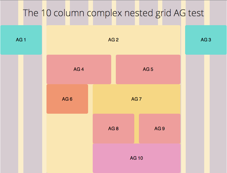
This is what we are going to obtain by the end of the tutorial

The HTML
The HTML for the grid test is as follows.
<div class="container">
<h1>The 10 column complex nested grid AG test</h1>

<div class="ag ag1">
  <h2>AG 1</h2>
</div>
<!-- /ag1 -->

<!-- ag3 to ag7 are nested within ag2.-->
<div class="ag ag2">
  <h2>AG 2</h2>
  <div class="ag ag4">
    <h2>AG 4</h2>
  </div>
  <div class="ag ag5">
    <h2>AG 5</h2>
  </div>
  <div class="ag ag6">
    <h2>AG 6</h2>
  </div>

  <!-- ag8, ag9 and ag10 are nested within ag7 -->
  <div class="ag ag7">
    <h2>AG 7</h2>
    <div class="ag ag8">
      <h2>AG 8</h2>
    </div>
    <div class="ag ag9">
      <h2>AG 9</h2>
    </div>
    <div class="ag ag10">
      <h2>AG 10</h2>
    </div>
  </div>
  <!-- /ag7 -->
</div>
<!-- /ag2 -->

<div class="ag ag3">
  <h2>AG 3</h2>
</div>
<!-- /ag3 -->

</div>
<!-- /container -->
Simply speaking, whenever something is found within another div, you should nest it within the previous div.
In our case, AG 3 to AG 7 will be nested under AG 2 while AG 8, AG 9 and AG 10 are nested under AG 7.
The Sass
We’re going give each ag a color like the one on Susy’s main webpage.
/**
Styles for AG grids & Container */
.container {
  background-color: #fbeecb;
}

.ag1, .ag3 {
  background-color: #71dad2;
}

.ag2 {
  background-color: #fae7b3;
}

.ag4,.ag5,.ag8,.ag9 {
  background-color: #ee9e9c;
}

.ag6 {
  background-color: #f09671;
}

.ag7 {
  background-color: #f6d784;
}

.ag10 {
  background-color: #ea9fc3;
}

/**
Text Styles */ h2 { text-align: center; font-size: 1rem; font-weight: normal; padding-top: 1.8rem; padding-bottom: 1.8rem; }
Susy Mixins and Functions
Before diving into writing susy mixins, I hope you wont mind if I explained how they work.
Container
Container establishes the grid containing element for the webpage. Given our html, the container mixin will be applied to the container class. This tells Susy where to start all the calculations from.
.container {
  @include container;
}
If were are to use Susy with responsive design, we have to pass some arguments into container. This will be elaborated on in part 2 of the tutorial.
Span Columns
The Span Column mixin is probably the one used most while using Susy. It allows you to align an element to the grid you would like defined.
The span column mixin takes a minimum of 1 argument and has the potential to accept a few more to customize to your needs.
@include span-columns( <$columns> [ <omega> , <$context>, <$padding>, <$from>, <$style>])
The most important arguments to be included here in span-columns are $columns, omega and $context. The rest of the explanation can be viewed on the Susy Reference page.
-
$columns means the number of columns you would like the particular element to take up.
-
omega is an optional flag to tell Susy that this is the final element in a row.
-
$context tells Susy the current nesting context. It defaults to the total number of columns you specified within the container. In our case, it is 10.
Since we’re clear of the two basic mixins used, we can start applying them to create the grid.
Using Susy for the AG Grid Test
As we have mentioned above, we need to tell Susy what is the containing element for the Susy grid. In our case, the containing element is .container.
We must also make the container clear its childrens since Susy makes use of floats to align our grids. For simplicity, I’m using overflow hidden as the self clearing method here. Other methods can be found on Chris Coyier’s page.
.container {
  @include container;
  overflow: hidden;
}
Lets start applying susy span column mixins to the rest of our grids. Taking the image as a reference, we count that ag1 takes up 2 columns, ag2 takes up 6 columns and ag3 takes up the final two columns.
.ag1 {
  @include span-columns(2);
}

.ag2 {
  @include span-columns(6, 10);
  // Optionally, you can choose to include the context.
}
.ag3 {
  @include span-columns(2 omega);
  // The omega flag is set here to tell Susy that ag3 is the final column.
}
This CSS output Susy has created for us.
.container {
  *zoom: 1;
  // Susy has calculated and provided fallbacks in px for the rem unit I used
  max-width: 784px;
  max-width: 49rem;
  _width: 784px;
  padding-left: 0;
  padding-right: 0;
  margin-left: auto;
  margin-right: auto;
  overflow: hidden; }

.ag1 {
  width: 18.36735%; // Size of 2 columns + 1 Gutter
  float: left;
  margin-right: 2.04082%;
  display: inline; }

.ag2 {
  width: 59.18367%; // Size of 6 columns + 5 Gutters
  float: left;
  margin-right: 2.04082%;
  display: inline; }

.ag3 {
  width: 18.36735%;
  float: right; // Omega flag creates a float right instead of float left
  margin-right: 0;
  *margin-left: -1rem;
  display: inline; }

Susy takes into account the container’s width at 49rem (or 784px) and proceeds to convert all our calculations into percentages. Its alot simpler to work with numbers like 2 and 6 instead of absolute percentages!
Although this doesn’t seem like much right now, you will see that its extremely awesome when responsive design comes into play in the next tutorial.
Let’s proceed to complete the rest of the grids that are within AG 2.
Creating Elements Within AG 2.
Here, we have to be very careful with the $context because $context defaults to the $total-columns, which was declared right at the top of our Sass file.
If left untouched, Susy will use 10 columns to calculate the width of everything within AG 2.
AG 2 consists of 6 columns and we want our items within the grid to have a context of 6 columns as well. In this case, we have to specify the context manually with the number 6.
The rest of the mixins can be used in the same manner as above.
.ag2 {
  // overflow hidden is used to self clear children
  overflow: hidden;
}

.ag4 {
  // Specifying the context with 6
  @include span-columns(3, 6);
}

.ag5 {
  // Additionally, adding omega to signify the last column
  @include span-columns(3 omega, 6);
}

.ag6 {
  @include span-columns(2, 6);
}

.ag7 {
  @include span-columns(4 omega, 6);
}
 What’s left now is everything within the AG 7 column.
Creating Elements Within AG 7
Repeat the process with everything you have done with the elements in AG 2. The context within AG 7 is 4 columns.
.ag7 {
  overflow: hidden;
}

.ag8 {
  @include span-columns(2, 4);
}

.ag9 {
  @include span-columns(2 omega, 4);
}

.ag10 {
  // There is no need to use span columns on AG 10 since elements take up 100% of the space by default in display block. In this case, we just have to make sure to clear the floats from ag8 and ag9.
  clear: both;

  // You can still use span-columns if you want to though. There's no fault in using that.
  @include span-columns(4, 4);
}
And we’re done!

Feel free to grab the source code and view the demo:
Wrapping Up the First Part
I hope this quick tutorial has given you the opportunity to familiarize yourself with Susy and to understand how span columns and containers are used.
In the next part of the tutorial next week, we will cover the use of Susy with responsonsive designs, altering the AG grid at various sizes. We will also look into using some of Susy’s helper mixins that provides additional padding or magin to really make our design fully customized.
This content originally appeared on Zell Liew and was authored by Zell Liew
Zell Liew | Sciencx (2013-09-22T00:00:00+00:00) A Complete Tutorial to Susy. Retrieved from https://www.scien.cx/2013/09/22/a-complete-tutorial-to-susy/
Please log in to upload a file.
There are no updates yet.
Click the Upload button above to add an update.
