This content originally appeared on Adam Silver and was authored by Adam Silver
Multiple submit buttons are problematic for keyboard users because forms can be submitted by pressing Enter when a field is focused.
When this happens the form will be submitted as if the user pressed the first button within the <form> element which isn’t always desirable.
# An example
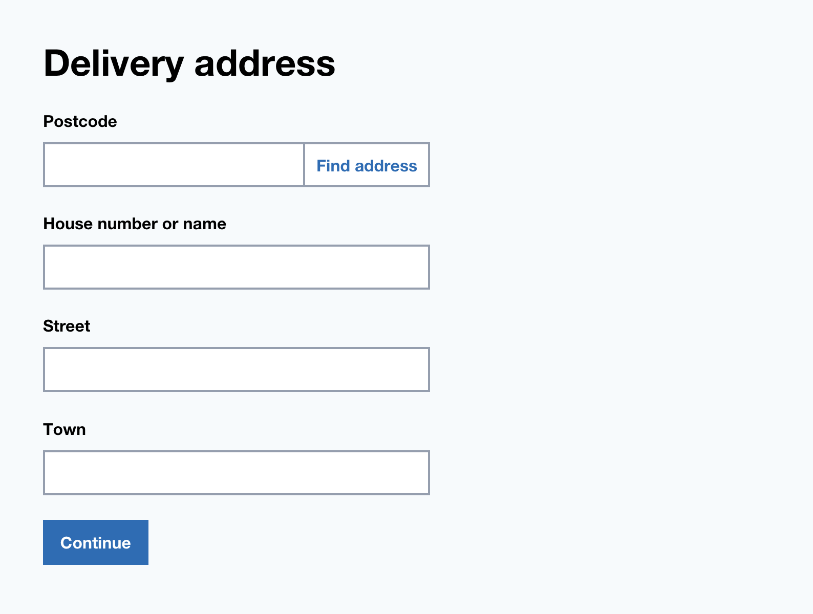
Take the following address form with a postcode lookup.

Pressing Enter from with any of the form fields will submit the form as if the ‘Find address’ button was clicked.
This at little odd as the ‘Save address’ button is the primary action here.
# How to solve this
# Separate into 2 forms
Split each action into 2 completely separate forms.
In this case, let users first search for their address via the postcode but give users an option to enter their address manually.
Having one action perform makes things simple and clear.

# 2. Put the main submit button first
If you can’t separate the forms, then you need to identify the form’s main action.
If it doesn’t naturally come first in the <form> then you can duplicate it and place it at the top of the form.
To remove it visually you can use this:
.visually-hidden {
  border: 0!important;
  clip: rect(0 0 0 0)!important;
  height: 1px!important;
  margin: -1px!important;
  overflow: hidden!important;
  padding: 0!important;
  position: absolute!important;
  width: 1px!important;
}
This introduces the problem that when a user tabs to the hidden button, the interface will appear unresponsive.
To fix this, give the button a tabindex="-1" attribute to stop the button being navigable via keyboard.
# Checklist
- Avoid multiple submit buttons whenever possible
- If you must have multiple submit buttons put the primary action first
- If putting it first visually doesn’t work, then hide it visually with CSS and the tabindex attribute
This content originally appeared on Adam Silver and was authored by Adam Silver
Adam Silver | Sciencx (2014-03-20T09:00:01+00:00) Forms with multiple submit buttons are problematic. Retrieved from https://www.scien.cx/2014/03/20/forms-with-multiple-submit-buttons-are-problematic/
Please log in to upload a file.
There are no updates yet.
Click the Upload button above to add an update.
