This content originally appeared on Zell Liew and was authored by Zell Liew
I talked about using rem and em for responsive typography and for building modular components in two blog posts previously. In both posts, comments about viewport based units inevitably comes into the picture.
I resisted working with viewport units for a while, believing that using them would be a pain in the ass because of the calculations involved.
Last week, I finally overcame the resistance and took a stab at exploring viewport units and how to use them in responsive typography.
Before I deep dive into viewport units and how they work with responsive typography, let’s first talk about what viewport units are.
What are Viewport Units?
There are 4 different types of viewport units available in CSS today. They are:
vw– Percentage of viewport widthvh– Percentage of viewport heightvmin–vworvh, whichever smallervmax–vworvh, whichever bigger
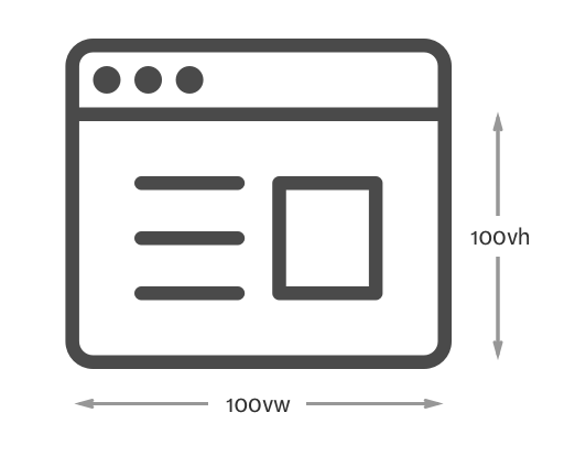
Viewport, in this case, refers to the browser screen. 1vw would mean one percent of the browser’s width. 100vw would mean the full browser width.

The good thing about viewport units is that they are automatically recalculated whenever the viewport changes. This happens on load, on resize or even on orientation change.
Since viewport units are automatically recalculated, it becomes extremely easy to create a component that will always be a quarter of the viewport:
.component {
  width: 50vw;
  height: 50vh;
  background: rgba(255, 0, 0, 0.25)
}

That’s viewport units in a nutshell. Now, let’s move into the meat of this article.
Using Viewport Units for Typography
There’s one reason why you might want to consider using viewport units for typography – viewport units are recalculated automatically depending on the client’s browser. This means we don’t have to explicitly declare font-size changes with media queries.
Let’s use an example to illustrate this point clearly.
Consider the following code where we change the font-size from 16px to 20px at a breakpoint of 800px:
// Note: CSS are all written in SCSS

html {
  font-size: 16px;

  @media (min-width: 800px) {
    font-size: 20px;
  }
}
When you look at this code, you can immediately tell that the font-size jumps from 16px to 20px at a viewport of 800px. That’s decent. It’s what we have done for a long time.
Once in a while, you’ll encounter the situation where you had to add an extra media query between two breakpoints to make sure the typography looks good on all devices:
html {
  font-size: 16px;

  @media (min-width: 600px) {
    font-size: 18px;
  }

  @media (min-width: 800px) {
    font-size: 20px;
  }
}
Although we can go on and specify multiple media queries and multiple font-sizes, it’s usually an overkill so we stick to 3 - 4 sizes.
But what if you can get the same effecting without specifying multiple media queries or multiple font-sizes?
That’s where viewport units come in. You can get the same effect easily by setting the font-size property in viewport units.
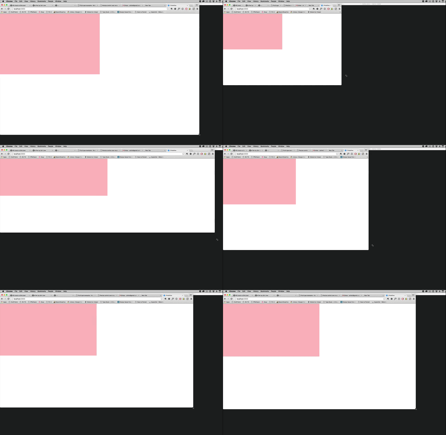
Consider the results from the following code:
html { font-size: 3vw; }

Pretty amazing, isn’t it?
The downside though, as you can see, is that viewport units are too responsive to the changes of the screen’s width.
If you set a font-size at 3vw like I did above, you’ll get a text size of 10px on a device with a screen width of 320px (mobile). That’s too small to read. On the flipside, text becomes 43px when you’re on a device with a screen width of 1440px (laptop). That’s too big.
We’re now presented with an interesting challenge – taming the viewport beast.
Thankfully, there’s a simple way to solve the problem. We can set a minimum font-size, then scale the font with a small viewport multiple by using the calc() property.
This is how it looks like in code:
html { font-size: calc(18px + 0.25vw) }
Looks pretty cool, doesn’t it? I first found out about this technique through Mike Riethmuller’s article on precise control over responsive typography.
Unfortunately, I realized at the same time that this code doesn’t work on some browsers. For example, it doesn’t resize on Safari for Mac (According to Mike, it does on Windows though).
The fix though, is surprisingly simple. We can combine the use of a percentage unit with vw to allow Safari to scale the fonts again:
html { font-size: calc(112.5% + 0.5vw) }
Tada!

Shwweeeeeet! Can we really get rid of em, rem and media queries altogether in our code? At this point, I can’t wait to try it out!
The next challenge I had to overcome was to try setting font-sizes of other typographic elements (h1-h6) in viewport units.
Setting Other Typography Elements in Viewport Units
The first thing I tried to do was to create a <h1> element thats twice the size of the body text. It turned out that it wasn’t straightforward to do so :(
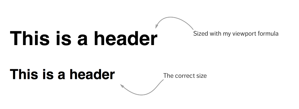
I tried multiplying the calculations in the <html> font-size by 2, and I saw that it’s larger than what it should be:
html { font-size: calc(112.5% + 0.25vw) }
h1 { font-size: calc((112.5% + 0.25vw) * 2); }

This happens because I’m using a percentage-based font-size calculation in the <h1>. Effectively, I’m recalculating the font-size in <h1> after inheriting the calculated font-size in <html>.
It might be easier to visualize if we put some numbers to it.
Let’s say you’re now on a viewport of 800px. The default font-size is 16px.
- 112.5% in the
<html>calculation means afont-sizeof 18px (112.5/100 * 16px) - 0.25vw in the calculation equals to 2px (
800px * 0.25 ÷ 100) - The computed
<html>font-sizeis 20px (18px + 2px)
So far so good for the HTML calculation? Great!
We’ll use the same method to tackle the <h1> calculation. Pay special attention to the the 112.5% when calculating <h1> this time.
- 112.5% in the
<h1>calculation means afont-sizeof 22.5px (112.5/100 * 20px) - 0.25 vw in the calculation equals to 2px (
800px * 0.25 ÷ 100) - The computed
<h1>font-sizeis 49px((22.5px + 2px) * 2)
Unfortunately, the correct <h1> size we’re looking for is twice the body font-size, or 40px. They’re different :(
There are two ways to solve this problem since we know the error has caused by <h1> inheriting the font-size of <html>
The first way is simply set 112.5% as 100% in <h1>:
h1 { font-size: calc((100% + 0.25vw) * 2) }
The second way to solve this problem is to make sure font-sizes aren’t inherited across elements.
h1 { font-size: calc((100% + 0.25vw) * 2) }
p { font-size: calc((100% + 0.25vw)) }
Both of these seemed like hacky ways to solve the problem. I wasn’t happy with either, so I kept searching.
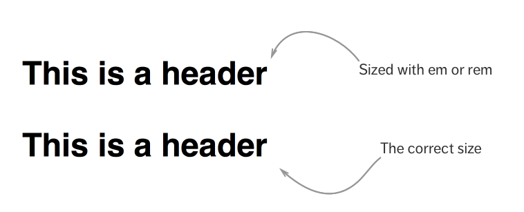
Eventually, the cleanest way I found is to revert to using Rem and Em. Why discard good ol’ units for shiny new ones? :)
html { font-size: calc(112.5% + 0.25vw) }
h1 { font-size: 2em; }

Since we’re talking about scaling font-sizes, the next question you may have is: “What about vertical rhythm or modular scale with viewport units?”
Well, let’s talk about that next.
Vertical Rhythm and Modular Scale with Viewport Units
This is relatively easy to answer.
Did you notice that viewport units are used only for sizing the <html> element? Everything else is still sized with rem and em!
This means you can still use em and rem units to create vertical rhythm and modular scale in the same way I’ve discussed previously in everything I know about responsive typography.
Nothing has changed! :)
Oh. One more thing before we end this article.
There’s one more challenge I had to overcome. Here’s the question I had: “How can you calculate vw such that your typography is going to be sized at 20px when the viewport is 800px”?
That’s a mouthful to ask, so let’s shorten the question into a single word – Precision. In other words, how can I be more precise with the font-sizes I intend to use?
Precision
Turns out, Mike has already solved this challenge for me. I’m just going to explain to you how this formula works.
Let’s say you want your…
font-sizeto be 18px when the viewport is at 600pxfont-sizeto be 22px when the viewport is at 1000px
First, we have to convert the smaller font-size (18px) into a percentage. The first part of the calculation is thus: calc(18/16 * 100%) (or simply calc(112.5%)).
Next, we calculate the vw amount. This part of the calculation is slightly more difficult.
You calculate the vw value by taking the difference in font-size (22 - 18), divide it by the difference in viewport widths (1000 - 600), then multiply it by 100vw - smaller-viewport-width (100vw - 600px).
When put together, its:
html {
  font-size: calc(112.5% + 4 * (100vw - 600px) / 400)
}
It might be a tad complicated at first, but once you know the ingredients, you can simplify it into a Sass mixin.
Indrek Paas has already converted the above formula into a simple Sass mixin. The only thing I’ll love to change in his implementation is to use percentages instead of pixels.
Super Duper Precision
So, how does implementing viewport units look like if you wanted your type sizes to scale at a different rate at different breakpoints?
Here’s one answer:
html {
  font-size: 100%;

  // Scales by 1px for every 100px from 600px to 1000px
  @media (min-width: 600px) {
    font-size: calc(112.5% + 4 * (100vw - 600px) / 400)
  }

  // Scales by 0.5px for every 100px from 1000px to 2000px
  @media (min-width: 1000px) {
    font-size: calc(137.5% + 5 * (100vw - 1000px) / 1000)
  }
}
But hey, in reality you probably won’t scale it with different rates anyway!
Which means, a more realistic implementation is:
html {
  font-size: 100%;

  // Scales by 1px for every 100px from 600px onwards
  @media (min-width: 600px) {
    font-size: calc(112.5% + 4 * (100vw - 600px) / 400)
  }

  // Sets font-size to 22px after a viewport of 1000px
  @media (min-width: 1000px) {
    font-size: calc(137.5%)
  }
}
You get the drift. Feel free to combine viewport units with media queries to achieve the effect you wanted.
Now, probably the most important question of all:
Would I use viewport units on an actual project?
Maybe. I haven’t worked with viewport units enough to form a conclusion yet. Here are a few things I’ll need to do before seriously trying it out on a real project:
- Create a Sass mixin to calculate vw
- Test for browser support and additional bugs
It’ll be super helpful if you can let me know about the bugs you found in the comments :)
SUPER IMPORTANT UPDATE: It has come to my attention (Thanks, Paul!) that calc with percentages is totally broken on IE (both 11 and Edge). My personal tests suggests it does fine, but the guys over at this thread proved me otherwise.
So, if you wanted to use viewport units, you can use a regular calc() function with the em unit, followed by a -webkit-calc() function with the percentage unit:
html {
  font-size: calc(0.875em + 0.25 * (100vw - 80em) / 40);
  font-size: -webkit-calc(87.5% + 0.25 * (100vw - 8000%) / 40);
}
Indrek has been kind enough to put up a Codepen demo for this at http://codepen.io/indrekpaas/pen/VarLaJ. Check it out!
Wrapping Up
So, in summary, we talked about using viewport units to size typography in this article. Viewport units can be beneficial because they are recalculated automatically whenever the viewport changes.
During the implementation, I discovered that it’s a much better practice to set viewport based units only to the <html> element. Everything else is to be sized in em and rem so we can do practices like modular scale and vertical rhythm easily.
What are your thoughts on using Viewport units for typography? I’ll love to hear what you have to say in the comments below!
This content originally appeared on Zell Liew and was authored by Zell Liew
Zell Liew | Sciencx (2016-03-09T00:00:00+00:00) Viewport Unit Based Typography. Retrieved from https://www.scien.cx/2016/03/09/viewport-unit-based-typography/
Please log in to upload a file.
There are no updates yet.
Click the Upload button above to add an update.
