This content originally appeared on bryanlrobinson.com and was authored by bryanlrobinson.com
Layout in CSS is hard. We’ve spent the 2 decades since the inception of CSS battling with its idea of how to lay out content on the web.
When we moved from table-based layouts to CSS layouts with floats and positioning, we gained a LOT of flexibility, but we also lost things like vertical centering that tables afforded us.
Floats and positioning got us a long way to making really nice looking sites, but with the advent of responsive design and fluid layouts, the struggle has been real: hacky solutions; exploitation of CSS bugs; extraneous HTML; not to mention, front-end frameworks like Bootstrap and Foundation.
Floats were great at putting content side-by-side, but came with height quirks and adding more content to a row could become tedious. Also, math was necessary to do things properly, and surprisingly both designers and developers don’t like math in many way.
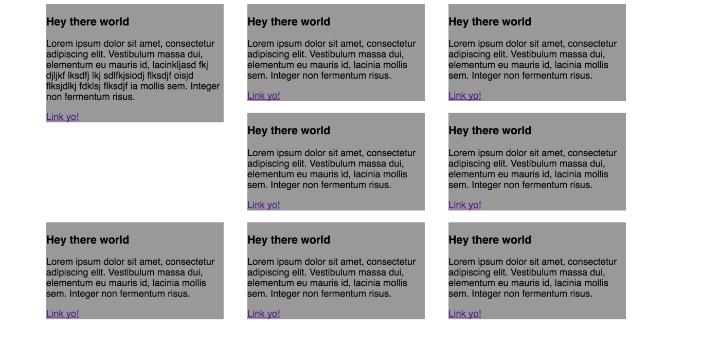
In the example below, I simply float 3 boxes side-by-side, but note on the container .stripe, I have a background-color set that doesn’t show on the page. This is because floated elements don’t have height according to their parent, meaning .stripe has no height itself.

If I insert an element that clears both left and right after, the background-color is now visible, because .stripe has a full height value.

If there are more HTML elements floated in the row, I either need to adjust my math to keep them on the row or accept that they’ll break to the next line. If I accept that they break to the next line and the height of my elements are uneven, then I get even more of a mess.

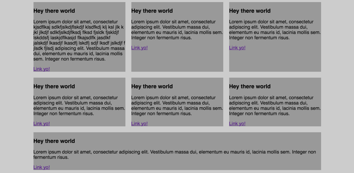
Now, we have the Flexible Box Layout Module. This is a new display value that turns the direct children of the element it’s applied to into flexible boxes. So, using very similar markup, here is an example where I just apply “display: flex” to the stripe container.

Flex is allowing for each of these boxes to be flexible and fill up the space available and adjust their size depending on how much content is in the row. This is great for side-by-side layouts, but we “lose” the ability to have extra content break onto a new line. So we add 4 new content items and we get this:

Which is amazingly helpful sometimes, but obviously has its drawbacks.
Luckily we have a flex property to allow for our flex items to wrap, conveniently called flex-wrap. We set that to “wrap” and voila!

In the next Flexbox post I write, I’ll dig more into how we can have things wrap in new and exciting ways, but the defaults solve so many problems we’ve had over the years that it makes sense to try it out.
If you're interested in trying things out, head over to My Codepen collection
This content originally appeared on bryanlrobinson.com and was authored by bryanlrobinson.com
bryanlrobinson.com | Sciencx (2016-05-02T00:00:00+00:00) Flexbox — Let’s start simple. Retrieved from https://www.scien.cx/2016/05/02/flexbox-lets-start-simple/
Please log in to upload a file.
There are no updates yet.
Click the Upload button above to add an update.
