This content originally appeared on Zell Liew and was authored by Zell Liew
I spoke about why you may have problems with large font-sizes on the mobile and the four methods to deal with it in a previous article. In this article, we’re going to look at implementing the fourth method that was mentioned—changing the Modular Scale ratio at different breakpoints.
I highly suggest that you read the previous article before continuing if you haven’t done so. With that aside, let’s dive in and learn how to change the ratio at different breakpoints.
We’ll begin by learning to change the ratio manually since it will pave the way to better a implementation that we’re going to discuss further down the article.
Changing The Ratio Manually
Let’s assume that you’re going to use the following numbers:
- A base font-size of 16px
- A ratio of 1.333 on screens smaller than 1000px
- A ratio of 1.618 on screens larger than 1000px
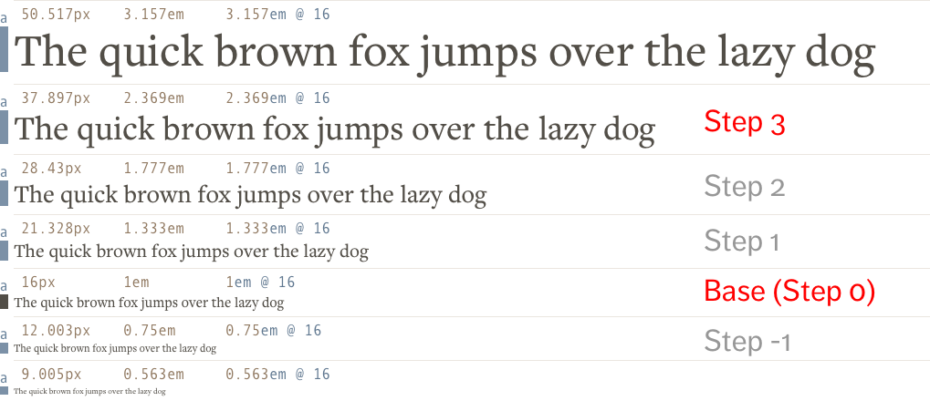
Let’s also say that your h1 font-size is set to the 3rd step. When I say the 3rd step, I mean the font-size of your h1 is the third number on the scale:

Mathematically, you can calculate the size of this step by multiplying the base font-size by the ratio to a power of the step:
font-size = base-size * (ratio)^step
If your base font-size is 16px and your ratio is 1.333, these are the steps that you’ll get:
- Step -2: 16px ÷ 1.333 ÷ 1.333 =
9.005px - Step -1: 16px ÷ 1.333 =
12.003px - Base (Step 0):
16px - Step 1: 16px * 1.333 =
21.328px - Step 2: 16px * 1.333 * 1.333 =
28.43px
So the h1, in this case, is set to the following values:
- below 1000px:
37.897px(16px * 1.333 * 1.333 * 1.333) - above 1000px:
67.773px(16px * 1.618 * 1.618 * 1.618)
Assuming we have the above assumptions about your base font-size, ratios and h1 values, your CSS code will be:
h1 {
  font-size: 37.897px;
}

@media (min-width: 1000px) {
  h1 {font-size: 67.773px;}
}
As you can see, the concept is simple. We just have to use a media query.
However, executing is painful since you have to calculate values manually (or use the Modular Scale calculator and insert the values manually) at every breakpoint.
There’s a simpler way. We can tweak things without doing the tedious math or checking the Modular Scale calculator—use the Modular Scale Sass plugin.
Changing the MS ratio with the MS plugin
Modular Scale’s Sass plugin helps you calculate font-sizes without having to do the math ourselves. All you need is to understand how the steps work.
Today, we’re not going to look at everything in the Modular Scale plugin. We’re zooming directly into the ones that help us change the ratio at different breakpoints.
To change the ratio across different device widths, you first need to create a variable called $ms-range. This variable is a list of values that contain two numbers in each argument:
$ms-range:
  1.2 20em,
  1.333 30em,
  1.618 40em
In each argument, the first number is the ratio you’ll like to use for your Modular Scale. The second number is the minimum width where the ratio kicks in. So, the $ms-range you see here will produce font-sizes such that:
- Below 20em: use ratio of 1.2
- Between 20em and 30em: use ratio of 1.2
- Between 30em and 40em: use ratio of 1.333
- Beyond 40em: use ratio of 1.618
Next, you’ll create the required media queries and font-sizes by using the ms-respond mixin. It takes in two arguments, $property and $steps.
h1 {
  @include ms-respond($property, $step);
}
$property is the property you’re trying to create. In our case, it’s font-size.
$steps is the number of steps you’re creating. Since we’re using the 3rd step for h1, this should be 3.
So, the code is:
h1 {
  @include ms-respond(font-size, 3);
}
The ms-respond mixin will create CSS where the font-size is set with calc() and vw units (Commonly called fluid typography but I like to call it viewport-based typography). It looks like this:
h1 {
  font-size: 1.728em;
}

@media (min-width: 20em) and (max-width: 30em) {
  h1 {
    font-size: calc( 1.728em + 0.64059 * ( ( 100vw - 20em) / 10 ));
  }
}

@media (min-width: 30em) and (max-width: 40em) {
  h1 {
    font-size: calc( 2.36859em + 1.86721 * ( ( 100vw - 30em) / 10 ));
  }
}

@media (min-width: 40em) {
  h1 {
    font-size: 4.2358em;
  }
}
Calculating viewport-based typography is complicated. I’ve dove into more details in a previous article so check it out if you’re interested in finding out more. The article also shows you whether you can use viewport-based typography on all browsers.
Anyway, since the Modular Scale plugin uses viewport based typography, you’ll see your h1 changing sizes whenever you resize your browser between 20em and 40em:

Many people love viewport-based typography because they get to write lesser media queries and their font-sizes changes automatically.
I don’t, unfortunately. I like to know the exact sizes of my text at every breakpoint so I can tweak them easily. Since it’s difficult to calculate the sizes at every single viewport just by looking at the CSS file, I don’t know how big my text are. Hence, I prefer to add more breakpoints with media queries instead of using viewport based typography.
So, if I were to use the Modular Scale plugin, I’ll set $ms-fluid to false so it produces em values instead.
$ms-fluid: false
$ms-range: // ...

h1 {
  @include ms-respond(font-size, 3);
}
The CSS produced is:
h1 {
  font-size: 1.728em; /* 1em * 1.2 * 1.2 * 1.2 */
}

@media (min-width: 20em) and (max-width: 30em) {
  h1 {
    font-size: 1.728em; /* 1em * 1.2 * 1.2 * 1.2 */
  }
}

@media (min-width: 30em) and (max-width: 40em) {
  h1 {
    font-size: 2.36859em; /* 1em * 1.333 * 1.333 * 1.333 */
  }
}

@media (min-width: 40em) {
  h1 {
    font-size: 4.2358em; /* 1em * 1.618 * 1.618 * 1.618 */
  }
}
There, much better. (Maybe I just like CSS that doesn’t look messy and overwhelming) :)
So, that’s how you use the Modular Scale plugin to change the ratio of your scale at different breakpoints. Remember, whichever you choose is up to your preference. Both methods do the job well.
Wrapping Up
In this article, we first went through how to calculate the font-sizes manually when the ratio changes at different breakpoints. After understanding the process, we moved on and learned to the Modular Scale plugin to create the same values. Specifically, we learned about the ms-respond function and how to use it.
Personally, I don’t even use the ms-respond function because I want to retain the ability to change steps plus change ratios at the same time. Unfortunately, that’s not doable with the Modular Scale plugin as far as I know.
I’ve went on and incorporated the functionality into Typi, a responsive typography library I’ve created. I’ll show you how to use Typi to change Modular Scale ratios at different breakpoints in the next article.
What are you thoughts about changing the Modular Scale ratio at different breakpoints? Let me know in the comments below.
This content originally appeared on Zell Liew and was authored by Zell Liew
Zell Liew | Sciencx (2016-05-18T00:00:00+00:00) Changing Modular Scale Ratio at Different Breakpoints. Retrieved from https://www.scien.cx/2016/05/18/changing-modular-scale-ratio-at-different-breakpoints/
Please log in to upload a file.
There are no updates yet.
Click the Upload button above to add an update.
