This content originally appeared on Zell Liew and was authored by Zell Liew
Previously, I shared the theory about adjusting your Modular Scale scale to size your headers for different devices. I also covered how you can do it with the Modular Scale plugin for the 4th method.
Today, I want to share more about the Modular Scale library so you can learn to integrate it into your project easily. I’m also going to share with you how to use Modular Scale with Typi.
The Modular Scale Sass Library
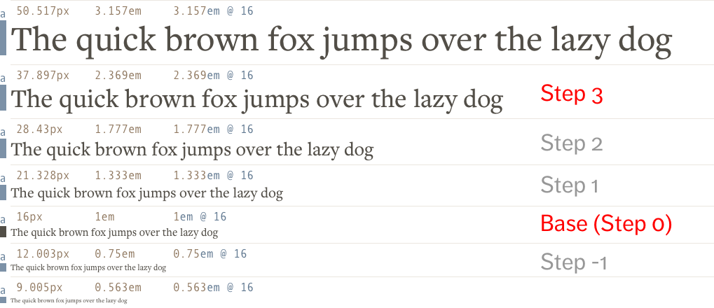
It’s quite common to see developers use the Modular Scale calculator to calculate the font-size for their text elements when Modular Scale is used. They inevitably resort to copy-and-pasting values from the calculator to their CSS files, like this:
h1 { font-size: 3.157em; }
h2 { font-size: 2.369em; }
If the font-size has to change at a specific breakpoint, these developers usually copy-paste another value from the calculator into their CSS, like this:
h1 { font-size: 3.157em; }
h2 { font-size: 2.369em; }

@media all and (min-width: 25em) {
  h1 { font-size: 4.209em; }
  h2 { font-size: 3.157em; }
}
There are two downsides to copy-pasting these numbers.
First, they look like magic numbers. There’s no easy way for a developer joining the project to know how the hell these numbers got into the stylesheet in the first place.
Second, it’s a lot of work to copy-paste numbers. What if you had to change the scale? Or the base? I can already sense the dread…
The Modular Scale Sass Library is a library that Scott Kellum, Adam Stacoviak and Mason Wendell developed to help ease the two pain points I mentioned.
To use the Modular Scale library, you first have to download it via bower, npm or hitting the download button on Github.
bower:bower install modular-scale --savenpm:npm install modular-scale --save
Then, you @import modular scale into your Sass file.
@import 'path-to-modular-scale/stylesheets/modular-scale';
Modular Scale gives you a ms() function to calculate the font-size you wanted instead of copy-pasting from the web calculator
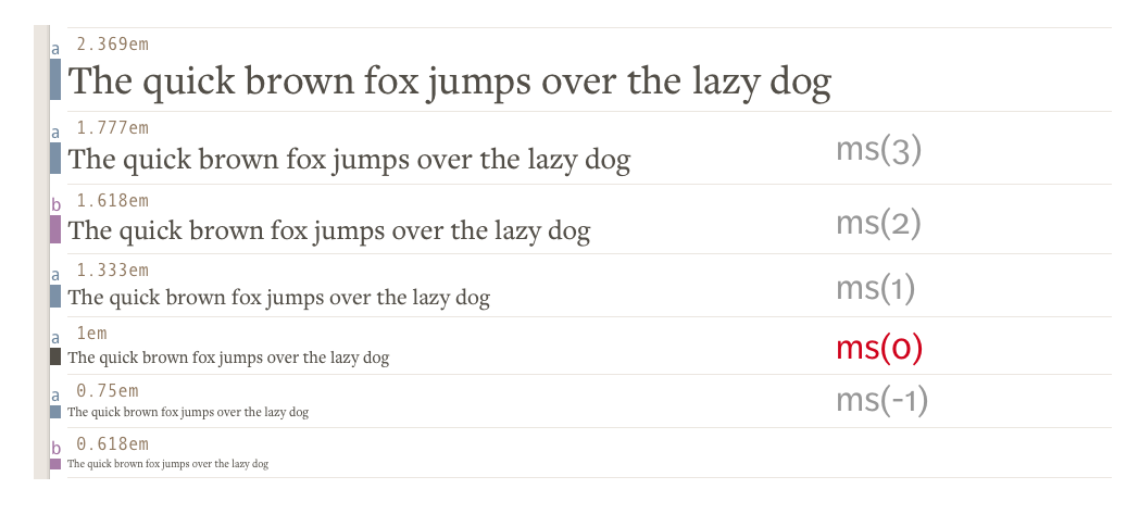
It takes in a number, the nth-step you want your font-size to be. By step, I mean the font-size is the number nth on your scale, like this:

Here’s how you use the function:
h1 {
  font-size: ms(3);
}
h1 {
  font-size: 2.369em;
}
For those who can’t view the image above, the 3rd step (ms(3)) means the plugin multiplies your base font-size with your ratio 3 times (1em * ratio * ratio * ratio)
$ms-1: ms(-1); // => 1em ÷ ratio
$ms: ms(0): // => 1em
$ms1: ms(1); // => 1em * ratio
$ms2: ms(2); // => 1em * ratio * ratio
$ms3: ms(3); // => 1em * ratio * ratio * ratio
The default ratio used in Modular Scale is 1.618. If you want to change this ratio, you can change the $ms-ratio setting:
$ms-ratio: 1.25;

$ms1: ms(1); // => 1em * 1.25 = 1.25em
$ms2: ms(2); // => 1em * 1.25 * 1.25 = 1.563em
$ms3: ms(3); // => 1em * 1.25 * 1.25 * 1.25 = 1.953em
If you wanted to use two ratios (see why here), you can set the ratio to a list of two numbers and Modular Scale will automatically help you calculate the size for the nth-step. This feature is superb because it’s really difficult to calculate the steps and line them up in ascending order.
$ms-ratio: 1.333 1.618;

$ms: ms(0); // => 1em
$ms1: ms(1); // => 1.333em
$ms2: ms(2); // => 1.618em
$ms3: ms(3); // => 1.777em

Likewise, you can also change the base font-size of the Modular Scale by setting the $ms-base property. The default font-size used is 1em.
$ms-base: 2em;

$ms: ms(0); // => 2em;
$ms1: ms(1); // => 2em * 1.618 = 3.23607em;
$ms2: ms(2); // => 2em * 1.618 * 1.618 = 5.23607em;
$ms3: ms(3); // => 2em * 1.618 * 1.618 * 1.618 = 8.47214em;
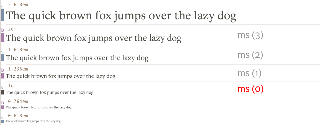
Of course, you can also use two bases for your modular scale if you want. All you need to do is to set $ms-base to a list of two numbers:
$ms-base: 1em 2em;

$ms: ms(0); // => 1em
$ms1: ms(1); // => 1.23607em
$ms2: ms(2); // => 1.61803em
$ms3: ms(3); // => 2em

Finally, Modular Scale gives you a ms-respond mixin that allows you to the change ratio of your Scale at different breakpoints. I’ve went in-depth into this on a separate article.
Phew, so there’s everything you ever need to know about Modular Scale.
Note: At the time of writing, the stable version of Modular Scale v2.x.x. I know Scott is making a v3 for Modular Scale that’s totally different from what I’ve explained above. I’ll update this article (or maybe create a new one) when I have the time to play with v3.
Next up, let’s go into the second part of the article where I’ll explain how to use Modular Scale with Typi.
Using Modular Scale with Typi
Typi is a library that makes responsive typography easy. If you’re totally new to Typi, I suggest checking out the basic tutorial before continuing.
If you familiar with Typi, you’ll know that you need to create font-maps to hold your typography configurations, like this:
$h1: (
  null: 2.369em,
  small: 3.157em
);
You can use Modular Scale directly with Typi by writing the ms() function as the first value of each key. The above would be equivalent to:
$ms-ratio: 1.333;
$h1-map: (
  null: ms(3),
  small: ms(4)
);
As you can can imagine, you can vary $ms-base and $ms-ratio, and Typi will output the font-size calculated by the Modular Scale plugin.
$ms-base: 1.5em;
$ms-ratio: 1.25;

$h1-map: (
  null: ms(3), // 2.92969em
  small: ms(4) // 3.66211em
);
Things however, change slightly when you want to change the Modular Scale ratio at different breakpoints. Typi (v2.2.2 onwards) allow you to do this with the help of a new map called $typi-ms. It looks like this:
$typi-ms: (
  null: 1.2,
  small: 1.333,
  large: 1.618
);
As you can imagine, $typi-ms uses the $breakpoints map to determine the media query produced for the small and large keys. This map suggests that the ratio used for the Modular scale should be:
- default (without breakpoints): 1.2
- small breakpoint: 1.333
- large breakpoint: 1.618
Once the $typi-ms map is created, you can modify your font-maps such that the font-size value is an integer that represents the nth-step of the scale instead of ms($nth-step).
$h1-map: (
  null: 2, // 2nd step
  small: 3 // 3rd step
  large: 4 // 4th step
);
When you use the typi mixin as usual, Typi will automatically calculate the correct font-size based on the $typi-ms map. The CSS produced for the above Sass maps is:
h1 {
  font-size: 1.44rem; /* 1em * 1.2 * 1.2 */
}

@media all and (min-width: 600px) {
  h1 {
    font-size: 2.36859rem; /* 1em * 1.333 * 1.333 * 1.333 */
  }
}

@media all and (min-width: 800px) {
  h1 {
    font-size: 6.85353rem; /* 1em * 1.618 * 1.618 * 1.618 * 1.618 */
  }
}
Notice how the font-size produced allows you to change the ratio and the steps at the same time? This wasn’t possible if you used the Modular Scale plugin directly.
Typi is also smart enough to “guess” the ratio and the step to use if you didn’t provide it with the information at every breakpoint. For instance, if you have the following maps, Typi will automatically create the large breakpoint with a ratio of 1.618, and a step of 3.
// Scss
$typi-ms: (
  null: 1.2,
  small: 1.333,
  large: 1.618,
);

$h1: (
  null: 2,
  small: 3
);
/* CSS */
h1 {
  font-size: 1.44rem; /* 1em * 1.2 * 1.2 */
}

@media all and (min-width: 600px) {
  h1 {
    font-size: 2.36859rem; /* 1em * 1.333 * 1.333 * 1.333 */
  }
}

@media all and (min-width: 800px) {
  h1 {
    font-size: 4.2358rem; /* 1em * 1.618 * 1.618 * 1.618 */
  }
}
If you have the following maps, Typi knows that it should use 1.618 as the ratio when creating 3rd step at the med breakpoint. (It determines the order based on the order of breakpoints in the $breakpoints map).
$typi-ms: (
  null: 1.2,
  small: 1.618,
);

$h1: (
  null: 2,
  large: 3,
);
/* CSS */
h1 {
  font-size: 1.44rem; /* 1em * 1.2 * 1.2 */
}

@media all and (min-width: 600px) {
  h1 {
    font-size: 2.61792rem; /* 1em * 1.618 * 1.618 */
  }
}

@media all and (min-width: 800px) {
  h1 {
    font-size: 4.2358rem; /* 1em * 1.618 * 1.618 * 1.618 */
  }
}
Additionally, if you want to, you can use multiple bases or multiple ratios together with the $typi-ms map. Here’s an example:
$typi-ms: (
  null: 1.2, // Single ratio of 1.2
  small: 1.2 1.5, // Two ratios, 1.2 and 1.5
  med: (1em, 1.5), // Single base of 1em and single ratio of 1.5
  large: (1em 2em, 1.618), // Double bases and a single ratio
  dont-do-this: (1em 2em, 1.333 1.618) // Double bases and double ratios
);
And that’s everything about using Modular Scale with Typi :)
Wrapping Up
In this article, we reviewed the basics of Modular Scale plugin, and learned how to use:
- a double-base modular scale
- a double-ratio modular scale
Then, we talked about how to do the same with Typi.
Finally, we looked at how to change the Modular Scale ratio at different breakpoints using Typi as well.
Next Steps
Modular Scale can be difficult to understand if you’re not use to Math. However, it gets really easy once you get used to the idea of “steps”. Try using Modular Scale (by itself) or Modular Scale (with Typi) and let me know if you have any questions in the comments below.
This content originally appeared on Zell Liew and was authored by Zell Liew
Zell Liew | Sciencx (2016-05-25T00:00:00+00:00) Everything about the Modular Scale Sass Libary and Modular Scale with Typi. Retrieved from https://www.scien.cx/2016/05/25/everything-about-the-modular-scale-sass-libary-and-modular-scale-with-typi/
Please log in to upload a file.
There are no updates yet.
Click the Upload button above to add an update.
