This content originally appeared on Viljami Salminen and was authored by Viljami Salminen
For the past year(s) I’ve been chasing for answers. Looking for new tools, thinking about design processes and figuring out what design really means to me. At times I’ve felt so disconnected with our processes that I’ve wondered if my career choice was right.
For a field rooted in the fine arts this period of change has been increasingly hard and is about to get even harder. We’ve moved away from designing static pages to creating digital systems of components, but we’ve done that mostly by using the same static design tools like Illustrator, Sketch, or even Figma. Tools that haven’t changed on a fundamental level in the past three decades.
Now, I think there’s something wrong with that picture. Our design products are becoming more and more dynamic, but our tools still treat them as blank canvases to paint on. Why?
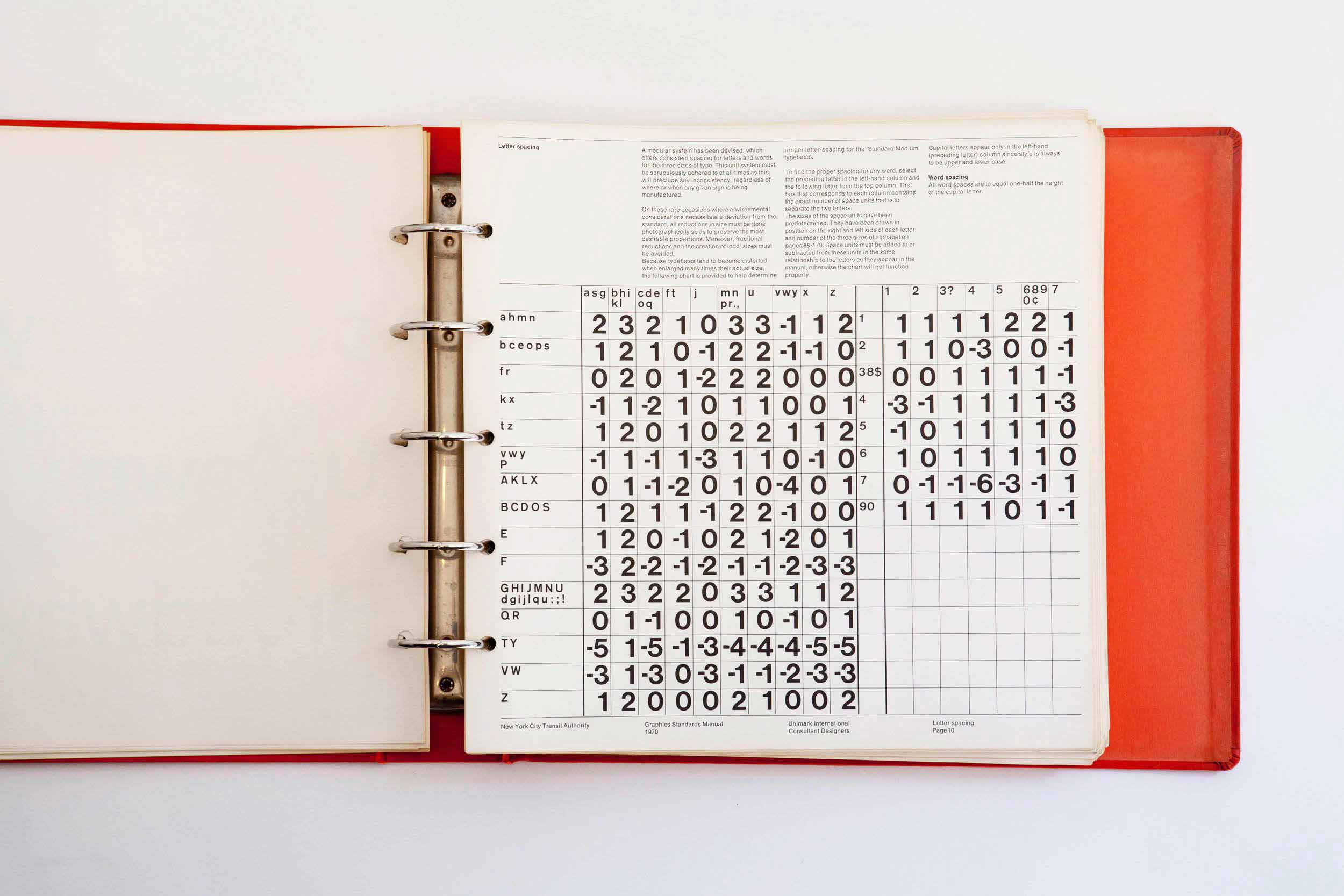 New York City Transit Manual. Image: Standards Manual
A Trip Down Memory Lane #
To start unwrapping this, I want to first take you back in time, approximately 30 years. You ready…?
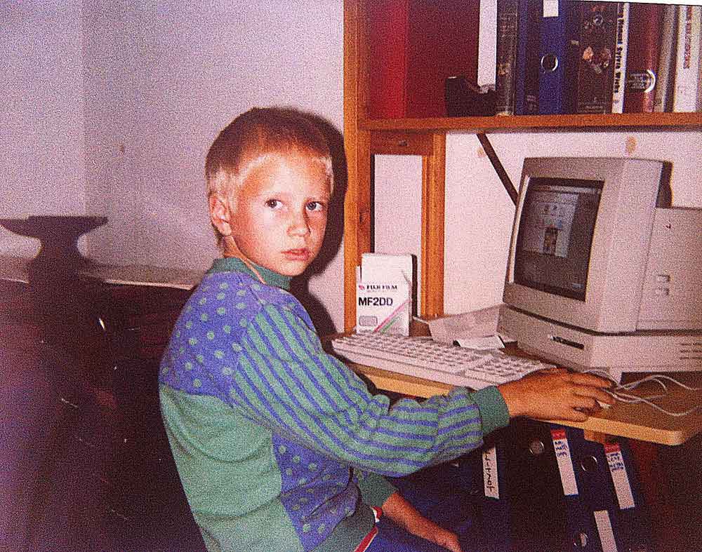 Me, circa 1990 using Macintosh LC
Imagine you’ve just landed in the 80s. 1986 to be exact. You’re sitting in front of a Macintosh 128K with a black and white display. You’re about to start creating a marketing booklet for one of your clients, so you go ahead and launch an application called Aldus PageMaker. You know it’s going to be printed in A4, so you choose that as the page size.
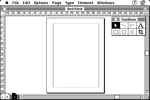 Aldus Pagemaker running on Mac OS
Two years later, in 1988, you’ve upgraded your design tool of choice to the latest industry standard, QuarkXPress 1.0. It’s fundamentally more or less the same as the previous application you got used to, but you like Quark’s modern sleek toolkit.
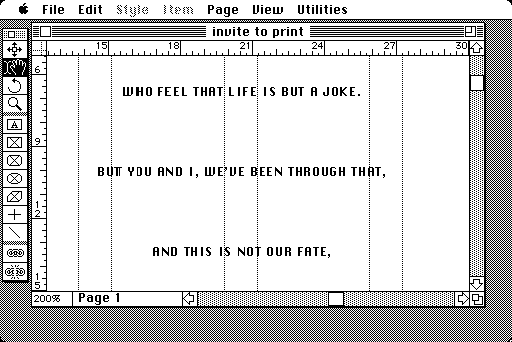 QuarkXPress running on Mac OS
Fast forward 10 years, it’s 1998. You’re using Pagemaker 6.0. Your medium is print. It all makes so much sense.
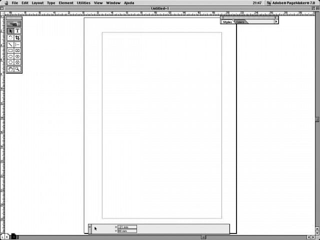 Pagemaker 6.0
As your career path moves more and more towards web design, things are starting to get hairy. You start experimenting with various tools like CorelDraw…
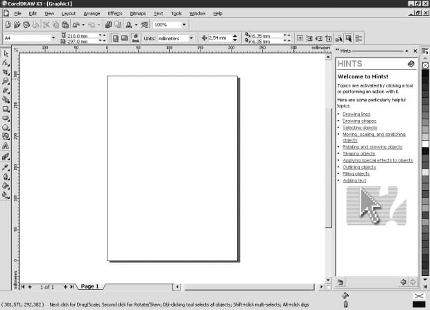
…Freehand…
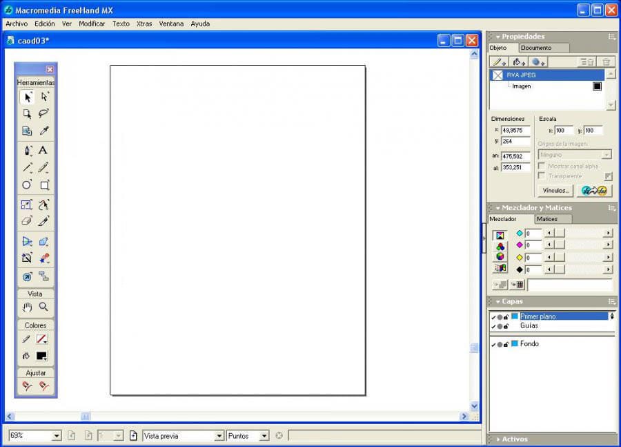
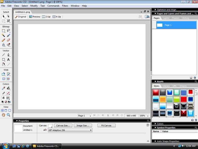
…Illustrator and Photoshop…
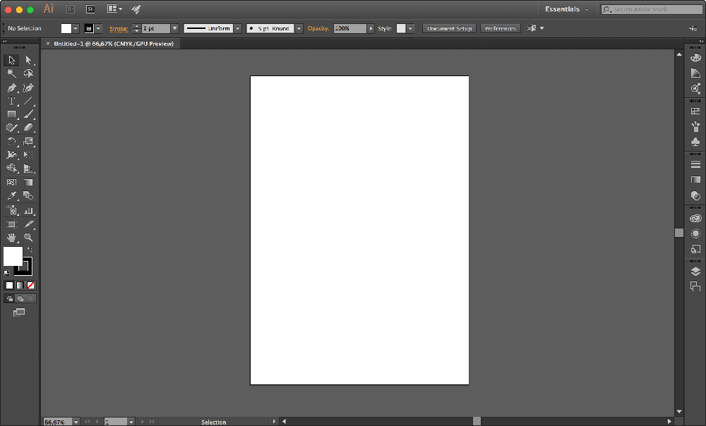
…Sketch…
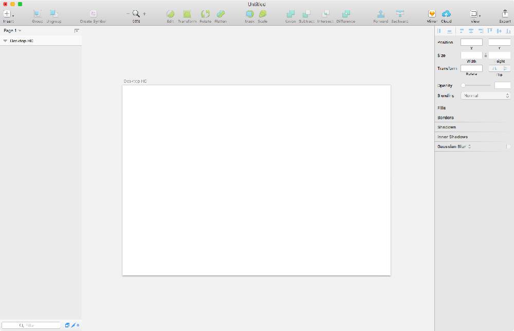
…and even Figma.
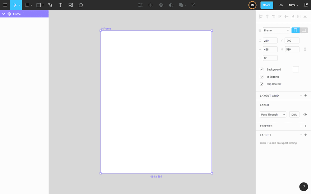
But there’s this thought in the back of your head which makes you feel like you’ve been here before. All these years, all this time, and no progress at all, huh?
Your design tools still fundamentally work the same way as they did three decades ago. Either a fixed canvas and the concept of a page is forced by the tool, or the tool forces you into such mental mode.
99 Problems, But A Tool Ain’t One? #
Let’s continue our exercise a little longer and imagine launching one of the more recent tools I shared. What’s the first thing you do? ------ Well, if you’re at all like me, you either choose your artboard size or draw an empty box to place your content in.

As you continue, you might draw some more boxes.

Eventually, you probably replace or fill these boxes with something more “meaningful.”

Ok, that’s enough, you probably get my point by now.
Houston, We've Got a Problem #
Firstly, the web doesn’t have a fixed canvas, but for some odd reason we keep on using tools and processes that force us into thinking about these fixed containers around our designs.
The control which designers know in the print medium is simply a limitation of the printed page. We should embrace the fact that the web doesn’t have these same constraints.
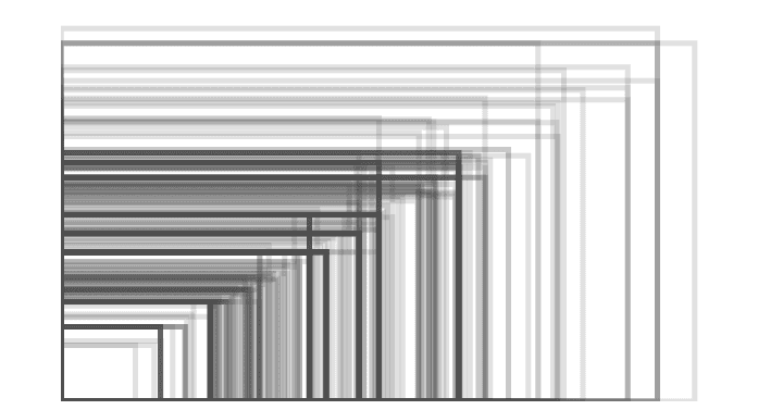 Android screen size fragmentation in 2012. Image: OpenSignal
Secondly, our tools falsely enforce the page metaphor even though we aren’t actually designing pages. Our canvas is infinite, but the tools we use force us into thinking about pages instead of systems of components or materials to build with.

Thirdly, our tools encourage form over content. It should be the other way around. Our decisions should start from the content out, not canvas in. Design in the absence of content is not design, it’s decoration like Jeffrey Zeldman once wrote.

Finally, our tools completely discourage systematic thinking. They make it hard to pay attention on how different parts of a system influence one another within a whole.
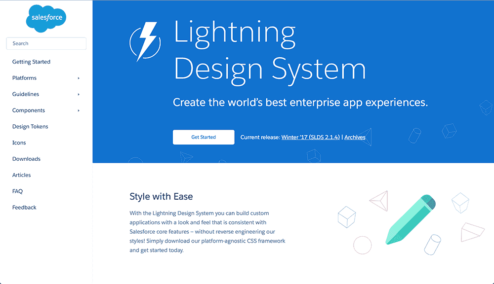 SalesForce Lightning Design System
Past Reveals The Future #
For a field rooted in the fine arts, this makes sense. Graphic design provided us a history spanning for centuries, so it’s natural that we borrowed our vocabulary and concepts like canvas and page from it. But when a new medium borrows from an existing one, some of it makes sense, but a lot generally doesn’t.
When John Allsopp wrote The Dao of Web Design in 2000, I’m not sure he knew how relevant the article would be almost two decades after it was written. Even with the introduction of responsive design and new component based workflows, I feel like we’re still repeating the same mistakes.
In 1928, a German writer called Walter Benjamin predicted that writers would soon start to compose their work with a typewriter, instead of a pen. He wrote something along the lines:
By writing directly into a mechanical form rather than a manuscript, the writer would be working closer to the nature of the multiplied result, and through an increased awareness and gradual mastery of the form’s new limitations and possibilities the writing itself would evolve.”
— Walter Benjamin
I find Walter’s century-old thinking fascinating. I feel like it’s close to what we should be doing on the web today as well. By working closer to the nature of the result our work itself evolves. We become more aware of the unknowns and how different parts of a system influence one another.
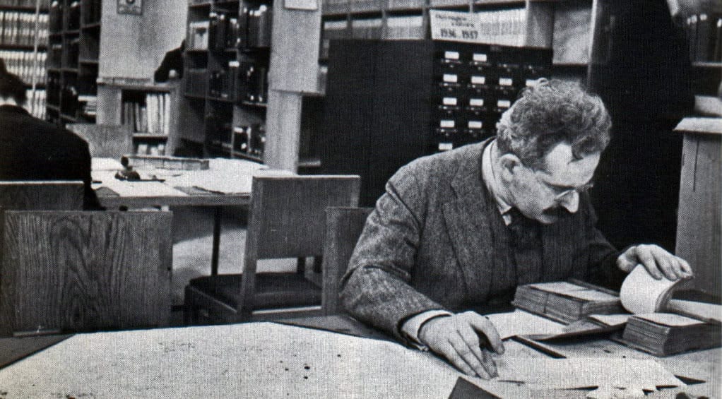 Walter Benjamin. Image: The American Reader
Walter’s thoughts on increased awareness take me back to the original questions I presented at the beginning of this article:
What design really means to me?
What kind of tools and processes will we use in the future?”
Turns out the answer to both of these questions has been in front of me all this time, but I’ve tried too hard to convince myself that I should be using design tools to do design. Even when they actually seem to be limiting my capabilities as a designer.
Contemporary Design Process #
Changing our ways of thinking and doing isn’t easy. Sometimes it’s necessary though, and the first step on this journey is to let go. Let go of our imaginary feel of control. Forget the boundaries presented by our tools and ways of thinking. Break out of the silos we’ve created.
As our design products are becoming more dynamic, it makes less and less sense to separate the design and the development disciplines. Instead of working in silos, I foresee a future where the terms designer and developer are interchangeable. A future where we are comfortable sketching our ideas in code or working closely with developers to achieve that.
Design is not just what it looks like and feels like. Design is how it works and sketching in code enables us to focus on that. Moving quicker to code helps us to put content over form, embrace the fluid nature of the web, and focus on systems of components instead of pages. It also helps us to find user experience issues that previously only became visible once the implementation started.
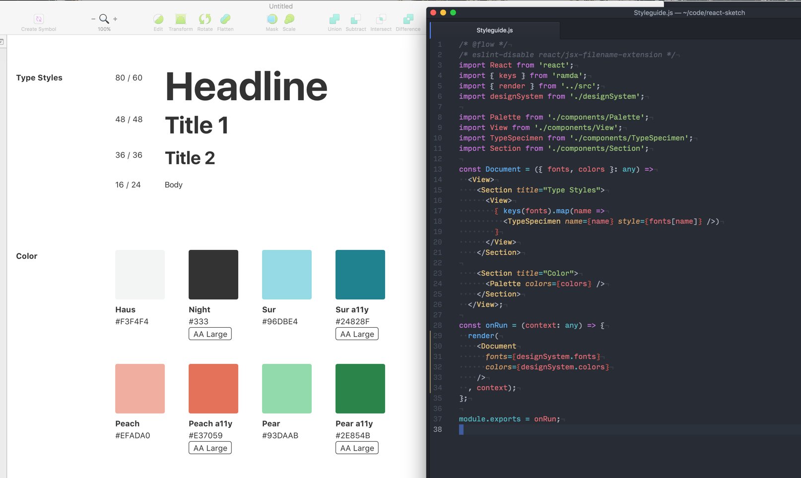 AirBnB’s React renderer for Sketch App that treats Sketch as a pure render function and keeps their code based design system the source of truth. Image: Jon Gold
This transition doesn’t have to be all or nothing, though. We can start taking baby steps towards better workflows today. Instead of for example trying to mockup all the different variations as static images in Sketch, we should probably prototype more complex features in the browser. That prototype can eventually be turned into a simple code based design system that outputs infinite variations for us.
When moving further, we should also introduce new processes and start utilizing tools such as style guides, pattern libraries, and modular code based designs systems that encourage conversation and collaboration not only by developers, but by designers and shareholders as well. This will eventually help each discipline to better understand the full breadth of our work from many perspectives.
In 10 years, I imagine us looking back at the period we live in right now with the same sense of disbelief that some of us remember from the past. History has a tendency to repeat itself, and we need to stop repeating the same mistakes over and over. ❦
Let’s get rid of #
Fixed canvas thinkingThe page metaphorForm over contentTools that discourage systematic thinkingDesigners and developers working separatelyDesigners working only on static mockupsShowing clients static comps and asking for sign-off
References And Links #
[1] First and foremost, I want to thank Frank Chimero for his talk called The Web’s Grain. It’s an amazing resource and gave me the idea for the box and canvas illustrations.
[2] Secondly, I want to thank Rune Madsen for his article titled On Meta-Design and Algorithmic Design Systems. It has been a tremendous source of inspiration for me over the past couple of years.
[3] Finally, thanks to Jon Gold for his exploration on Declarative Design Tools. It gave me the enthusiasm to write this article.
More resources and further reading in random order:
- A Component Based Style Guide for This Website
- On Meta-Design and Algorithmic Design Systems by Rune Madsen
- The Web’s Grain by Frank Chimero
- Thought as a Technology by Michael Nielsen
- A Dao of Web Design by John Allsopp
- Create Design Systems, Not Pages by Brad Frost
- Design Machines by Travis Gertz
- Programming Design Systems by Rune Madsen
- Walls Come Tumbling Down by Andy Clarke
- Design is How it Works by iA
- Taking The Robots To Design School by Jon Gold
- Declarative Design Tools by Jon Gold
- A Visual Lexicon by Robin Rendle
This content originally appeared on Viljami Salminen and was authored by Viljami Salminen
Viljami Salminen | Sciencx (2017-02-12T00:00:00+00:00) On Design Tools and Processes. Retrieved from https://www.scien.cx/2017/02/12/on-design-tools-and-processes/
Please log in to upload a file.
There are no updates yet.
Click the Upload button above to add an update.
