This content originally appeared on Adam Silver and was authored by Adam Silver
Sometimes links are made to look like buttons. Sometimes buttons are made to look like links.
This can be problematic but maybe there’s something we can do about it.
But before we get to it, let’s discuss the 4 different types of buttons and links.
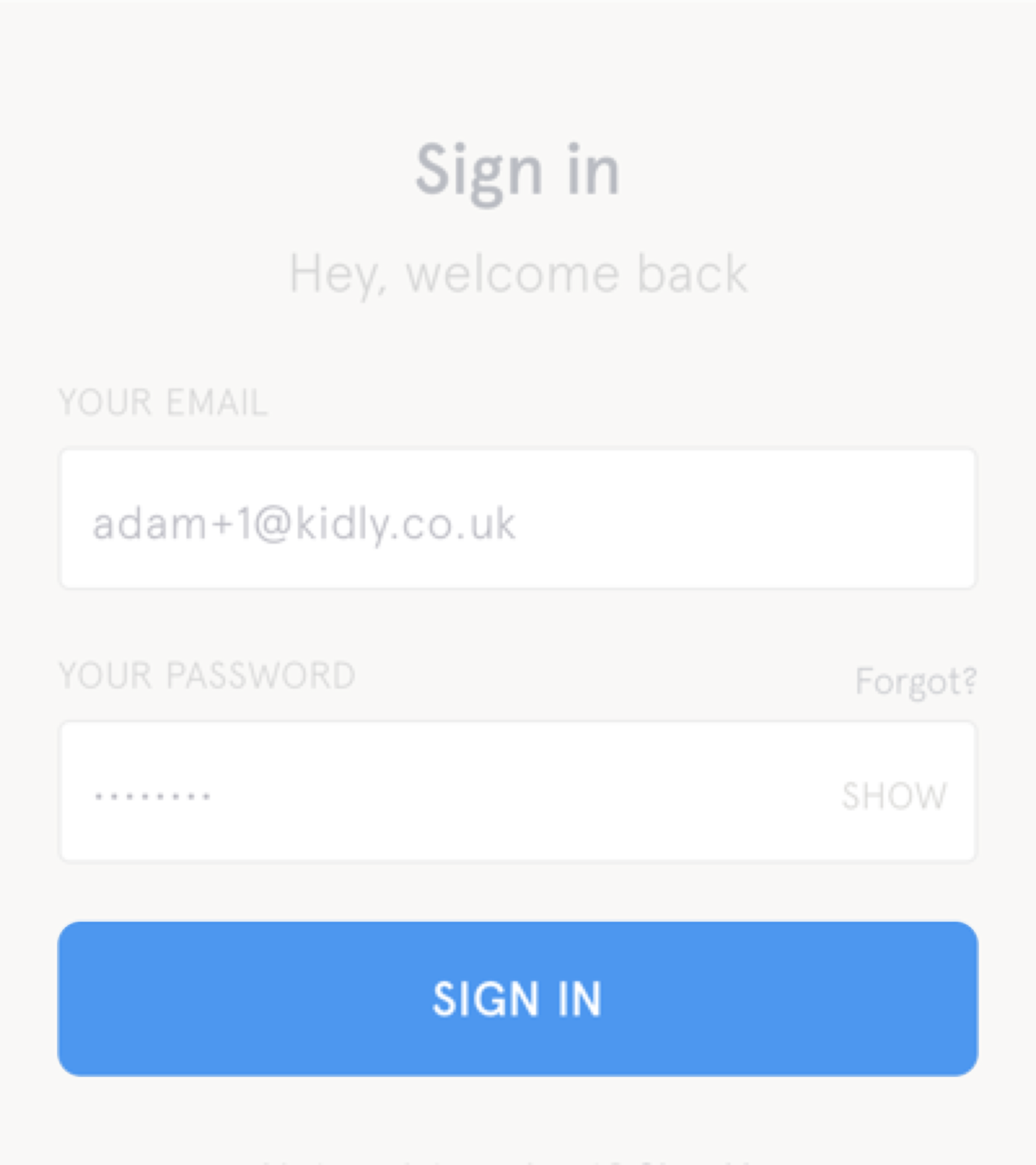
# 1. Submit buttons
Submit buttons are used to submit forms like signing in, creating an account or adding a product to basket.
# 2. Links
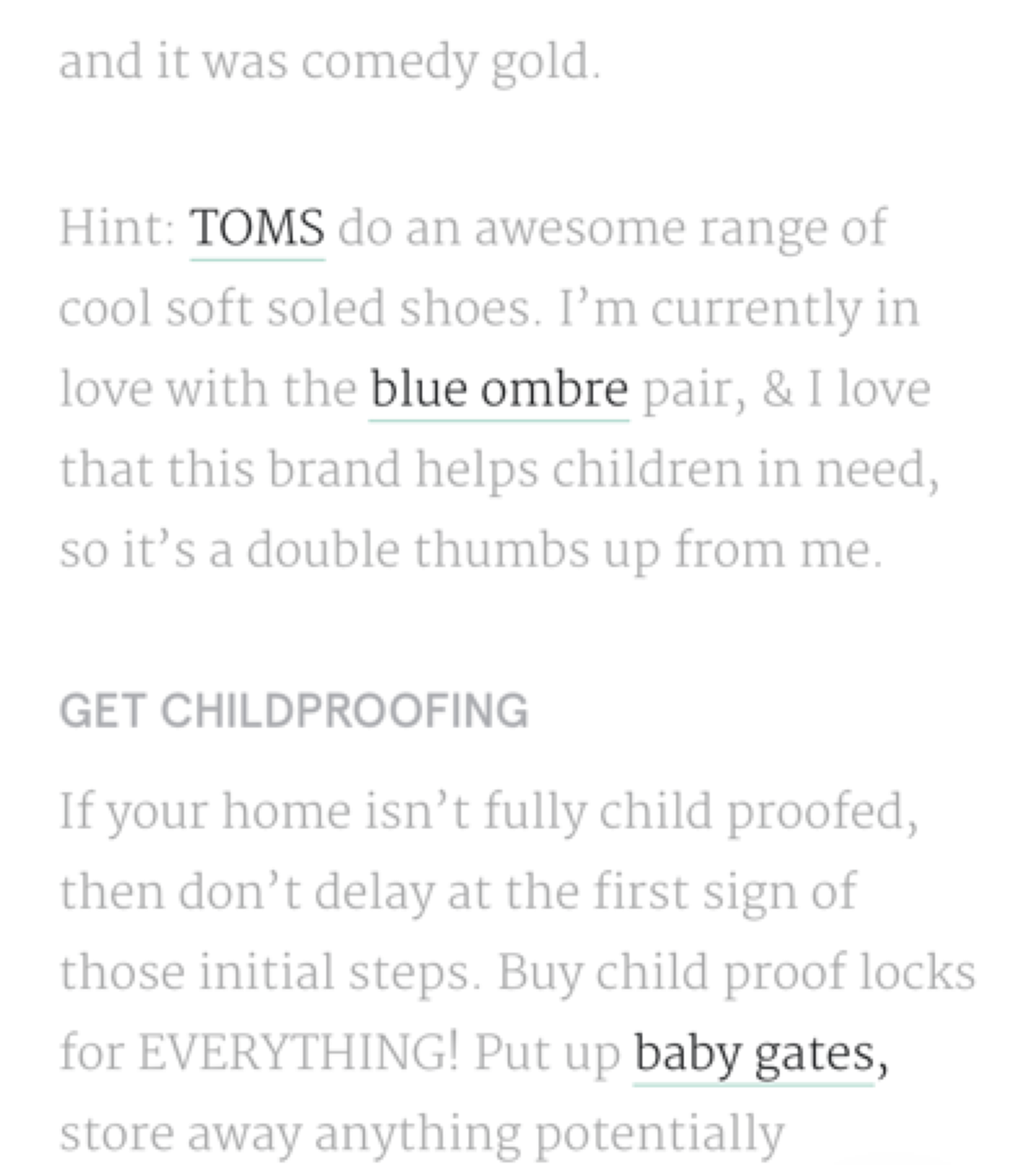
Links are used for navigating to a (location within a) page.
They’re usually underlined so they can be distinguishd from regular text.
Or sometimes they are part of a menu and distinguished by their location like within a header.
# 3. Buttons
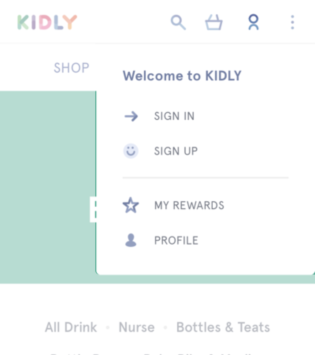
Buttons (<button type="button">) are used for Javascript behaviour like revealing a menu or slide of a carousel.
# 4. Calls to action
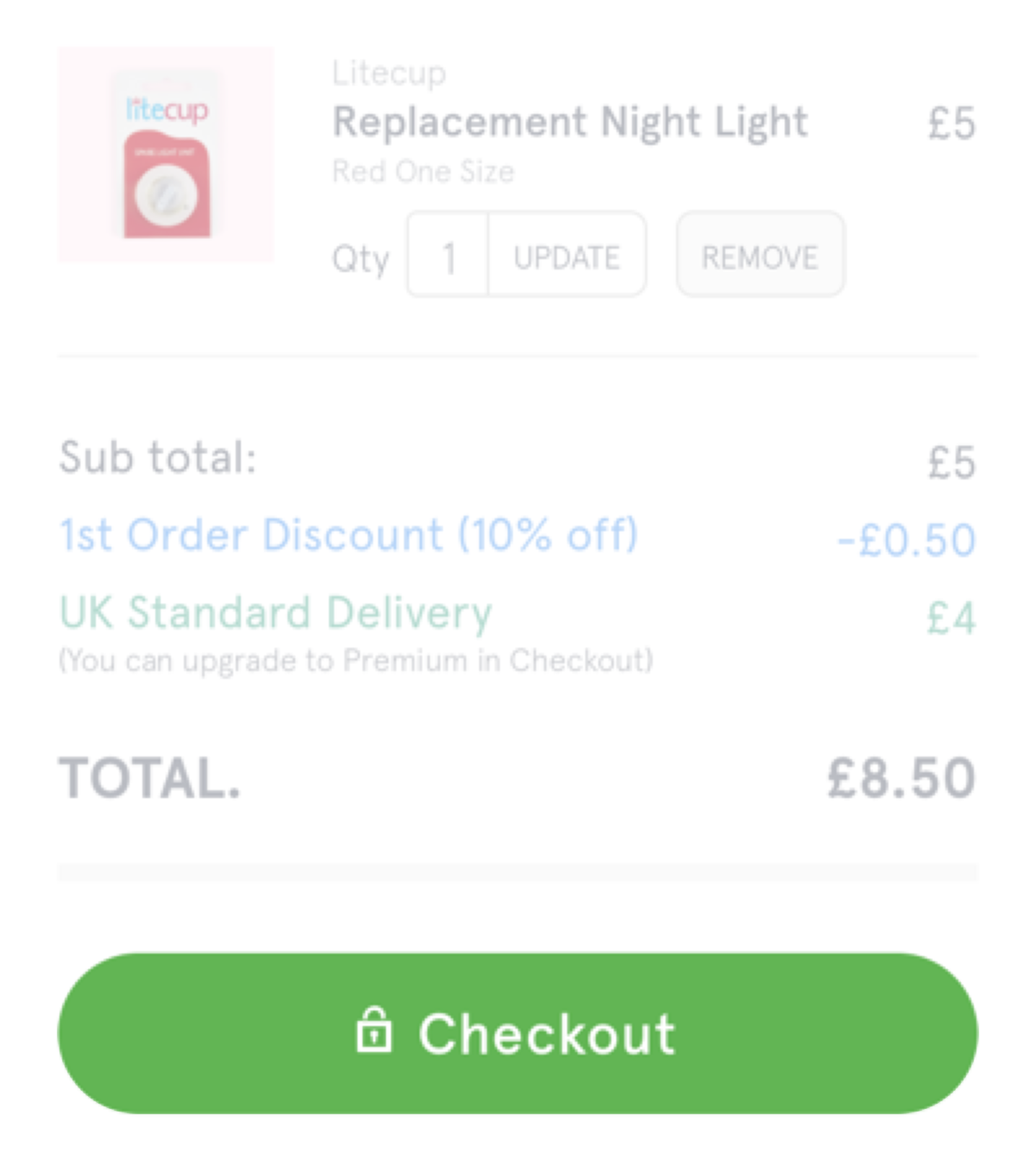
Calls to action are actually links that look like buttons in order to make them prominent.
# What’s the problem?
In Resilient Web Design Jeremy Keith talks about ‘material honesty’.
He says that “one material should not be used as a substitute for another, otherwise the end result is deceptive”.
Making a link look like a button is materially dishonest. It tells users that links and buttons are the same when they’re not.
In Buttons In Design Systems Nathan Curtis says links should be distinguished from buttons because “button behaviours bring a whole host of distinct considerations from your simple anchor tag”.
For example, a link can be opened in a new tab, or copied or bookmarked for later. Buttons don’t share this behaviour.
Calls to action—which again, are just links—are deceptive. Their styling stops users from knowing they’re links and therefore obscures their function.
We could make calls to action look like regular links. But this makes them visually weak and hard to spot. That’s the problem.
And sometimes links and buttons appear next to each other as part of the same menu.
Kidly’s account menu button shown earlier is next to a basket link. You wouldn’t know it though because both are styled the same way with iconography.
Here’s another similar example: all 3 items in the menu look like links when ‘Choose day’ is a button that opens a calendar.
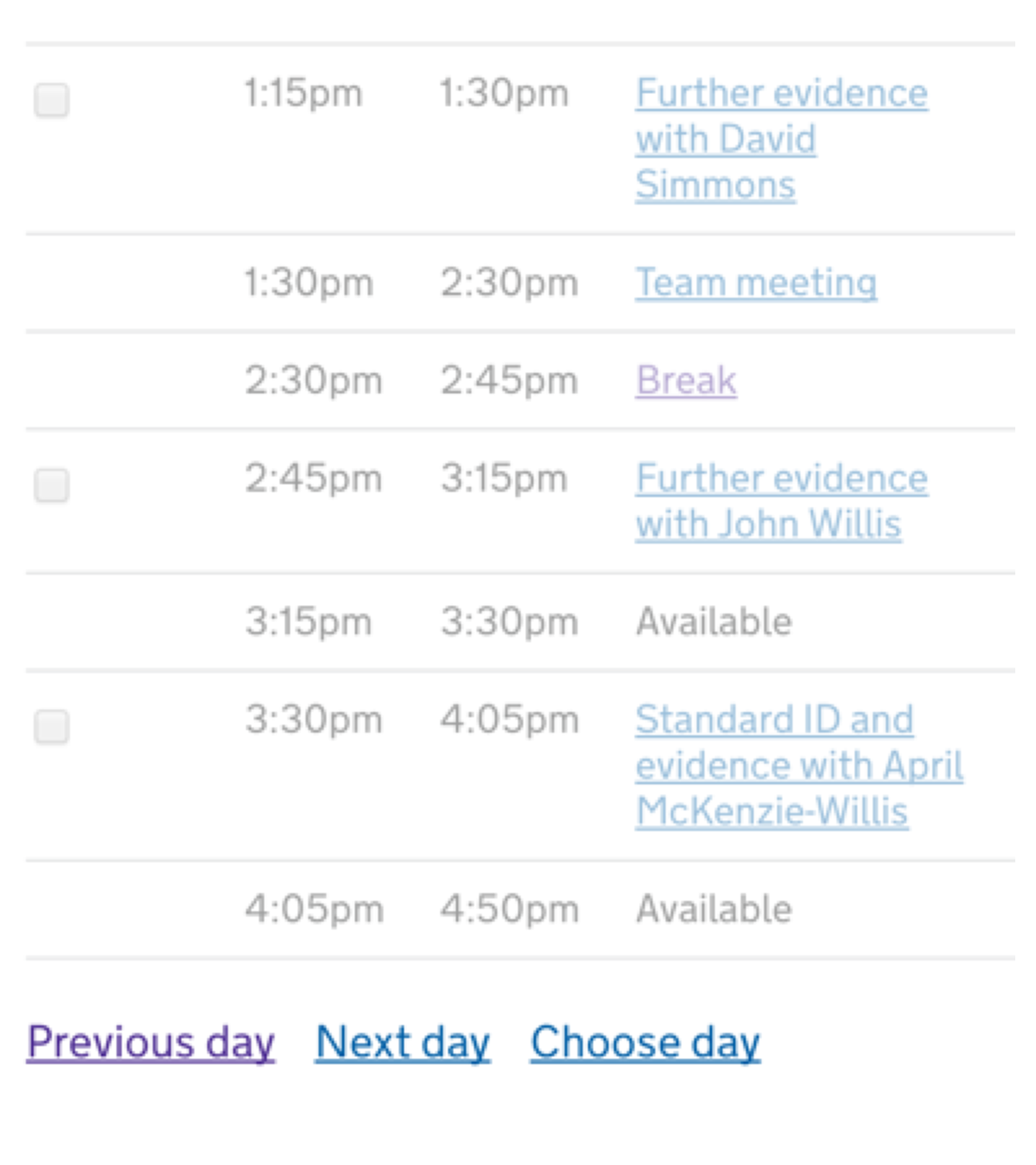
But it looks like it goes to another page just like ‘Previous day’ and ‘Next day’ do. And that means users should expect to be able to open these items in a new tab etc.
Maybe ‘Choose day’ should open in a new page and that would solve the problem? But then again that might not be the best experience.
In any case, the reason all 3 items are styled the same is because consistency is a quality of good design.
But here the differences are indistinguishable because there are no relevant signifiers. this makes the UI a little deceptive.
Consistency is not about making different things the same. It’s about making the same things the same.
# Differentiating calls to action
If you’ve been nodding in agreement so far, then you’ll probably agree that calls to action need to stand out, but they also need to look different to buttons to signify their true behaviour of a link.
Here’s the GOV.UK ‘start button’:
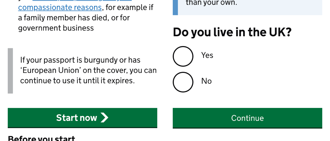
It stands out but looks different to a submit button. The start button is slightly bigger and has an arrow. The arrow may suggest the user is going to be taken to a new flow.
There’s a difference, but it’s pretty subtle and may be lost on users (more on this shortly).
Firstly, submit buttons shouldn’t have a hand cursor. This cursor helps people who use a pointing device provide an additional clue it’s a link.
Secondly, calls to action need to be less button-y and more link-y.
This isn’t easy but I think we can use a combination of whitepsace, size, iconography to make them stand out. And maybe an underline.
It’s may help to remove as much content from the page as possible. The less there is the less it gets in the way of the call to action.
And if you can give users just one call to action that reduces choice and again helps that one thing stand out.
Granted it’s not always possible but we can try.
# Differentiating buttons and links that are part of the same menu
The problem here is that we want the items to be equally weighted without removing the signifiers that help users differentiate them.
In other words buttons naturally overpower links.
Kidly’s menu, for example, looks consistent and equally weighted due to the use of iconography. But any meaning (subtle or otherwise) is lost.
With the schedule page ‘Choose day’ is not more or less important than ‘Previous day’ or ‘Next day’. Perhaps we need to make ‘Choose day’ look less link-y and more button-y without overpowering the links?
Locating them in the same place is a no brainer. Perhaps we can use whitespace and a separator. Maybe we just need a smaller button. But the button shouldn’t have an underline as that’s reserved for links.
# Do users care?
Because we have made links look like buttons – and because we have exacerbated the problem by incorrectly using the hand cursor — some users may have acclimatised and the lines have blurred.
Perhaps, if users knew they could open a call to action in a new tab, they would? I certainly might.
Maybe others wouldn’t. But does that matter? Choice is a principle of inclusive design.
Same goes for labels. Many sites don’t connect labels to radio buttons. Due to this people don’t trust that clicking the label (which is often easier) will select the radio button.
If most sites got it right, users may start to use this and benefit.
Users shape design and design shapes users. If the majority of sites differentiated buttons from links, users might care and find value in the functionality that has been made more obvious.
In isolation we might think of this as a small problem. But when combined with other small problems it can noticeably degrade the user experience.
When we talk about getting the small details right, this is the sort of thing that comes to mind.
# It’s the journey, not the destination.
Others say it’s a grey area because forms and links can both take users to another page.
While true the journey is not the same as the destination.
My TV and the remote control have power buttons. The one on the remote is rubbery, small, red and located in the top right corner. And there’s lots of other buttons in close proximity.
The one on the TV is solid, much bigger and concealed.
It would be odd if the designs were reversed or made ‘consistent’ by ignoring the context in which they are used.
Forms and links may take users to the same place. But just because the destination is the same, the journey (or interaction) is different.
Pretending they are the same and removing any signifiers isn’t useful.
Semantics are there for a reason and it’s a designer’s job to make them obvious.
# Summary
Design is about solving problems.
While this may not be the biggest problem in the world, I do think there’s something we can do about.
Links and buttons are a fundamental part of the web. Getting them right can only be a good thing.
In isolation this may not seem like a big deal, but in combination with other small details it could make a difference.
This content originally appeared on Adam Silver and was authored by Adam Silver
Adam Silver | Sciencx (2017-10-16T09:00:01+00:00) But sometimes buttons look like links. Retrieved from https://www.scien.cx/2017/10/16/but-sometimes-buttons-look-like-links/
Please log in to upload a file.
There are no updates yet.
Click the Upload button above to add an update.
