This content originally appeared on Zach Leatherman and was authored by Zach Leatherman
Prerequisite: Before we continue on, please take a second to make sure you’ve reviewed The Web Font Loading Checklist, a short list of criteria I use to properly evaluate web font loading strategies. In the Reduce Movement during Page Load section, our goal is to reduce the amount of movement the user sees while the page is being loaded.
I’m sure you’ve been browsing around the web, halfway through reading your favorite hot-take article about some React minutiae when a third party advertisement loads, changes the dimensions of its container, throws off your scroll position, and disrupts your reading experience! How frustrating. I am here to let you know, dear reader, that web font loads can have this same frustrating effect.
font-display #
I love font-display. It’s easy to use.
- It’s the go-to for improving your web font loading quickly and easily.
- It hasn’t really been picked up by any third party font hosting services yet, but we can’t really blame
font-displayfor that can we? font-displaypairs great with preload (well, mostly)- It shines brightest if you’re only using one web font on your page.
- Some day I may write an article about how it was absolutely not designed for icon fonts (sorry—that day is not today).
If you’re using multiple web fonts for a single family—things may not operate as smoothly as we would like—especially if you’re trying to reduce movement during page load (see the last item on the checklist).
Consider this font-display: swap demo from Web Font Loading Recipes (Demo):

A pretty standard controlled waterfall experiment, network throttled to Fast 3G in Chrome Devtools. The browser finds four web fonts of almost identical size using font-display: swap and downloads them in parallel.

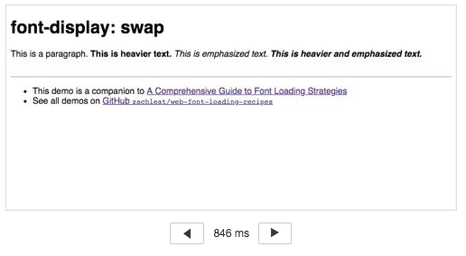
This is a paragraph. This is heavier text. This is emphasized text. This is heavier and emphasized text.
At 846ms into our page load the HTML has rendered and we have some real nice fallback FOUT rendering here. The text is readable, hooray! But if you look at the above waterfall carefully and analyze the related filmstrip, you may notice that each web font has downloaded and repainted independently (3 repaints for 4 font files).

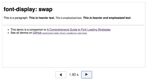
This is a paragraph. This is heavier text. This is emphasized text. This is heavier and emphasized text.
At 1.90s the italic web font has loaded and repainted.

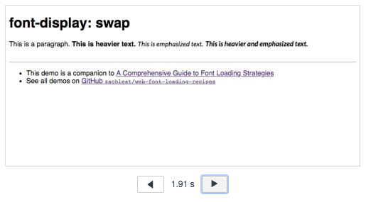
This is a paragraph. This is heavier text. This is emphasized text. This is heavier and emphasized text.
At 1.91s the bold italic variant has loaded and repainted.

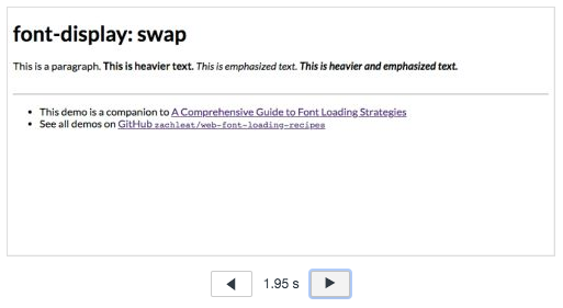
This is a paragraph. This is heavier text. This is emphasized text. This is heavier and emphasized text.
Finally, at 1.95s both the roman and bold variants have loaded and repainted to finish the remainder of the external resources.
What does this mean? Each web font has its own loading lifecycle and may have its own repaint (it the requests don’t finish close enough together for the browser to bundle them) and reflow. For each individual web font, you could have up to four independent moments (this demo had three repaints for four web fonts) in your page load where the text dimensions change to render using a web font. These repaints could occur at wildly different times if the font files are of differing size and/or if the load takes place outside of the controlled network throttled environment of Chrome Devtools.
Make the reflows go away #
- The easiest way to fix this is to use
font-display: optional. This will use the fallback font on first render and only grab web fonts stored in the cache. In theory this means that your web fonts will only be used if they are available in the first 100ms, greatly reducing the impact from reflow or eliminating it altogether. Unfortunately this means no web fonts on empty cache views. - Another way to fix this is to use a Variable Font! Variable fonts, while increasing in popularity, are still somewhat of a rarity. They are also bigger than their non-variable counterparts but due to their single-file nature your repaints will be grouped for free. Even better: use variable fonts with
font-display: swapfor FOUT and a single grouped repaint. One more nuanced drawback to variable fonts is that the extra file size weight is loaded serially, and not in parallel as the waterfall screenshot of non-variable web fonts above depicted. - Another, more complex solution that will offer web fonts on an empty cache is to use the CSS Font Loading API. Use the FOUT with a Class approach to group web font renders for a single family into a single repaint. For extra points, go even further and use a font-synthesis FOFT approach to all-but-eliminate noticeable reflow from your page (even on empty cache views). Try The Compromise!
- One way to minimize the problem is to try to match the metrics (dimensions) of your fallback text as closely as possible to your web font. Check out the Font Style Matcher, created by Monica Dinculescu, to help you with this. Note that this method requires JavaScript and wouldn’t work with just
font-displayalone. - In this same vein, there are Metric compatible fonts, designed to match another font’s dimensions perfectly. It’s unlikely that the web font you’ve chosen has a metric compatible system font available for use—they’re quite rare—but they do exist! Using a Metric compatible font would not require JavaScript and would work with
font-displayalone.
Go forth and web font, y’all!
Related #
- A Comprehensive Guide to Font Loading Strategies
- The Web Font Loading Glossary
- Web Font Loading Recipes (Code examples)
- A big giant list of all of the Web Fonts blog posts on zachleat.com
This content originally appeared on Zach Leatherman and was authored by Zach Leatherman
Zach Leatherman | Sciencx (2018-08-31T05:00:00+00:00) The Problem with font-display and Reflow. Retrieved from https://www.scien.cx/2018/08/31/the-problem-with-font-display-and-reflow/
Please log in to upload a file.
There are no updates yet.
Click the Upload button above to add an update.
