This content originally appeared on bryanlrobinson.com and was authored by bryanlrobinson.com

Have you ever wanted to go back in time and see what it was like to browse the web using Sir Tim Berners-Lee's first web browser? I have. Apparently so did the team at CERN.
For the 30th anniversary of the world's first web browser, The European Organization for Nuclear Research (CERN) brought togoether a team to recreate WorldWideWeb in a modern browser.
You can read a decent bit about the project over at its site worldwideweb.cern.ch.
Check your sites in a purely text-based browser
I'm a fan of semantic, server-rendered HTML, so I had to see how my site would perform. I crossed my fingers, launched the browser and pulled up my site. I'm proud to say that this site and my company site (codecontemporary.com) perform admirably. Both seem to be well structured and surface content in a way that makes sense.

There are a few exceptions. My code blocks handle formatting with JavaScript -- which wasn't invented yet. All the code examples are gibberish. My "Side Projects" in the footer are just links with images inside. The <IMG> tag (caps intended) wasn't proposed until 1993 (3 years later). Check this site in the browser to see for yourself.
If you want to know how well you're writing semantic HTML, see what it looks like in a web browser that understands almost no modern code.

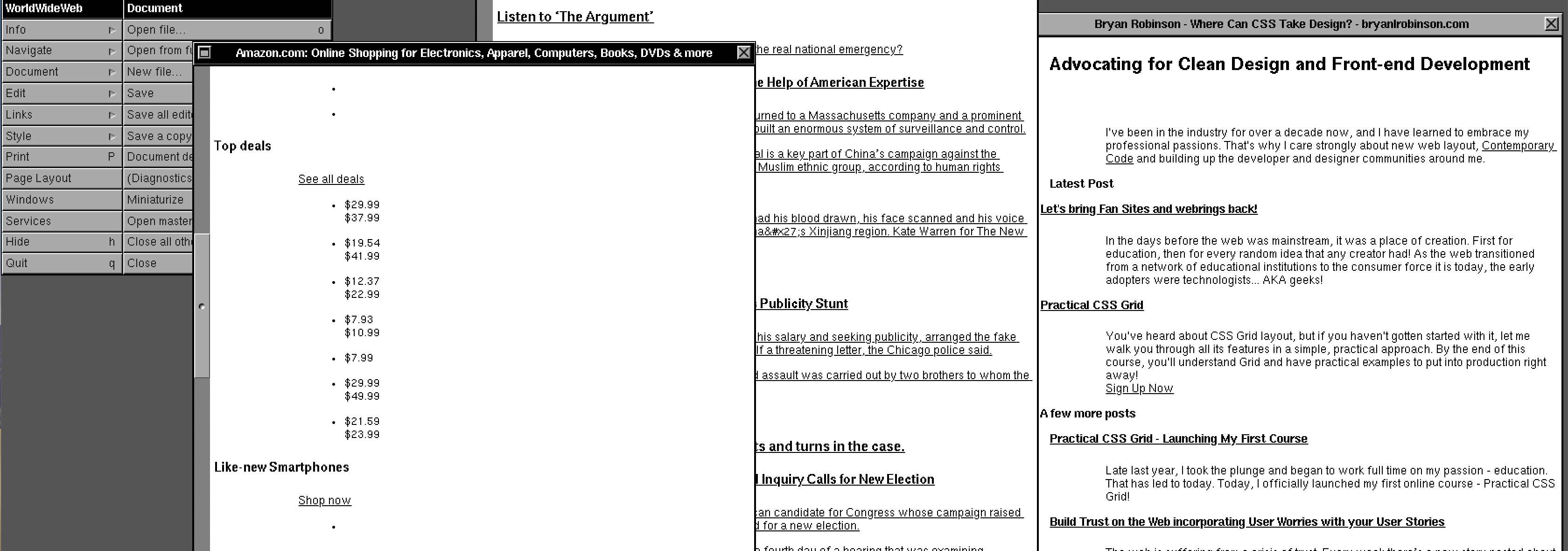
On a lark, I pulled up Amazon. Why yes, Amazon, I'd love to buy a Top Deal for $29.99 instead of $37.99... whatever it is, that's a deal!
It's not too surprising that a company the size of Amazon uses a lot of JavaScript, but I didn't expect some content to appear and other pieces not appear.

A news site like The New York Times fares a bit better. If you can get passed the absolute glut of navigation, you're presented with the news of the day. From a hierarchy perspective, all content is smashed together, but that's not any different when you give them CSS and JS. You can't blame an old browser for that! Oooh sick Journalism UX burn!
At a glance, a "topic of the day" looks like a random floating name. Their use of related stories also makes it really hard to tell to which stories the comment counts are attached.
The real site suffers from hierarchy issues, but it's also interesting to see how design issues easily bleed over to HTML. In fairness, most of their content shows up, unlike Amazon.
What's the point? Why should we look at our sites in WorldWideWeb and feel shame or pride?
If your site's content flows properly in a browser as old as this, you can feel some sense of security that maybe screen readers and web crawlers can understand your markup.
This is no replacement for proper accessibility testing, but it's an interesting side effect of a "Digital Archeologists."
So what can we learn from this? If you write the basics properly, your content can stand the test of time. Don't forget to at least think markup first.
If your markup is clean, semantic, and actually there then your content has staying power and reusability in any browser.
What are your thoughts? Should we care about how our markup is served?
This content originally appeared on bryanlrobinson.com and was authored by bryanlrobinson.com
bryanlrobinson.com | Sciencx (2019-02-21T00:00:00+00:00) What Can We Learn from CERN’s WorldWideWeb rebuild?. Retrieved from https://www.scien.cx/2019/02/21/what-can-we-learn-from-cerns-worldwideweb-rebuild/
Please log in to upload a file.
There are no updates yet.
Click the Upload button above to add an update.
