This content originally appeared on Web development blog - Manuel Matuzović and was authored by Manuel Matuzović
I'm a huge fan of CodePen (No, they didn’t pay me to write this). I'm using it for prototyping, experimenting, sharing code, and in my latest blog post, The Dark Side of the Grid, I'm also making use of their Embedded Pens.
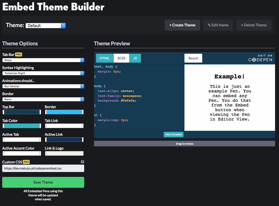
CodePen allows you to customize syntax highlighting, and background and text colors of UI elements in Embedded Pens. As a PRO user, I can also add custom CSS, which gives me the ability to improve Pens not just visually but in terms of accessibility.

Accessibility wins
Before I tell you where I see room for improvement, I want to highlight what they did well.
- You can customize colors and make sure that contrast ratios are high enough.
- There’s a click-to-load option. Pens can be in a preview state where they need to be clicked to loaded, which is good for performance.
- All buttons and links in Pens are HTML
<button>and<a>elements with actual text (What a time we live in that this makes me happy). - Embedded Pens are
iframes. There’s atitleattribute on eachiframewith the title of the Pen as a value. This is important because screen readers announce this value when theiframeis focussed. If the attribute is omitted, VoiceOver for example, falls back to thenameattribute. This can be annoying, especially if the value of thenameis a long hash.
title attribute. It falls back to the name attribute if the title is omitted.Accessibility improvements
I use the keyboard a lot, even on the web, and I want to make sure that other keyboard users get the best possible experience on my website.
Focus styling
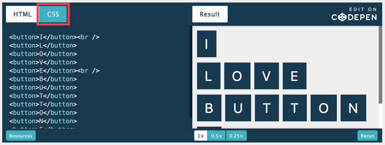
Depending on the colors in a CodePen theme and the browser used, focus styles are more or less visible. To make sure that focusable elements are sufficiently highlighted all the time, I added these lines to my custom CSS file:
button:focus,
a:focus {
  /* Highlighting on focus */
  outline: 5px solid #f23c50;
  outline-offset: 2px;
  /* Prevent items from overlapping the outline */
  transform: rotate(0);
}
outline property highlights the “CSS” button on focus.Wait! What?Why did you add transform: rotate(0);?
To make sure that other items don't overlap the outline of the focused item, I create a new stacking context on focus by applying the transform property with a value that doesn't change anything else visually. transform is just one of many other properties that create a new stacking context.
As part of my testing, I discovered that in Firefox on macOS 10.13.6 a pre element within the iframe receives focus as well. That's why added the following lines.
pre:focus {
  /* Highlighting on focus */
  outline: 5px solid #f23c50;
  /* The negative value insets the outline */
  outline-offset: -5px;
  /* Fallback for browsers that don't support outline-offset */
  border: 5px solid #f23c50;
}

@supports (outline-offset: -5px) {
  pre:focus {
    /* Removes the border in browsers that support outline-offset */
    border: none;
  }
}
Note: I’m setting the outline property to a negative value because otherwise the outline wouldn’t be visible due to a overflow: hidden rule on one of the pre elements parents.
This is how the Pen looks like in Firefox:
Skip links
Let’s say, you're not interested in the embedded Pen. As a mouse user, you just keep scrolling. As a keyboard user, you have to press Tab at least 9 times until you get to the next focusable element. Or worse, you get trapped in the Pen. This happens if the Pen is editable. You can pass the buttons in the top bar but the journey ends as soon as you get to the pre element where the code is displayed. Once you're in there, there’s no way of getting out.
We can’t fix that issue but we can give users more options. You might have heard of skip links. If not, please read Skip links are important by Nicolas Steenhout. A skip link is a link that’s usually only visible on focus and lets users skip large parts or repetitive blocks in a page. They're often the very first item in a page.

Sometimes it also makes sense to add in-page skip links. For example when you want to give users the ability to skip components or widgets in your page with a lot of links, like social media embeds, videos, or CodePens. That’s exactly what I did in my blog post.
In-page skip links
Directly before the embed code for the Pen, I added a div with an anchor link to an element that comes after the Pen in the DOM. By clicking this link, users can skip everything between the link and the target.
<div class="skip-link-container">
  <a href="#codepen1-skip" class="skip-link"> Skip CodePen </a>
</div>

<!-- CODEPEN EMBED CODE -->

<!-- The target: -->
<h2 id="codepen1-skip">Subsequent element</h2>
By default, this link should be visually hidden and only visible on focus. It’s not enough to just apply display: none and remove it on focus. To ensure that the link is still accessible to screen reader users, it's necessary to get more creative.
.skip-link-container {
  position: relative;
}

/* All the properties in this declaration block only apply if the link isn’t focused. */
.skip-link:not(:focus) {
  border: 0;
  clip: rect(0 0 0 0);
  clip-path: inset(50%);
  height: 1px;
  left: 0;
  margin: -1px;
  overflow: hidden;
  padding: 0;
  position: absolute;
  top: 0;
  white-space: nowrap;
  width: 1px;
}
This is a great improvement because we’ve reduced the number of key presses needed to skip the Pen from 9 to 1. There’s just one more thing I want to add. Since the page jumps from the anchor link to the target and the skipped area might not be in the viewport anymore, users might become lost. To help with that, we can give them a visual feedback after the jump has happened.
/* “The :target CSS pseudo-class represents a unique element (the target element) with an id matching the URL's fragment.”
  https://developer.mozilla.org/en-US/docs/Web/CSS/:target */

*:target {
  transition: background 0.2s;
  animation: target-highlight 1.2s ease-in-out;
}

@keyframes target-highlight {
  50% {
    background: #f23c50;
  }
  100% {
    background: none;
  }
}
And this is how the final result looks like. Watch the video or try it yourself.
What’s next?
Keyboard users benefit the most from my proposed improvements. I haven't tested how accessible embedded CodePens are for screen reader users but Scott O'Hara, who reviewed this article, told me that he had difficulties using Pens with VoiceOver in the past. So, the next thing I (or you? ?) could do is to test CodePens with several screen readers and share the results.
Until then, keep on making awesome websites for everyone. If you have any questions or feedback, please find me on Twitter or write me an e-mail.
PS: Thank you for reviewing this post, Scott. ❤️
This content originally appeared on Web development blog - Manuel Matuzović and was authored by Manuel Matuzović
Manuel Matuzović | Sciencx (2019-03-07T18:58:49+00:00) Improving the keyboard accessibility of Embedded CodePens. Retrieved from https://www.scien.cx/2019/03/07/improving-the-keyboard-accessibility-of-embedded-codepens/
Please log in to upload a file.
There are no updates yet.
Click the Upload button above to add an update.
