This content originally appeared on Manuel Matuzović - Blog and was authored by Manuel Matuzović
It’s always nice to see when people post their Lighthouse scores on social media to highlight how well they’ve optimised their own or their client's website. It shows that they care about the quality of what they build.

Lighthouse awards us with the number 100 in a green circle if we did an exceptional job. It’s something you can proudly share with your client or on Twitter.
It’s important to measure the quality of our code, but it’s even more important that we interpret the scores automatic testing tools give us correctly. If Lighthouse tells us that our site is 100% accessible, it doesn’t mean it is. It just means we’ve laid the groundwork for manual testing. Lighthouse uses the axe-core accessibility testing library with a custom set of rules for its tests. It identifies some bad practices, but not all of them. Other practices aren’t bad per se, but can be harmful, if we misuse them.
With automatic testing alone you can’t ensure good quality. To prove that, I built the most inaccessible site possible with a perfect Lighthouse score.
Background
Zach Leatherman recently posted this on twitter:
Free blog post idea:
How to Build the Slowest Website with a Perfect Lighthouse Score
And here’s Vadim Makeev’s response to his tweet, which inspired me to write this post.
That would be a wonderful read! Here’s one for a11y audit:
`<img src=picture.png alt=picture.png>`
I thought it would be a fantastic idea to not just try to mess with as many people as possible, but get rewarded with a perfect Lighthouse score on top.
Let’s exclude as many people as possible
We’ll take this simple, accessible page as a basis.
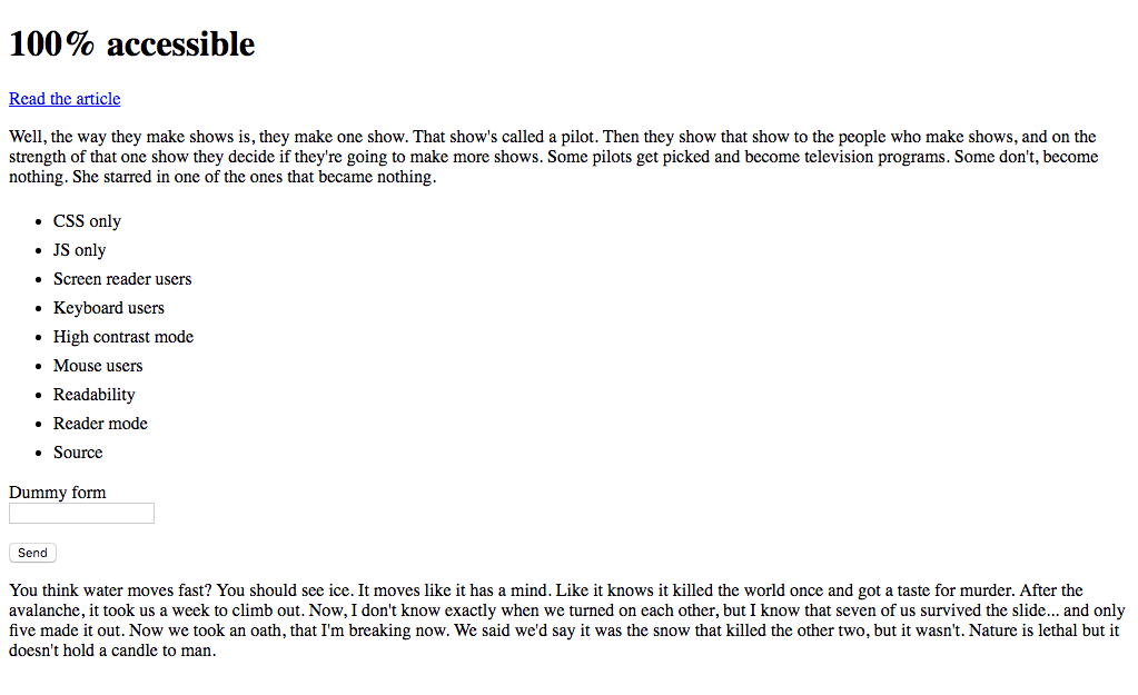
CodePen: “100%” accessible - step 0
🖕 CSS only 🖕
Let’s start nice and easy. I want to make sure that CSS is a dependency on my perfect website. To achieve that I'm adding the hidden attribute to the body element. hidden is the HTML equivalent to display: none; in CSS. (Checkout Inclusively Hidden by Scott O’Hara, if you want to learn more about accessible hiding).
HTML
<body hidden>
  ...
</body>
hidden hides content visually, and it removes it from the accessibility tree. That alone would be enough to exclude everyone and pass the Lighthouse tests, but I don’t want to make it too easy on myself. I want to create a site that’s perfectly inaccessible and technically still displays content.
So let’s add some CSS and bring our content back.
HTML
<head>
  <link rel="stylesheet" href="style.css" />
</head>
<body class="loaded" hidden>
  ...
</body>
CSS
.loaded {
  display: block;
}
We’re back to where we were before but now CSS must load if users want to get access to content on our site.
CodePen: “100%” accessible - step 1
🖕 JS only 🖕
Let’s add one more dependency. I’m not applying the class that displays our content in HTML anymore, but I add it via JS.
HTML
<head>
  <link rel="stylesheet" href="style.css" />
  <script src="script.js"></script>
</head>

<body hidden>
  ...
</body>
JS
document.querySelector('body').classList.add('loaded');Great! The site still looks the same but in order for it to display anything at all the CSS and JS file must load and work properly.
CodePen: “100%” accessible - step 2
I'd say it's time for our first Lighthouse test. Fingers crossed! 🤞🏼

Perfect score on a CSS and JS only site. That's great, but we can do better.
🖕 Screen reader users 🖕
There are many ways to exclude screen reader users. The easiest and most efficient way is to use the aria-hidden="true" attribute and value. This attribute is powerful and we must apply it with caution, because it removes elements from the accessibility tree. Normally, we may only use it to improve the experience for users of assistive technologies by removing redundant or extraneous content.
In our website we’re putting it on the body element.
HTML
<body hidden aria-hidden="true">
  ...
</body>
Screen reader users will now experience one of those “rare” moments when they have to deal with an inaccessible site. *
Update 06.10.21: Originally, Lighthouse didn’t flag this as an issue, but they seem to have fixed it. That’s great! Unfortunately (fortunately for this article), we can work around that by setting tabindex to -1 on all focusable elements.
<a href="https://www.matuzo.at/blog/building-the-most-inaccessible-site-possible-with-a-perfect-lighthouse-score/" rel="noopener" tabindex="-1">
  Read the article
</a>

<form action="#form">
  <p>
    <label for="text">Dummy form</label><br>
    <input type="text" id="text" tabindex="-1">
  </p>
  <button tabindex="-1">Send</button>
</form>
CodePen: “100%” accessible - step 3
🖕 Keyboard users 🖕
Keyboard users can navigate through a page by pressing the Tab key to jump from one interactive element to another. Browsers show an outline around these items if they’re in focus.

Let’s get rid of that.
CSS
*:focus {
  outline: none !important;
}
All it takes are 3 lines of CSS to exclude a whole group of people from being able to access the site. Although, technically, they can still interact with it. They won’t see the focus indicator anymore but interactive elements are still tababble. Since this experiment is all about exclusion, let’s make sure that the keyboard can’t be used at all.
JS
document.addEventListener('keydown', function (e) {
  e.preventDefault();
});
Our exclusion-first app now removes the default functionality of all keys.
CodePen: “100%” accessible - step 4
Time for another test.

Still perfect.
Okay, now it's time to get dirty.
🖕 High contrast mode 🖕
People with low vision can improve contrasts on Windows by enabling the so called High Contrast Mode.
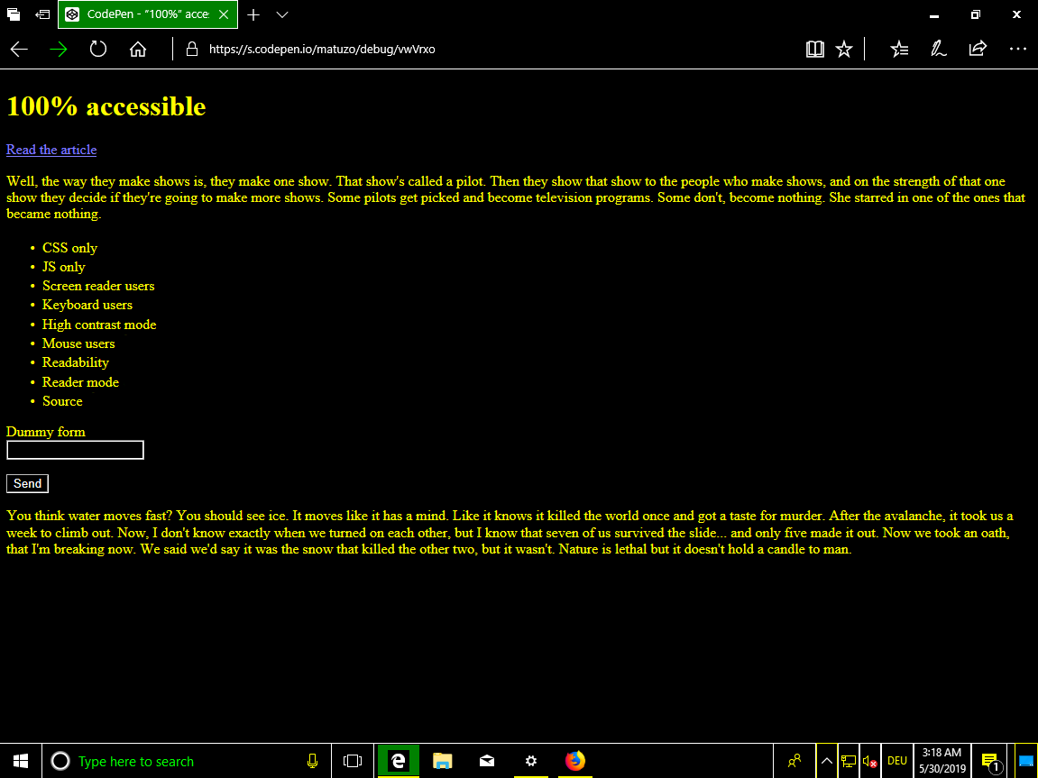
The whole operating system uses high contrasting colors for all applications including browsers and websites.
We can target high contrast mode users specifically by using a dedicated media feature.
CSS
@media screen and (-ms-high-contrast: active) {
  /* High contrast styling rules */
  * {
    color: #000000;
  }
}
Rules in this media query only apply if High Contrast is enabled. Unfortunately, we don’t know which colors the theme uses, nor if it’s a light or dark theme. Setting the color to #000000 on all elements might or might not work, depending on user preference.
This fifty-fifty chance is not exclusive enough for me, but we’re lucky: Windows High Contrast colors are mapped to CSS system color keywords. We can use these system color keywords to make sure our text always matches our High Contrast Mode background color, regardless of what it is set to. The background color is mapped to window. So, let’s use the value of the background color for the text color of all elements.
CSS
@media screen and (-ms-high-contrast: active) {
  * {
    color: window !important;
  }
}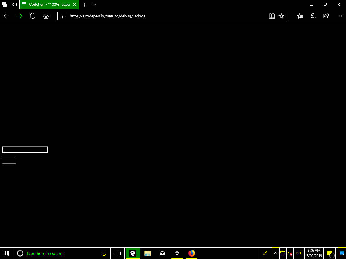
Oh, man. This is so evil. My LinkedIn inbox will be filled with job offerings by companies like Facebook and Uber.
CodePen: “100%” accessible - step 5
🖕 Mouse users 🖕
Excluding mouse users is easy, we just remove the cursor.
CSS
*,
*:hover {
  cursor: none;
}
cursor: none; is to mouse users what outline: none; is to keyboard users. Getting your bearings is initially difficult, but interactive elements are still clickable. Let’s improve the quality of our app by decreasing the user experience once more.
CSS
body {
  pointer-events: none;
}
pointer-events: none; frees our users from the ability to click anything on our site. This property is well-supported, but if we want to make sure that this feature works on as many browsers as possible, we can apply a principle called progressive degradation™.
JS
function removeA11y() {
  if ('pointerEvents' in document.body.style) {
    console.log('pointer-events supported');
    return;
  }

  document.addEventListener('click', function (e) {
    e.preventDefault();
  });
}

removeA11y();
This JavaScript fallback will kick in and remove click events from all elements, if the browser doesn't support the pointer-events property.
CodePen: “100%” accessible - step 6

Great! Still perfectly accessible!
🖕 Readability 🖕
We can’t use the mouse or keyboard anymore but we can still read the content above the fold. Let’s do something about that.
CSS
body {
  opacity: 0.03;
}
Our page content is still present but almost invisible. Fabulous!
Update 06.10.21: Originally, Lighthouse didn’t flag this as an issue, but they seem to have fixed it. That’s great! Unfortunately (fortunately for this article), we can work around that by using the filter property instead.
body {
  filter: opacity(0.03);
}
CodePen: “100%” accessible - step 7
🖕 Reader mode 🖕
Testing the site in different browsers, I noticed that it’s still accessible in Safari in Reader Mode.
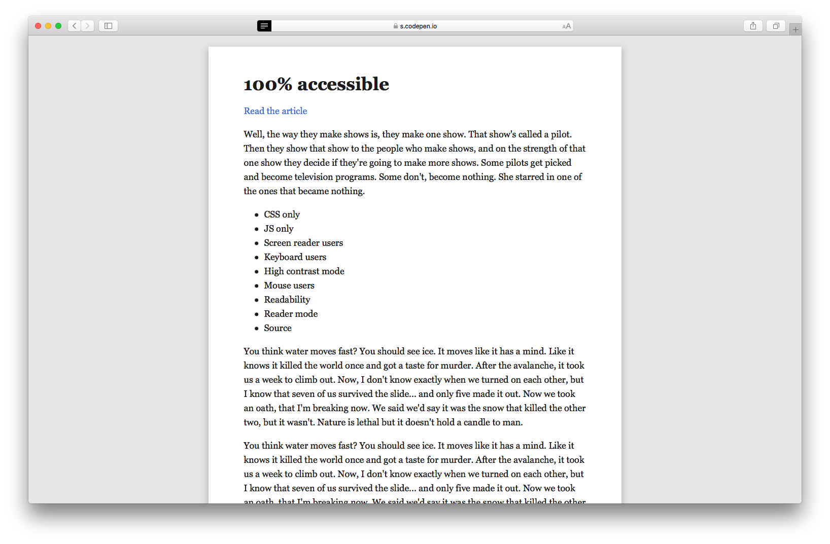
As it turns out, it’s possible to disable Reader Mode by defining a small font size in the body.
CSS
body {
  opacity: 0.03;
  font-size: 1px;
}
CodePen: “100%” accessible - step 8
🖕 View Page Source 🖕
The site is inaccessible to people with low and good vision, mouse, keyboard and screen reader users.\
If browser power users encounter a site like this, it might awaken their inner Zero Cool and they try to hack the site. What I mean by hack is view the page source.
To put the cherry on top of my exclusion-first site, I’m converting the text to html entities. Entities are usually used to display reserved characters, invisible characters, and characters that are difficult to type with a standard keyboard. I’m using them to obfuscate text on our site.
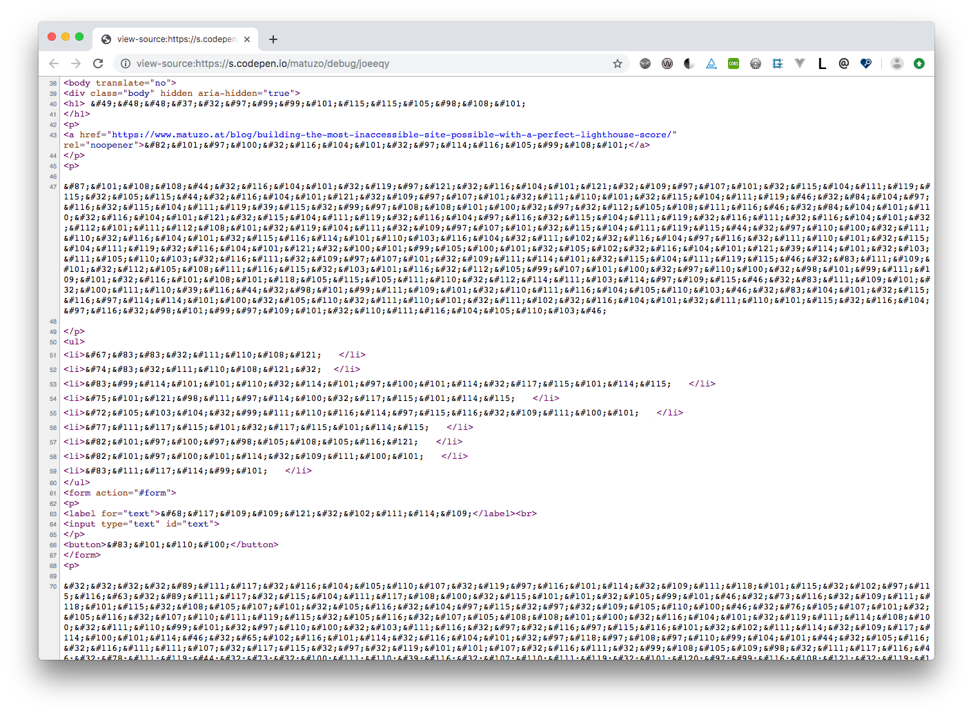
CodePen: “100%” accessible - step 9
To wrap it up, a final test.

Conclusion
My intention with this post was not to diss Lighthouse or axe-core, the engine behind Lighthouse. I use both tools regularly and I’m glad I have them.\
This post is about you and me. Scores indicate the quality of our apps and sites, but we must not trust these numbers thoughtlessly. We have to understand that automatic testing is just a first step.
Next time you see a high Lighthouse score and you want to call it a day, read the text next to the score.

These checks highlight opportunities to improve the accessibility of your web app. Only a subset of accessibility issues can be automatically detected so manual testing is also encouraged.
Below that paragraph, you'll find a list of additional items you should test manually and a link to a page that explains How To Do an Accessibility Review.
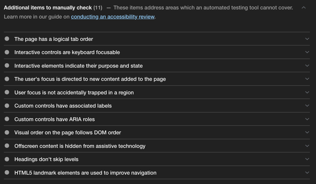
We don’t test and optimize our sites for the good feeling a high score gives us. We’re doing it because we want to, and we have to, make sure that what we build is accessible to as many people as possible.
We don’t fully rely on automation when we’re designing and developing, and we shouldn't do it either when we’re testing.
Thanks to Eric for proofreading and feedback.
Links and resources
- Google Lighthouse
- axe-core
- Inclusively Hidden
- The WebAIM Million
- Web Fundamentals – Accessibility
- Eric W. Bailey
- The A11y Project
∗ (sarcasm)
Update June 12th
Added a paragraph about manual testing recommendations provided by lighthouse.
My blog doesn't support comments yet, but you can reply via blog@matuzo.at.
This content originally appeared on Manuel Matuzović - Blog and was authored by Manuel Matuzović
Manuel Matuzović | Sciencx (2019-05-31T00:00:00+00:00) Building the most inaccessible site possible with a perfect Lighthouse score. Retrieved from https://www.scien.cx/2019/05/31/building-the-most-inaccessible-site-possible-with-a-perfect-lighthouse-score-3/
Please log in to upload a file.
There are no updates yet.
Click the Upload button above to add an update.
