
This content originally appeared on Accessible Dreams and was authored by Dennie Declercq
In this blogpost I’d love to talk about ‘simplify the layout’. In other words this means making the lay-out easier to understand. In this blogpost I am going to tell you how to make a layout for an app that’s really accessible. Easy to use.
I am going to focus on people with autism, learning disabilities (in other words intellectual or cognitive disabilities) and people that are distracted very often. An example is people on the ADD / ADHD spectrum.
How to start with simplifying the layout?
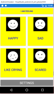
You can start simplifying the layout of your application with cutting down the content of your application. Simplifying the lay-out is making the screen easy to understand. This can be done with less content par screen. Big busy screens with lot of divided content isn’t easy for everyone.
And I know, a lot of developers want to build applications with as much as possible options. Eye – catchers. For people that have difficulties with understanding the basic usage of your application are this options eye – killer.
Another adjustment to make an accessible lay-out is a bigger font. Of course, a bigger font is helpful for people with vision loss. But also for people with intellectual disabilities it’s easier to recognize words and text if the font is bigger.
For many people with disabilities it’s easy to have enough contrast. Use dark text on a white background. Specific for people with intellectual disabilities a white or light background is easier.
But if you really want to be accessible and inclusive for a lot of people you can add the option to switch to a dark background with a light text-color scheme. Some people with autism prefer this combination. They have the feeling to have less sensory overload with a dark color scheme.
This content originally appeared on Accessible Dreams and was authored by Dennie Declercq
Dennie Declercq | Sciencx (2019-09-29T16:05:02+00:00) Simplify The Layout. Retrieved from https://www.scien.cx/2019/09/29/simplify-the-layout/
Please log in to upload a file.
There are no updates yet.
Click the Upload button above to add an update.