This content originally appeared on 24 ways and was authored by Drew McLellan
Julie Grundy kicks off this, our fifteenth year, by diving headlong into the snowy issue of customising form inputs. Nothing makes a more special gift at Christmas that something you’ve designed and customised yourself. But can it be done while staying accessible to every user?
In my work as an accessibility consultant, there are some frequent problems I find on people’s websites. One that’s come up a lot recently is that people are making custom select inputs for their forms. I can tell that people are trying to make them accessible, because they’ve added ARIA attributes or visually-hidden instructions for screen reader users. Sometimes they use a plugin which claims to be accessible. And this is great, I love that folks want to do the right thing! But so far I’ve never come across a custom select input which actually meets all of the WCAG AA criteria.
Often I recommend to people that they use the native HTML select element instead. Yes, they’re super ugly, but as Scott Jehl shows us in his article Styling a Select Like It’s 2019 they are a lot easier to style than they used to be. They come with a lot of accessibility for free – they’re recognised and announced clearly by all screen reader software, they work reliably and predictably with keyboards and touch, and they look good in high contrast themes.
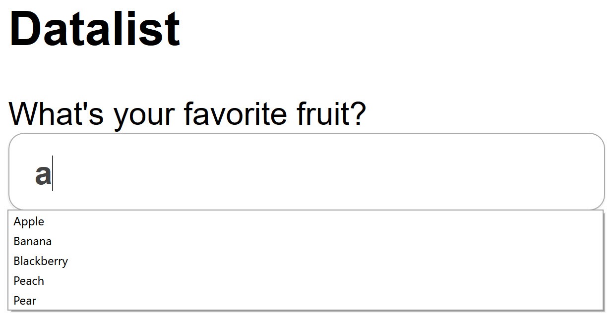
But sometimes, I can’t recommend the select input as a replacement. We want a way for someone to choose an item from a list of options, but it’s more complicated than just that. We want autocomplete options. We want to put images in there, not just text. The optgroup element is ugly, hard to style, and not announced by screen readers. The focus styles are low contrast. I had high hopes for the datalist element, but although it works well with screen readers, it’s no good for people with low vision who zoom or use high contrast themes.

Select inputs are limited in a lot of ways. They’re frustrating to work with when you have something which looks almost like what you want, but is too restricted to be useful. We know we can do better, so we make our own.
Let’s work out how to do that while keeping all the accessibility features of the original.
Semantic HTML
We’ll start with a solid, semantic HTML base. A select input is essentially a text input which restricts the possible answers, so let’s make a standard input.
<label for="custom-select">User Type</label>
<input type="text" id="custom-select">
Then we need to show everyone who can see that there are options available, so let’s add an image with an arrow, like the native element.
<label for="custom-select">User Type</label>
<input type="text" id="custom-select">
<img src="arrow-down.svg" alt="">
For this input, we’re going to use ARIA attributes to represent the information in the icon, so we’ll give it an empty alt attribute so screen readers don’t announce its filename.
Finally, we want a list of options. An unordered list element is a sensible choice here. It also lets screen reader software understand that these bits of text are related to each other as part of a group.
<ul class="custom-select-options">
  <li>User</li>
  <li>Author</li>
  <li>Editor</li>
  <li>Manager</li>
  <li>Administrator</li>
</ul>
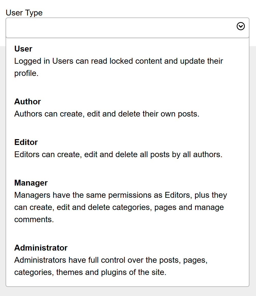
You can dynamically add or remove options from this list whenever you need to. And, unlike our <option> element inside a <select>, we can add whatever we like inside the list item. So if you need images to distinguish between lots of very similar-named objects, or to add supplementary details, you can go right ahead. I’m going to add some extra text to mine, to help explain the differences between the choices.
This is a good base to begin with. But it looks nothing like a select input! We want to make sure our sighted users get something they’re familiar with and know how to use already.

Styling with CSS
I’ll add some basic styles similar to what’s in Scott Jehl’s article above.

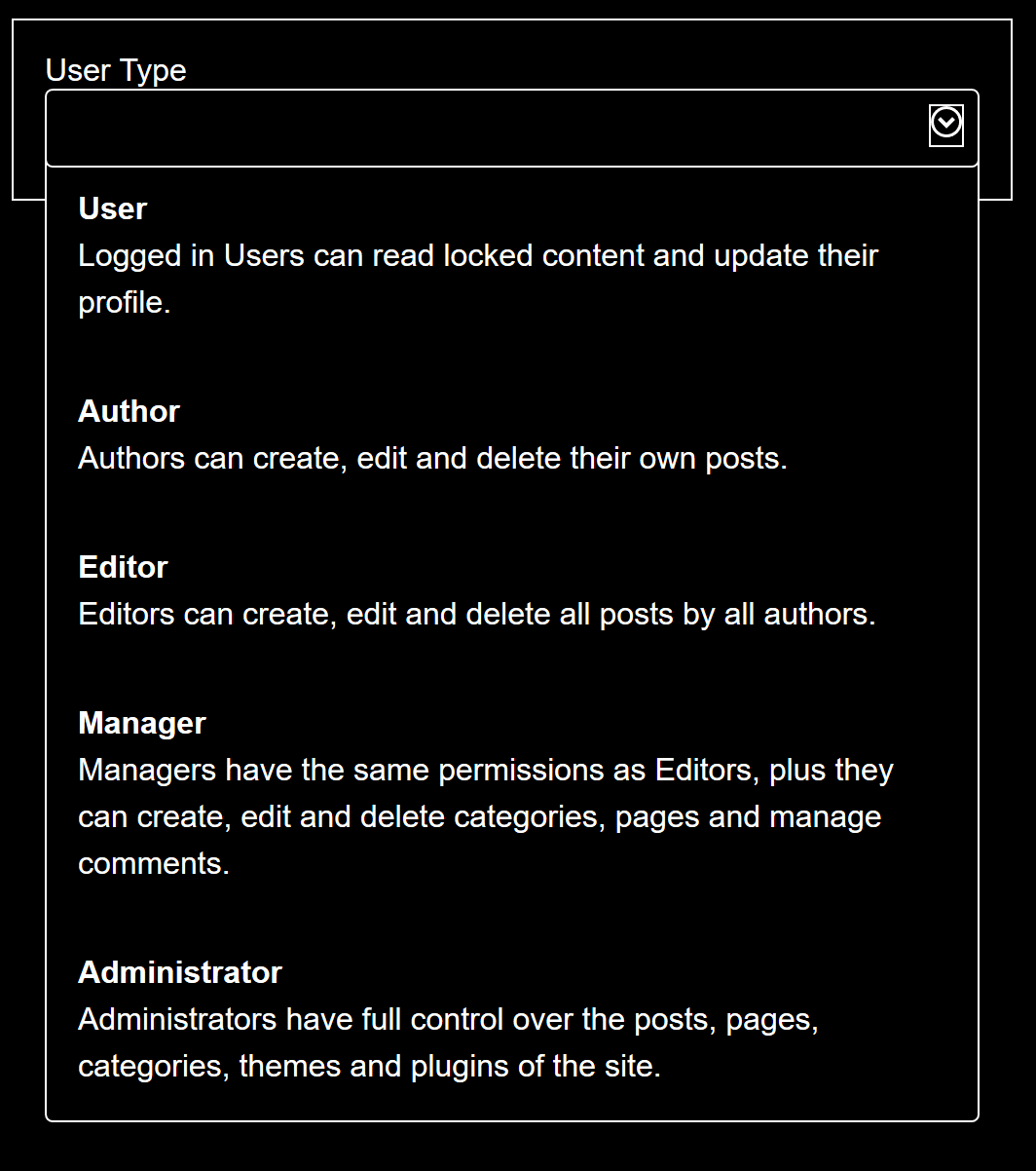
We also need to make sure that people who customise their colours in high contrast modes can still tell what they’re looking at. After checking it in the default Windows high contrast theme, I’ve decided to add a left-hand border to the focus and hover styles, to make sure it’s clear which item is about to be chosen.

This would be a good time to add any dark-mode styles if that’s your jam. People who get migraines from bright screens will thank you!
JavaScript for behaviour
Of course, our custom select doesn’t actually do anything yet. We have a few tasks for it: to toggle the options list open and closed when we click the input, to filter the options when people type in the input, and for selecting an option to add it to the input and close the list. I’m going to tackle toggling first because it’s the easiest.
Toggling
Sometimes folks use opacity or height to hide content on screen, but that’s like using Harry Potter’s invisibility cloak. No-one can see what’s under there, but Harry doesn’t cease to exist and you can still poke him with a wand. In our case, screen reader and keyboard users can still reach an invisible list.
Instead of making the content see-through or smaller, I’m going to use display: none to hide the list. display: none removes the content from the accessibility tree, so it can’t be accessed by any user, not just people who can see. I always have a pair of utility classes for hiding things, as follows:
.hidden-all {
  display: none;
}

.hidden-visually {
    position: absolute;
    width: 1px;
    height: 1px;
    padding: 0;
    overflow: hidden;
    clip: rect(0,0,0,0);
    white-space: nowrap;
    -webkit-clip-path: inset(50%);
    clip-path: inset(50%);
    border: 0;
}
So now I can just toggle the CSS class .hidden-all on my list whenever I like.
Browsing the options
Opening up our list works well for our mouse and touch-screen users. Our styles give a nice big tap target for touch, and mouse users can click wherever they like.
We need to make sure our keyboard users are taken care of though. Some of our sighted users will be relying on the keyboard if they have mobility or dexterity issues. Usually our screen reader users are in Browse mode, which lets them click the arrow keys to navigate through content. However, custom selects are usually inside form elements. which pushes screen reader software to Forms Mode. In Forms mode, the screen reader software can only reach focusable items when the user clicks the Tab key, unless we provide an alternative. Our list items are not focusable by default, so let’s work on that alternative.
To do this, I’m adding a tabindex of -1 to each list item. This way I can send focus to them with JavaScript, but they won’t be part of the normal keyboard focus path of the page.
csOptions.forEach(function(option) {
    option.setAttribute('tabindex, '-1')
})
Now I can move the focus using the Up and Down arrow keys, as well as with a mouse or tapping the screen. The activeElement property of the document is a way of finding where the keyboard focus is at the moment. I can use that to loop through the elements in the list and move the focus point forward or back, depending on which key is pressed.
function doKeyAction(whichKey) {
  const focusPoint = document.activeElement
  switch(whichKey) {
    case: 'ArrowDown':
      toggleList('Open')
      moveFocus(focusPoint, 'forward')
      break
    case: 'ArrowUp':
      toggleList('Open')
      moveFocus(focusPoint, 'back')
      break
  }
}
Selecting
The Enter key is traditional for activating an element, and we want to match the original select input.
We add another case to the keypress detector…
case 'Enter':
  makeChoice(focusPoint)
  toggleList('Shut')
  setState('closed')
  break
… then make a function which grabs the currently focused item and puts it in our text input. Then we can close the list and move focus up to the input as well.
function makeChoice(whichOption) {
    const optionText = whichOption.documentQuerySelector('strong')
    csInput.value = optionText
}
Filtering
Standard select inputs have keyboard shortcuts – typing a letter will send focus to the first item in the option which begins with that letter. If you type the letter again, focus will move to the next option beginning with that letter.
This is useful, but there’s no clue to tell users how many options might be in this category, so they have to experiment to find out. We can make an improvement for our users by filtering to just the set of options which matches that letter or sequence of letters. Then sighted users can see exactly how many options they’ve got, and continue filtering by typing more if they like. (Our screen reader users can’t see the remaining options while they’re typing, but don’t worry – we’ll have a solution for them in the next section).
I’m going to use the .filter method to make a new array which only has the items which match the text value of the input. There are different ways you could do this part – my goal was to avoid having to use regex, but you should choose whatever method works best for your content.
function doFilter() {
  const terms = csInput.value
  const aFilteredOptions = aOptions.filter(option => {
    if (option.innerText.toUpperCase().startsWith(terms.toUpperCase())) {
    return true
    }
  })
  // hide all options
  csOptions.forEach(option => option.style.display = "none")
  // re-show the options which match our terms
  aFilteredOptions.forEach(function(option) {
    option.style.display = ""
  })
}
Nice! This is now looking and behaving really well. We’ve got one more problem though – for a screen reader user, this is a jumble of information. What’s being reported to the browser’s accessibility API is that there’s an input followed by some clickable text. Are they related? Who knows! What happens if we start typing, or click one of the clicky text things? It’s a mystery when you can’t see what’s happening. But we can fix that.
ARIA
ARIA attributes don’t provide much in the way of additional features. Adding an aria-expanded='true' attribute doesn’t actually make anything expand. What ARIA does is provide information about what’s happening to the accessibility API, which can then pass it on to any assistive technology which asks for it.
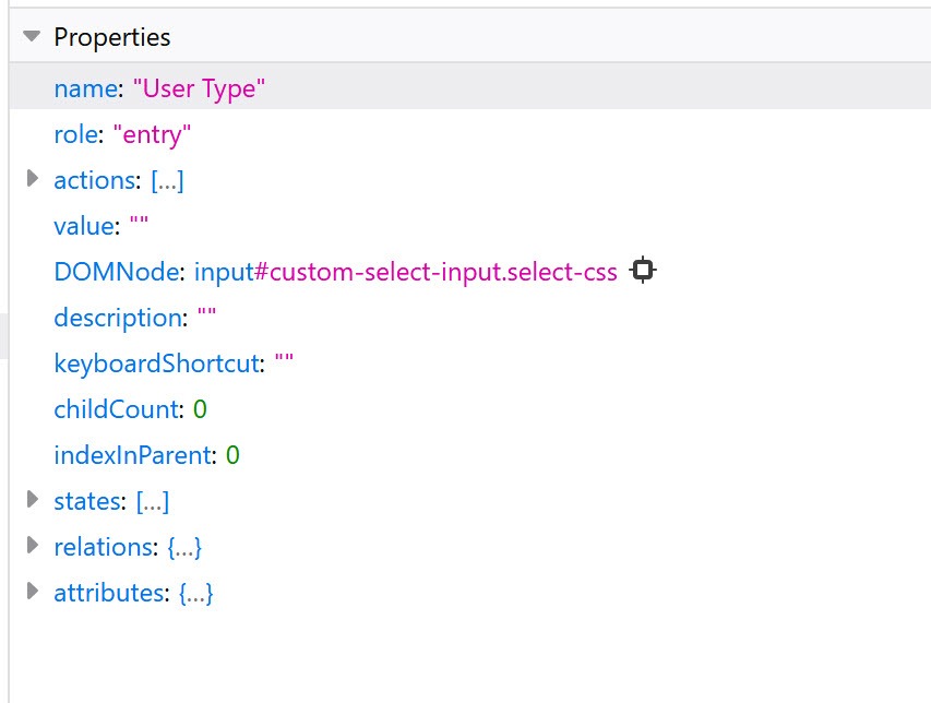
The WCAG requirements tell us that when we’re making custom elements, we need to make sure that as a whole, the widget tells us its name, its role, and its current value. Both Chrome and Firefox reveal the accessibility tree in their dev tools, so you can check how any of your widgets will be reported.
We already have a name for our input – it comes from the label we associated to the text input right at the start. We don’t need to name every other part of the field, as that makes it seem like more than one input is present. We also don’t need to add a value, because when we select an item from the list, it’s added to the text input and therefore is exposed to the API.


But our screen readers are going to announce this custom select widget as a text entry field, with some images and a list nearby.
The ARIA Authoring Practices site has a pattern for comboboxes with listboxes attached. It tells you all the ARIA you need to make screen reader software give a useful description of our custom widget.
I’m going to add all this ARIA via JavaScript, instead of putting it in the HTML. If my JavaScript doesn’t work for any reason, the input can still be a plain text field, and we don’t want screen readers to announce it as anything fancier than that.
csSelector.setAttribute('role', 'combobox')
csSelector.setAttribute('aria-haspopup', 'listbox')
csSelector.setAttribute('aria-owns', '#list')
csInput.setAttribute('aria-autocomplete', 'both')
csInput.setAttribute('aria-controls', 'list')
The next thing to do is let blind users know if the list is opened or closed. For that task I’m going to add an aria-expanded attribute to the group, and update it from false to true whenever the list changes state in our toggling function.
The final touch is to add a secret status message to the widget. We can use it to update the number of options available after we’ve filtered them by typing into the input. When there are a lot of options to choose from, this helps people who can’t see the list reducing know if they’re on the right track or not.
To do that we first have to give the status message a home in our HTML.
<div id='custom-select-status' class='hidden-visually' aria-live='polite'></div>I’m using our visually-hidden style so that only screen readers will find it. I’m using aria-live so that it will be announced as often as it updates, not just when a screen reader user navigates past it. Live regions need to be present at page load, but we won’t have anything to say about the custom select then so we can leave it empty for now.
Next we add one line to our filtering function, to find the length of our current list.
updateStatus(aFilteredOptions.length)Then we send that to a function which will update our live region.
function updateStatus(howMany) {
    console.log('updating status')
    csStatus.textContent = howMany + " options available."
}
Conclusion
Let’s review what we’ve done to make an awesome custom select input:
- Used semantic HTML so that it’s easily interpreted by assistive technology while expanding the types of content we can include in it
- Added CSS styles which are robust enough to survive different visual environments while also fitting into our branding needs
- Used JavaScript to provide the basic functionality that the native element has
- Added more JavaScript to get useful functionality that the native element lacks
- Carefully added ARIA attributes to make sure that the purpose and results of using the element are available to assistive technology and are updated as the user interacts with it.
You can check out my custom select pattern on GitHub – I’ll be making additions as I test it on more assistive technology, and I welcome suggestions for improvements.
The ARIA pattern linked above has a variety of examples and customisations. I hope stepping through this example shows you why each of the requirements exists, and how you can make them fit your own needs.
I think the volume of custom select inputs out there shows the ways in which the native select input is insufficient for modern websites. You’ll be pleased to know that Greg Whitworth and Simon Pieters are working on improving several input types! You can let them know what features you’d like selects to have. But until that work pays off, let’s make our custom selects as accessible and robust as they can possibly be.
About the author
Julie Grundy is an accessibility expert who works for Intopia, a digital accessibility consultancy. She has over 15 years experience as a front-end web developer in the health and education sectors. She believes in the democratic web and aims to unlock digital worlds for as many people as possible. In her spare time, she knits very slowly and chases very quickly after her two whippets.
This content originally appeared on 24 ways and was authored by Drew McLellan
Drew McLellan | Sciencx (2019-12-01T12:00:00+00:00) Making a Better Custom Select Element. Retrieved from https://www.scien.cx/2019/12/01/making-a-better-custom-select-element/
Please log in to upload a file.
There are no updates yet.
Click the Upload button above to add an update.
