This content originally appeared on Jonnie Hallman (@destroytoday) and was authored by Jonnie Hallman (@destroytoday)
Unlike the Stripe homepage section, embedding the floating Casper animation was quite the technical challenge. Because of an issue in mobile Safari where scroll events wouldn’t trigger after swiping and releasing, the original page that it lived on only displayed the animation on the desktop viewport. Now, that issue no longer exists, so there’s no reason not to have the animation scale gracefully to both phone and tablet screen sizes. Herein lies the technical challenge.
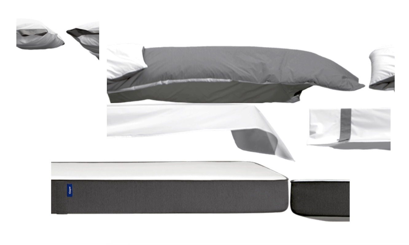
A sprite sheet of Casper sheets
As detailed in the process post I wrote about the Casper homepage, the animation itself is a sprite sheet that is “animated” by changing the background position to show the next frame for each “product”. Because the elements use background-image to display the sprite sheets, scaling the elements is no longer as easy as resizing the width and height, as it would be with a regular <img> tag. Originally, I scaled the animation using transform: scale(...) on the container, but this disregards my need to scale gracefully. It also requires me to set the scale manually at each breakpoint and prevents the container from having a real size (i.e., the sibling elements wouldn’t move up to fill the negative space as the animation scales down). Instead, I wanted an automatic approach of scaling fluidly.
I started by replacing the hard-coded pixel positions and dimensions of the elements themselves with percentage values that would scale with their container. This involved taking the positions and dimensions, dividing by the container’s size, multiplying by 100, and slapping on a %. This was the easy part. For the background images, as the elements would scale, the sprite frames would remain the same scale, but become cropped. I needed to tie the background position and dimensions to the scale of the container, too.
To get the scale of the container, I measured the width of the element as the page resizes and divided by the max width of the container. With a Math.min(1, ...) wrapped around the equation to mimic a max-width, this looks like:
container.style.setProperty(
  '--scale',
  Math.min(1, containerWidth / containerMaxWidth)
)
In order for the children elements to reference this scale, I set it as a CSS variable. Then, within all of the elements, I apply this scale to their sizes like this:
element.style.setProperty(
  'background-size',
  'calc(var(--scale) * ${spriteWidth}px)
   calc(var(--scale) * ${spriteHeight}px)'
)
The sprite sizes are the full width of the sprite image assets. This worked as expected to scale the sprites, but the positioning was way off for each frame.

At first, I couldn’t put my finger on it, until I realized I would need to apply the scale to the background positions as well:
element.style.setProperty(
  'background-position',
  'calc(var(--scale) * ${framePositionX}px)
   calc(var(--scale) * ${framePositionY}px)'
)
When I started resizing the window, the bed scaled perfectly down to mobile—no need for manually set media queries or transforms. The only problem remaining was that the elements were absolutely positioned, so the container lost its height. To fix this, I leaned on a trick I’ve been using for years—setting padding-bottom to the aspect ratio of the full image. This is simply a matter of dividing the height by the width, then converting to a percentage. Now, the container’s padding scales with the container to mimic the container naturally resizing itself to the aspect ratio of the full image.
This animation was a really fun challenge to “modernize” and migrate into my website’s codebase. The experience provided good practice for creating more portable code. The best part is that now I can use this animation wherever I want at whatever size and it just works. I could even create a Flying Toasters-esque screensaver of floating Caspers... Hmm...
This content originally appeared on Jonnie Hallman (@destroytoday) and was authored by Jonnie Hallman (@destroytoday)
Jonnie Hallman (@destroytoday) | Sciencx (2020-02-19T13:11:00+00:00) Casper homepage section. Retrieved from https://www.scien.cx/2020/02/19/casper-homepage-section/
Please log in to upload a file.
There are no updates yet.
Click the Upload button above to add an update.
