This content originally appeared on Zell Liew and was authored by Zell Liew
This is the third article in the Learn JavaScript design series. Today, I’ll talk about how I built the Account and Component Page.
Account page
I gave each student a default password. I want to let them change their password, so I created the Account page.
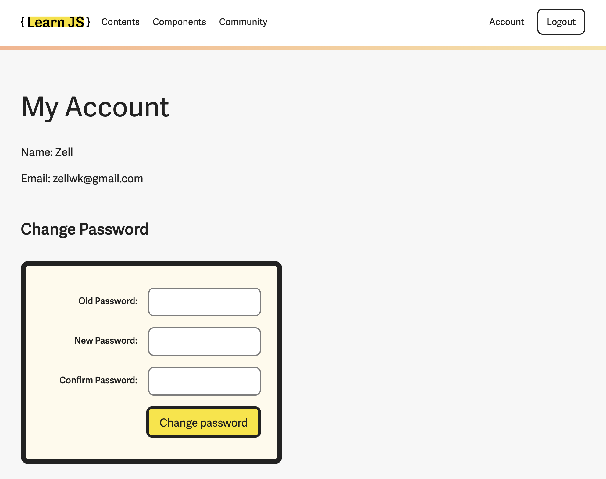
There’s only one important activity here: The changing of passwords.
You need three fields to change passwords:
- The old password
- The new password
- Confirmation for the new password
We can put the fields in a single column.
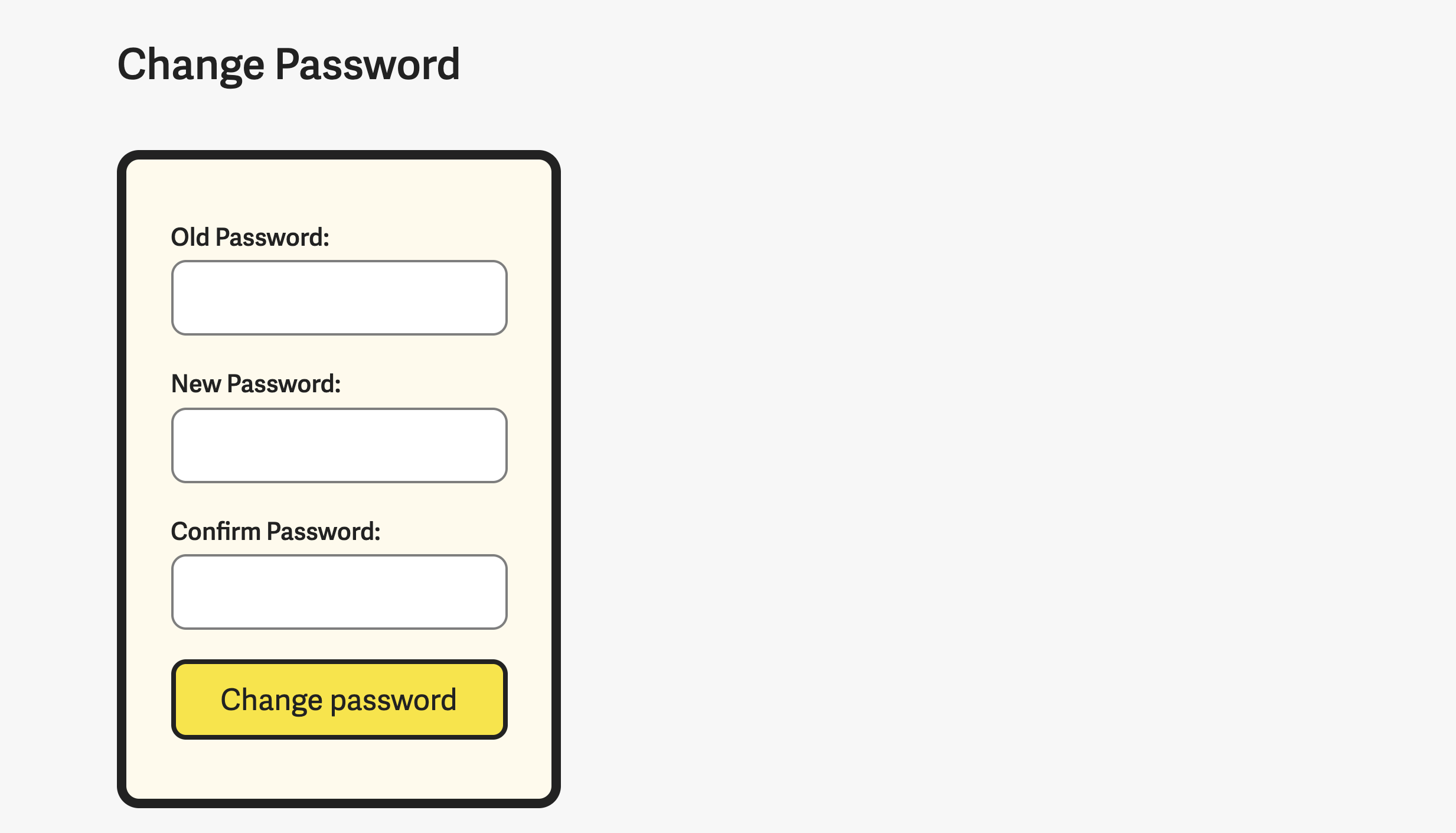
This works on mobile, but it looks weird on desktop; there’s too much whitespace on the right.
I tried to reduce the awkwardness by reducing the whitespace. I did this by creating a two-column grid in the form. Labels on the left, fields on the right.
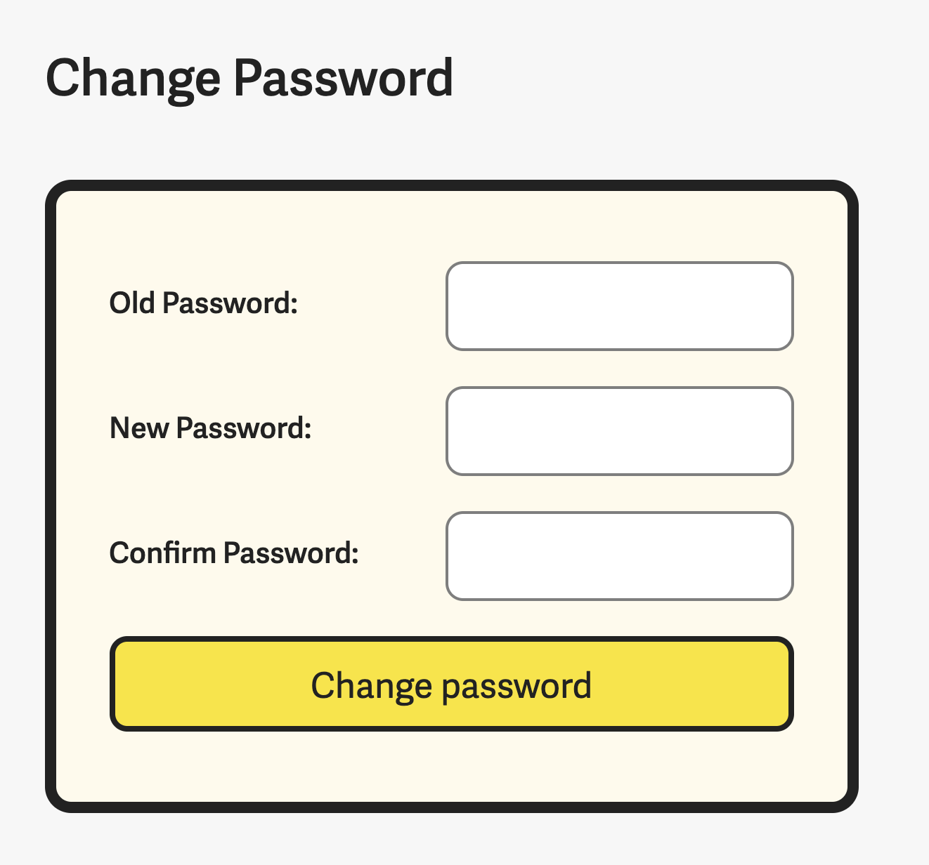
It looks much better than before, but there’s still room for improvement.
Here each label looks disjointed from their respective fields. This happens because the whitespace between labels and fields are quite large.
According to proximity rule, related fields should be close to each other. The easiest way to do this is to right-align the labels.
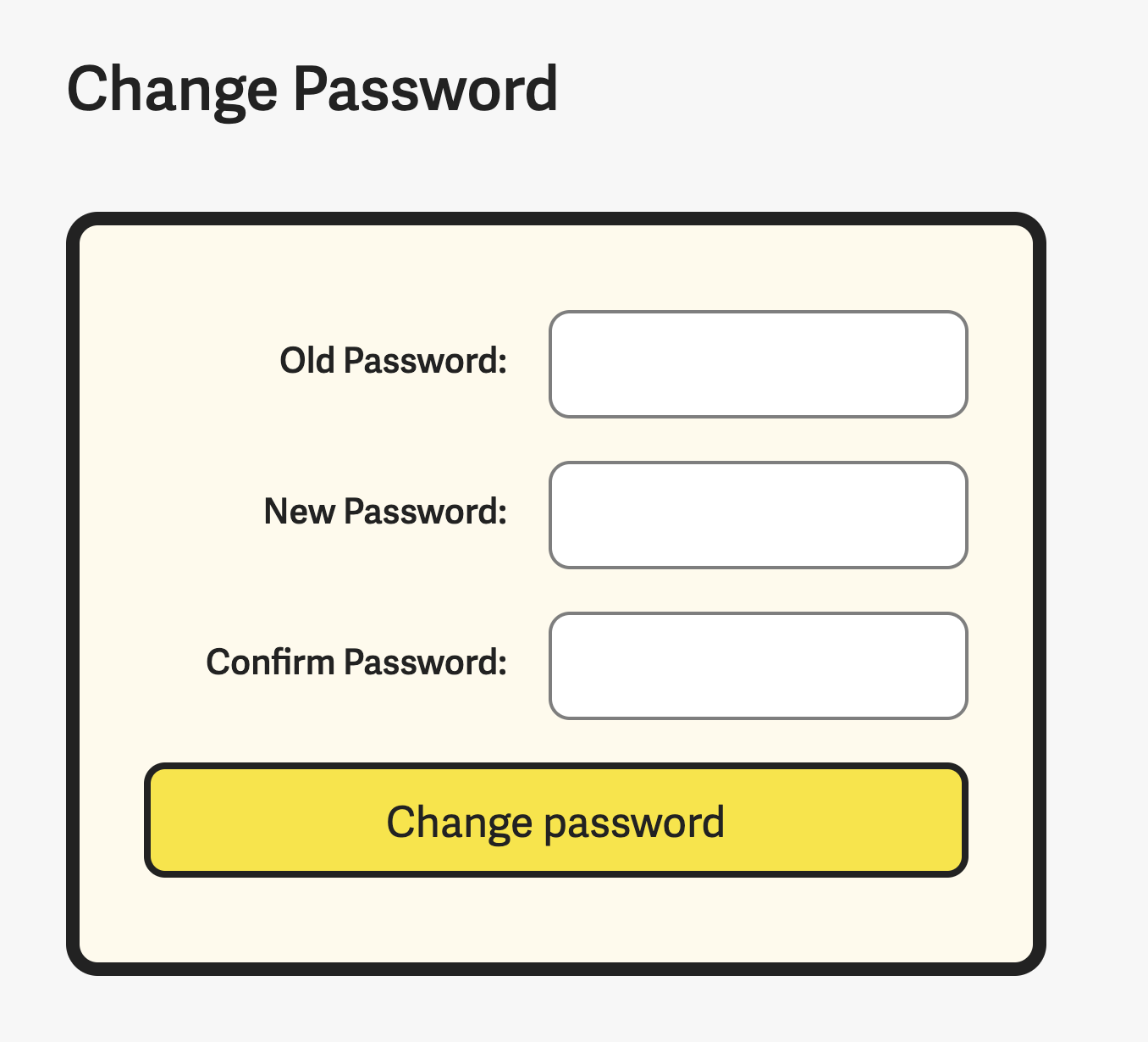
This looks better, but it’s still weird. Why? It looks weird because the button is full-width. It’s not aligned to anything (on the left edge).
Since a “button” is kinda like a “field”, we can align it like a field.
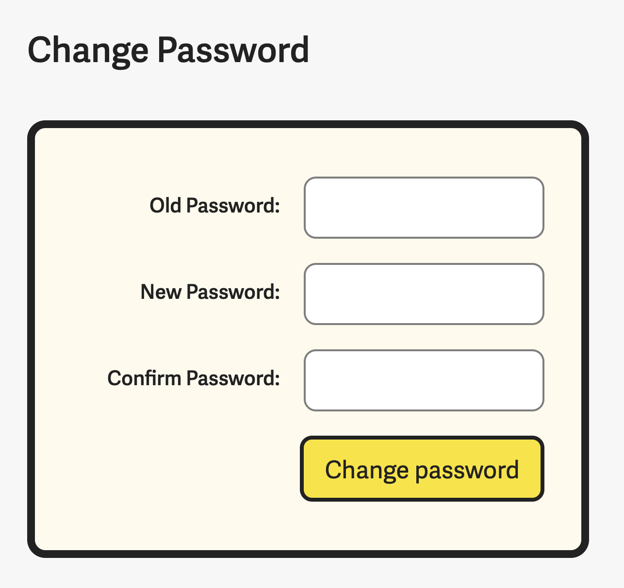
This looks better since the entire form looks well aligned.
Components page
There are 20 components in Learn JavaScript. Students progress through the course like this:
- Learn concepts
- Build simple components
- Learn more complicated concepts
- Improve the things they built (plus build more things)
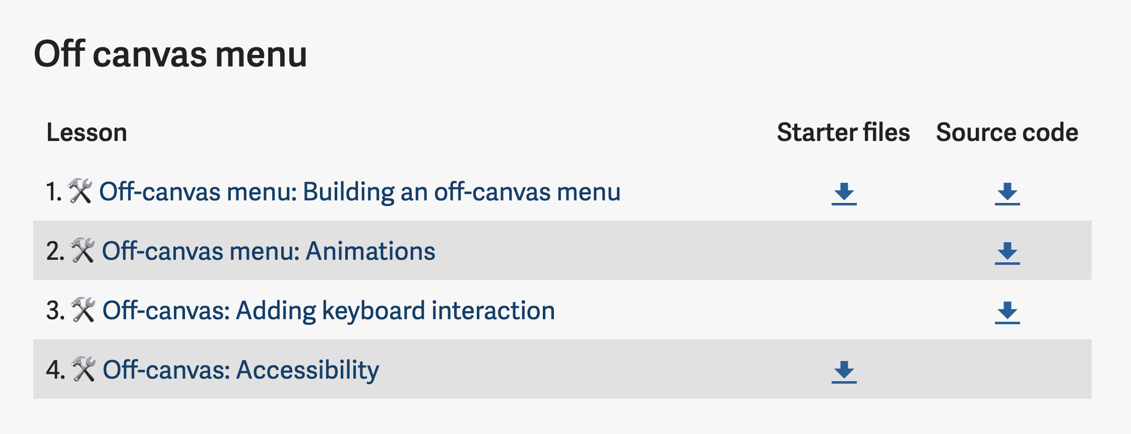
This means a single component can be separated into different modules. For example, the simplest component, an off-canvas menu, is separated into 4 modules.
- Module 3: Building simple components
- Module 7: Animations
- Module 15: Keyboard
- Module 16: Accessibility
Students may want to go through the lessons for one component in sequence, so I created a Components page.
I could build this page like the Content page (with a list), but it’s not enough. Each lesson comes with starter files and source code. I want to allow students to download these files easily too.
So I chose to go with a table instead. Here’s what it looks like:
That’s it!
Ending thoughts
I hope this series helped you learn to think more about design.
I hesitate to write this series because I feel my design skills still not refined. I feel that there are things I can improve in, but I’m not sure what.
I’m always on the lookout to improve my design skills though. Please let me know if you have any thoughts or suggestions!
This content originally appeared on Zell Liew and was authored by Zell Liew
Zell Liew | Sciencx (2020-03-04T00:00:00+00:00) Designing Learn JavaScript’s course portal (Part 3). Retrieved from https://www.scien.cx/2020/03/04/designing-learn-javascripts-course-portal-part-3/
Please log in to upload a file.
There are no updates yet.
Click the Upload button above to add an update.
