This content originally appeared on Better Web Type and was authored by Matej Latin
How’s it going? Life is slowly getting back to normal here in Slovenia—finally! I was recently able to take some time off and rest so now I’m back refreshed and enthusiastic about work again. We have a lot of catching up to do on web typography related stuff so let’s dive right in!
News
? Jordan Hughes, the guy behind the Good Books website recently got in touch and told me that he added my book recommendations, as well as my book to a couple of pages on it. Thanks, Jordan! ?♂️
?? I just finished writing the first draft for my new course UX Buddy. The next stage is editing and proofreading to iron out all the details. After that, I’ll finally put it online somehow—I’m not yet sure of the actual implementation. Still hoping for an early-stage release in September.
Featured
Fonts for complex data
Have you ever had to design a dashboard or a chart? Or maybe even a dashboard of charts? I was presented with challenges like this in the past and always felt frustrated because of a lack of resources or knowledge when it came to fonts. My work sometimes looked strange, but I never knew exactly why. In this article, Jonathan Hoefler gives solid and sound advice on how to use fonts for showing complex data. It’s a must-read!
Font of the month

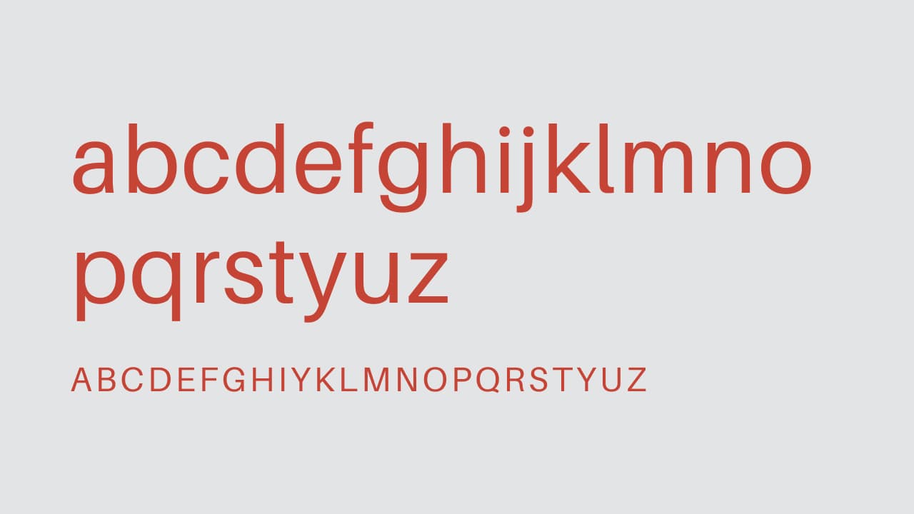
Scunthorpe Sans
Scunthorpe is a small town in England that I used to pass on my train travels to Edinburgh. Nothing about it stands out. But now there’s a font named after it. And it’s a really interesting font because it automatically censors some of the nasty words in the English language. The authors of the font used ligatures to do it—that’s genius! I love the presentation on the website as well!
Cool Articles
Micro-Typography: How To Space And Kern Punctuation Marks And Other Symbols
We already know that there are different sizes of space in typography, but here’s a really cool article that will teach you how and when to use which one.
How typefaces influence you
There’s existing research that suggests that typefaces can have a significant impact on our perception. Here’s (another) article looking at typefaces used in politics.
Typographic doubletakes
We covered the basics of combining typefaces in the Better Web Type course. Jonathan Hoefler takes a look at five more ways of finding cool and original combinations.
The fonts in popular things identified Vol. 1
Have you ever watched a series on Netflix and wondered what font they used for the logo or the credits? I know I have, it happens to me all the time. Apparently, this happens to Jeremiah Shoaf from Typewofl too as he just started a new series of blog posts about it.
This content originally appeared on Better Web Type and was authored by Matej Latin
Matej Latin | Sciencx (2020-05-20T13:45:24+00:00) Cool new stuff in web typography in May ’20. Retrieved from https://www.scien.cx/2020/05/20/cool-new-stuff-in-web-typography-in-may-20/
Please log in to upload a file.
There are no updates yet.
Click the Upload button above to add an update.
