This content originally appeared on Jonnie Hallman (@destroytoday) and was authored by Jonnie Hallman (@destroytoday)
Now that I’ve decided to bring back onboarding to Cushion, I need to design it. From my design explorations over the past few months, I have a new form design I can start to introduce that’s more accessible and keyboard-friendly. It involves treating input fields as blocks that contain the labels as well. With this approach, I can easily show a focus ring when active, which wasn’t always easy with the current Cushion—as a matter of fact, I’m pretty sure I simply disabled focus rings. Noticing that I’m already straying off topic, the focus of the onboarding is not the form design—I’m just excited to start using it.
I didn’t spend too long iterating various ideas for the onboarding steps, since I’m working on limited time and I can always launch it, then iterate as it’s live. The purpose of the onboarding is to be good enough for folks to go through it, answer a few questions, and feel eased into the app—rather than dropped in without a parachute. I can measure any drop-off with Mixpanel, so if there is an issue with one of the onboarding steps, I can spot it and quickly address it.
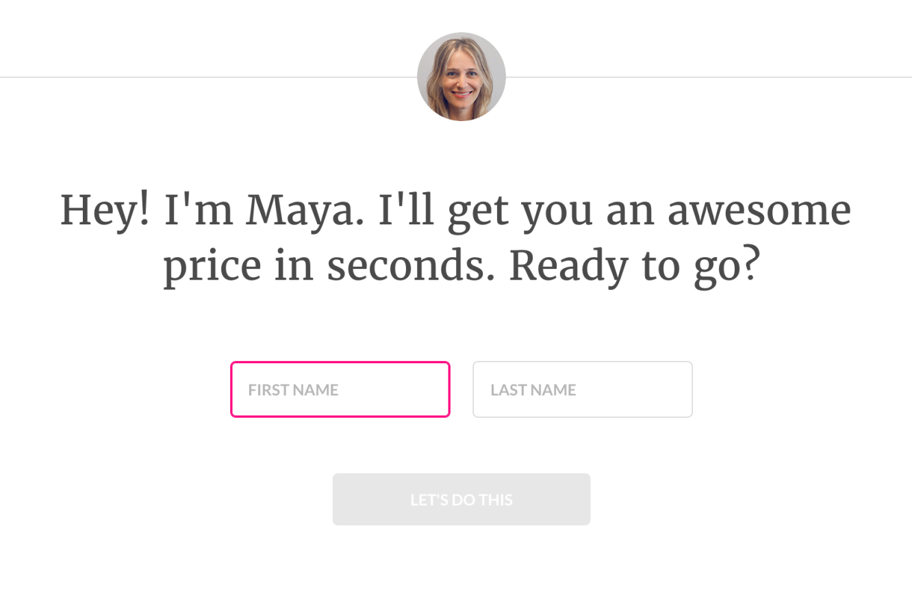
A few months ago, while going through all the longstanding to-dos on my list during the COVID lockdown, I signed up for renters’ insurance with Lemonade. Their onboarding was expectedly long considering it’s an insurance company, but I didn’t mind it. The main reason was that it felt friendly. They treated onboarding like a conversation, with an avatar of “Maya” at the top throughout the entire process. The questions came across casual and human-friendly rather feeling like I was chatting with a stiff insurance bot. I actually enjoyed the experience, so I wondered if using myself could produce the same effect, while also reiterating that this is a one-person operation—a fact that often shocks people. It might be super weird and awkward to include myself, but I might as well give it a shot.
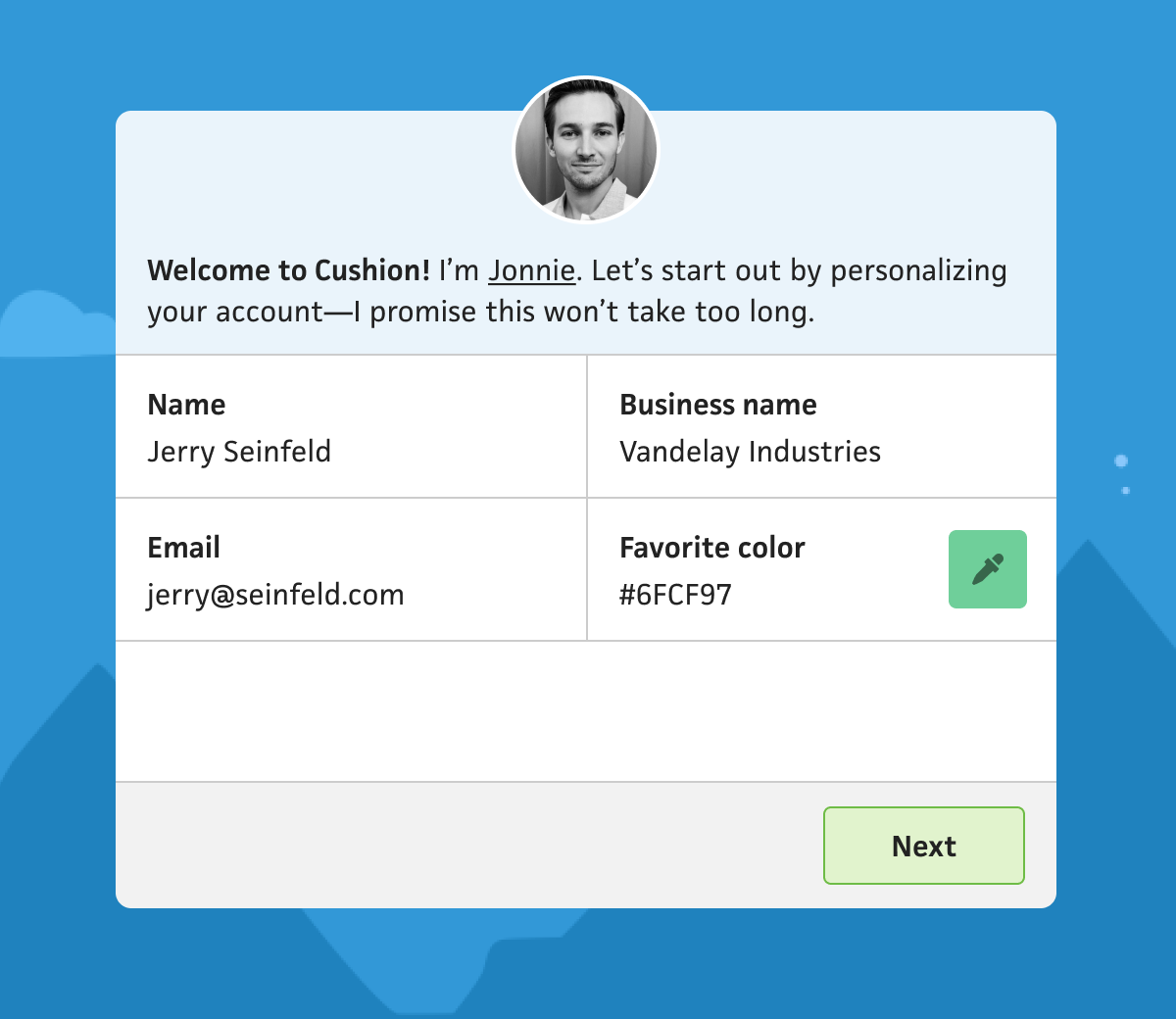
I wanted to start with a softball, so I have users fill out their name, business name, and favorite color. The name helps me with a more personalized support experience rather than talking to an email address. The business name appears on invoices and in invoice emails, but sometimes folks don’t know they can set it or where to set it, so including it here simply gets it out of the way. I do include the email address, but this will be pre-populated by the sign up form. Showing it again might be helpful to catch any typos, but also, I just needed to balance the form and it’s a good placeholder for now. Last is the favorite color, which still hasn’t been factored into the app, but I think it’s a lighthearted way to introduce folks to certain UI elements in Cushion, like the color picker.
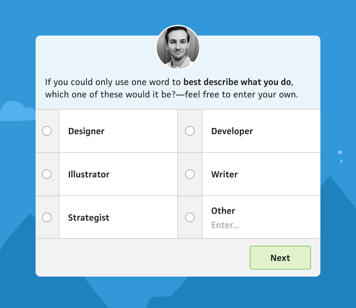
Next, I think I might ask users what best describes what they do. I’m really curious about this one because it’ll help me find any wedges in the user base. If I can discover that 50% of Pro subscribers are writers, I can focus on writers when it comes to marketing Cushion. I’m trying to keep this simple by limiting it to one word rather than feeling like people should differentiate ”UX designer” from “product designer” from “UI designer”, etc. However, if the user is an editorial illustrator vs a children’s book illustrator, those are two very different work experiences (sometimes same day turnarounds vs several month-long projects), but I don’t need to get too detailed yet. I can always follow up with a 2nd step once they’re in the app. Part of me does worry that my initial batch of presumed professions is way off from the majority of the user base, but I think it’s a good start. If I start seeing a ton of repeat “others”, I can adjust the form.
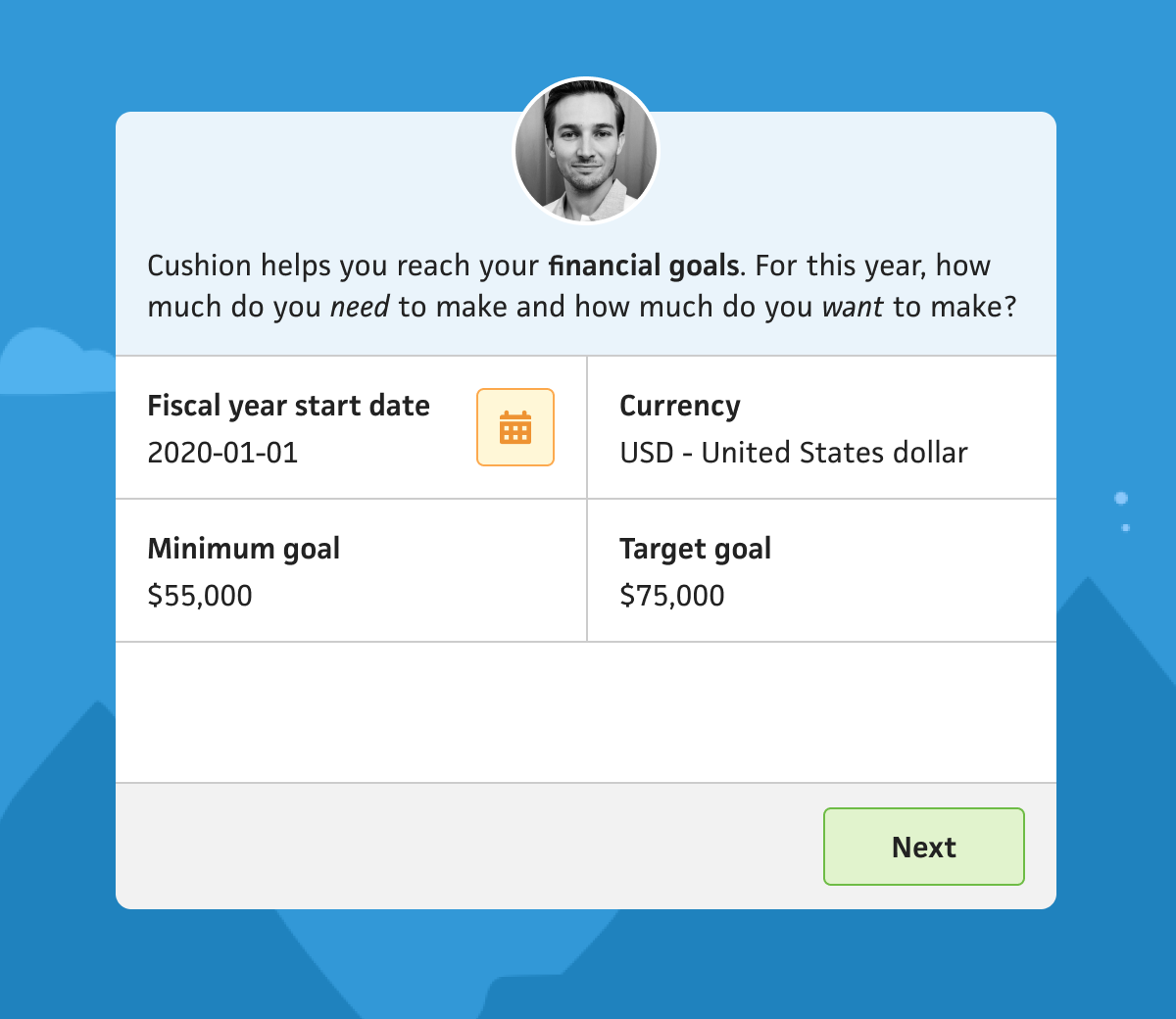
The following step is more app-focused than personalizing the user, and it’s a step I’ve always included in the previous onboarding iterations. Every single time I’ve analyzed usage or released a questionnaire for folks, budgeting and financial goals are always top of the list when it comes to what people value the most in Cushion. I think it truly helps keep freelancers on track in a world where it’s up to them to both define their salary and make enough throughout the year to pay for it. Because of that, I love including this step. I think it provides the first glimpse at how Cushion can help them rather than just be yet another invoicing/scheduling/whatever app.
I also take this opportunity to get a couple more settings out of the way, since the default currency in Cushion is USD and the first thing anyone who isn’t in the US needs to do is update their currency. As for the goals, including both the minimum and target goals show users that Cushion recognizes that these are two different things in the freelance world. Since freelancers are in control of the projects they take on and how to price them, they need to know exactly how much they absolutely need to make, which is hopefully different from how much they want to make. Cushion does have a third “stretch goal”, which is intended for those years where you’re absolutely crushing it and want to keep going, but it often confuses people, so I didn’t include it. I figure by providing two goals, I can simply calculate the stretch goal to start by mimicking the difference between the minimum goal and target goal.
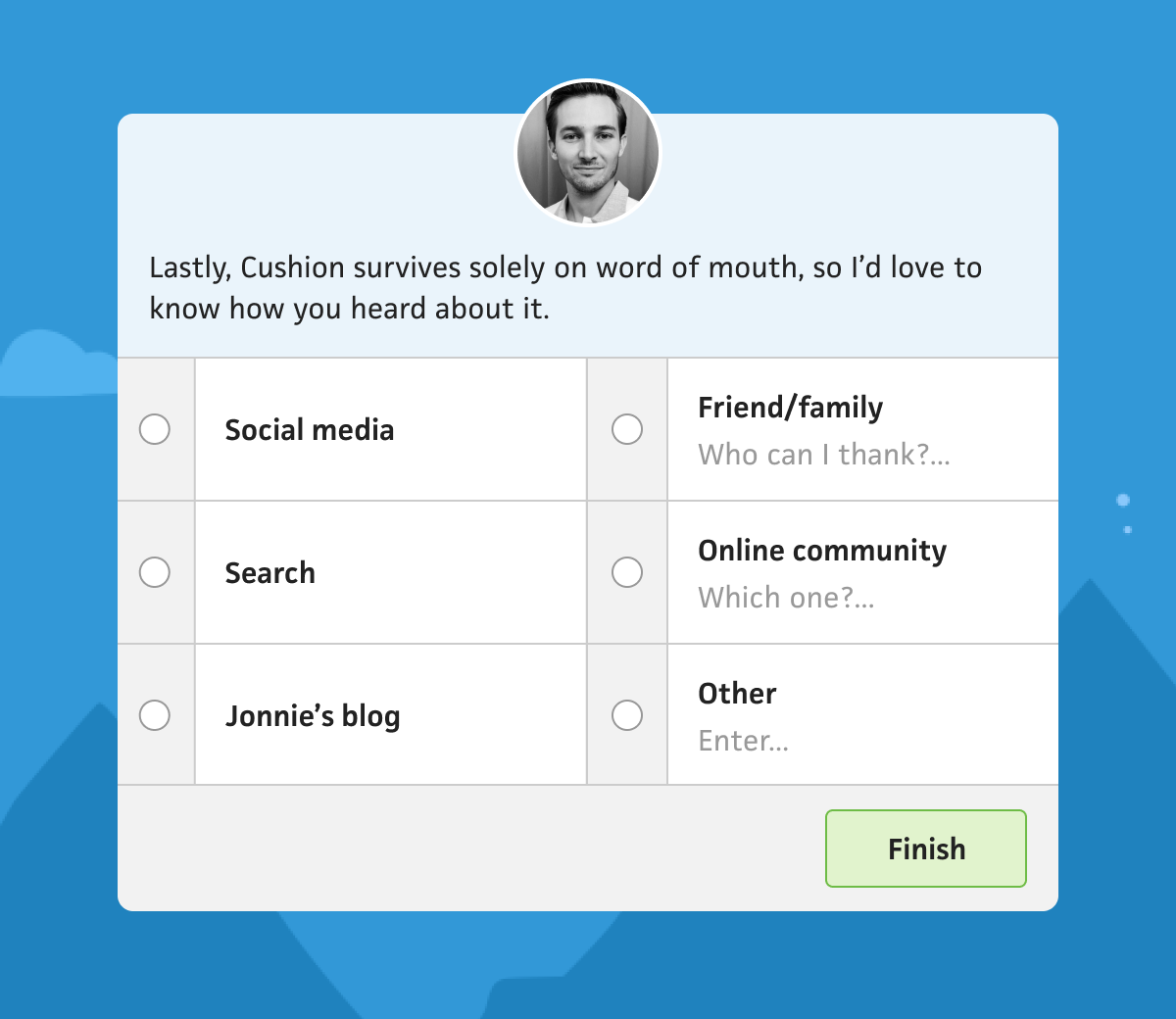
At this point, everything’s up in the air for me. I could take the route of asking folks how they heard about Cushion, which is incredibly value for me, or I could simply thank them for signing up, which has been a hit in the past. I’ve also considered other options, like asking whether they’re a solo freelancer or a small studio, or where they land on the freelancer spectrum, between first-timer vs lifetime freelancer. Another idea is to ask which aspects of Cushion they’re most interested in using—budget, invoicing, scheduling, time-tracking, etc. This could really help me learn what they’re after ahead of time, but also guide them better throughout the app. At the same time, I’d hate for this onboarding to come off like it’s more for me than it is for them. I keep reminding myself that there could also be opportunities post-signup where I can ask certain questions.
Aside from designing onboarding for the folks who truly want to benefit from Cushion, I’m also thinking about the people who kick the tires for two seconds, then bounce. I imagine they’re also the type to enter incorrect info that could potentially mess up the results, so I’m thinking about included a “skip” button for each step, so those people don’t need to set anything (and I can disregard much of what they do). I realize there are probably still real potential subscribers in that bunch, but I’d bet that the longer-term users are the ones who take the time. We’ll find out.
This content originally appeared on Jonnie Hallman (@destroytoday) and was authored by Jonnie Hallman (@destroytoday)
Jonnie Hallman (@destroytoday) | Sciencx (2020-08-13T07:36:00+00:00) A friendly onboarding flow. Retrieved from https://www.scien.cx/2020/08/13/a-friendly-onboarding-flow/
Please log in to upload a file.
There are no updates yet.
Click the Upload button above to add an update.
