This content originally appeared on Bits and Pieces - Medium and was authored by Chameera Dulanga
Why You Should Use Picture Tag Instead of Img Tag
Resolution Switching, Art Direction, Chrome DevTools Support, and More

Using images and animations in user interfaces has become a common thing in modern web applications. Although these modern designs are focused on improving your application’s user experience, things can get backfired if those images are not responsive for all devices.
As developers, we must fulfill all these requirements. But most of the time, we are missing out on some small things which can make a huge difference since we are searching for solutions at a higher level.
Choosing between picture tag and img tag can be such a tiny decision, but you will be able to improve both user experience and performance if you make the right choice.
This article will discuss the difference between the picture and img tags and what makes picture tag more prominent than img tag.
Next time you create a React image component — make sure to implement your soon-to-be-learned best practices in it. Return the correct tag according to the received props and take care of all necessary fallbacks. You can even share it on Bit.dev’s component hub (using Bit) to make it available for your team as well as your future self. This way, you’ll have a super-optimized image component that you can use in all your web projects, without giving it a second thought.
Why img Tag is Not Enough for Modern Web Applications?
As we all know, the Img tag has been one of the core elements in HTML for a significant period, and there have been no doubts about its simpleness and usability.
However, with the development of devices of various screen sizes, resolutions, and complex user requirements, questions have begun to raise about its responsiveness and ability to be used in multi-device applications.
All these questions can be grouped into two major issues;
- Resolution Switching — Problems of serving smaller size images for narrow screen devices.
- Art Direction — Problem of showing different images on different screen sizes.
Now, let’s see how these issues have been addressed and the picture tag’s additional features.
Resolution Switching Using srcset & sizes Attributes
As I mentioned earlier, modern-day web designers often use high-resolution images to increase user attraction. But as developers, we must be really careful to choose the correct HTML element.
Suppose you use a simple Img tag for high-res images. In that case, that same image is used in each device your application runs, and indeed it will result in performance issues in devices with lower screen resolutions like mobile devices.
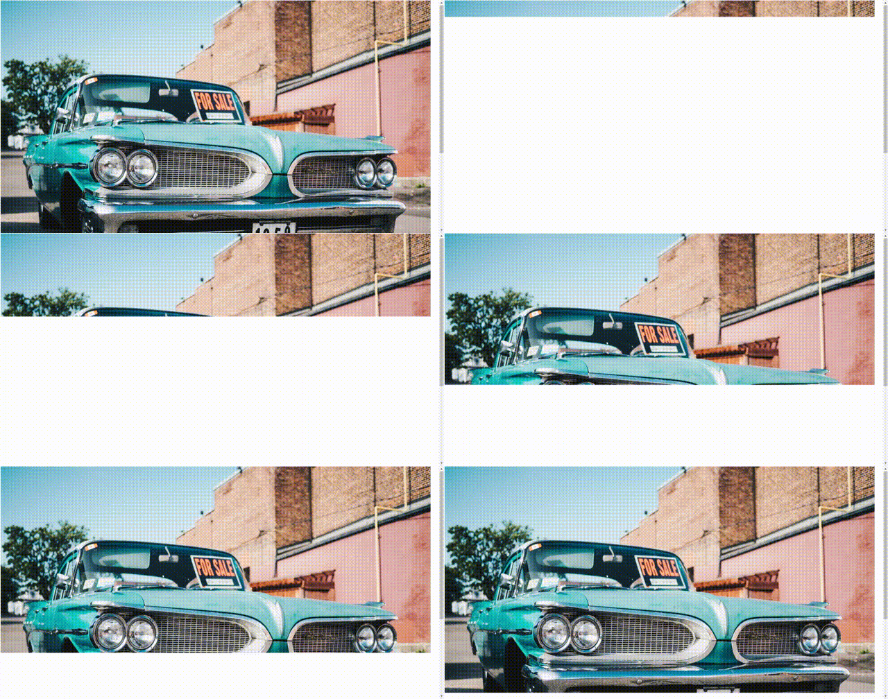
This could result in longer image loading times and top to bottom partial image loadings.

This issue can be easily addressed with thepicture tag by using srcset and sizes attributes.
<picture>
<source
      srcset="small-car-image.jpg 400w,
              medium-car-image.jpg 800w,
              large-car-image.jpg 1200w"
      sizes="(min-width: 1280px) 1200px,
             (min-width: 768px) 400px,
             100vw">
<img src="medium-car-image.jpg" alt="Car">
</picture>
srcset attribute accepts multiple images with their respective width in pixels, and the browser uses these values to choose between provided images. In the above example, there are 3 versions of the same image in 3 different sizes
The sizes attribute defines the space that the image will take up on the screen. In the above example, the image will take up 1200px if the screen’s minimum width is 1280px.
Having said that, it is advisable not to use the Picture tag just for Resolution Switching since the same can be achieved using the updated version of the Img tag (which has more browser support)
<img srcset="small-car-image.jpg 400w,
             medium-car-image.jpg 800w,
             large-car-image.jpg 1200w"
     sizes="(min-width: 1280px) 1200px,
            (min-width: 768px) 400px,
            100vw"

     src="medium-car-image.jpg" alt="Car">
But, in most cases, we need to handle both Resolution Switching and Art Direction simultaneously, and the picturetag is the best solution.
So let’s see how we can resolve Art Direction using the picture tag.
Art Direction Using media Attribute
The main idea behind Art Direction is to display different images based on the screen sizes of the device. In most cases, an image that looks fabulous on larger screens may get cropped or look so small when you switch to mobile.
We can address this issue by providing different versions of the image for different screen sizes. These different versions can be landscape, portrait, or any customized version of the same image.
With picture tag, we can easily achieve resolution switching by using multiple source tags inside the picture tag.
<picture>

   <source ....>
   <source ....>
   <source ....>
</picture>
Then we can use media attribute to define different media conditions where these sources will be used. We can also use srcset and sizes attributes in a similar manner as we discussed in the previous section.
The following example shows a complete example of using Art Direction and Resolution Switching using a picture tag.
<picture>

   <source media="(orientation: landscape)"

      srcset="land-small-car-image.jpg 200w,
              land-medium-car-image.jpg 600w,
              land-large-car-image.jpg 1000w"

      sizes="(min-width: 700px) 500px,
             (min-width: 600px) 400px,
             100vw">

   <source media="(orientation: portrait)"

      srcset="port-small-car-image.jpg 700w,
              port-medium-car-image.jpg 1200w,
              port-large-car-image.jpg 1600w"

      sizes="(min-width: 768px) 700px,
             (min-width: 1024px) 600px,
             500px">

   <img src="land-medium-car-image.jpg" alt="Car">
</picture>
If the screen orientation is landscape browser will show the images from the first image set, and if the orientation is portrait browser will use the second set. In addition to that, you can use media attribute with max-width and min-width parameters:
<picture>
     <source media="(max-width: 767px)" ....>
     <source media="(min-width: 768px)" ....>
</picture>
The last img tag is there for backward compatibility for browsers that do not support picture tags.
Using with Partially Supported Image Types
With the rapid development of technologies, different types of modern image types are introduced day by day. Some of these types such as webp, svg , and avif provide a higher user experience level.
On the other hand, there are limitations in some browsers on these modern image types, and things will get backfired if we don’t use the compatible image types.
But, we can easily address this issue by using Picture tag since it allows us to include multiple sources inside that.
<picture>
  <source srcset="test.avif" type="image/avif">
  <source srcset="test.webp" type="image/webp">
  <img src="test.png" alt="test image">
</picture>
The above example includes three image types from avif, webp, and png formats. First, the browser will try avif format, and if that fails, it will try webp format. If the browser does not support both of these, it will use png image.
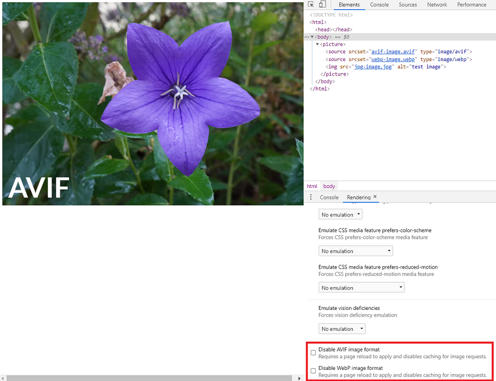
Things got more interesting about picture tag when Chrome announced that “DevTools will provide two new emulations in the Rendering tab to emulate partially supported image types”.
From Chrome 88 Onwards, You Can Use Chrome DevTools to Check Browser Compatibility with Image Types.

Final Thoughts
Although we talk about why the picture tag is more prominent than the img tag, I must insist that the img tag is not dead or won’t be dead sooner.
If we use the provided attributes like srcset and size wisely, we can get the maximum out of the imgtag. For example, we can resolve Resolution Switching only using the img tag.
On the other hand, we can use picture tag to achieve both Resolution Switching and Art Direction easily using media queries and other provided attributes.
The ability to work with partially supported image types and Chrome DevTools support can be recognized as additional plus points for picture tag.
However, both these elements have their pros and cons. So we must carefully think and use the most suitable element based on our requirements.
Thank you for Reading !!!
Learn More
- How we Build a Design System
- Technique for Color Blind Friendly Web Apps using Chrome DevTools
- Improve Page Rendering Speed Using Only CSS
Why You Should Use Picture Tag Instead of Img Tag was originally published in Bits and Pieces on Medium, where people are continuing the conversation by highlighting and responding to this story.
This content originally appeared on Bits and Pieces - Medium and was authored by Chameera Dulanga
Chameera Dulanga | Sciencx (2021-01-25T22:27:31+00:00) Why You Should Use Picture Tag Instead of Img Tag. Retrieved from https://www.scien.cx/2021/01/25/why-you-should-use-picture-tag-instead-of-img-tag/
Please log in to upload a file.
There are no updates yet.
Click the Upload button above to add an update.
