This content originally appeared on DEV Community and was authored by Karmasakshi Goyal
I talk about how to embrace the notch to make your PWAs cover the entire screen on iOS devices.
The Problem
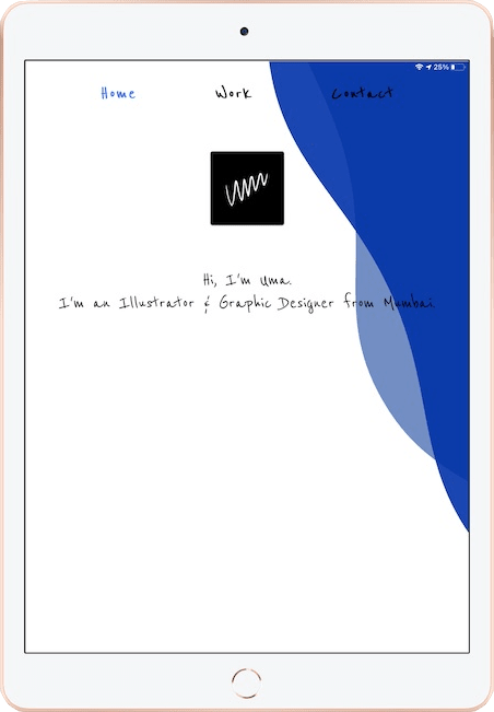
To avoid content being hidden under notches, Apple limits the viewport of PWAs by default:
Apple also limits the viewport on iPhones and iPads without a notch to the area below the Status Bar:
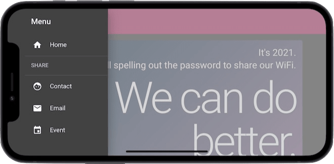
If you want your PWA to embrace the notch and make it cover the entire screen, you will need a small hack.
The Solution
Set your document to flow to the notch area:
// index.html

<head>
  ...
  <meta name="viewport" content="initial-scale=1, viewport-fit=cover, width=device-width"></meta>
  <meta name="apple-mobile-web-app-capable" content="yes"></meta>
  <meta name="apple-mobile-web-app-status-bar-style" content="black-translucent"></meta>
  ...
</head>
Note that this will set the font color of the iOS Status Bar to white.
The hack: Set the minimum height of the document to 100% plus the height of the safe area on top. This will prevent a white bar in the bottom which gets shown since you moved the document “up”.
Also, add safe area padding to all 4 sides to ensure content is never hidden under the notch regardless of the device orientation:
/* styles.css */

html {
  min-height: calc(100% + env(safe-area-inset-top));
  padding: env(safe-area-inset-top) env(safe-area-inset-right) env(safe-area-inset-bottom) env(safe-area-inset-left);
  ...
  background-attachment: fixed;
  background-image: url('/bg.svg');
  background-position: center;
  background-repeat: no-repeat;
  background-size: cover;
}
The Result
Bonus Tip
If you have elements with position: fixed (e.g. toast, sidebar, bottom navigation, etc.) add the safe area padding to their containers or themselves, whichever is relevant. You only need to pad the sides where the notch can possibly be positioned.
/* styles.css */

.left-sidebar {
  padding: env(safe-area-inset-top) 0 0 env(safe-area-inset-left);
}
For fixed headers, you can either choose to display the header below the notch area (like Share By Cam does) or pad relevant sides of the header instead of html to fill the notch area.
I developed this hack after several retries way back on iOS 12, but never shared hoping it would be fixed by Apple. Looks like this quirk is here to stay, so be it. Cheers!
Shout-out to MockUPhone for the brilliant phone mocking tool!
This content originally appeared on DEV Community and was authored by Karmasakshi Goyal
Karmasakshi Goyal | Sciencx (2021-02-10T10:35:43+00:00) Make Your PWAs Look Handsome on iOS. Retrieved from https://www.scien.cx/2021/02/10/make-your-pwas-look-handsome-on-ios/
Please log in to upload a file.
There are no updates yet.
Click the Upload button above to add an update.


