This content originally appeared on Telerik Blogs and was authored by Peter Milchev
Longing to travel again? Don't worry, we’ve got you covered with our improvised lucky wheel powered by Card and Rotator controls for ASP.NET AJAX.
Longing to travel again? I bet you are. We all are. Don't worry, we’ve got you covered with our improvised lucky wheel . And though now it's not the time to travel, we're looking forward to the exciting moments in the near future. So, have a spin and find out what’s your lucky destination. Don’t be shy and share your results in the comments.
The “lucky wheel” presented in this blog post is powered by the RadRotator and the RadCard components, part of the Telerik UI for ASP.NET AJAX suite. Find out how to easily leverage the predefined styles of our new Card component and integrate it with any template control with the integration demo revealed later on in the blog.
What we’re going to cover in this blog post:
Card Component Overview
First introduced in R3 2020, the RadCard is one of our latest additions to the 120+ components (and even more to come soon) of our rich and mature Telerik UI for ASP.NET AJAX suite. So, make sure you upgrade to the latest version before you try it out yourself! Read the whole blog to get more familiar with it and utilize its full potential.
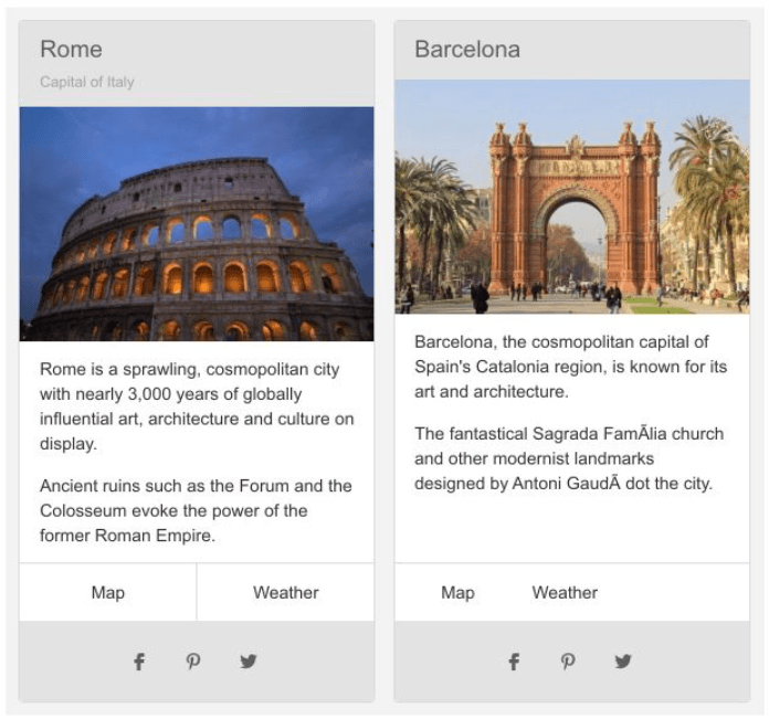
The Telerik UI for ASP.NET AJAX Card control Is designed to help you organize content when building catalogues, e-shops, dashboards or even blogs. It quickly grabs the user’s attention with its sleek layout, consisting of a title, image, some text as the body and perhaps a footer. Use cards to create beautiful UIs that enable your users to easily access the information they are most interested in.

The component itself is a very flexible web control inheriting the RadWebControl class and can contain plain HTML elements as well as other Web Forms controls. Allowing you to create the Card from the server side, add controls to it programmatically and access them at a later stage. You can achieve simplicity in your designs with as little code as possible, especially if you are not a huge fan of CSS. But even if you are—it will save you development time and give you a good kick-start.
Features and Functionality
The best part of the Card is that it is extremely customizable. Benefit from a limitless number of options and match the Card to the unique requirements of your application.
To easily achieve the desired appearance, you can choose from some of the predefined CardComponents, most of them inheriting the System.Web.UI.HtmlControls.HtmlContainerControl. The building blocks can be further customized with subcomponents as header, title & subtitle, body, footer, actions and more. Check out our documentation page for a full list of the available properties and their values. Depending on the CardComponent used, you will have some predefined properties that will set the necessary CSS classes for you. For fine-tuning, you can always add HTML attributes, custom classes, and inline styles to both the Card and its components.
Another strong trait of the RadCard component is its ability to seamlessly fit in an ItemTemplate. It allows you to not only to create the card structure by adding its card components, but also to add binding expressions or even other controls. With the assistance of a few helper CSS classes, the content of the card can be oriented vertically or horizontally, and the actions can be stretched, centered, aligned to the start or to the end, as demonstrated in the Card Orientation demo.
It is so flexible that you can easily customize the whole component to rotate on hover with just a couple of styles. Imagine what you can do with more styles and a tiny bit of JavaScript. Feel free to implement the code below on your page and enjoy the RadCard acrobatics.
<style>
    .RadCard {
        -webkit-transition: -webkit-transform .8s ease-in-out;
        transition: transform .8s ease-in-out;
    }

    .RadCard:hover {
        -webkit-transform: rotate(360deg);
        transform: rotate(360deg);
    }
</style>

<telerik:RadCard runat="server" Width="150px" Skin="Material">
    <telerik:CardHeaderComponent runat="server">
        <telerik:CardTitleComponent runat="server">
            Hover me, I will do a barrel roll for you :)
        </telerik:CardTitleComponent>
    </telerik:CardHeaderComponent>
</telerik:RadCard>
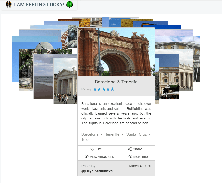
The rich functionality of the Card allows it to be used in many app scenarios. Some examples are integration with other controls such as Repeater, ListView and DataGrid, where you can represent the data in a beautiful, consistent and structured way. The “Lucky wheel” demo shown in the next section of the blog demonstrates an integration with a RadRotator. The carousel-like wheel represents a section of rotating images, which when selected display detailed information for the specific card.
The “Lucky Wheel” Integration Demo
We are all dreaming about our next vacation and so badly need to get away. Whether you’re wishing for a sun-soaked beach vacation, safari in Africa or you simply can’t decide where to go next—spin the lucky wheel and see where the wind takes you.
A little walkthrough of what you will see in the Lucky wheel with RadRotator online demo—the landing page is a Rotator control featuring a number of travel destinations. Each destination is represented by a Card that consists of a title, image, description, a list of tourist attractions as well as a few action buttons. Select a destination by clicking on an image or just spin the wheel by clicking the “I am feeling lucky” button.
Once the destination is selected, you can check its details by clicking the “More Info” action. It will load our TripXpert sample application in a RadWindow. You didn’t forget our lovely travel planner sample application, right?
The “Attractions” action button on the other hand will open another RadWindow, this time with a local RadListView that uses a different RadCard layout for its ItemTemplate. There you can see the attractions you can visit for the destination you have selected.
Wrap Up
In this article we have covered the basics of the Card component, its functionality and integration with other controls as RadRotator. Whether you’re thinking of developing a travel app or simply want to have some fun—feel free to try out the “Lucky wheel” and share your thoughts in the comments section below.
This content originally appeared on Telerik Blogs and was authored by Peter Milchev
Peter Milchev | Sciencx (2021-02-11T03:27:59+00:00) "Lucky Wheel" Your Next Travel Destination. Retrieved from https://www.scien.cx/2021/02/11/lucky-wheel-your-next-travel-destination/
Please log in to upload a file.
There are no updates yet.
Click the Upload button above to add an update.

