This content originally appeared on DEV Community and was authored by Yoav Kadosh
For the past 3 years, I've been working with a great team of UI developers on one of Amdocs' flagship products, and in the process, we've faced many challenges.
To solve these challenges, we developed a set of React components and hooks, each dedicated to solving a single UI challenge.
Recently, we decided to release these components and hooks as an open-source library, called webrix.js.
Unlike many other component banks out there that provide feature-packed, fully-branded end-user components, we decided to take a different approach and develop a set of small, single-purpose, unbranded components. This gives you more freedom to develop your own component bank with the UX that best matches your domain.
Below are some of the components you can find in Webrix.js:
Movable

The <Movable/> component can be used to create movable elements, with optional constraints. We use <Movable/> to create things like sliders, resizers, movable modals, scrollbar handles, and more. See more <Movable/> examples here.
Resizable
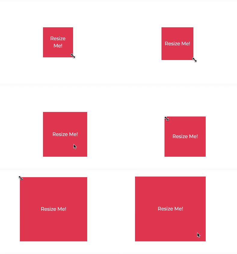
The <Resizable/> component can be used to create resizable elements, with optional constraints. We use <Resizable/> for creating resizable modals, image editing tools, and resizable layouts. See more <Resizable/> examples here.
Poppable
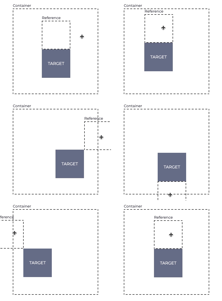
The <Poppable/> component can be used to create elements that "pop out" of the screen. We use <Poppable/> for creating popups, menus, tooltips, dropdowns, and more. The <Poppable/> has a built-in mechanism for overflow avoidance and dynamic z-index calculations. See more <Poppable/> examples here.
Scrollable
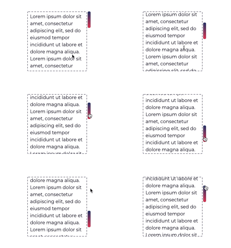
The <Scrollable/> component can be used to create elements with scrollable content and fully-customizable scrollbars. The elements behave just like a natively scrollable element, so working with them is pretty straightforward, and requires no CSS hacks. See more <Scrollable/> examples here.
Collapsible

The <Collapsible/> component allows you to collapse/expand an element with arbitrary content height and apply a nice transition to it. This is a challenge to achieve with CSS only, so we use a mix of JS & CSS to overcome this (we discuss the solution further in the documentation). See more <Collapsible/> examples here.
These are just a few of the available components in Webrix.js
Since these components are already used by some of Amdocs' products, they are field-tested and have reached a certain maturity level.
I invite you to visit our documentation and take a look at some of the examples that were created using Webrix.js.
Also, starring our project on GitHub will help us a lot! ?
This content originally appeared on DEV Community and was authored by Yoav Kadosh
Yoav Kadosh | Sciencx (2021-02-17T12:34:40+00:00) Webrix.js – Building Blocks for Interactive React Apps. Retrieved from https://www.scien.cx/2021/02/17/webrix-js-building-blocks-for-interactive-react-apps/
Please log in to upload a file.
There are no updates yet.
Click the Upload button above to add an update.
