This content originally appeared on DEV Community and was authored by Thomas Kuenneth
Welcome back to the third installment of (de)composing action bars. Today we look at something like this:
We used to implement it in xml. First the layout:
<com.google.android.material.bottomnavigation.BottomNavigationView
  android:id="@+id/bottom_navigation"
  android:layout_width="match_parent"
  android:layout_height="wrap_content"
  app:layout_constraintBottom_toBottomOf="parent"
  app:layout_constraintEnd_toEndOf="parent"
  app:layout_constraintStart_toStartOf="parent"
  app:menu="@menu/bottom_navigation_menu" />
Then the content:
<?xml version="1.0" encoding="utf-8"?>
<menu xmlns:android="http://schemas.android.com/apk/res/android">
  <item
    android:id="@+id/page_home"
    android:enabled="true"
    android:icon="@drawable/ic_baseline_home_24"
    android:title="@string/home"/>
  <item
    android:id="@+id/page_info"
    android:enabled="true"
    android:icon="@drawable/ic_baseline_info_24"
    android:title="@string/info"/>
</menu>
According to its docs, BottomNavigationView represents
a standard bottom navigation bar for application.
It is an implementation of material design bottom
navigation.Bottom navigation bars make it easy for users to
explore and switch between top-level views in a single tap.
They should be used when an application has three to five
top-level destinations.
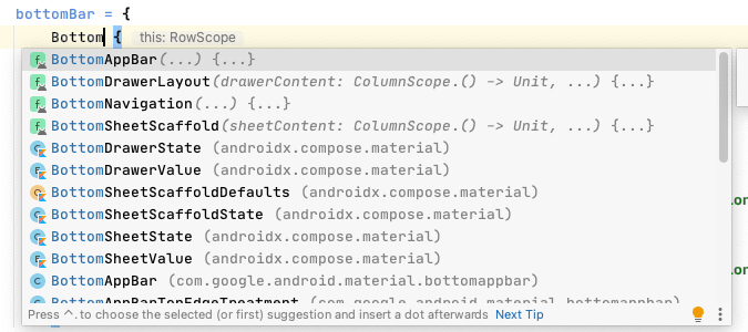
Let's see how to do this with Jetpack Compose. If you start typing Bottom you get a plethora of choices:
So there is the BottomAppBar() composable, which fits nicely in Scaffold(). The docs say:
A
BottomAppBardisplays actions relating to the current
screen and is placed at the bottom of the screen. It can
also optionally display aFloatingActionButton, which is
either overlaid on top of theBottomAppBar, or inset,
carving a cutout in theBottomAppBar.
It may contain:
- Navigation drawer control
- Floating action button (FAB)
- Action icons
- Overflow menu control
Let's bake a simple one:
bottomBar = {
  BottomAppBar {
    IconButton(onClick = { }) {
      Icon(Icons.Filled.Menu, contentDescription = null)
    }
    Spacer(Modifier.weight(1f, true))
    IconButton(onClick = { }) {
      Icon(Icons.Filled.Favorite, contentDescription = null)
    }
    IconButton(onClick = { }) {
      Icon(Icons.Filled.MoreVert, contentDescription = null)
    }
  }
}
You may be wondering why I put in Spacer(Modifier.weight(1f, true)), which moves the actions to the end of the BottomAppBar.
According to the Material Design docs bottom app bars have different layouts based on the presence of a floating action button and its position in the bar. They dictate the number of actions that can be included in the bar.
Centered FAB
Use bottom app bars on home screens that feature a
navigation menu control and a prominent action (such as a
FAB). A minimum of one and a maximum of two additional
actions can be placed on the opposite side of the bar.
End FAB
Use a FAB on secondary screens that require a floating
action button and three to four additional actions.
No FAB
When no floating action button is needed, the bottom app
bar can accommodate a navigation menu icon and up to four
actions aligned on the opposing edge.
While this certainly looks beautiful this is not what my introductory example from the old world did. Please recall it was about toplevel navigation destinations.
There is a BottomNavigation() composable. To conclude this post, let's see how it works. According to the docs
BottomNavigationis a component placed at the bottom of
the screen that represents primary destinations in your
application.
BottomNavigationshould contain multiple
BottomNavigationItems, each representing a singular
destination.
This translates to something like this:
BottomNavigation() {
  BottomNavigationItem(
    icon = { Icon(Icons.Filled.Info, contentDescription = null) },
    label = { Text("About") },
    selected = false,
    onClick = { }
  )
  BottomNavigationItem(
    icon = { Icon(Icons.Filled.Settings, contentDescription = null) },
    label = { Text("Settings") },
    selected = false,
    onClick = { }
  )
}
This for sure looks great. How to actually implement navigation may, however, be worth another post. ? Have you used the composables I described here in your apps? I would love to hear your thoughts in the comments.
This content originally appeared on DEV Community and was authored by Thomas Kuenneth
Thomas Kuenneth | Sciencx (2021-02-23T15:26:55+00:00) From top to bottom…bars. Retrieved from https://www.scien.cx/2021/02/23/from-top-to-bottom-bars/
Please log in to upload a file.
There are no updates yet.
Click the Upload button above to add an update.


