This content originally appeared on Telerik Blogs and was authored by Maria Veledinova
Check out everything that's new in the latest Telerik UI for Blazor release. From the new Form component to improved validation and more, we aim to help you develop amazing Blazor apps!
Hey Blazor and Telerik UI for Blazor Folks, the native Blazor Form component is here and we are super excited to share with you the new updates that are part of Telerik UI for Blazor 2.22.0 release! Three Validation components, Grid Excel-like editing and navigation, TreeList enhancements, Window draggable, additional features in our input-based controls and more!
Read ahead to find out more about the full Telerik UI for Blazor 2.22.0 release components and features which you can plug and play in your Blazor Server and WebAssembly apps.
New Blazor Form Component
Form Component Overview
With the new Telerik Form component for Blazor, the generation and management of forms is simple thanks to the multiple built-in features, various parameters and exposed events. You can easily use the automatic generation of fields or achieve your own Blazor app-specific layout. Use custom editors, organize them into groups and columns, apply validation, set the Form orientation and more!
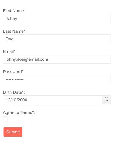
Telerik UI for Blazor Form Component
Telerik Blazor Form Using a Model or EditContext
You can use the Telerik Blazor Form Component with a model or EditContext.
To use the Form component with a model, simply add the <TelerikForm> tag and provide an object to the Model parameter of the component. To enable form validation, you need to add <FormValidation> tag in it and provide a validator—for example the DataAnnotationsValidator that comes with the Blazor framework. The Form also works with any validator (including third-party) that is compatible with the EditForm and EditContext such as ObjectGraphDataAnnotationsValidator and FluentValidation.
To use the Form component with an EditContext, you need to add the <TelerikForm> tag and provide an object of type EditContext to the EditContext parameter of the Form. To apply validation, you can use either the <FormValidation> tag or the extensions methods of the EditContext. This lets you employ more complex business logic that uses the EditContext features.
Form Automatic Generation of Fields
The Telerik Blazor Form can generate editors based on the model fields (from both a Model and EditContext).

Telerik UI for Blazor Form Autogenerated Fields
The following data types are supported out-of-the box and they use the following default editors:
- string → Telerik TextBox
- int, double, float, decimal → Telerik NumericTextBox
- Enum → Telerik DropDownList
- DateTime → Telerik DatePicker
- bool → Telerik CheckBox
Form Component Items
In addition to the default editors in the Form component, you can also use custom editors defined through the FormItem tag. To use custom editors, you specify their collection in the FormItems tag (a child of the TelerikForm tag).
The simplicity of the editors customization is provided by the multiple parameters exposed by the FormItem tag: LabelText, Id, Hint, Field, Field Type, Class, Template and more!

Telerik UI for Blazor Form Custom Editors
Form Component Groups
Forms often need to have their fields organized either logically or for a better user experience. You can easily arrange the fields in a Telerik Form component into groups using the FormGroup tag, which exposes the following parameters:
- LabelText — defines a label for a group
- Columns — defines the number of columns in a group
- ColumnSpacing — defines the space between the editors in a group
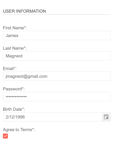
Telerik UI for Blazor Form Grouping
Form Component Orientation
The Form component can take vertical (default) and horizontal orientation. Setting the Form orientation to horizonal will place the labels to the left hand-side of the editors.
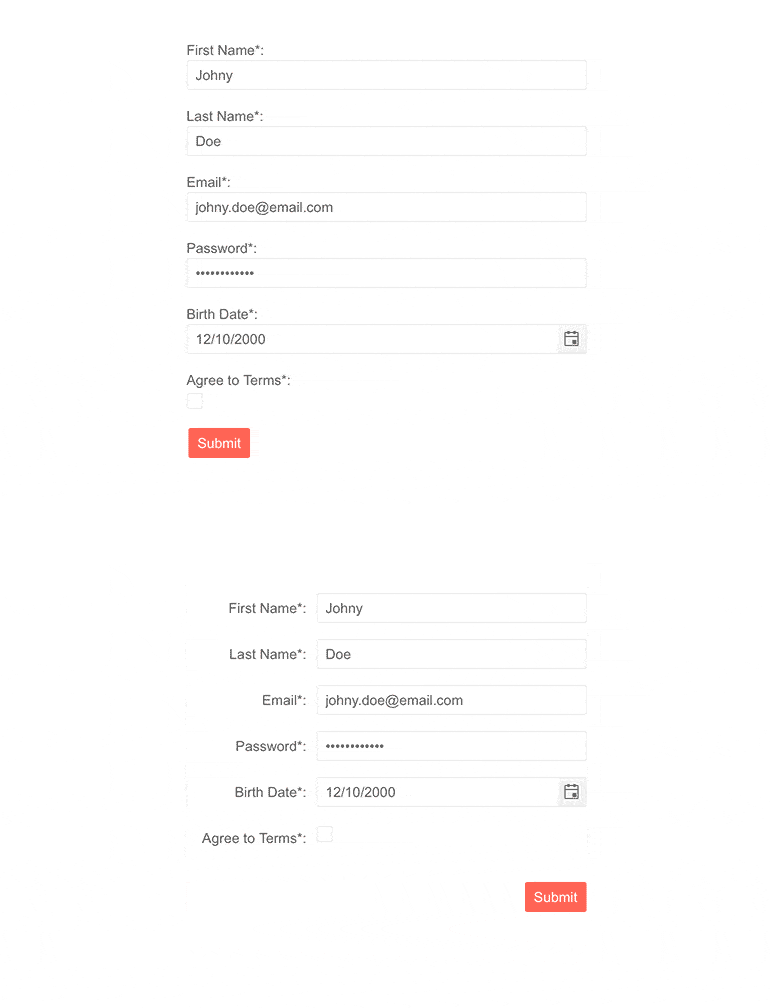
Telerik UI for Blazor Form Orientation
Form Component Events
The Telerik Form component exposes three events that allow you to respond to user actions and implement custom logic.
- OnSubmit — fires when the user clicks on the Submit button in the form and can be used to manually trigger validation of the EditContext and apply custom logic
- OnValidSubmit — fires when the form is submitted and there are no validation errors
- OnInvalidSubmit — fires when there are validation errors in the form upon its submission
Three New Validation Components
To enable easy styling and customization of validation messages in your Blazor app we shipped three options: TelerikValidationMessage, TelerikValidationTooltip and TelerikValidationSummary.
These components add customization and localization options on top of the standard ValidationSummary and ValidationMessage which the Blazor framework provides. The three Telerik Validation Components can be used together with the Telerik Form or with any form that provides an EditContext.
Let’s review the Telerik validation components, features and use cases for each of them.
TelerikValidationMessage
The Telerik Validation Message for Blazor is applicable per form field and expands the standard ValidationMessage provided by the framework. The TelerikValidationMessage includes built-in features for:
- Templates — these allow you to control and render custom content with the form validation messages
- Class — this allows you to add a custom CSS class to the span, that wraps the validation message
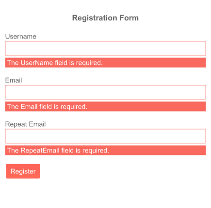
Telerik UI for Blazor Validation Message Template
TelerikValidationTooltip
Another way to point to an invalid input is using the Telerik Validation Tooltip component. It renders the validation message as tooltip when users hover the editor and shows up as popup rather than an inline element.
The TelerikValidationTooltip comes with options to adapt it any way you need by setting its:
- Position — the Position param takes a member of the TooltipPosition enum: Top (default), Bottom, Right, Left
- Template — allows you to render custom content in the validation tooltip
- Class— using the Class parameter you can add custom CSS class to the validation tooltip
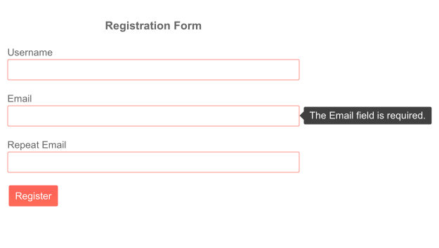
Telerik UI for Blazor Validation Tooltip Position
ValidationSummary
The Telerik Validation Summary for Blazor is built on top of the standard ValidationSummary provided by the framework and lets you customize the summary of all validation errors through Templates and Class Parameter.
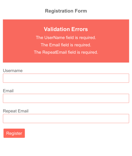
Telerik UI for Blazor Validation Summary Template
New Grid Features and Enhancements
Grid Excel-like Navigation and Editing
We enhanced the Blazor Grid InCell edit mode to allow smooth navigation and editing through the keyboard resembling the experience of managing data in Excel spreadsheets.
By using the Tab key users can go from one grid editor to the next one on the same row—respectively, with Shift+Tab, they can navigate to previous cell. Using Enter will activate “Edit mode” for a focused cell or will commit the changes and open the next row in the same column for editing. When a cell is opened for editing, it will focus all of its content (both with the keyboard, and with a mouse click) so you can start typing immediately.
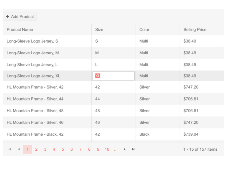
Telerik UI for Blazor Grid Excel-Like Editing
Grid cell edits can be committed in three ways:
- Using Enter to commit changes to current row and opening the cell underneath the last-edited cell for editing (useful when editing all rows, focusing on a single column, again in an Excel like fashion)
- Using Tab and navigating till the end of the current row, focus moves to the first cell in the next row
- Navigating away/clicking outside of the current Grid row
Grid Rows Checkbox-Only Selection
You can make the Grid rows selection exclusive only to the case when users have checked a dedicated checkbox column. This can easily be achieved by setting to true the new parameter CheckBoxOnlySelection of the GridCheckboxColumn. When this property is set to true, clicking elsewhere on the row with the mouse will not have a selection effect, thus you can reserve it for edit or other user actions.
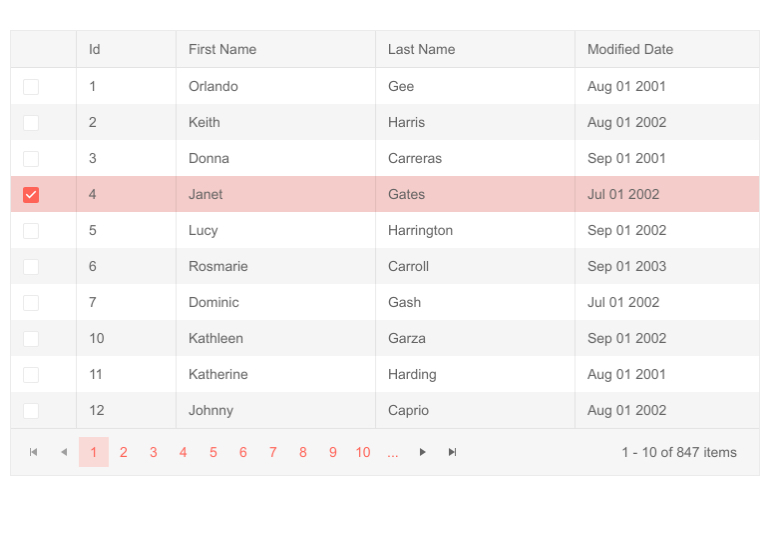
Telerik UI for Blazor Grid Checkbox-only Selection
Grid Custom Column Menu
With the 2.22.0 release we enhanced the Grid column menu with a column menu chooser template that allows you to rearrange and customize the column list.
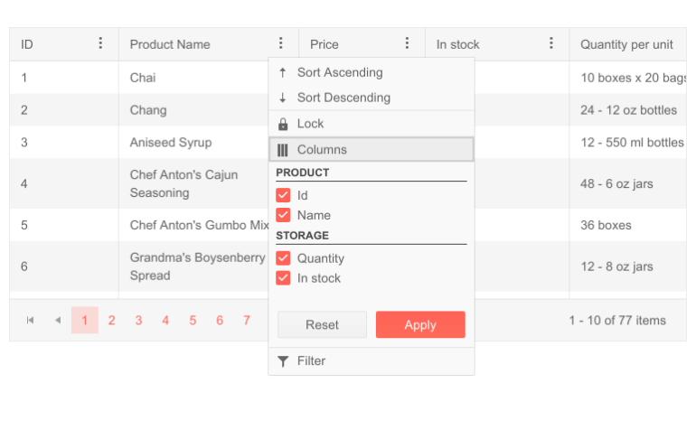
Telerik UI for Blazor Grid Custom Column Menu
TelerikCheckbox as a Default Boolean Editor
The TelerikCheckbox will replace the default boolean editor in the Telerik Grid component. Changing the previous <input type="checkbox"> to <TelerikCheckbox> will enable consistent styling when switching into edit mode.
Frozen Columns with Column Virtualization
With this release we are enabling the integration of two popular Grid features—frozen/locked columns and column virtualization. This will allow users to keep important columns visible while scrolling seamlessly through large volumes of Grid data that utilizes column virtualization.
Blazor Window Enhancements
Window Draggable
The Telerik Blazor Window component is now enhanced with draggable functionality. You can move the window around through its title bar, allowing you to easily rearrange the screen in a way it best fits your needs. Moving the Window is enabled by default and you can stop it by setting the Draggable parameter of the Window component to false.
In case you are using the “Left” and “Top” values to provide an initial position for a draggable window, you now need to make sure to @bind- them, so that they can update.
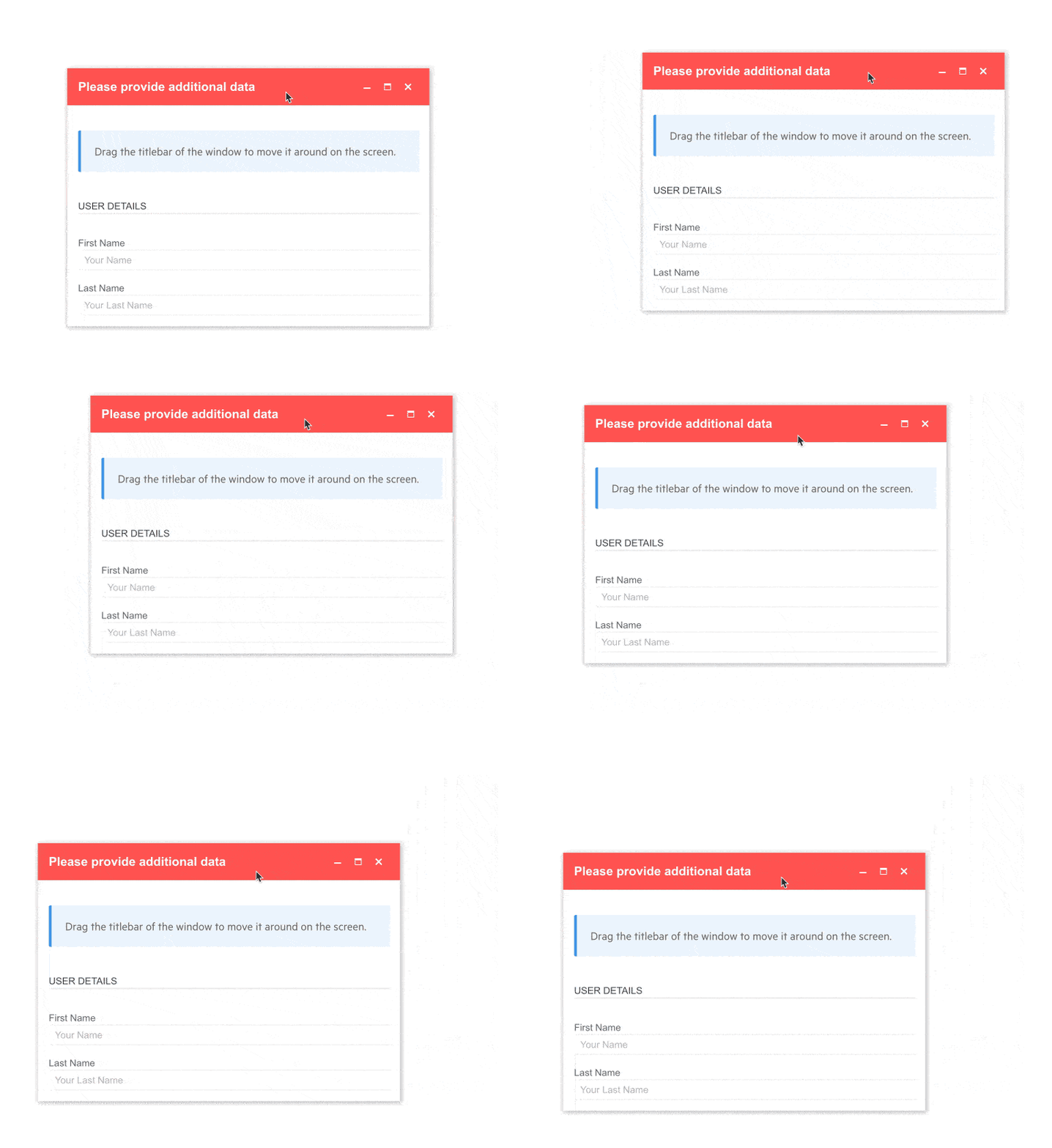
Telerik UI for Blazor Window Draggable
Blazor TreeList Component Enhancements
The TreeList component is another heavily used data component in Blazor applications, so we try to give it a little love with almost every release.
TreeList Excel-like Navigation & Editing
Users working with hierarchical data in the TreeList can now benefit from Excel-like editing and navigation. Keeping the same logic as in the Telerik Grid users can navigate through data in InCell edit mode with Tab (or Shift+Tab) and go into edit mode with the Enter key.
TreeList Checkbox-Only Selection
It is now possible to configure your TreeList for row selection only though a dedicated treelist checkbox column. This can easily be achieved by setting to true the new parameter CheckBoxOnlySelection of the TreeListCheckboxColumn.
TreeList TelerikCheckbox as a Default Boolean Editor
With the current release the TelerikCheckbox component will replace the default boolean editor in the Telerik Grid component, allowing consistent styles when editing data.
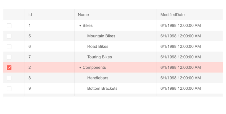
Telerik UI for Blazor TreeList Checkbox-only Selection
Input-based Components Enhancements
OnBlur Event
With the current Telerik UI for Blazor release, a large number of input-based components got their own OnBlur event. The OnBlur event fires when the component loses focus and is now exposed in the following list of components: AutoComplete, ComboBox, DateInput, Date and Time Pickers, DropDownList, MaskedTextBox, MultiSelect NumericTextBox,TextArea and TextBox.
TabIndex Property
We are complementing the list of components that already support TabIndex property such as ComboBox, DateInput, Date and Time Pickers, NumericTextBox, MultiSelect and more!
Download Telerik UI for Blazor 2.22.0
We encourage you try out the latest and greatest from Telerik UI for Blazor and let us know what you think!
- For everyone new to Telerik UI for Blazor—you can download a free trial of Telerik UI for Blazor 2.22.0 from the Telerik UI for Blazor page
- Telerik active license holders can grab the latest version from the “Your Account” page or directly update the Telerik.UI.for.Blazor NuGet package reference to version 2.22.0 in existing Blazor solutions
Thank You!
As always, thank you from the Telerik UI for Blazor Team at Progress. Please be sure to leave us your feedback at our dedicated Blazor feedback portal or in the comment section below!
This content originally appeared on Telerik Blogs and was authored by Maria Veledinova
Maria Veledinova | Sciencx (2021-02-24T18:57:33+00:00) Telerik UI for Blazor 2.22.0—Form, Validators, Grid Excel-like Editing and More!. Retrieved from https://www.scien.cx/2021/02/24/telerik-ui-for-blazor-2-22-0-form-validators-grid-excel-like-editing-and-more/
Please log in to upload a file.
There are no updates yet.
Click the Upload button above to add an update.
