This content originally appeared on Telerik Blogs and was authored by Maria Veledinova
Let’s take a look at the versatile new components and updated in Telerik UI for Blazor this month.
Hey Blazor and Telerik UI for Blazor folks,
It’s release time again, and this month Telerik UI for Blazor brings Gauges in every shape and form—Linear, Circular, Radial and Arc. Along with the data visualization UI additions, we have also shipped Media Query and Color Palette components. The Telerik UI for Blazor Team also focused on implementing some of the most voted-for items in the feedback portal, which brings an abundance of new features for existing components such as the Editor, Window, Date and Time Pickers, Form and the mandatory Grid enhancements that are a part of every new version.
Read the March release blog post below to find out more about the full 2.23.0 content, which you can plug and play in your Blazor Server and WebAssembly apps.
New Blazor Components
Blazor Gauges
Gauge components are popular visual indicators for quantities such as sales, stock levels, temperature or speed, and they typically are better suited for presenting a single data value than a graph. Gauges are great for visualizing state information using color for their value axis—for example acceptable or unacceptable ranges can be colored red, yellow and green to represent low, medium and high states.
Confirming the need for Gauges in Blazor applications—both as standalone components and dashboards with gauge sets comparing multiple data values at a glance—we are happy to add different Gauge options
Blazor Circular Gauge Component
The latest addition to the Telerik Data Visualization UI library is the Telerik Blazor Circular gauge component. It has functionality and features similar to the well-known Arc Gauge, but visualizing the values as a complete sleek circle.
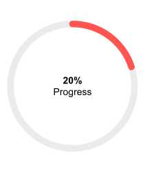
Telerik UI for Blazor Circular Gauge Component
The Circular Gauge has multiple configuration options for managing color, size, central label template, start angle and direction. In addition to that, you can also adjust the scale with major and minor ticks, labels and more.
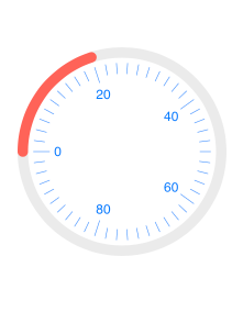
Telerik UI for Blazor Circular Gauge Scale Options
Blazor Linear Gauge Component
For cases when you need to present numerical values on a scale of ranges in a linear fashion, you can rely on the Telerik Blazor Linear Gauge component. Like all of the Telerik gauge components, it comes with multiple built-in features for configuring and customizing the different elements of a gauge—size, CSS class, orientation, pointers, labels, ranges and scale.

Telerik UI for Blazor Linear Gauge Component
The Linear Gauge pointers (also known as markers) can be completely transformed to match specific requirements using their exposed properties for shape, color, opacity, size, margin and more.

Telerik UI for Blazor Linear Gauge Multiple Custom Pointers
You can provide one or more instances of linear scale range and customize their start and end value, color and opacity via the exposed parameters.

Telerik UI for Blazor Linear Gauge Scale Ranges
The Linear gauge supports both vertical and horizontal orientation, as shown in the image below.
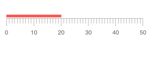
Telerik UI for Blazor Horizontal Linear Gauge
Radial Gauge Component
If you are looking for a radial format of representation of numerical values, then the Telerik UI for Blazor Radial gauge is the right choice.
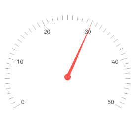
Telerik UI for Blazor Radial Gauge Component
The Radial Gauge is packed with multiple configuration options for its size, CSS class, scale, ranges, labels and pointers. It allows you to easily achieve the desired look and behavior for your Blazor app.
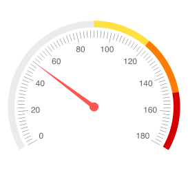
Telerik UI for Blazor Radial Gauge Scale Ranges
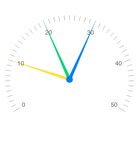
Telerik UI for Blazor Radial Gauge Multiple Pointers
Arc Gauge Component
The Telerik for Blazor UI Arc Gauge component displays a value range which is represented by an arc. The difference between Arc and Radial gauges is that in ArcGauge the value is represented by a value range on the arc instead of a pointer indicating a specific value.
You can customize the arc gauge center label using templates and display custom information relevant to the presented value.
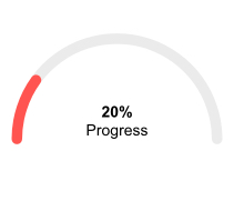
Telerik UI for Blazor Arc Gauge Center Template
The Arc gauge scale options are completely customizable as well—you can set major and minor ticks, colors, start and end angle, colors, direction and more.
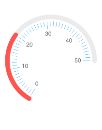
Telerik UI for Blazor Arc Custom Scale
Blazor ColorPalette Component
ColorPalette Overview
Bring color and vibrance to your Blazor apps with the new Color Palette component. The component provides a list of color tiles that can be predefined or custom built, and exposes multiple properties, events (OnChange, ValueChanged & OnBlur) and two-way binding for interaction. Like the rest of the Telerik Blazor components, it comes with built-in keyboard navigation and accessibility. The ColorPalette is perfectly suited when only a limited set of colors should be available to users.
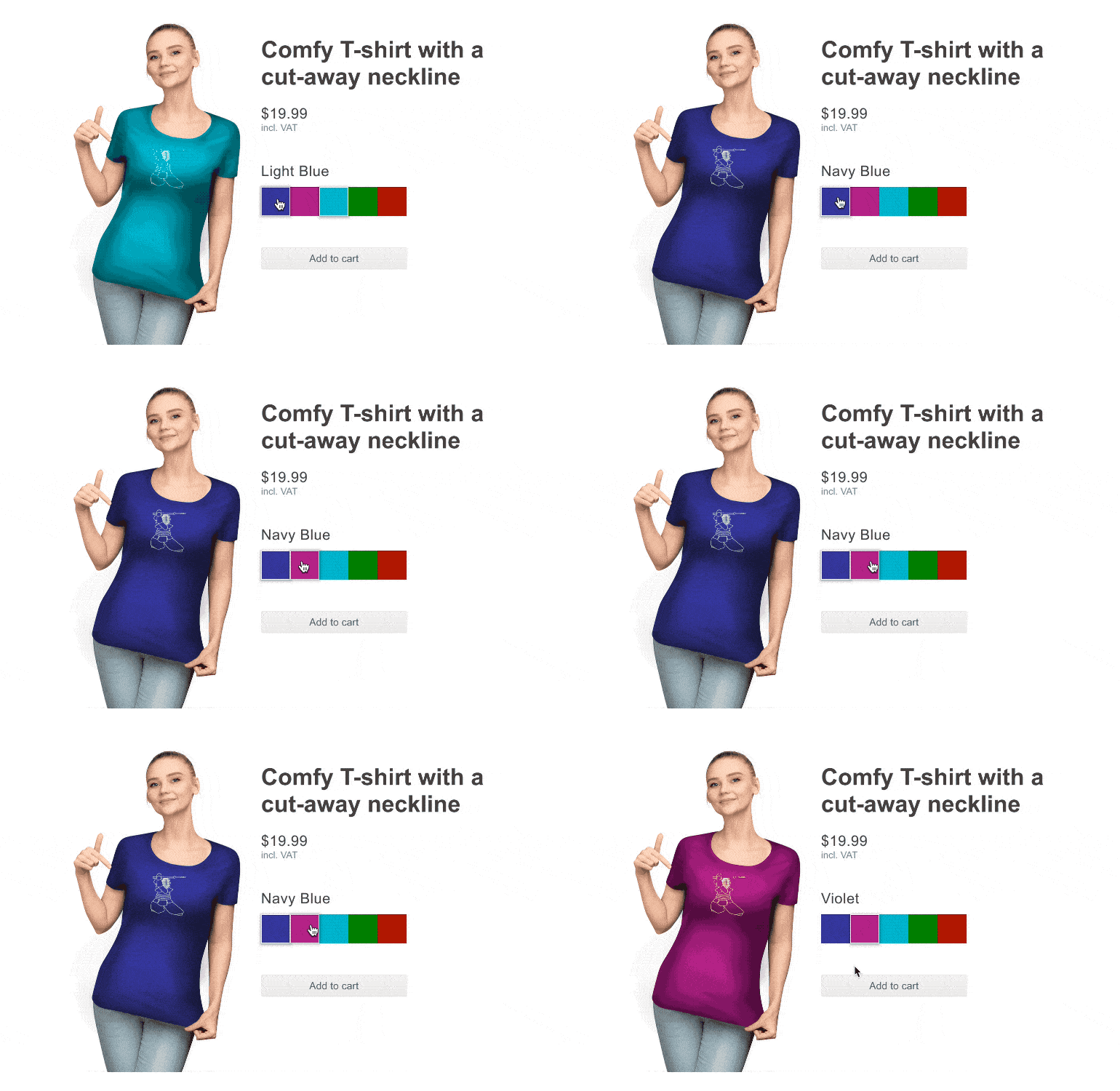
Telerik UI for Blazor Color Palette Component
ColorPalette Presets
The Telerik Blazor Color Palette component comes with a set of predefined color sets that can be set with a single property and shown to your users.
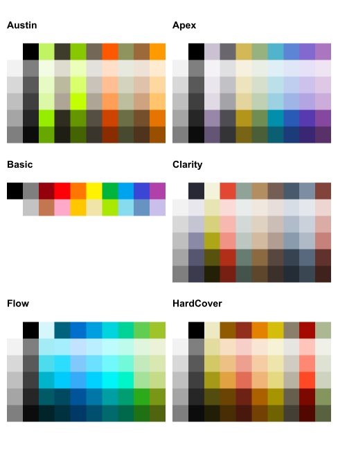
Telerik UI for Blazor Color Palette Color Presets
Custom ColorPalette
In case you need to adapt the standard color palette, you have the flexibility to provide your own set of colors (any valid CSS color) to the Blazor Color Palette component.

Telerik UI for Blazor Color Palette Custom
ColorPalette Layout Customizations
The ColorPalette component allows layout customizations of its size, columns, tile width and height.
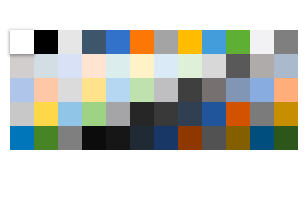
Telerik UI for Blazor Custom Layout
Blazor Media Query Component
The new Blazor Media Query component brings great value and eases the development of responsive rendering of UI components. It lets you get flags in your C# code that correspond to CSS media queries without writing any JavaScript. Depending on the browser viewport size, you can easily change component settings, render different components or prevent components from rendering using the MediaQuery component.
New Blazor Grid Component Features
Hide Grid Columns on Small Device
And right after the introduction of the MediaQuery component is the perfect time to showcase the benefits it brings when integrated with the Grid. You can build responsive Blazor Grid layout and toggle the column visibility based on the resolution.
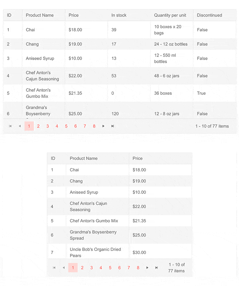
Telerik UI for Blazor Grid Hide Columns on Small Device
With the MediaQuery component, you can easily add flags to set the Grid column Visible parameter based on the screen size and hide specific grid columns on smaller resolution devices.
Fit Grid Column Width to Content
The Grid column width can easily be fit to its content with a double click the resize border in the header of the grid. The column will automatically fit its width to the contents of its data, header and footer.
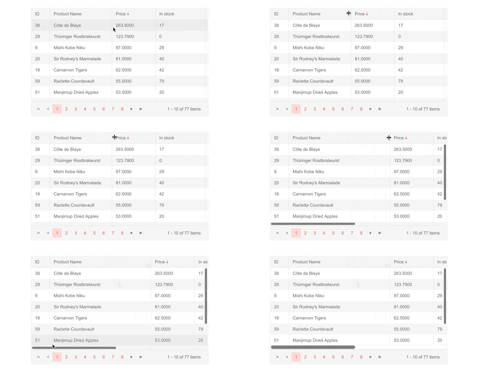
Telerik UI for Blazor Grid Fit Column Width to Content
*Note: The same feature for fitting column width according to content is also available for the TreeList component.
Grid InLine and InCell Edit Modes Validation
With the current release, we added built-in validation functionality to the InCell and Inline edit modes. Built on top of the DataAnnotationValidator and including our Telerik Validation Tooltip, the new feature brings an easy and elegant out-of-the-box solution for invalid fields.
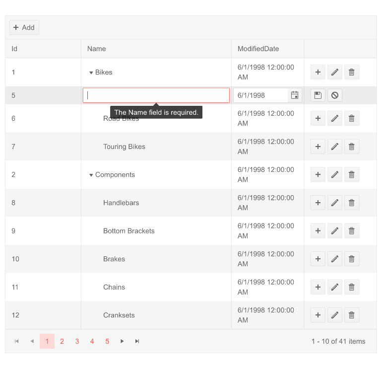
Telerik UI for Blazor Grid Inline Edit Validation
*Note: The built-in validation feature is also available for the TreeList component InCell and InLine edit mode.
New Blazor Window Component Enhancements
Blazor Predefined Dialogs
Telerik UI for Blazor provides matching theme styled alternatives to the standard confirm, alert and prompt dialogs. The three options for predefined Dialogs include:
- Alert—suitable for errors which needs to grab users’ attention and prevent interactions with the UI
- Confirm—simple confirmation dialog with OK and Cancel options
- Prompt—allows user input and returns it as a string when users press OK, and null when they press Cancel
They are all invoked through simple awaitable methods, so you can break up the logic execution while you wait for the user response.
@code { [CascadingParameter] public DialogFactory Dialogs { get; set; } public async Task ShowConfirm() { var isConfirmed = await Dialogs.ConfirmAsync("Are you sure?"); ... }}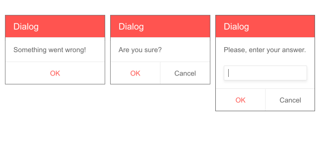
Telerik UI for Blazor Predefined Dialogs
Stacking Windows
With the new stacking z-index feature, Blazor applications will bring any focused window to the front.
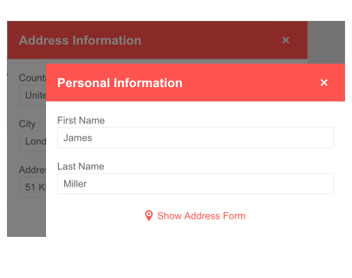
Telerik UI for Blazor Stacked Windows
New Blazor Editor Component Features
Blazor Editor Highlining Tool
The Telerik Blazor Editor built-in tools are now expanded with BackColor and ForeColor, which allow the customization the background-color and the color of the text. Using the out-of-the-box dropdown color palette, users can easily highlight text areas or modify the font color in Blazor applications.
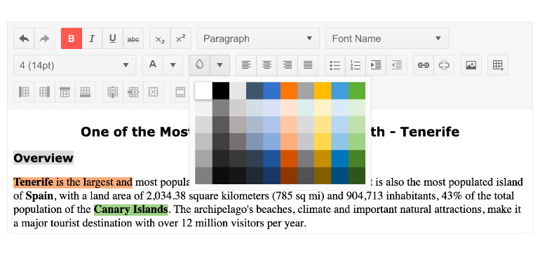
Telerik UI for Blazor Editor Highlighting Tool
Blazor Editor Paste Cleanup Options
The Telerik Blazor Editor component now provides various built-in options to clean up pasted HTML content, so users can now freely copy and paste content from MS Word to the Editor and produce quality result in no time.
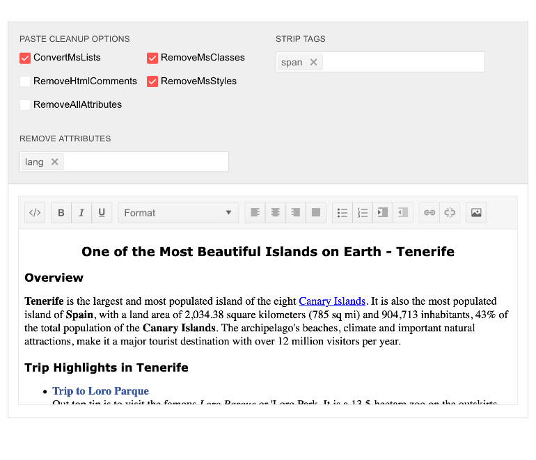
Telerik UI for Blazor Editor Paste Cleanup Options
The paste cleanup settings include converting MS Word lists to HTML lists, removal of comments, attributes, styles and more. The full list of the functionality and behavior of the Editor paste settings can be found in the feature documentation.
Blazor Editor Support for Pasting Images
In addition to the copy and past of text content, the Editor allows you to do the same with images.
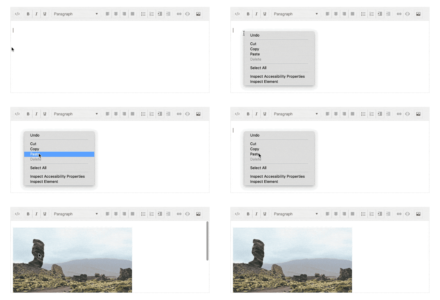
Telerik UI for Blazor Editor Pasting Image
Please note that there are certain limitations implied by the security policy of the browser, which can be worked around by following the guidelines described in the documentation.
Date and Time Pickers Enhancements
All of Telerik Blazor Date and Time Picker components (namely: DateInput, TimePicker, DatePicker and DateTimePicker) now expose configuration option for the step used to increment or decrement each date or time value.

Telerik UI for Blazor DateInput Step Interval
Depending on the picker component used, you can configure date or time values for each of the available segments: Year, Month, Day, Hour, Minute and Second.
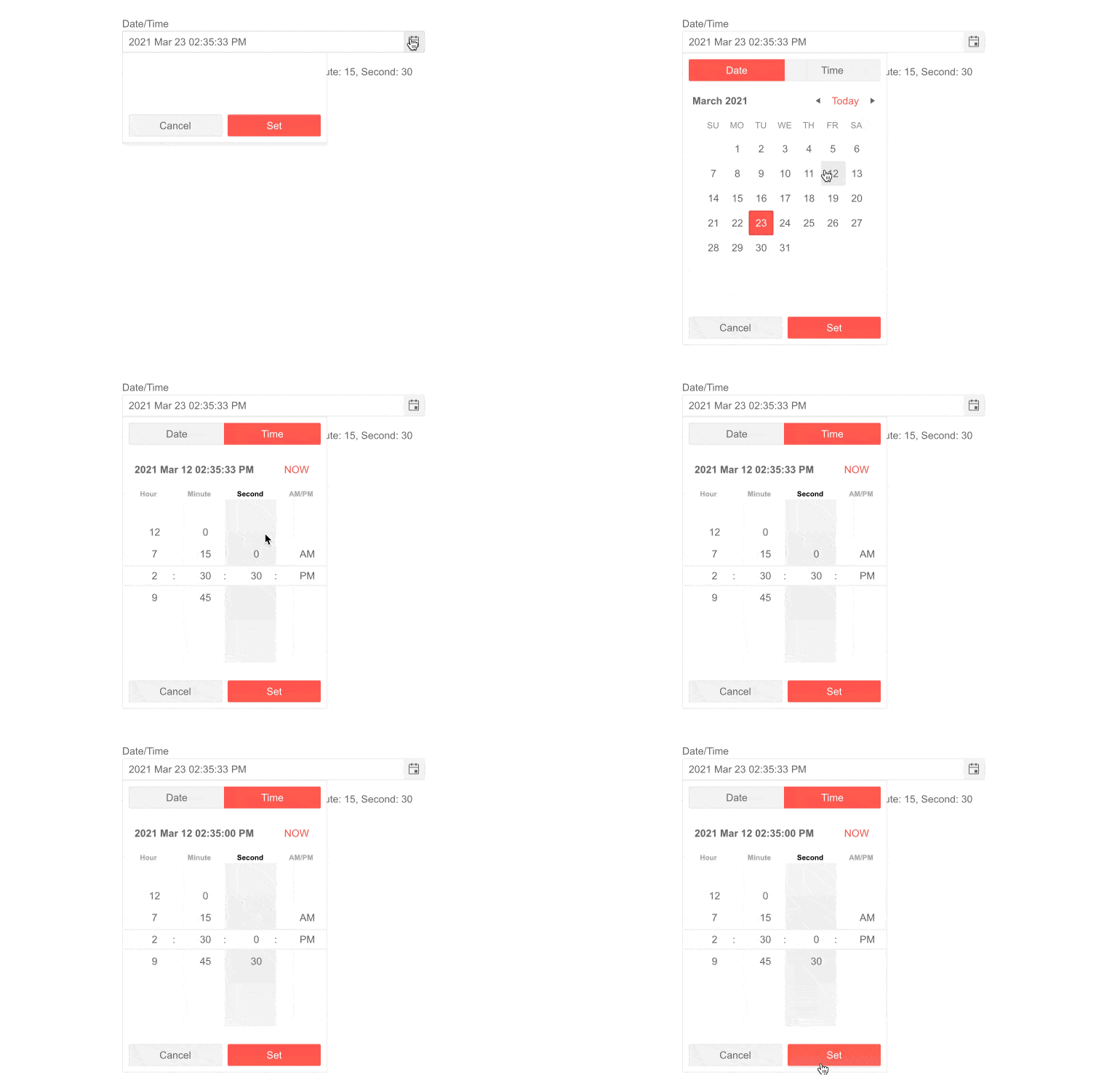
Telerik UI for Blazor DateTimePicker Step Interval
The steps you define control the list of options in the dropdown element, and the values change from the keyboard when the user presses the “Up” or “Down” arrows.
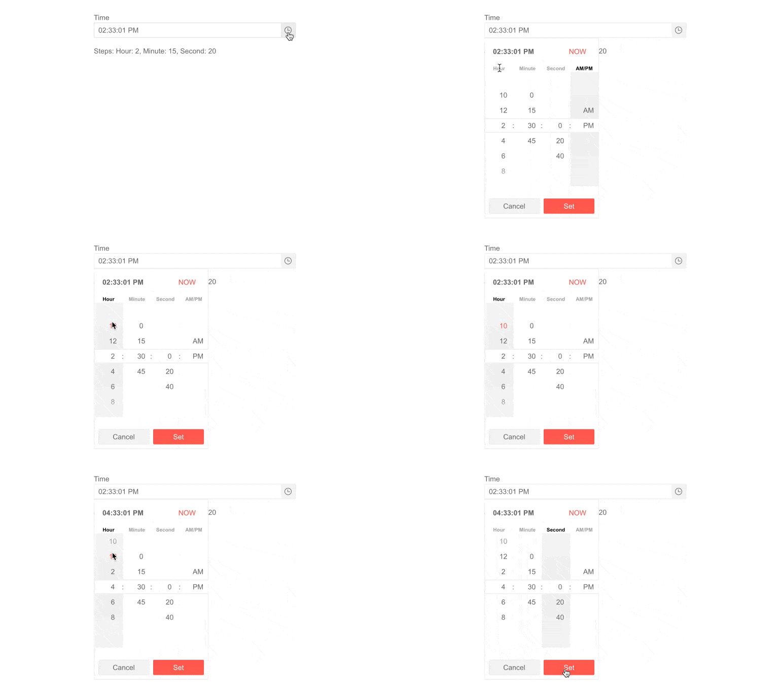
Telerik UI for Blazor TimePicker Step Interval
Form Component Disabled Items
The Blazor Form component that we shipped a few weeks ago received a configuration option enhancement for disabled items. They can be configured via:
- Enabled parameter of the FormItem (takes precedence)
- Editable(false) data annotation attribute of the model
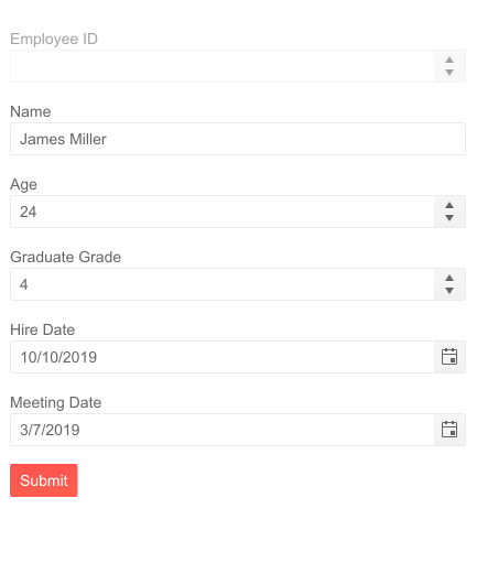
Telerik UI for Blazor Form Disabled Items
Download Telerik UI for Blazor 2.23.0
We encourage you try out the latest and greatest from Telerik UI for Blazor and let us know what you think!
- For everyone new to Telerik UI for Blazor—you can download a free trial of Telerik UI for Blazor 2.23.0 from the Telerik UI for Blazor page
- Telerik active license holders—you can grab the latest version from the “Your Account” page or directly update the Telerik.UI.for.Blazor NuGet package reference to version 2.23.0 in existing Blazor solutions
Thank You
—Your Telerik Blazor Team at Progress
This content originally appeared on Telerik Blogs and was authored by Maria Veledinova
Maria Veledinova | Sciencx (2021-03-30T09:45:11+00:00) Telerik UI for Blazor 2.23.0—Gauges, ColorPalette, MediaQuery and More!. Retrieved from https://www.scien.cx/2021/03/30/telerik-ui-for-blazor-2-23-0-gauges-colorpalette-mediaquery-and-more/
Please log in to upload a file.
There are no updates yet.
Click the Upload button above to add an update.
