This content originally appeared on Web development blog - Manuel Matuzović and was authored by Manuel Matuzović
Every element I use for the basic structure of a HTML document, with explanations why.
Usually when I start a new project, I either copy the HTML structure of the last site I built or I head over to HTML5 Boilerplate and copy their boilerplate. Recently I didn’t start a new project, but I had to document the structure we use at work for the sites we build. So, simply copying and pasting wasn’t an option, I had to understand the choices that have been made. Since I spent quite some time researching and putting the structure together, I decided to share it with you.
My boilerplate
This is the final document. Scroll down for details.
<!DOCTYPE html>
<html lang="en" class="no-js">
<head>
  <meta charset="UTF-8">
  <meta name="viewport" content="width=device-width">

  <title>Unique page title - My Site</title>
  <meta name="description" content="Page description">

  <meta property="og:title" content="Unique page title - My Site">
  <meta property="og:description" content="Page description">
  <meta property="og:image" content="https://www.mywebsite.com/image.jpg">
  <meta property="og:image:alt" content="Image description">
  <meta property="og:locale" content="en_GB">
  <meta property="og:type" content="website">
  <meta property="og:url" content="https://www.mywebsite.com/page">
  <meta name="twitter:card" content="summary_large_image">

  <link rel="icon" href="/favicon.ico">
  <link rel="icon" href="/favicon.svg" type="image/svg+xml">
  <link rel="apple-touch-icon" href="/apple-touch-icon.png">
  <link rel="manifest" href="/my.webmanifest">
  <meta name="theme-color" content="#FF00FF">

  <link rel="stylesheet" href="styles.css" />
  <link rel="stylesheet" href="print.css" media="print" />

  <link rel="canonical" href="https://www.mywebsite.com/page" />

  <script type="module">
    document.documentElement.classList.remove('no-js');
    document.documentElement.classList.add('js');
  </script>
</head>

<body>
  <!-- Content -->
  <script src="legacy.js" nomodule></script>
  <script src="script.js" type="module"></script>
</body>
</html>
Line by line explanation
General
<!DOCTYPE html>For the old-schoolers among you, you don’t need any of the other doc types you’ve learned by heart. This is the one and only. Even though today there are no other real options, it has to be present for compatibility reasons.
<html lang="en" class="no-js">The lang attribute is one of the most important attributes in HTML, because it’s powerful and responsible for many things. You can read more about it in On Use of the Lang Attribute and The lang attribute: browsers telling lies, telling sweet little lies. Applied to the html element, it defines the natural language of the page. It contains a single “language tag” in the format defined in Tags for Identifying Languages (BCP47), for example en for English, de for German or ru for Russian.
I use the no-js class in case I want to apply styling to specific components in browsers that don’t support JavaScript. This class will be removed in browsers that support and execute modern JavaScript.
<meta charset="UTF-8">This attribute declares the document’s character encoding. Leaving it off might cause specific characters to display incorrectly in some browsers.
Here’s how Safari displays my name with and without the charset meta tag.
Manuel Matuzović - Manuel Matuzović
It must come before the <title> element to avoid faulty characters in the page title.
<meta name="viewport" content="width=device-width, initial-scale=1">The viewport meta tag allows us to change the width of the viewport, which is necessary for responsive web design. width=device-width sets the viewport width to the width of the screen. initial-scale controls the zoom level when the page is first loaded.
I’m not sure if setting initial-scale=1 is still necessary. I believe I read somewhere that it was only needed for Safari on < iOS 9, but I can’t find the article anymore.
The viewport meta tag must come before the <title> element to consistently ensure proper document rendering.
We dont need the shrink-to-fit=no option anymore since iOS 9.3.
- Time to remove the shrink-to-fit=no band aid?
- Using the viewport meta tag to control layout on mobile browsers
Title, description, and social media
<title>Unique page title - My Site</title>The unique title of the page. It’s displayed in many places, for example, on the browser tab, in search engine results, when you save a page as a bookmark, etc.
<meta name="description" content="Page description">The unique description of the page, for example, displayed on search result pages. It can be any length, but search engines truncate snippets to ~155–160 characters.
<meta property="og:title" content="Unique page title - My Site">The unique title of the page. Used by URL scrapers on social media platforms like Twitter or Facebook.
<meta property="og:description" content="Page description">The unique description of the page. Used by URL scrapers on social media platforms like Twitter or Facebook.
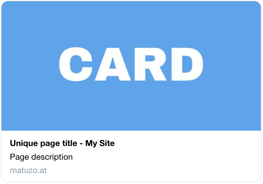
<meta property="og:image" content="image.jpg">The image displayed when you share the link to a page on social media, chat applications, or other sites that scrape URLs.
Ideally, it should be a square image with the important content placed in the middle of the square in a rectangle with a 2:1 ratio. This will make sure that the image will look good in cards with rectangle and square shaped images.
Here’s is how this image will look on Twitter and on WhatsApp.


Rules for Twitter: Images for this Card support an aspect ratio of 2:1 with minimum dimensions of 300x157 or maximum of 4096x4096 pixels. Images must be less than 5MB in size. JPG, PNG, WEBP and GIF formats are supported.
<meta property="og:image:alt" content="Image description">A description of the image. Don’t use this meta tag if the image is purely decorative and doesn’t provide any meaningful information. Screen readers ignore the image, if we don’t provide alt text.
<meta property="og:locale" content="en_GB">An optional Open Graph property, but recommended. It defines the natural language of the page.
<meta property="og:type" content="website">The type of content you’re sharing, e.g. website, article, or video.movie. A required property for valid Open Graph pages.
<meta property="og:url" content="https://www.mywebsite.com/page">The canonical URL of the page. A required property for valid Open Graph pages.
<meta name="twitter:card" content="summary_large_image">This meta tag defines how cards will look when shared on Twitter. There are two options for websites, summary and summary_large_image.
summary_large_image

summary

You can see that I’m using a square image to ensure that the card looks good in both variations. I’ve painted the top and bottom part of the card pink so that you can see that these parts will be cut off in a summary_large_image.
Icons and address bar
<meta name="theme-color" content="#FF00FF">theme-color provides browsers with a CSS color to customize the display of the page or of the surrounding user interface.
Supported browsers: Chrome, Brave and Samsung Internet on Android.

<link rel="icon" href="/favicon.ico">A 32×32px favicon for legacy browsers. It should live in the root of your website.
<link rel="icon" href="/favicon.svg" type="image/svg+xml">Most modern browser support SVG favicons. The benefits of the favicon.svg are that it looks better when it’s scaled, because it’s a vector and not raster image, and we can add HTML and CSS to the SVG, which means that we can support dark mode.
<svg xmlns="http://www.w3.org/2000/svg" viewBox="0 0 512 512">
<style>
  path {
    fill: #153a51;
  }

  @media (prefers-color-scheme: dark) {
    path {
      fill: #FFFFFF;
    }
  }
</style>
<path d="M397.8 117.9v290h-76.4V273.5h-.8l-46.4 97.2h-36.8l-46-96.8h-.8v134h-76.4v-290h80.4l60.8 150.8h.8l61.2-150.8h80.4z"/>
</svg>
Favicon on my website in light mode.
![]()
Favicon on my website in dark mode.
![]()
<link rel="apple-touch-icon" href="/apple-touch-icon.png">The 180×180px icon Apple devices will use if you add the page to your home screen.
<link rel="manifest" href="/my.webmanifest">For Android devices we need a .webmanifest file, which provides browsers with the information where the icons needed for the home screen and the splash screen for PWAs are located.
{
    "name": "matuzo.at",
    "icons": [
        { "src": "/icon-192.png", "type": "image/png", "sizes": "192x192" },
        { "src": "/icon-512.png", "type": "image/png", "sizes": "512x512" }
    ]
}
<link rel="stylesheet" href="styles.css" />CSS for the site.
<link rel="stylesheet" href="print.css" media="print" />Print CSS for the site.
<link rel="canonical" href="https://www.mywebsite.com/page" />Use the canonical link element to prevent SEO issues caused by duplicate content by specifying the original source for pages that are available on multiple URLs.
<script type="module">
  document.documentElement.classList.remove('no-js');
  document.documentElement.classList.add('js');
</script>
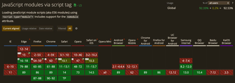
I’m cutting the mustard at JS module support. If a browser supports JavaScript modules, it means that it’s a browser that supports modern JavaScript, such as modules, ES 6 syntax, fetch, etc. I ship most JS only to these browsers and I use the js class in CSS, if the styling of a component is different, when JS is active.

<script src="legacy.js" nomodule></script>If I want to write JavaScript targeted specifically at browsers that don’t support modules, I add the nomodule attribute, which causes the script to only run in legacy browsers, namely IE 11.
<script src="script.js" type="module"></script>JavaScript with the type="module" will only run in browsers that support modules, it’s the opposite of the nomodule attribute.
This isn’t the absolute minimum, but it’s what I need im most sites I build. To round things up, I’ve added a bunch of tags to this post that we probably don’t need anymore and some others that you might need occasionally. If you want to learn more about the <head> element and its children, check out Josh Buchea’s fantastic repository HEAD.
Did I get anything wrong or did I miss anything? Please tell me on Twitter or via e-mail.
Stuff we don’t need anymore
<meta name="msapplication-TileColor" content="#efefef">According to Andrey Sitnik, this is no longer required for recent versions of Windows.
<meta http-equiv="X-UA-Compatible" content="ie=edge">Starting with IE11, document modes are deprecated and should no longer be used, except on a temporary basis.
Starting with IE11, edge mode is the preferred document mode; it represents the highest support for modern standards available to the browser.
<link rel="mask-icon" href="/safari-pinned-tab.svg" color="#36b1bf">Since Safari 12, we don’t need a separate variation of the icon for pinned tabs anymore.
Other noteworthy elements
<link rel="preload" href="font.woff2" as="font" type="font/woff2">Use preload if you want to ensure that specific resources are available earlier in the page lifecycle.
- Preloading content with rel="preload"
- Preload, Prefetch And Priorities in Chrome
- Prefetching, preloading, prebrowsing
<link type="application/atom+xml" rel="alternate" href="/feed.xml" title="My Blog - Manuel Matuzovic">RSS Feed for your site.
<meta name="format-detection" content="telephone=no">Disable automatic detection and formatting of phone numbers.
<meta name="twitter:dnt" content="on">Disallow Twitter from using your site’s info for personalization purposes.
Check out HEAD for much more.
This content originally appeared on Web development blog - Manuel Matuzović and was authored by Manuel Matuzović
Manuel Matuzović | Sciencx (2021-04-09T12:38:54+00:00) My current HTML boilerplate. Retrieved from https://www.scien.cx/2021/04/09/my-current-html-boilerplate/
Please log in to upload a file.
There are no updates yet.
Click the Upload button above to add an update.
