This content originally appeared on DEV Community and was authored by Siddharth Chandra
The libraries and toolkits discussed in this article can be used for rendering dynamic plot on desktop, mobile and web-based platforms so that a quick summary of results can be presented. These tools can be used by data scientists and researchers for an effective analysis of dynamic data.
But, before moving on to these tools/libraries, let's look at some obvious points!
The key features and characteristics that are directly related to effective visualisation and plotting cab be as follows:
- Free and Open Source without any licensing issues.
- Support for assorted web standards.
- Animated charts and plots for better analysis of data.
- Integrated wizards and template.
- Data imports from multiple sources.
- Integration of APIs to 3rd party channels.
- Responsive outputs.
- Multi-color plots with multiple dimensional views.
The real-world scenarios of desktop and web-based applications need different types of visual components so that the application can be built with a user-friendly interface.
A few scenarios where the need comes up for plotting, visualisation and dynamic graphs in software applications can be as follows:
- Real-time maps and street views for mobile app-based delivery systems.
- Dynamic graphs and plots for predictions (for stock-market, e-governance and weather forecasting).
- Knowledge discovery and predictive mining (for learning time series).
The hunt for data visualisation tools that can present huge data sets on web-based platforms can be tedious since a number of software frameworks and tools are available for plotting data and for the dynamic graph generation.
In this article, we will cover the free and open-source resources that can be used for the visualisation of big data sets.
Candela
Candela is certainly one of the best free and open-source visualisation packages. It can be integrated into data science tasks for visualisation using multiple programming interfaces, including JavaScript, Python and R.
Candela supports assorted plots and graphical segments, including BoxPlot, BarChart, GanttChart, Geo, Histogram, GLO, GeoDots, TreeHeatMap, OnSet, ScatterPlotMatrix and many more, using which easily understandable plots can be generated.
D3.js
D3.js is a free and open-source JavaScript library distribution that is used to manage data of multiple dimensions - even big data sets can be plotted. The library supports data visualisation through web-based standards, including HTML, SVG and CSS.
The key goal of this platform is to provide the maximum capability of the current browser, including strong viewing components and an approach focused on the DOM without a proprietary system.
DataWrapper
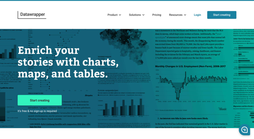
Datawrapper is an open-source data visualisation tool for anyone to create easy, realistic and embeddable charts quickly. This platform is available in both free and premium segments. The free version of Datawrapper is very powerful and has a huge number of features.
Dygraphs
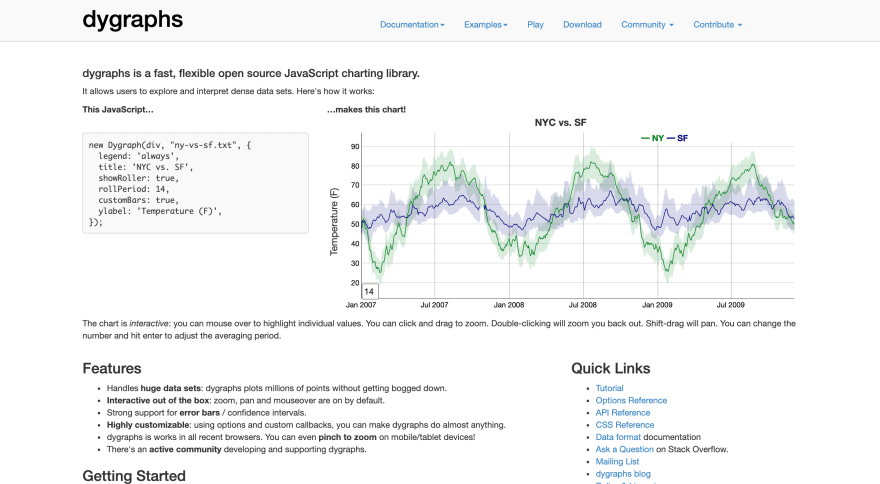
Dygraphs is a flexible and fast library written in JavaScript and is friendly with assorted web browsers. The charts and plots can be generated with a high resolution. On mouseover, the individual points of the graphs, the values and data points can be analysed, which is useful for data analytics and knowledge discovery.
Leaflet
The leaflet library is built to be quick, powerful and user-friendly for data scientists and researchers. It runs easily across all major desktop and mobile platforms and can be expanded with several plugins. It has an easy-to-use and well-documented API and easy-to-read source code so that advanced data science applications can be worked out.
The leaflet is a collaborative and open-source charts library written in JavaScript. It is also very lightweight for the deployment of real-world applications and operates effectively on computer, mobile and tablet devices.
A number of dynamic graphs and maps can be generated by the leaflet with the OpenStreetMap so that real-time locations and positions can be plotted on different types of display devices.
FlotCharts
Flot is a plotting library developed with the integration of jQuery and JavaScript to focus on the generation of high performance and interactive plots. Dynamic graphs that have powerful features like planning, zooming, redraw, tick labels, log scales, etc, can be generated using FlotCharts.
Sigma.js
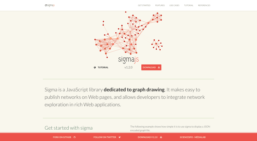
Sigma is a free and open-source JavaScript-based library for the drawing of graphs, networks and dynamic plots. It allows networks to be published on websites and lets developers integrate network searching into rich web applications.
Sigma works as a rendering engine in which the data sets can be linked and real-time graphs and networks can be plotted for multiple applications, including social network analysis, wireless networks, street maps and many others.
Well, that's it from me.
Let me know in the comments, what are all the libraries you have used and which is your favourite.
Just starting your Open Source Journey? Don't forget to check Hello Open Source
Need inspiration or a different perspective on the Python projects or just out there to explore? Check Awesome Python Repos
Want to make a simple and awesome game from scratch? Check out PongPong
Want to
++your GitHub Profile README? Check out Quote - README
Till next time!
Namaste ?
This content originally appeared on DEV Community and was authored by Siddharth Chandra
Siddharth Chandra | Sciencx (2021-04-17T05:15:04+00:00) Visualisation Libraries – JavaScript, Python and More. Retrieved from https://www.scien.cx/2021/04/17/visualisation-libraries-javascript-python-and-more/
Please log in to upload a file.
There are no updates yet.
Click the Upload button above to add an update.


