This content originally appeared on Telerik Blogs and was authored by Leomaris Reyes
Howdy! It’s a pleasure for me to have you here. I imagine that you are in this post because you are starting in Xamarin Forms and you want to improve your knowledge.
This time we will be creating a simple UI step by step, which will help us to improve many important XAML skills that will make our lives easier when developing a UI in Xamarin Forms. Our design today is obtained from Dribble, created by user Yana.
We will be replicating this UI, and I’ll highlight some important points we’ll cover:
✔ Identifying the main layout
✔ Overlapping controls
✔ Handling card list with a CollectionView
So, let’s start!
Creating the Basic Settings
First of all, let’s add PancakeView Nuget Package.

Then, add the following namespace:
xmlns:PanCake="clr-namespace:Xamarin.Forms.PancakeView;assembly=Xamarin.Forms.PancakeView"
Add the the following lines, which will help us to hide the status bar on iOS:
xmlns:ios="clr-namespace:Xamarin.Forms.PlatformConfiguration.iOSSpecific;assembly=Xamarin.Forms.Core"
    ios:Page.PrefersStatusBarHidden="True"
    ios:Page.PreferredStatusBarUpdateAnimation="Fade"
And finally, let’s set our screen for only vertical designs. If you don’t know how to do it, you can see this post.
Identifying the Main Layout
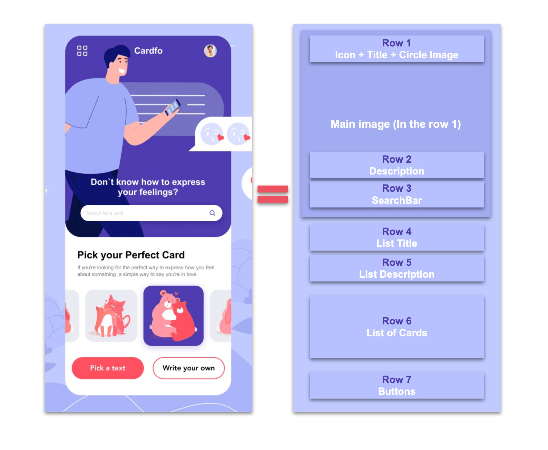
The first step that we have to keep in mind is to select the right layout. In this case, we’ll be using a grid. If you want to know more information about grids, you can go here. In the following image, we’ll be analyzing the columns and rows needed for our main structure.

Code implementation:
<Grid RowDefinitions="Auto,Auto,Auto,Auto,Auto,Auto,Auto">
     <!-- Add the code explained from the Rows 1 to 7-->
</Grid>
✔ Overlapping Controls
In this step, we will be replicating rows 1, 2 and 3 (as specified in the structure image above). One of the most important points here is to learn a simple way to overlap controls.
These rows are composed of the following elements:
- Main image: As you can see, this image has corner radius bottoms. That’s why we’ll be using PancakeView. Inside the Main structure, add the following line of code:
<PanCake:PancakeView Grid.Row="0" Grid.RowSpan="3" CornerRadius="0,0,55,55">
     <Image  Source="Main" Aspect="AspectFill" />
</PanCake:PancakeView>

<!-- The next line code goes here-->
- Icon ➕ Title ➕ Rounded image:
⚠ To get the overlapping with the image added above, you just have to add the next line in the same number of color used in the previous explanation—in this case, Row number 0.
In this part, let’s add another Grid, which will contain the three elements mentioned above. It’s important to know we also will be using PancakeView to get the rounded image.
<Grid Grid.Row="0" ColumnDefinitions="*,*,*" Padding="20,40,20,0">
          <!-- Icon-->
          <Image Grid.Column="0" Source="Points" HorizontalOptions="Start" HeightRequest="20"/>
          <!-- Title-->
          <Label Grid.Column="1" Text="CardInfo" VerticalTextAlignment="Center" TextColor="White" FontAttributes="Bold" HorizontalTextAlignment="Center"/>
          <!-- Rounded image-->
          <PanCake:PancakeView Grid.Column="2" HorizontalOptions="End" CornerRadius="25"  WidthRequest="50" HeightRequest="50">
               <Image  Source="Model" Aspect="AspectFill"/>
          </PanCake:PancakeView>
</Grid>
- Finally, Description ➕ SearchBar:
<!-- Description-->
<Label Grid.Row="1" Padding="0,180,0,0" HorizontalTextAlignment="Center" FontSize="23" Text="Don't know how to express your feelings?" TextColor="White" FontAttributes="Bold"/>
<!-- SearchBar -->
<SearchBar Grid.Row="2" BackgroundColor="Transparent" Margin="30"/>
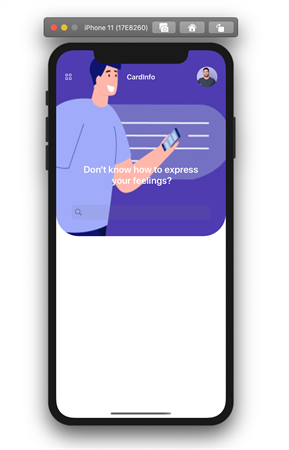
At this point, we have the following result:

Handling the Card List with a CollectionView
Before the card list, let’s add the Title and Description labels:
<!-- List Title-->
<Label Grid.Row="3" Padding="30,30,0,10" FontSize="25" FontAttributes="Bold" Text="Pick your perfect Card"/>
<!-- List Description-->
<Label Grid.Row="4" Padding="30,0" Text="If you're looking for the perfect way to express how you feel about something, a simple way to say you're in love." TextColor="Silver"/>
Now, let’s continue with the list. It’s important to know that it has been made adhering to the Model-View-View-Model (MVVM) pattern (that’s why the properties are bound). If you want to know more information about it, you can visit this post.
<!-- Card list-->
<CollectionView Grid.Row="5"
       HorizontalScrollBarVisibility="Never"
       Margin="0,20"
       ItemsSource="{Binding cards}"
       VerticalOptions="StartAndExpand"
       ItemsLayout="HorizontalList"
       HeightRequest="135">
       <CollectionView.ItemTemplate>
           <DataTemplate>
                <Grid RowDefinitions="Auto" Margin="8,0">
                    <Frame Grid.Row="0" HasShadow="False" CornerRadius="20" BackgroundColor="#e7ebf1" WidthRequest="95" HorizontalOptions="Start">
                         <Image Grid.Row="0" HorizontalOptions="Center" Source="{Binding Picture}" WidthRequest="150"/>
                    </Frame>
                </Grid>
           </DataTemplate>
       </CollectionView.ItemTemplate>
</CollectionView>
Last Step: Adding the Bottom Buttons!
<!-- Bottom buttons-->
<Grid Grid.Row="6" ColumnDefinitions="*,*">
   <Button Grid.Column="0" Text="Pick a Text" TextColor="White" FontAttributes="Bold" BackgroundColor="#ff5061" Margin="20,0" HeightRequest="60" CornerRadius="30" />
   <Button Grid.Column="1" Text="Write your Own" TextColor="Black" BorderColor="#ff5061" BorderWidth="3" FontAttributes="Bold" Margin="20,0" HeightRequest="60" CornerRadius="30" />
</Grid>-->
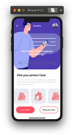
And our simple UI is done!

Thanks for reading! You can see the complete code on my Github repository.
See you next time!
This content originally appeared on Telerik Blogs and was authored by Leomaris Reyes
Leomaris Reyes | Sciencx (2021-04-21T10:40:00+00:00) Are You Starting in Xamarin Forms? Let’s Create a Simple UI. Retrieved from https://www.scien.cx/2021/04/21/are-you-starting-in-xamarin-forms-lets-create-a-simple-ui/
Please log in to upload a file.
There are no updates yet.
Click the Upload button above to add an update.
