This content originally appeared on Level Up Coding - Medium and was authored by Kristin Cooper
6 weeks ago I quit my management consulting job and started a data science boot camp. My world went from pretty slides and back-to-back MS Teams meetings to planets, animals, and dead languages (read: Jupyter notebooks, Python, pandas, and statistics in math notation).
One thing I will take forward always from my time in consulting is the importance of storytelling. Who cares how many models I could build if no one understands how to use them and why they’re important? And, as the adage says, a picture is worth a thousand words.
It’s impossible to overstate the importance of clean, clear, simple visuals in the field of data science and analytics.
Matplotlib
Anyone who has dabbled in data science has likely been introduced Matplotlib, the standard free plotting library inspired by the more intense/less accessible MATLAB. It’s simple and intuitive to use, making it great for beginners.
The problem is… it’s ugly, and aesthetic customizations can take an excessive amount of code.
Enter: Plotly
Plotly is a free, open-source graphing library that can be used with several coding languages including Python, Javascript, and R. While plotly and matplotlib are similar in structure and capabilities, three clear benefits of plotly over matplotlib are:
- It’s easier to make much more aesthetically pleasing visuals
- Plotly graphs are interactive by default
- Animation can be achieved in just one line of code
Comparison Time!
Let’s demonstrate some simple examples.
First, import standard packages that we’ll use throughout the examples.
import numpy as np
import matplotlib.pyplot as plt
import plotly.express as px
import plotly.graph_objects as go
from plotly.subplots import make_subplots
1. Aesthetics:
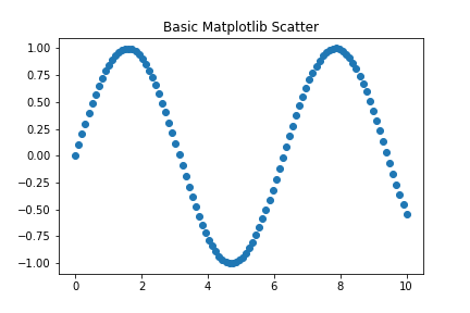
We’ll start with a very simple scatter plot to demonstrate the basic aesthetics of each library.
Create some sample data for a 2-dimensional curve, and plot using matplotlib:
xaxis = np.linspace(0, 10, 100)
yaxis = np.sin(xaxis)
mat_scatter = plt.scatter(x=xaxis, y=yaxis)
plt.title('Basic Matplotlib Scatter')
plt.show();
Plot the same sample data using plotly’s express module:
plotly_scatter = px.scatter(x=xaxis, y=yaxis, title='Basic Plotly Scatter')
plotly_scatter.show()
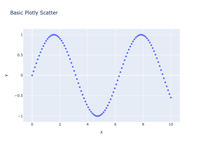
Right off the bat, the plotly figure is much more visually pleasing, though I suppose this is subjective at this level of simplicity. Plotly also automatically adds axis labels based on the variables used, whereas I would have to code that in matplotlib. You can see also that plotly uses fewer methods that accept more arguments (example: setting the plot’s title).
2. Interactivity:
The histogram is a great way to show plotly’s out-of-the-box interactivity.
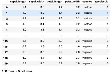
Create a dataframe using one of pandas’ datasets, then slice out 3 different dataframes based on the categorical ‘species’ column. This is setting us up to demonstrate how multiple plots can be created on a single figure.
df = px.data.iris()
setosa_df = df[df['species'] == 'setosa']
versicolor_df = df[df['species'] == 'versicolor']
virginica_df = df[df['species'] == 'virginica']
Plot a histogram of the setosa species petal lengths using matplotlib:
mat_hist = plt.hist(x=setosa_df['petal_length'])
plt.title('Matplotlib Histogram - Setosa Petal Lengths')
plt.xlabel('Petal Length')
plt.ylabel('Count')
plt.savefig('images/mat_hist.png')
plt.show();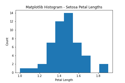
Plot the same histogram using plotly express:
plotly_hist = px.histogram(setosa_df, x='petal_length', title='Plotly Histogram - Setosa Petal Lengths', labels={'petal_length': 'Petal Length'})plotly_hist.write_html('images/plotlyhistogram.html')
plotly_hist.write_image('images/plotly_hist.png')
plotly_hist.show()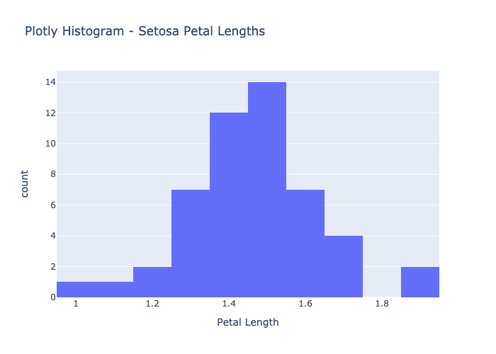
Here’s where the comparison gets better.
Plotly graphs by default are interactive, meaning you can hover over the graph to see details of the underlying data, zoom in/out, etc. without adding any code whatsoever. In our setosa petal lengths histogram example, users can hover over each bin to see the range of x-values captured in that bin (in this case, range of petal lengths), and the count of elements that fall into that bin. The x-axis was automatically labelled using the column header from the dataframe. Passing in a dictionary of original value: desired label to the “labels” parameter, I can easily make those labels more intuitive for a user who may not be as familiar with the underlying dataset. You can save figures as static PNG/JPG files or as interactive HTML files that open in a web browser. The interactive version of the figure renders automatically in Jupyter Notebook.
A Quick Aside — Subplots:
Both matplotlib and plotly can plot multiple subplots onto a single figure to show comparisons. We’ll demonstrate using the same data on irises.
Using matplotlib, create a figure with 3 columns, then plot histograms of each species’ petal lengths onto the figure.
mat_hist_fig, axes = plt.subplots(ncols=3, figsize=(15,5), sharex=True, sharey=True)
mat_hist_fig.set_tight_layout(tight=True)
mat_hist_fig.suptitle('Matplotlib Histograms - Iris Petal Lengths by Species')
axes[0].hist(setosa_df['petal_length'], bins=5, color='navy')
axes[0].set_title('Setosa')
axes[0].set(ylabel='Count')
axes[0].set(xlabel='Petal Length')
axes[1].hist(versicolor_df['petal_length'], bins=5, color='purple')
axes[1].set_title('Versicolor')
axes[1].set(xlabel='Petal Length')
axes[2].hist(virginica_df['petal_length'], bins=5, color='cornflowerblue')
axes[2].set_title('Virginica')
axes[2].set(xlabel='Petal Length')
mat_hist_fig.savefig('images/mat_hist_fig.png');
Similarly, using plotly’s subplots module, make a figure with 3 subplots and give them titles. Then, update the figure title, turn off the legend to save space, and set x and y axis labels. Use plotly’s graph objects module to add traces to each subplot in the figure.
plotly_hist_fig = make_subplots(rows=1, cols=3, subplot_titles=('Setosa', 'Versicolor', 'Virginica'), shared_yaxes=True, shared_xaxes=True, horizontal_spacing=.02)plotly_hist_fig.update_layout(title_text='Plotly Histograms - Iris Petal Lengths by Species', showlegend=False, height=400)
plotly_hist_fig.update_xaxes(title_text='Petal Length', range=[0,8])
plotly_hist_fig.update_yaxes(title_text='Count', col=1)
plotly_hist_fig.add_trace(
    go.Histogram(x=setosa_df['petal_length'], name='Setosa', marker_color='navy', nbinsx=5),
    1, 1)
plotly_hist_fig.add_trace(
    go.Histogram(x=versicolor_df['petal_length'], name='Versicolor', marker_color='purple', nbinsx=5),
    1, 2)
plotly_hist_fig.add_trace(
    go.Histogram(x=virginica_df['petal_length'], name='Virginica', marker_color='cornflowerblue', nbinsx=5),
    1, 3)
plotly_hist_fig.write_image('images/plotly_hist_fig.png')
plotly_hist_fig.show()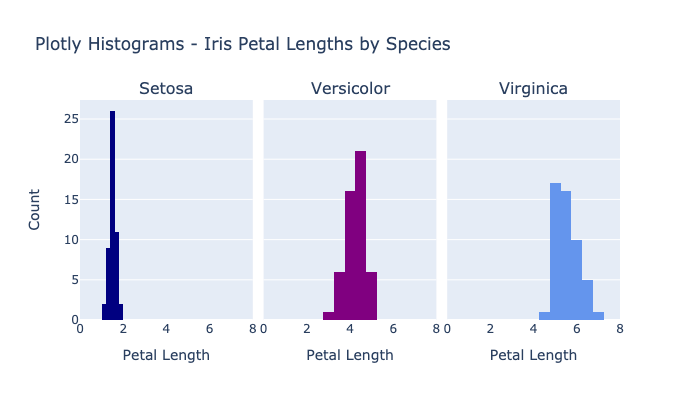
Overall, very similar concepts used across the two libraries. I find customizations to be easier in plotly since there are fewer methods with more arguments, as opposed to matplotlib which applies customizations by calling more methods directly onto the figure/subplots. As seen here, sizing is much more presentation-ready out of the box using plotly.
3. Animation:
The coolest thing I’ve discovered using plotly is its absolutely dummy-proof animation customization.
Using the same data and the same scenario as the figures above, create an animated histogram in plotly by setting the ‘animation_frame’ parameter to a categorical element (in our case, species).
plotly_hist_anim = px.histogram(df, x='petal_length', nbins=5, title='Plotly Histogram - Iris Petal Lengths', labels={'petal_length': 'Petal Length'}, animation_frame='species', color='species', color_discrete_sequence=['navy', 'purple', 'cornflowerblue'])plotly_hist_anim.update_layout(xaxis_range=(0, df['petal_length'].max()), yaxis_range=(0, 25))
plotly_hist_anim.write_html('images/plotly_hist_anim.html')
plotly_hist_anim.show()The sophistication of this graph for how few lines of code are needed is incredible. Pretty much any categorical data element (with max of maybe 10–15 unique values) can be passed into the animation parameter(s) to quickly show comparisons and include user-friendly filtering capabilities.
Conclusion
As you can see from a few simple examples, plotly far surpasses matplotlib’s graphing library in simplicity, elegance, interactivity, and animation, so even your ETL can be beautiful.
Next up to explore: plotly’s Dash, with which one can create interactive web-based data visualization apps with pure Python code.
Additional Resources:
Badreesh Shetty writes an excellent blog detailing the Matplotlib library.
Plotly’s documentation is nice and easy to navigate, though I stumbled across a few things that were out of date so be ready for some trial and error. They show a lot more advanced examples and graph types.
Meet the Beyonce of Python Graphing Libraries was originally published in Level Up Coding on Medium, where people are continuing the conversation by highlighting and responding to this story.
This content originally appeared on Level Up Coding - Medium and was authored by Kristin Cooper
Kristin Cooper | Sciencx (2021-05-06T13:45:03+00:00) Meet the Beyonce of Python Graphing Libraries. Retrieved from https://www.scien.cx/2021/05/06/meet-the-beyonce-of-python-graphing-libraries/
Please log in to upload a file.
There are no updates yet.
Click the Upload button above to add an update.
