This content originally appeared on DEV Community and was authored by Andrew Jones
Recently I saw this UI design for a Nintendo Switch Store mobile app concept from Orizon Design on Dribbble:

My first thought was "Wow, it would be so hard to implement the glowing effect from that design." This got me thinking about a reusable approach to do this.
Implementation
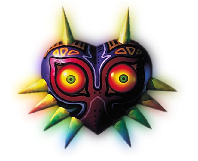
I started by creating a simple HTML page with a transparent-background picture of Majora's Mask (following the Nintendo theme with my favorite game).
    <h1>"Smart" Image Glow Effect</h1>
    <div id="maskparent">
      <img src="/mask.png" id="mask" alt="Majora's Mask with glow" />
    </div>
At first, I tried adding filters to the mask picture, like the drop-shadow:
#mask {
  filter: drop-shadow(0 0 0.75rem rgb(255, 217, 0));
}
This was the result:
However, this was a super basic, single-color glow, and the color had to be manually set. It wouldn't be reusable across images either, because the single color would be different for each image. Plus, the single-color doesn't look good with a colorful image like Majora's Mask.
After some research and testing, I found that the best way to accomplish this would be using a copy of the mask in the background.
I added this code to the CSS:
#maskparent {
  background-repeat: no-repeat;
  background-image: url("/mask.png");
}
This successfully placed a copy of the image directly behind the image, but next we needed to blur it to actually create a glow effect instead of just a double image.
I accomplished this with a backdrop-filter on the mask element. This allows an element to effectively apply a filter to the element behind itself. So, applying backdrop-filter to the mask actually applies a filter to the background image of the div underneath the mask.
#mask {
  /* This line:
   1. blurs the background so we can see it around the
         image as "glow"
   2. increases the background saturation so we get colors
         back after the shadow effect dulls them out
  */
  backdrop-filter: blur(15px) saturate(3);
}
This was an "aha!" moment, we almost have the effect I was looking for:
However, you can see there's one issue left: the parent div clips the backdrop blur, creating a weird hard edge.
To solve this, we can use a trick to make the element div border-box bigger without moving the element:
#mask {
  ...
  /* These lines prevent the border box from clipping the blur
     effect */
  padding: 20px;
  margin: -20px;
}
Ta-da! This was exactly the effect I was looking for:
Taking it Further
One note, this vanilla-HTML/CSS implementation doesn't exactly solve the re-usability problem I mentioned, because the picture URL is hardcoded twice. This could easily be solved with JS or in a JS framework. For example, we could make a React component to wrap <img> which sets the same picture URL for the background image and the HTML image.
You can play with this effect in the codesandbox below.
If you liked this article, let me know in the comments or check out my Twitter, @ajones_codes. Thanks for reading!
This content originally appeared on DEV Community and was authored by Andrew Jones
Andrew Jones | Sciencx (2021-05-08T18:23:33+00:00) CSS Smart Image Glow. Retrieved from https://www.scien.cx/2021/05/08/css-smart-image-glow/
Please log in to upload a file.
There are no updates yet.
Click the Upload button above to add an update.


