This content originally appeared on DEV Community and was authored by Richard Beattie
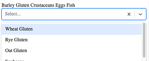
In prepsheets.com users can specify which allergens ingredients and recipes have. The natural UI element for this is a multiselect. I was already using react-select which is an awesome library adding a stylable multi-select with lots of options (creating new options; async loading of options; etc). However after setting it up, it felt too cramped. If users had more than 3 allergen selected (some of which are quite long "") then the select would grow and become cumbersome. Instead I decided to place the selected options above the mutliselect. This article goes over how to do this.
Setting up
We're using react-select here so go ahead and install it
npm install react-select
Now let's see what the default multi-select looks like
import Select from "react-select";

const options = [
  { value: "chocolate", label: "Chocolate" },
  { value: "strawberry", label: "Strawberry" },
  { value: "vanilla", label: "Vanilla" },
];

const MyComponent = () => <Select options={options} isMulti />;
I'm using the 24 offical Irish allergens as you can see below when you add a certain amount the select grows which dosn't look nice in my opinion.
Moving selected options to outside the select
The next step is to not show the selected values in the select but rather above it. Let's create a wrapper component for React-Select
// OptionsOutsideSelect.js
import { Select } from "react-select";

const OptionsOutsideSelect = (props) => {
  const { isMulti, value } = props;

  return (
    <div>
      {isMulti ? value.map((val) => <span>{val.label} </span>) : null}
      <Select {...props} controlShouldRenderValue={!isMulti} />
    </div>
  );
};

export default OptionsOutsideSelect;
If isMulti is true then we use the controlShouldRenderValue prop to hide the selected values and loop over the values prop and map them to <span> elements.
It should be possible to use the MultiValue component from react-select however I couldn't get that to work, which brings us to the next step
Styling the selected options
Let's change how we're mapping the selected values to look like
<ValuesContainer>
  {isMulti
    ? value.map((val) => <Value key={val.value}>{val.label}</Value>)
    : null}
</ValuesContainer>
I'm going to use styled-components to style ValusContainer and Value but you can of course move the same rules over to whatever you're using
import styled from "styled-components";

const ValuesContainer = styled.div`
  display: flex;
  flex-wrap: wrap;
  align-items: center;
`;

const Value = styled.div`
  padding: 0.3rem 0.5rem 0.3rem 0.5rem;
  margin: 0 0.55rem 0.55rem 0;
  font-size: 0.75rem;
  color: black;
  background-color: rgba(247, 173, 46, 0.6);
  user-select: none;
`;
This creates the below image which looks resonable
The only thing left to do now is let users remove selected options
Adding a remove button
First we'll add an "X" button to all Values
<Value>
  <XButton name={val.value} onClick={handleRemoveValue}>
    ✕ // This is the mulitply ✕ not the x on your keyboard
  </XButton>
</Value>
Now we need to make the handleRemoveValue function
const { onChange } = props;

const handleRemoveValue = (e) => {
  if (!onChange) return;
  const { name: buttonName } = e.currentTarget;
  const removedValue = value.find((val) => val.value === buttonName);
  if (!removedValue) return;
  onChange(
    value.filter((val) => val.value !== buttonName),
    { name, action: "remove-value", removedValue }
  );
};
And Ta-Da ? you have a react-select with the options rendered outside the select. I've included a code-sandbox below to show what this looks like
This content originally appeared on DEV Community and was authored by Richard Beattie
Richard Beattie | Sciencx (2021-05-12T15:54:18+00:00) React Select with options outside. Retrieved from https://www.scien.cx/2021/05/12/react-select-with-options-outside/
Please log in to upload a file.
There are no updates yet.
Click the Upload button above to add an update.


