This content originally appeared on Telerik Blogs and was authored by Maria Veledinova
Telerik UI for Blazor 2.24 release brings new PanelBar and Card components, Grid and TreeList updates, Blazor Reporting demo integration, Calendar templates, a new Visual Studio Code Converter Wizard and much more!
Hey developer folks, it’s Telerik R2 2021 release time and we’re excited to announce that the Telerik UI for Blazor component suite reached a new milestone of 75+ truly native components.
While we have continuously shipped new components and features in the period of January to May 2021, we are happy to share that there are even more native Blazor goodies coming your way with the current Telerik UI for Blazor 2.24 release. New PanelBar and Card components are here, along with Grid and TreeList Rows Reorder and Multi-column headers, Virtualization in multiple DropDown components, Blazor Reporting demo integration, Calendar templates, new Visual Studio Code Converter and more.
TL;DR Telerik UI for Blazor R2 2021
Below is a summary of the R2 2021 Telerik UI for Blazor release content shipped between January and May (Telerik UI for Blazor 2.22, 2.23 and 2.24 releases):
- New components: PanelBar, Form, Card, Color Palette, Arc Gauge, Linear Gauge, Circular Gauge, Radial Gauge, Validation Summary, Validation Tooltip, Validation Message and MediaQuery
- New Grid features: Multi-column headers, rows drag & drop, Excel-like editing and navigation, fit column width to content, hide columns on small devices, frozen columns with Virtualization, grouping columns in the ColumnMenu, CheckBox-only selection, checkbox as default editor for Boolean, built-in validation for InCell & InLine editing
- New TreeList features: Multi-column headers, Rows drag & drop, Excel-like editing and navigation, hide columns on small devices, fit column width to content, built-in validation for InCell & InLine editing, frozen columns with Virtualization, CheckBox-only selection, checkbox as default editor for Boolean
- New Editor features: Highlighting, paste cleanup, copy & paste images
- New Time Interval feature in DateInput, DatePicker, TimePicker and DateTimePicker components
- New Window features: Draggable & stacking multiple windows
- New Calendar features: Templates & Cell Render Event
- New Dropdowns feature: Virtualization
- New Predefined Dialogs features: Alert, Confirm and Prompt
- New DropDownList feature: Filter
- Support for ShouldRender Property in the Grid, TreeList, Splitter & TreeView
- Telerik Document Processing: .doc file format support
- Integration demo with Telerik Reporting Blazor ReportViewer
- New VS Code Converter: Seamless setup of Telerik UI for Blazor components in existing Blazor projects
Deep Dive into 2.24 Release of UI for Blazor
And if you are eager to learn more about the latest additions in Telerik UI for Blazor 2.24.0 release, read ahead and see in detail all the new components, features and tooling that will help you speed up development of Blazor Server and WebAssembly apps.
Blazor PanelBar UI Component
PanelBar Component Overview
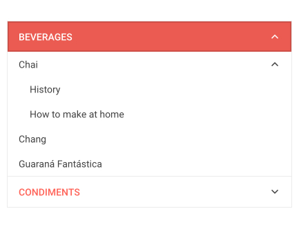
The new Telerik Blazor PanelBar is a data-bound component that renders expandable hierarchical panels consisting of title and content. The PanelBar supports single and multiple expand modes, templates for rendering custom content, flat and hierarchical data, as well as many configuration options for its item and data binding. Like the rest of the Telerik UI for Blazor component, it comes with built-in keyboard navigation support and accessibility.

Telerik UI for Blazor PanelBar UI Component
PanelBar Support for Flat and Hierarchical Data
You can bind the PanelBar to either flat data (the entire collection of panel bar items is available at one level) or hierarchical data (the collection of child items is provided in a field of its parent’s model).
Telerik UI for Blazor PanelBar Hierarchical Data
PanelBar Templates
Defining the PanelBar item content is done via templates—you have the flexibility to set HeaderTemplate and ContentTemplate for all the items or for items of a certain level.
PanelBar Configuration
The PanelBar expand mode (ExpandMode property) can be configured to single or multiple, allowing many panels to be expanded. Additionally, you can set a panel as disabled and prevent interaction with it.
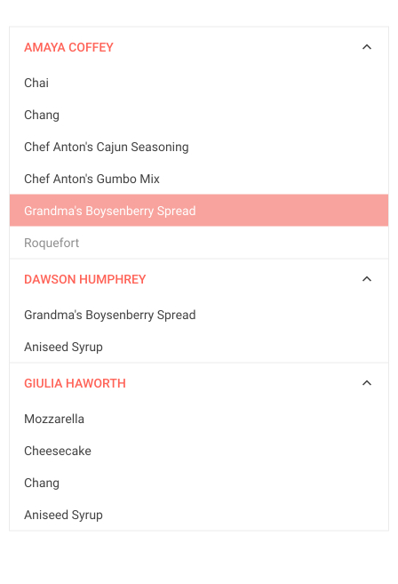
Telerik UI for Blazor PanelBar Multiple Expanded Items
PanelBar Events
The PanelBar exposes several events that allow you to respond to user actions and implement custom logic:
- ExpandedItemsChanged – fires when the expanded state has changed
- OnItemClick – fires when an item is clicked
- OnItemRender – fires when an item is rendered
Blazor Card UI Component
Card Component Overview
The new Card component is a great companion for building attractive Blazor apps with its multiple built-in features. You can easily organize card content in different orientations, take advantage of the theme color variations and define custom card layout such as group, list or deck.

Telerik UI for Blazor Card UI Component
Card Component Anatomy
While the Card itself can be considered a building block when arranging your layout, it has multiple building blocks itself, which make it really easy and fun to use and customize each part of it: CardHeader, CardImage, CardBody, CardActions, CardFooter, CardSeparator, CardTitle and CardSubtitle.
Card Component Orientation
The Telerik Blazor Card lets you easily rearrange its building blocks by switching between the two built-in orientation options for your layout—horizontal and vertical.
Telerik UI for Blazor Card Orientation Modes
Card Component Theme Colors
The Telerik Blazor Card provides an attractive way of presenting content through its theme color variations. Pick the right one for you—primary, secondary, success, error, light, dark and more.
Card Component Actions Options
The Card actions buttons can be organized horizontally or vertically and laid out in four ways: at start, center or end, or stretched buttons that will fill the whole container with equal size.
Dynamic Cards Rendering
Using data collections, you can dynamically render Telerik Blazor Cards and create beautiful layouts as shown in the image below.
Telerik UI for Blazor Data Cards
Card Collapse & Expand
The Telerik Blazor Card component can be transformed into a collapsible/expandable card by placing the card body and actions within the TelerikAnimationContainer UI component. This allows for showing a larger number of cards and flexibility to expand only needed cards.
Telerik UI for Blazor Expand & Collapse Card Example
Reporting Demo Integration
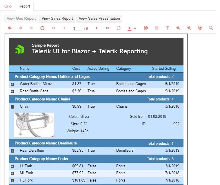
As the product and our demos start and end with you in mind, we listened to your feedback and added a demo showcasing the integration between Telerik UI for Blazor and Telerik Reporting.
The Blazor reporting demo showcases the integration between the Grid and Report Viewer. Switch from Grid tab to Reporting and see how your grid data transforms into a report with many built-in features, such as interactivity of grouped items and ability to export to various file formats such as Word, Excel, PPT and more. The report also comes with handy user features such as search, zoom in and out, full-screen mode, printing and more!
Telerik UI for Blazor Grid & Blazor ReportViewer Integration
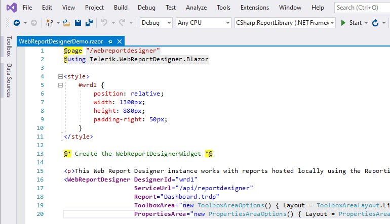
Blazor Report Designer (by Telerik Reporting Team)
Our fellows at Telerik Reporting Team expanded the Blazor reporting capabilities and in addition to the Report Viewer, they just shipped a new version enabling you to integrate Web Report Designer functionality in your Blazor apps. Read the complete story in the dedicated release blog post.
Blazor Grid New Features
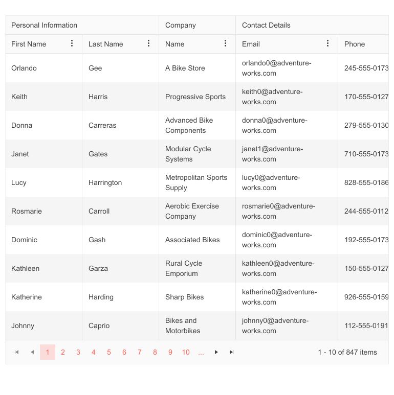
Grid Multi-Column Headers
The new Grid multi-column headers feature allows you to visually group relevant columns under a common header through the nested Columns RenderFragment under the GridColumn.
Telerik UI for Blazor Grid Multi-Column Headers
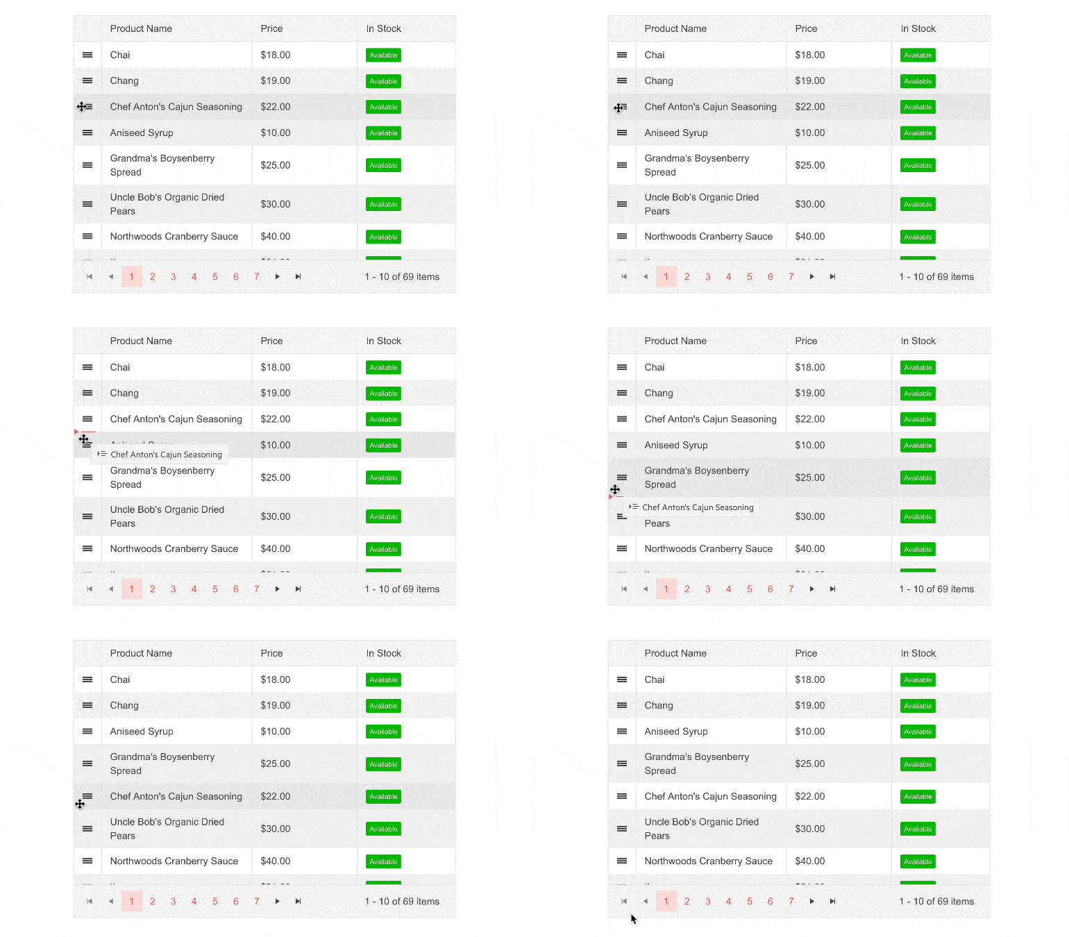
Grid Drag & Drop Rows
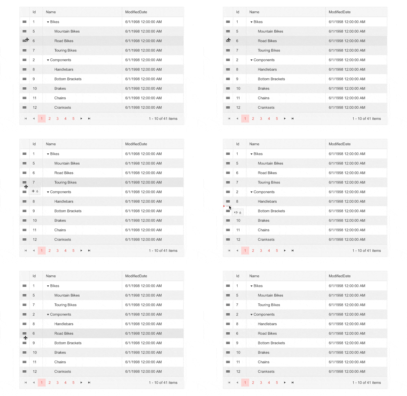
The Telerik Blazor Grid now shines with a row drag-and-drop feature that renders a column with a drag handle. Using RowDraggable parameter, you can instantly enable reordering rows within a grid or drag and drop between grids.
Telerik UI for Blazor Grid Rows Drag & Drop
Blazor TreeList New Features
Just like the Grid, the Telerik Blazor TreeList got expanded with two power features—drag-and-drop rows and multi-column headers.
TreeList Multi-Column headers
The built-in feature for defining multi-column headers in the TreeList can be achieved through the nested Columns RenderFragment of the TreeListColumn.
TreeList Drag & Drop Rows
Just like the Grid, the Telerik Blazor TreeList got the shiny row drag-and-drop feature. You can reorder one or multiple rows between different parents in the same TreeList or between different Telerik TreeList instances.
Telerik UI for Blazor TreeList Rows Drag & Drop
Other Telerik Blazor Components New Features
Virtualization in Multiple DropDown Components
The Telerik Blazor Select components—namely the AutoComplete, ComboBox, DropDownList and MultiSelect—received a major boost with the new virtualization feature enabling loading items on demand based on current scroll position.
To take advantage of selects virtualization, you need to set the ScrollMode property, plus provide specific values for the PopupHeight, ItemHeight and the PageSize properties, which configure the size of the “page” to be rendered/loaded on each scroll.
You can virtualize a large set of local data for blazing fast UI performance, and even fetch each page of data from a remote service to optimize the data queries and loading.
Telerik UI for Blazor DropDownList Virtualization
Filtering in DropDownList Component
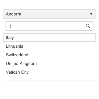
With the current release, the Telerik Blazor DropDownList is enhanced with a filtering capability. Using an input shown at the top of the dropdown popup, users can type in a subset of a searched value and filter the underlying datasource. The supported string filtering operators include: Contains, DoesNotContain, EndsWith, IsContainedIn and StartsWith.
Telerik UI for Blazor DropDownList Filter
Custom Calendar Rendering
Calendar Templates Support
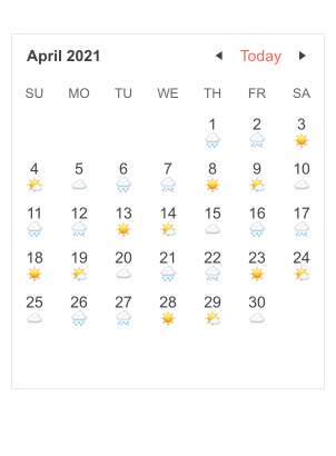
The Telerik Calendar for Blazor now supports custom rendering via templates for the Month, Year, Decade and Century views of the component. In the screenshot below you can see custom rendering of the days in the Month view based on certain conditions.
Telerik UI for Blazor Calendar Template
Calendar CellRender Event
To apply further conditional styling to the calendar cells, you can now use the CellRender event and apply additional logic.
Telerik UI for Blazor CellRender Event
Support for ShouldRender Property in the Grid, TreeList, Splitter & TreeView
The ShouldRender property allows you to make the component re-render after async callback is attached to certain events. We have exposed the feature to multiple relevant events in the following components:
- Grid – OnRowClick, OnRowContextMenu, OnRowDoubleClick, OnExpand, OnCollapse
- TreeList – OnExpand, OnCollapse
- Splitter – OnExpand, OnCollapse, OnResize
- TreeView – OnExpand, OnItemClick
New Visual Studio Code Converter
Recognizing the growing demand and interest for Visual Studio Code, we added another Telerik time and effort saver to it. In addition to the existing Telerik Blazor Convert Wizard for Visual Studio, with this release we added new Visual Studio Code Converter, which allows seamless setup and configuration of Telerik UI for Blazor components in existing Blazor projects from within your favorite IDE.
Updates in Telerik Document Processing
In the latest distribution package you will find Telerik.Documents.Flow.FormatProviders.Doc NuGet that will allow you to import .doc file format, and then manipulate, convert and export it to any of the other supported format providers.
Telerik Forums Revamp
And last but not least, we revamped one of the favorite places that developers love hanging out—the Telerik Forums. Check out the complete forums story of why and what in the dedicated blog post.
Telerik and Kendo UI Forums Hub
Download Telerik UI for Blazor 2.24.0
Head over to the Telerik UI for Blazor page, download a free trial of Telerik UI for Blazor 2.24.0, or if you are an active license holder you can grab the latest and greatest from the “Your Account” page or update your NuGet Telerik.UI.for.Blazor package reference to version 2.24.0. directly in your Blazor solutions.
Download Telerik UI for Blazor 2.24.0
Webinar & Dedicated Twitch Sessions
Be sure to sign up for the Telerik R2 2021 release webinar and live Twitch sessions to see the newly released components and features in action:
- Telerik R2 2021 Release Webinar on Tuesday, May 18 I 11 am – 1 pm ET
- Live Twitch session on Wednesday, May 19 I 9 – 10:30 am ET (Blazor, WinUI, Xamarin)
- Live Twitch session on Thursday, May 20 I 1:30 – 3 pm ET (Blazor, WinUI, Xamarin)
Thank You!
- Your Telerik Blazor Team at Progress
This content originally appeared on Telerik Blogs and was authored by Maria Veledinova
Maria Veledinova | Sciencx (2021-05-12T15:09:26+00:00) What’s New in Telerik UI for Blazor R2 2021. Retrieved from https://www.scien.cx/2021/05/12/whats-new-in-telerik-ui-for-blazor-r2-2021/
Please log in to upload a file.
There are no updates yet.
Click the Upload button above to add an update.

