This content originally appeared on TPGi and was authored by Ian Lloyd
Having read Steve Faulkner’s post a short while ago about the often-questionable use of roles in HTML when a more suitable native HTML element would be far better, I was prompted to come up with something that would help in some small way to alleviate this problem. Immediately, I had the idea of creating a user style sheet that specifically called out potentially misused roles.
But before we continue any further, let’s just take a step back and briefly remind ourselves why using a native element is better than redefining a nonsemantic <div>. For this, we will use the classic case of the button (and apologies to all those for whom this is old hat).
How to make a button – the hard way
To create a button from scratch, you could add a role of “button” to a <div>. You would also need to add a tabindex attribute so that keyboard-only users can active this link, so you end up with this:
<div role="button" tabindex="0">Details</div>By default, this will neither look nor behave like a button, which isn’t exactly ideal. Here is said button as viewed in the browser:

So, we can (and should) style it to look more like a button by adding some padding, a border, some hover and focus styles (the usual buttony traits) and eventually you will end up with something like this:
[role="button"] {
 margin: 10px 20px;
 display: inline-block;
 padding: 10px;
 border: 1px solid gray;
 background: #efefef;
 text-align: center;
 border-radius: 5px;
 font-size: 20px;
}
The problem here is that when you click on it or try to activate it using the keyboard, it does nothing. You still need to hook up some JavaScript to capture the click events and allow the button to be activated with Enter key or Space. So it’s time to roll up the sleeves and write some code. Here is a script that does this:
function doButtonyThings(){
 alert("Something button-like happens");
}

const allPseudoButtons = document.querySelectorAll('[role="button"]');
Array.from(allPseudoButtons).forEach(pseudoButton => {
 pseudoButton.addEventListener('click', event => {
  doButtonyThings();
 });
 pseudoButton.addEventListener('keyup', event => {
  if ((event.keyCode===13)||(event.keyCode===32)) {
   doButtonyThings();
   if (event.keyCode===32) {
    event.preventDefault();
   }
  }
 });
});
Note that we also have to add even more script to make sure that when Space is pressed, it doesn’t do the default action of scrolling the page, something that’s often forgotten even when Space is supported. This usually results in the button action taking place and then the page immediately scrolling away from wherever that action presented itself. Frustrating.
In reality, the script that adds keyboard support will probably be much more complex than the example above. In most cases where people are creating buttons out of <div>s, they aren’t hand-crafting small pieces of JavaScript. Rather, they are relying on heavy JavaScript frameworks to take care of this (think sledgehammers and nuts). But let’s assume that one way or the other we now have something that looks like a button and behaves like a button. Because it is exposed as a button to assistive technology through its role attribute and it responds to keypresses, it is accessible. It took some effort to get here but job done, right?
How to make a button – the simpler way
Let’s not beat around the bush, though—it would’ve been far simpler to do this:
<button type="button">Details</button> About the hardest thing to do here is to remember to add type="button" to ensure that the button won’t act as a submit button when it’s inside a <form> element. But with just that markup, you get a button that’s exposed to assistive technology as a button, looks like a button and responds to keypresses without having to add more JavaScript.
So instead of reinventing the wheel each time, let’s try to use what the browser already provides.
User stylesheets to the rescue
I have a number of user style sheets that I use in my daily work that I can toggle on and off to highlight certain aspects of a page. It’s not as robust a process as interrogating the actual markup in developer tools, but it does provide a quick at-a-glance view of the page, and it can give you very high-level overview about how the page has been developed. For example, I have user style sheets that indicate structural elements such as sections, lists, headings and tables. I have another style sheet that specifically looks for aria authoring patterns such as tabs, tree menus and suchlike, and it attempts to visually indicate where certain patterns have not been adhered to. These ones are less robust, but as before, they can sometimes alert me to problems that require further investigation even before I run any automated testing tools.
With the use of roles, I knew that there was a possibility that one of these diagnostic style sheets could be used to alert where a role is used and, furthermore, indicate even more clearly cases where a role has been applied where a native HTML equivalent would have been a far better option. I set about creating this style sheet, an excerpt of which you can see below (covering just buttons and links):
[role="button"]:before,
[role="link"]:before {
  content:"🚨 ROLE:" attr(role);
  border:2px solid darkred;
  color:darkred;
  display: inline-block;
  padding: 0 5px;
  margin: 2px 5px 2px 0;
  border-radius: 5px;
  background: white;
  font-size: 16px;
  font-family: sans-serif;
  font-weight: bold;
}
button[role="button"]:before,
a[role="link"]:before {
  content:"⚠ ROLE:" attr(role);
  border-color:orange;
  color:black;
}
In essence, it’s looking for role attributes that we know have native HTML equivalents, and it screams at you. If the role is applied to the equivalent HTML element, that scream is downgraded to a general grumble and some shifty, judgemental looks.
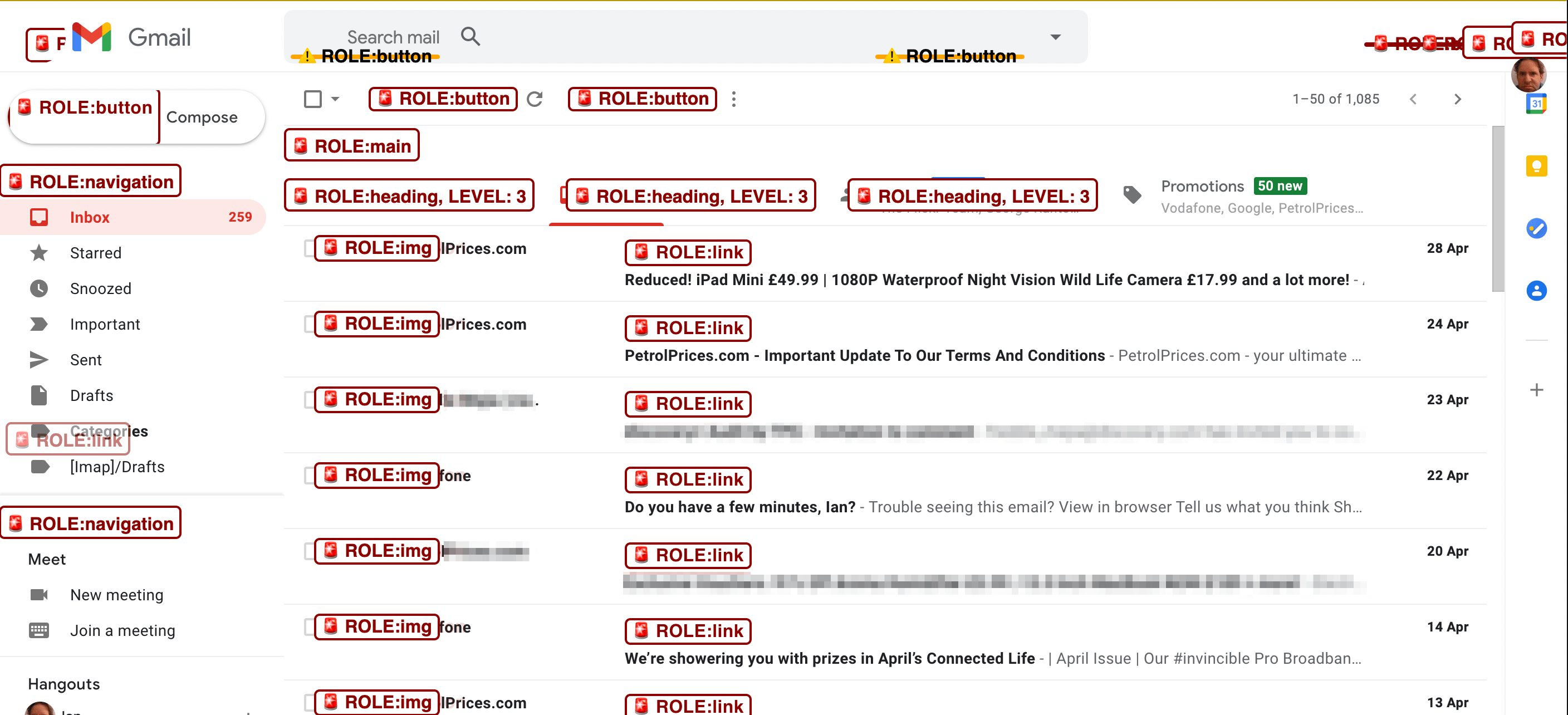
Here’s an example of it put to use on Gmail:

In the spirit of openness and also so that others might be able to correct any heinous mistakes that I may have made, I’ve made this role-highlighting user style sheet available on GitHub. Look for the CSS file named ‘reveal-roles.css’. (And also feel free to extend and enhance with pull requests as you see fit.)
You’ve found some issues. Now what?
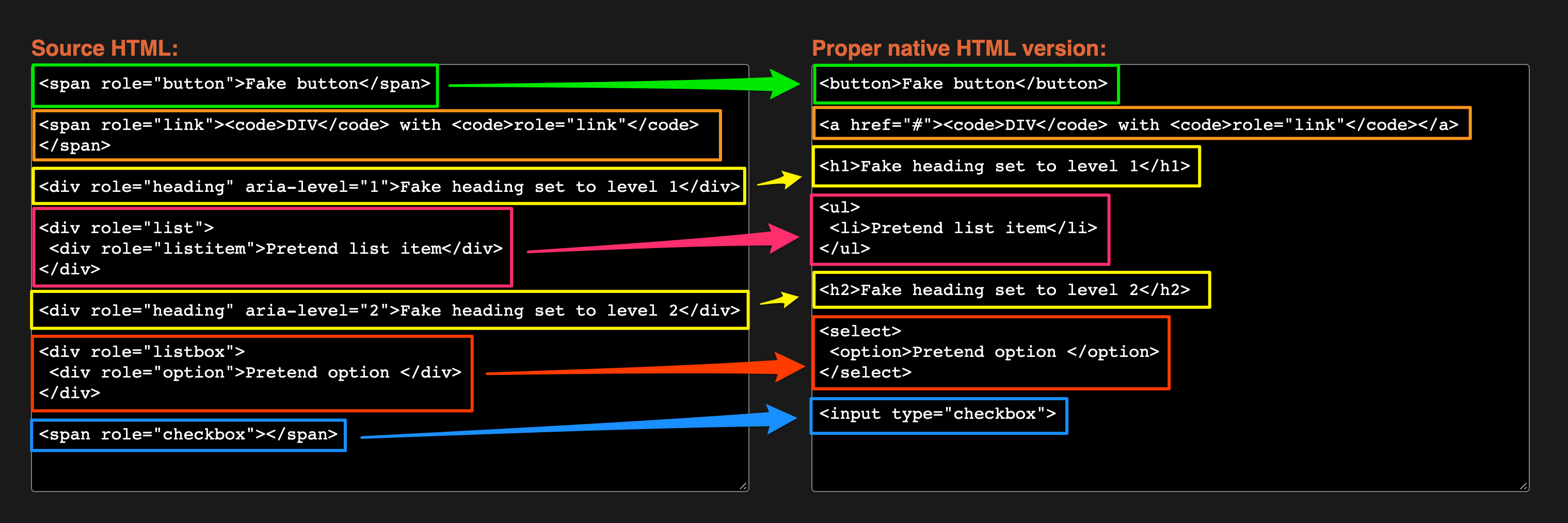
It’s one thing to highlight issues or potential issues on a page, but we ultimately want to be able to fix those. If you can 100% reliably identify a problem on the page, then you should be able to rectify it in a reasonably robust manner. With this in mind, I created a tool which I have called Role Reverser. Using the same set of selectors used in the diagnostic style sheet, the tool can be used to interrogate markup that you paste into it, then replace any nonsemantic role-attribute-based HTML elements with their native HTML equivalents. Here’s a before-and-after example:

If you’re a developer, this at least helps you understand what you might need to change on the page to make your markup more accessible by default. It also helps an accessibility practitioner quickly provide that semantic version in remediation advice that they give when auditing a site.
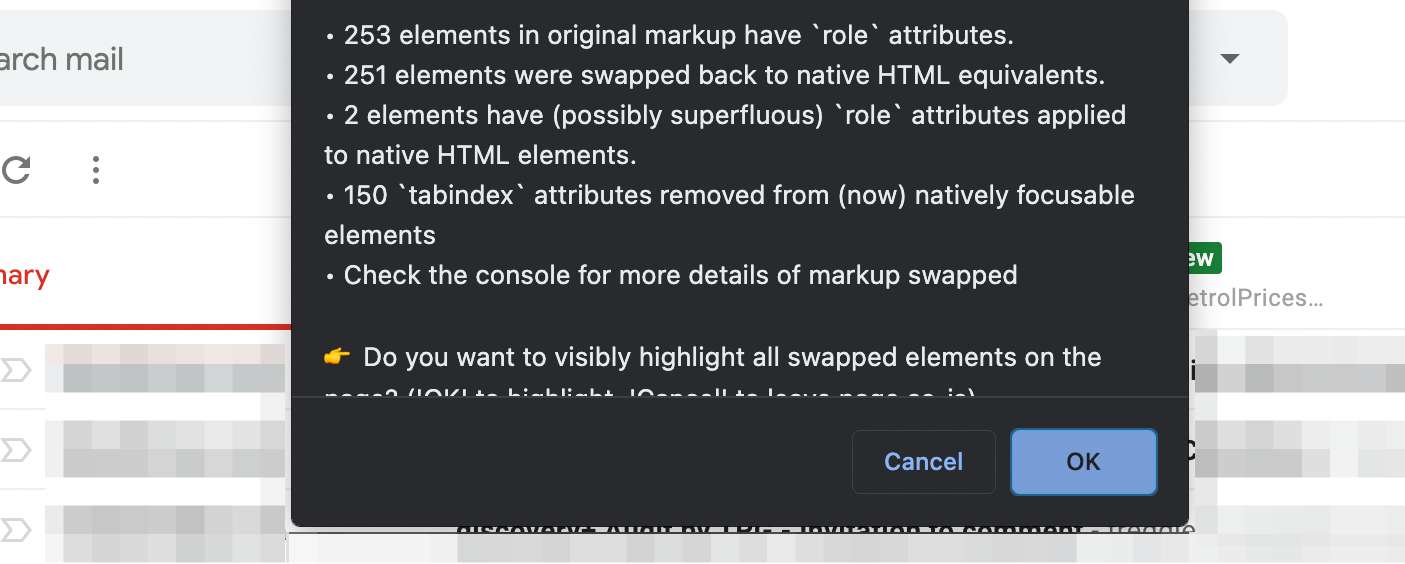
The tool lets you paste markup into it to generate a more semantic version of the source markup, but you can also run a bookmarklet version of the tool on any page to see the effect of changing to native HTML elements. Going back to our old friend Gmail, here’s the summary of what the tool finds on the page:

The alert reads:
- 253 elements in original markup have
roleattributes. - 251 elements were swapped back to native HTML equivalents.
- 2 elements have (possibly superfluous) `role` attributes applied
- 150
tabindexattributes removed from (now) natively focusable elements
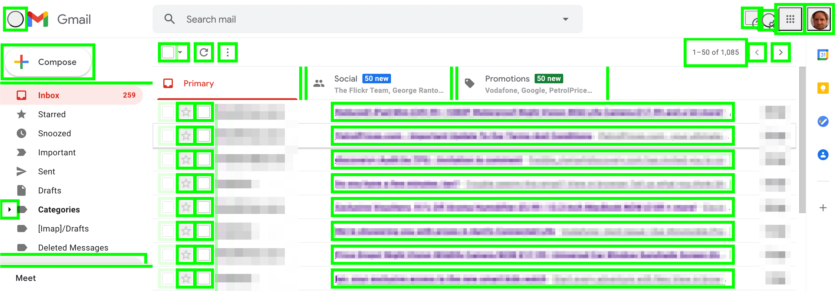
If you hit the ‘OK’ button, it will visually highlight all swapped elements on the page that are now native HTML equivalents (pressing ‘Cancel’ leaves the swapped elements in place—it just doesn’t outline them in lurid, tasteless lime green):

What it cannot do, of course, is fix the problem at its source. So if a page is written with a framework of some description, and the framework uses templates to generate the markup, then the end result from running this tool will only give you an indication of what should be in the page’s markup. It is a target, something to aim for.
Another consideration to make is that some developers might create custom markup using <div> elements because they have an aversion to working with <button>s and other native controls—because of their default styling. It would appear that for many of these developers, the task of resetting some of those default styles is more of a headache to them than creating a button from the ground up using <div> elements, and then applying custom JavaScript and CSS to make it look and behave like a button.
Using this tool to replace one of these pretend buttons with a real <button> element may introduce styling and behaviour issues. Sometimes making a swap like this can be seamless. It really depends on how the CSS has been created on a given site and whether any global CSS resets have been used.
In summary, don’t make things hard for yourself as a developer by putting in all that extra legwork to recreate these native elements from scratch. Take the simple approach and use what the browser gives you for free. If it looks like a button, it can be clicked like a button, and it smells like a button… then it should probably be a <button>. And the same goes for you, all you pretend tables and phony links!
The post Enough with the role-play—let’s get back to the basics appeared first on TPGi.
This content originally appeared on TPGi and was authored by Ian Lloyd
Ian Lloyd | Sciencx (2021-05-16T13:30:56+00:00) Enough with the role-play—let’s get back to the basics. Retrieved from https://www.scien.cx/2021/05/16/enough-with-the-role-play-lets-get-back-to-the-basics/
Please log in to upload a file.
There are no updates yet.
Click the Upload button above to add an update.
