This content originally appeared on Bits and Pieces - Medium and was authored by Eden Ella
Why you should stop publishing monolithic NPM packages and start collaborating on independent components.

React components are most often shared between projects by publishing components as a single Node package, a solution that seems to be chosen by many due to technical limitations more than anything else.
In this article, we’ll explore a radically different solution for sharing and collaborating on components, Bit.
Bit: The platform for the modular web
Bit is a tool for developing, versioning, and composing independent components.
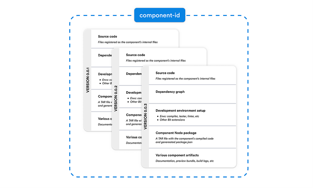
Independent components are components that are independently developed and versioned. They encapsulate in them their source code, dependency graph, dev environment configurations, and various generated artifacts (including the component’s Node package).
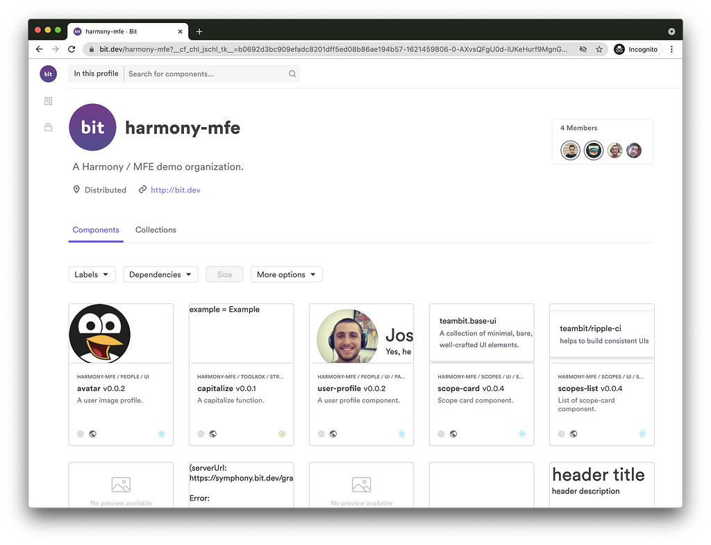
See examples of independent components organized into different scopes, here:
Initializing a Bit workspace
$ mkdir ws-directory && cd ws-directory
$ bit init --harmony
successfully initialized a bit workspace.
Install Bit on your machine and initialize a Bit workspace.
A Bit Workspace is a local development environment for independent components. It provides a simplified, monorepo-like, dev experience for the development and composition of independent components.
Setting up a scope
// file: workspace.jsonc
{
  "$schema": "https://static.bit.dev/teambit/schemas/schema.json",
  "teambit.workspace/workspace": {
    "name": "my-workspace-name",
    "defaultDirectory": "{scope}/{name}",

    "defaultScope": "my-org.my-scope"  <-- <owner>.<scope-name>

   },
  // ...
}
A scope, a storage place for independent components, can be hosted on your own server or on bit.dev.
To use bit.dev, sign up, and create your own scope or “collection”, then set the desfaultScope property to that scope’s name (incl. the owner’s name).
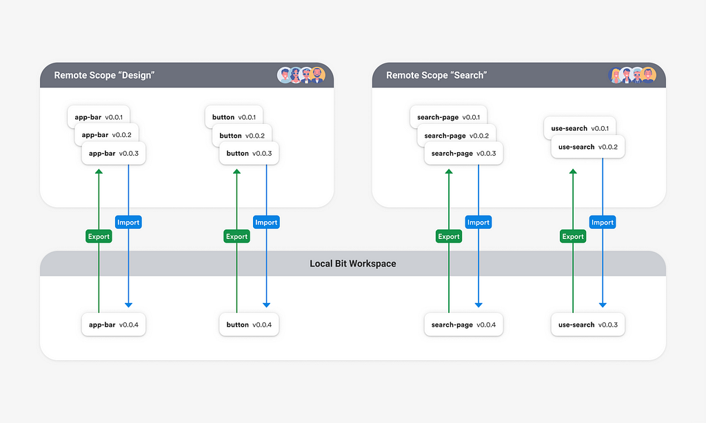
A single workspace can export its component to different remote scopes.
Choosing a development environment
// file: workspace.jsonc
{
// ...
  "teambit.workspace/variants": {
    "*": {
      "teambit.react/react": { }
    }
  }
}
A development environment is just another independent component. Each environment provides multiple services needed for component development. That includes compiling, testing, linting, documenting, CI, and more. Here we’ll use teambit.react/react , Bit’s official React environment.
Two important things to know about environments:
- You can create and share your own customized environment by extending an existing one.
- You can use multiple environments in a single workspace (for example, a React environment, a React Native environment, and a Node environment). In the example above, I’ve used the * sign to apply the React environment on all components in that workspace but specific directories and namespaces can also be used to apply the React env on a more limited set of components.
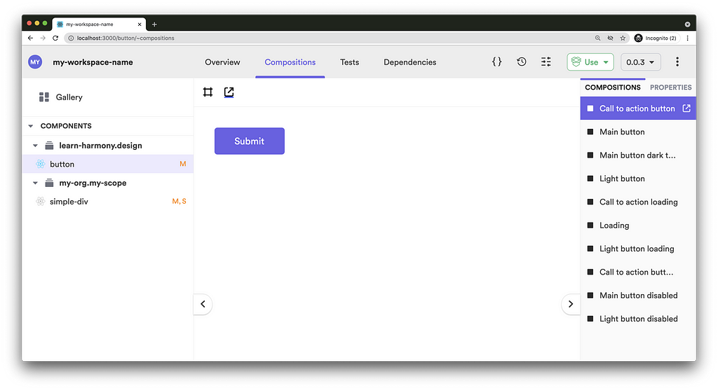
Running the Workspace UI
The workspace UI displays the components’ documentation, previews, test logs, version logs, dependency graphs, and much more.
It also keeps us informed with our components’ statuses (much like statuses found to the side of files in VSCode).
$ bit start
You can now view 'my-workspace-name' components in the browser.
Bit server is running on http://localhost:3000
Creating the component’s files & tracking them as a single component
$ bit create react-component simple-div
the following 1 component(s) were created
my-org.my-scope/simple-div
    location: my-scope/simple-div
    env:      teambit.react/react
Components in Bit can be created using a pre-defined template or entirely from scratch. We’ll create a simple div component just to speed things up. The bit create command creates a set of files and tracks them as a single component.
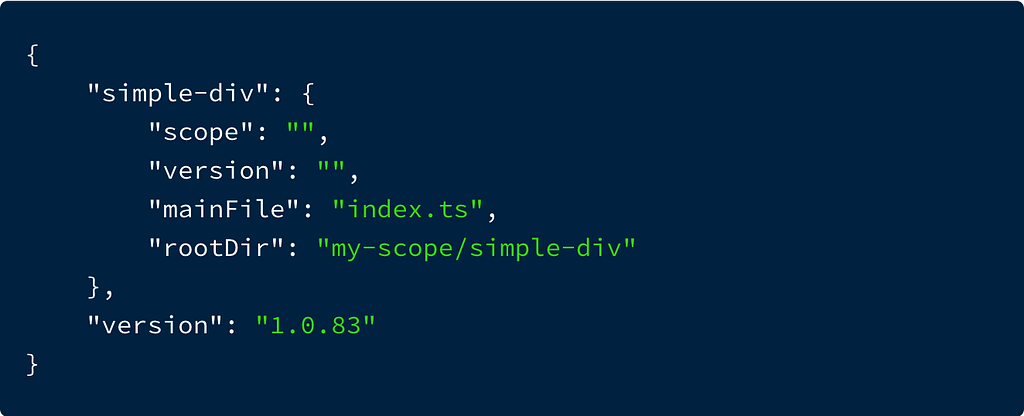
You’ll see your tracked components in the workspace .bitmap file (right now the simple-div component is not yet versioned)
Let’s explore the generated files:
> index.ts
The component’s entry file.

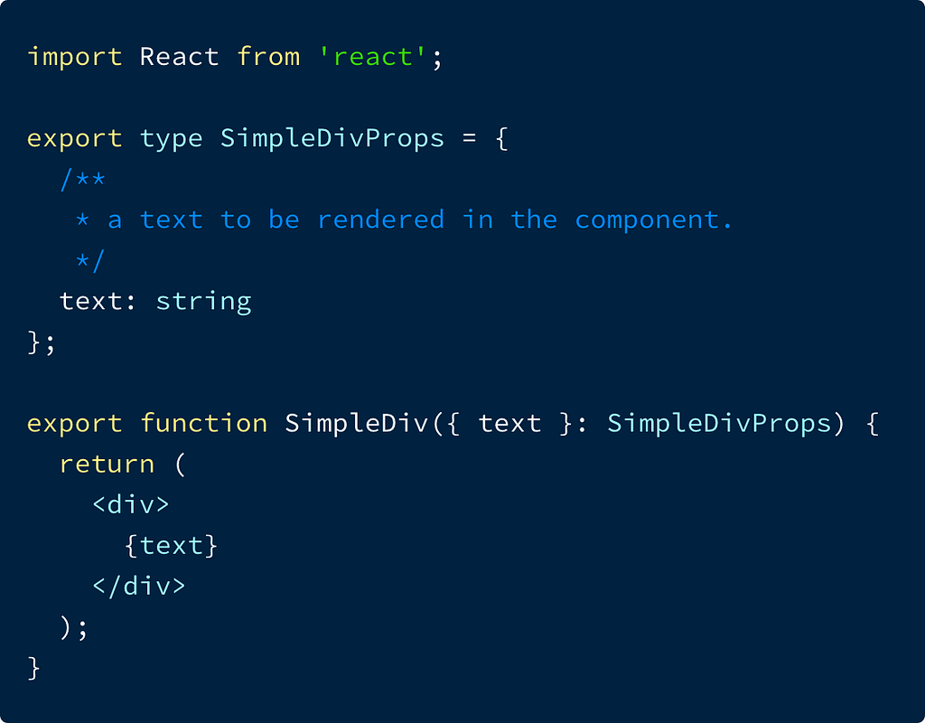
> simple-div.tsx
The component’s implementation file
> simple-div.compositions.tsx
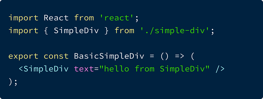
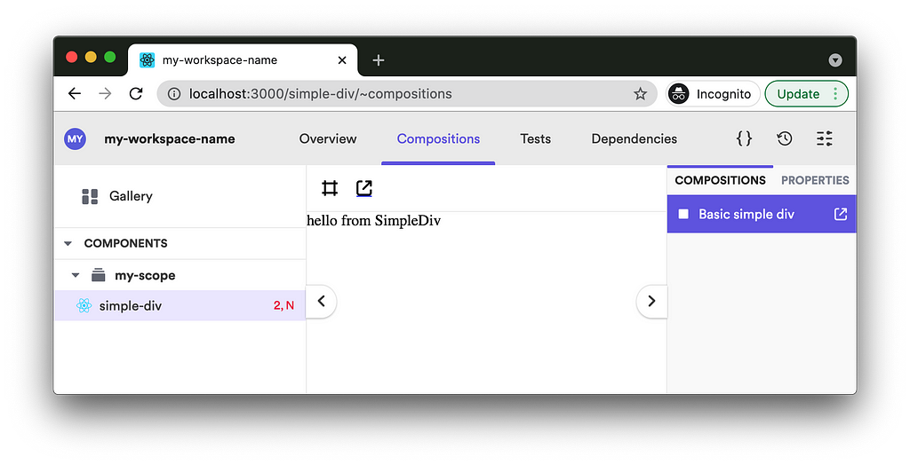
‘Compositions’ are usages or instances of a component that are loaded by Bit and rendered in isolation. ‘Compositions’ can be used to demonstrate a stand-alone component (similarly to Storybook), but more importantly, to run manual and automated integration tests. They provide the author of a component with a way to validate these integrations will be successful when done by consumers of that component.
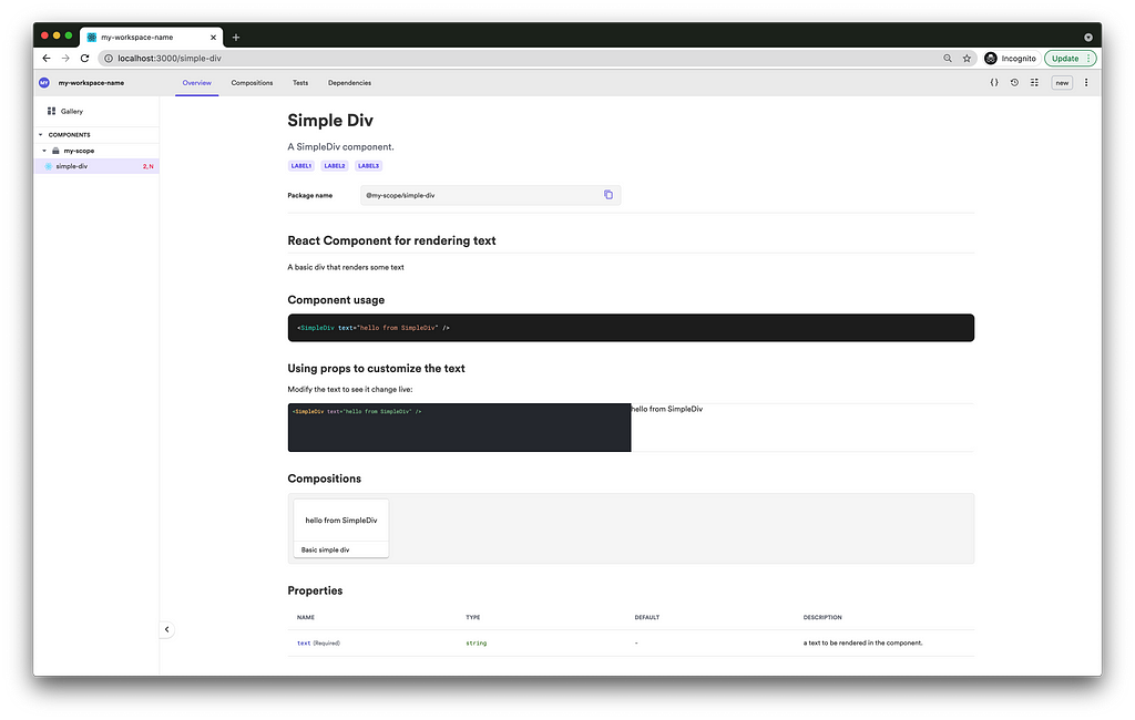
> simple-div.docs.mdx
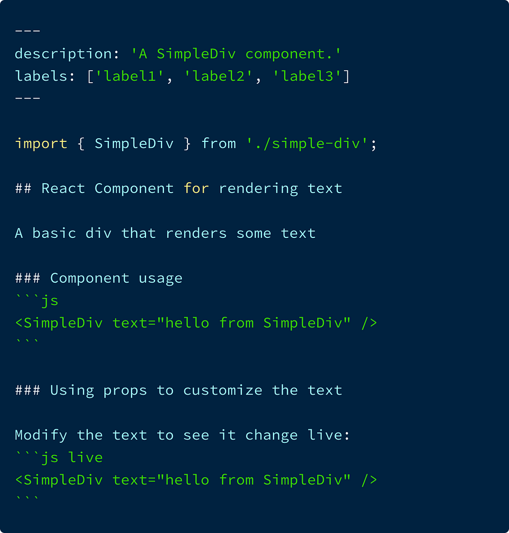
A Bit-flavored MDX documentation file that allows integrating JSX with Markdown, and Bit-specific frontmatter (metadata) properties.
The manually authored docs will be embedded with a properties table that was auto-generated from TypeScript/prop-types, and JSDoc. The documentation is loaded by Bit and rendered in the component’s ‘Overview’.
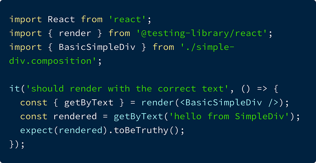
> simple-div.spec.tsx
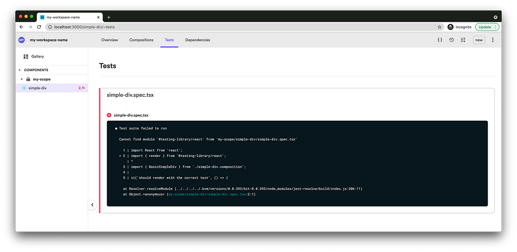
The component tests. Tests can directly use the component or one of its compositions. Tests run when in ‘watch mode’ (when Bit’s dev server is running), when the component is tagged with a new version, and when a dependency of that component is tagged with a new version. Right now the test fails as there is no @testing-library/react installed in that workspace.
Tagging a component with a new release version
$ bit tag simple-div 1.0.0 --message "first release version"
1 component(s) tagged
(use "bit export [collection]" to push these components to a remote")
(use "bit untag" to unstage versions)
new components
(first version for components)
     > simple-div@1.0.0
The tagging process will tag the component with a new release version, but before that, it will run its CI. This will include testing, compiling, generating a node package, generating the bundled documentation and compositions (for preview), etc. All these artifacts will be part of the final release version.
Once the build process completes, the component is versioned and stored as objects inside the workspace .git/bit directory. In the next step, these objects will be pushed to a remote scope.
Exporting a component’s release version
$ bit export
Now that we have an immutable version of our component with all its artifacts and configurations encapsulated, we are ready to export it to a remote scope. This will be the scope previously set in the defaultScope property in the workspace configuration file (workspace.jsonc ).
Collaborating on independent components
Importing (cloning) an independent component into a workspace
$ bit import learn-harmony.design/button
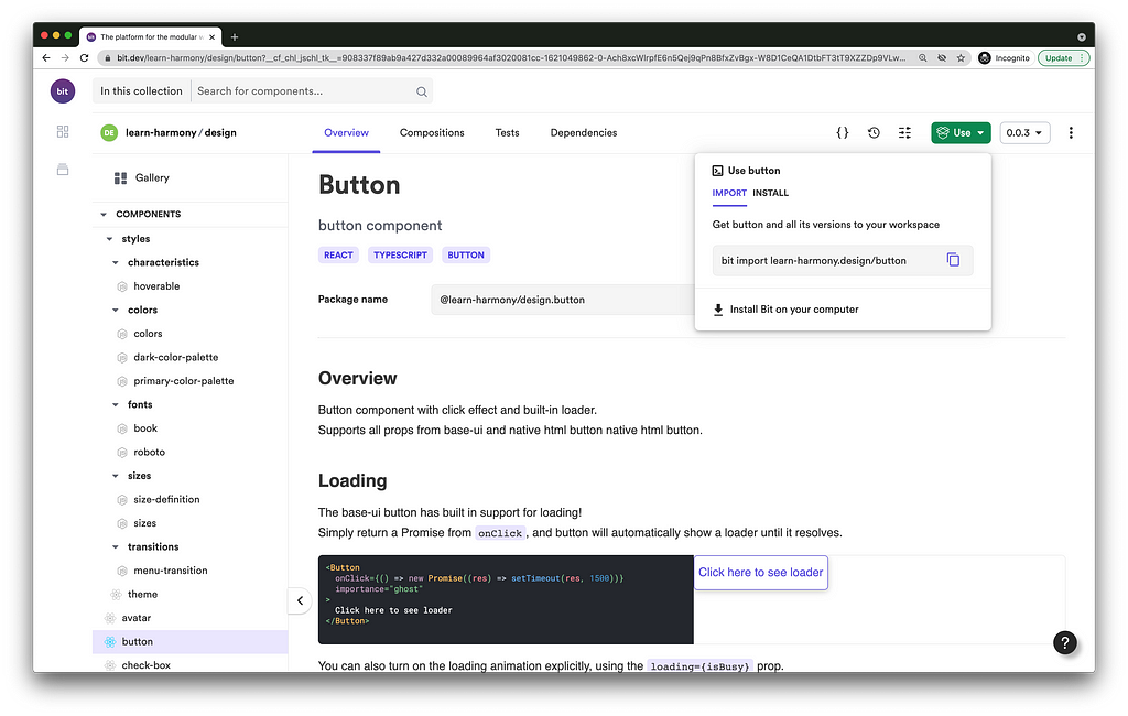
The import process clones the component’s source files, dependency graph, and distributable code (compiled code and package.json ), into a Bit workspace. To make collaboration as easy and seamless as possible, the component's dev environment configuration is imported as well. That means no time gets wasted on setting up the right dev environment.
An imported component is consumed using its absolute node package name and not its relative path. This makes every component independent of its context. For example, to use the imported button component in the previously generated ‘simple-div’ component, we’ll do the following:
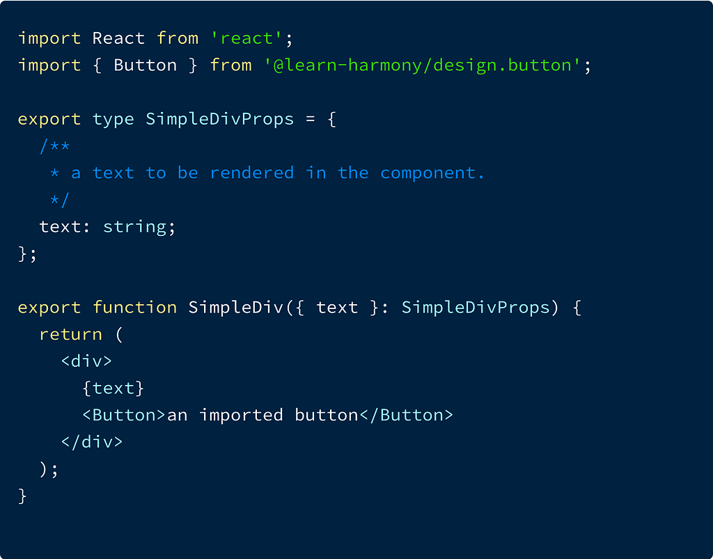
Imported components can be modified and exported back with a new release version.
Installing a component’s package
$ bit install @learn-harmony/design.button
As mentioned earlier, an independent component also encapsulates a distributable Node package. This package can be directly installed from bit.dev, or other registries (the publishing process, as anything else in Bit, is customizable).
Packages in a Bit workspace are installed using the bit install command. However, they can also be installed using popular NPM clients by configuring your NPM client.
Managing independent components dependencies
Bit auto-generates and manages the dependency graph for each component and for the entire workspace. Looking at the ‘Dependencies’ tab for the ‘simple-div’ component, we can see that it now depends on the newly imported ‘button’ component and its dependencies.
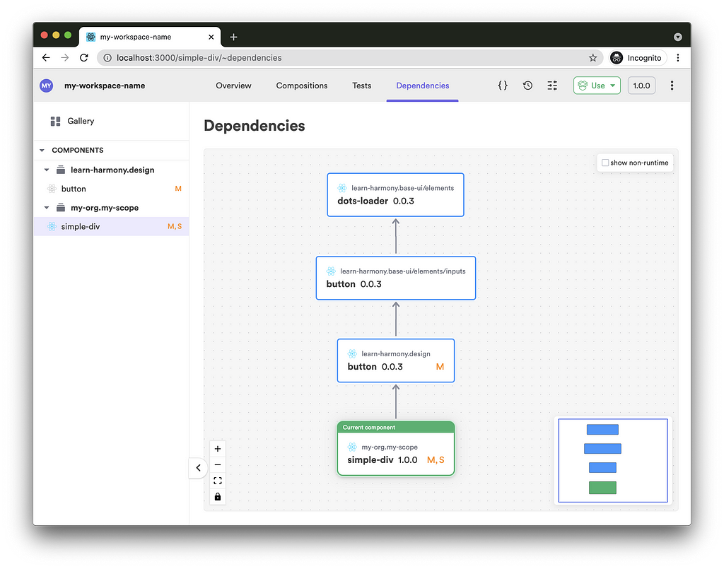
Updates made to any component in this dependency graph will propagate to the ‘simple-div’, triggering its CI and tagging it with a new release version.
Bit (OSS) offers a component-driven CI that propagates through all affected components on a single workspace. Bit.dev offers a component-driven CI that propagates through all exported components, across-scopes.
Conclusion
Now that we have independent components, there’s really no reason to compromise on modularity. Why should your consumers have to deal with the entire library when all they need is one or two components? Why should they deal with updates that are irrelevant to their own use? Why should maintainers of these components have to deal with the entire library and not just the components they’re working on? Why would permission levels be ubiquitous to all components? I can keep going…
Try it out for yourself ->
Bit: The platform for the modular web
Related Stories
- Independent Components: The Web’s New Building Blocks
- Building a React Design System for Adoption and Scale
- 6 Ways to Speed Up Web Application Development with Bit
- 4 Bit Use-Cases: Build Micro Frontends and Design Systems
Collaborating on React Components with Bit was originally published in Bits and Pieces on Medium, where people are continuing the conversation by highlighting and responding to this story.
This content originally appeared on Bits and Pieces - Medium and was authored by Eden Ella
Eden Ella | Sciencx (2021-05-19T22:17:27+00:00) Collaborating on React Components with Bit. Retrieved from https://www.scien.cx/2021/05/19/collaborating-on-react-components-with-bit/
Please log in to upload a file.
There are no updates yet.
Click the Upload button above to add an update.
