
This content originally appeared on Bits and Pieces - Medium and was authored by Eden Ella
Building a React Component Library — The Right Way
How to build a component library in React and TypeScript, with a fantastic developer experience.
In this tutorial, we’ll build a modular React + TypeScript library with documentation, tests, isolated component previews, and much more.
Why modular? Modularity is key to a “good library”. It what makes a library easy to maintain, and easy to use. Using the right tools, modularity becomes very easy to achieve.
Using Bit to develop, version, push and publish individual components — all from the same workspace
We’ll use Bit to develop and version each component in isolation and manage the dependencies between components in our project. Our components will then be individually published to a package registry of our choice, each with a package.json that was auto-generated by Bit.
I addition to that, each component will be ‘exported’ (pushed) as an independent component to Bit.dev’s component hosting. This will allow us to collaborate on components, with many features, and enjoy a component-driven CI that propagates updates from a single component to all its dependents (we’ll also source-control the entire workspace and push it to Github, but more on that later).

Using a pre-configured development environment for components
We’ll make use of Bit’s pre-configured (and extensible) React component development environment, to get us up and running as quickly as possible, and doing so using a setup that implements best practices.
Our environment will provide us with lots of goodies for component development, like TypeScript (for compilation), Jest (for testing), MDX (for documentation), and Webpack (for the bundled component previews), to name just a few.
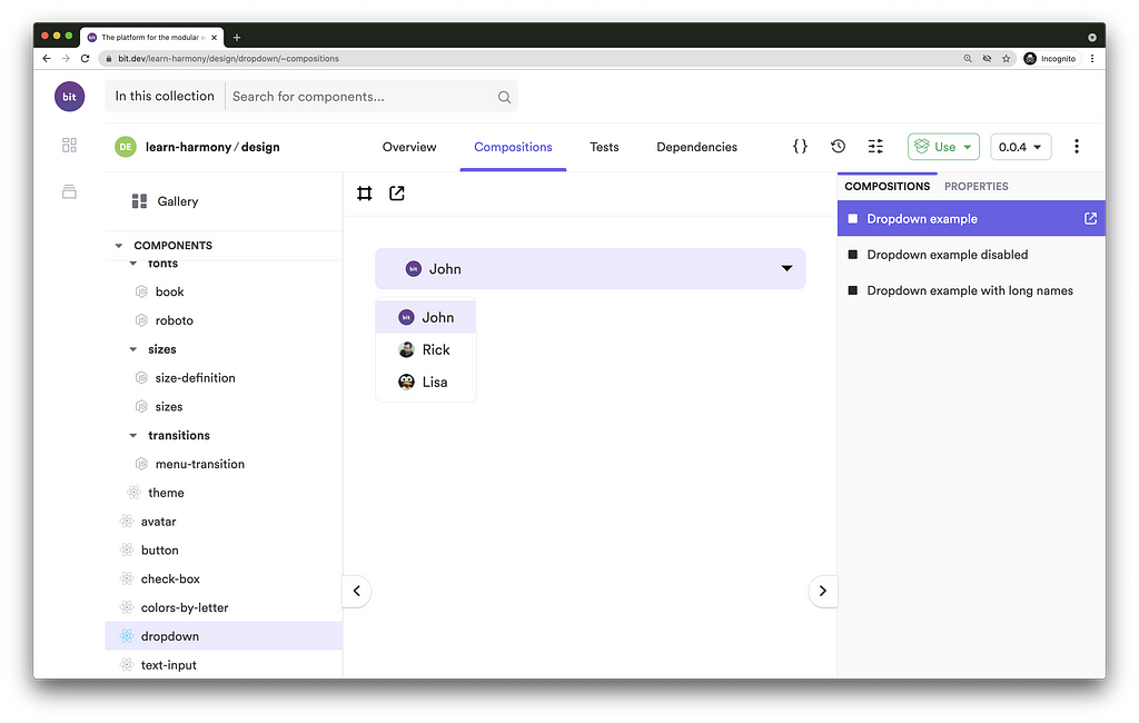
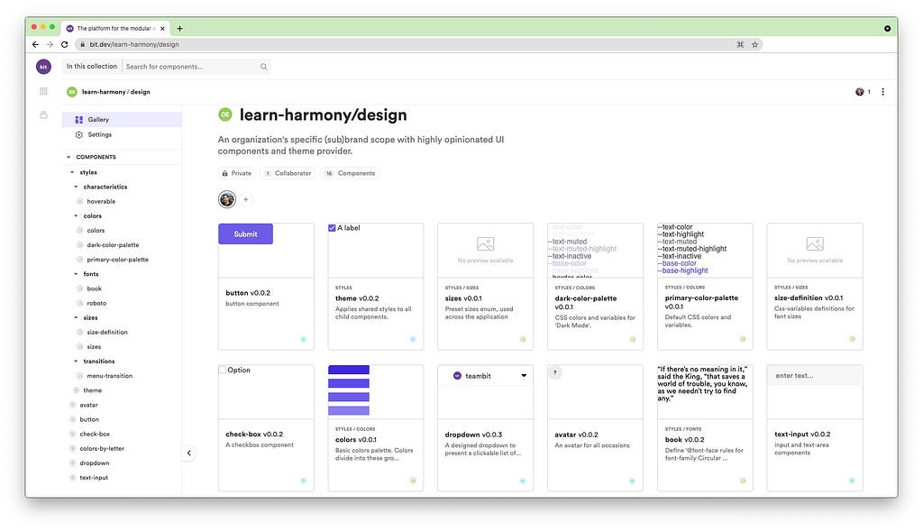
Before we begin, to get a clear picture of how a “library” built with Bit looks like, check out this remote scope hosting multiple independent components:
Setting up a Bit workspace
A Bit workspace is where independent components are developed and versioned while retaining a simple, monolith-like, dev experience.
Initialize a Bit Workspace
- Install Bit on your machine.
We’ll start by installing Bit version manager (BVM), and use it to install Bit.
$ npm i -g @teambit/bvm
$ bvm install
For more information and troubleshooting, see here.
2. Initialize a new Bit workspace using the react-workspacetemplate. We’ll name our workspace my-component-library :
$ bit new react-workspace my-component-library
a new workspace has been created successfully at path/to/my-component-library
3. Install all workspace dependencies:
$ bit install
Bit creates the following files when initializing a new workspace:
workspace.jsonc - The workspace configuration file that sets rules and policies for the workspace and all its components. Since we’ve generated our workspace using the react-workspace template, it is already set to use Bit’s offical React component development environment.
.bitmap - An auto-generated mapping between tracked components in the workspace and their physical location on the filesystem. Learn more here.
.bit - Your local scope. Where your workspace's component release versions are stored.
Set up a remote scope for hosting
- A remote scope is where independent components are hosted so that they can be used across different projects.
Bit.dev is a package registry and a platform for independent component hosting. We’ll use it to publish and install packages, but also to collaborate on components (though, as mentioned earlier, components can also be published to NPM’s registry or any other registry).
Head over to bit.dev to create a new scope (“collection”) for component hosting. Make sure to choose the ‘Harmony’ scope type. - Open the workspace.jsonc file and set the defaultScope property to your username and scope name.
// file: workspace.jsonc
{
  "$schema": "https://static.bit.dev/teambit/schemas/schema.json",
  "teambit.workspace/workspace": {
    "name": "my-component-library",
    "defaultDirectory": "{scope}/{name}",
// <scope-owner>.<scope-name>
"defaultScope": "our-org.my-scope"
// ...
}
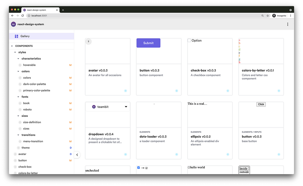
Running Bit’s dev server and Workspace UI
The workspace UI lets us explore components managed by the workspace, and get real-time feedback regarding each component status (found issues, etc.).
Let’s start Bit’s dev server to run the workspace UI. This will also run various dev services in watch mode (e.g, testing, compiling, etc.).
$ bit start
ENVIRONMENT NAME        URL                               STATUS
teambit.react/react     http://localhost:3100             RUNNING
You can now view 'my-component-library' components in the browser.
Bit server is running on http://localhost:3000
Creating the component files
Create a new component named ‘button’ with the namespace ‘inputs’, using one of the React environment component templates.
$ bit create react-component inputs/button
the following 1 component(s) were created
my-scope/inputs/button
    location: my-scope/inputs/button
    env:      teambit.react/react
Using a component template is not mandatory. Learn more here.
Tracking a new component
Our component files have been generated and are now tracked as a single component. Check your workspace .bitmap file to see that the button component was added.

The version property is blank since our component hasn’t yet been tagged with a release version.
Handling issues found with the new component
If we head over to our workspace UI (localhost:3000), we can see that an issue was found with our component (the “N” notation to the right of the component name).
Since Bit Harmony is in its beta release, you may encounter bugs. If that happens, restart Bit’s dev server (Ctrl+c and bit start ).
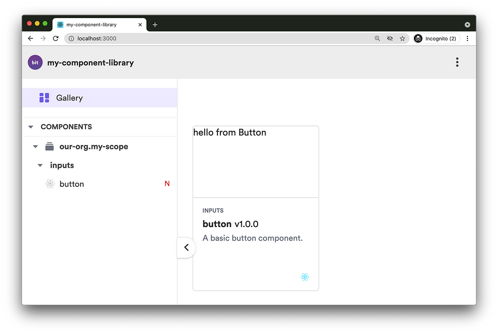
To examine this issue run:
$ bit status
new components
(use "bit tag --all [version]" to lock a version with all your changes)
> inputs/button ... issues found
missing packages or links from node_modules to the source (run "bit install" to fix both issues. if it's an external package, make sure it's added as a package dependency):
          button.spec.tsx -> @testing-library/react
We’ll install the missing dependency using Bit, like so:
$ bit install @testing-library/react
...
✔ installing dependencies using pnpm
✔ running post install subscribers
✔ linking components
Successfully resolved dependencies for 1 component(s) in 7.184 seconds
Check your workspace.jsonc file to see it updated with the installed library. Note that it will not add this library as a dependency of all components in the workspace, only to those that actually dependent on it (that is because Bit analyzes your code and builds the dependency graph for each componentt).
Behind the scenes, Bit uses pnpm for package installation. You can change that to your package manager of choice, using the workspace.jsonc config file.
Our component is now issues-free:
$ bit status
new components
(use "bit tag --all [version]" to lock a version with all your changes)
> inputs/button ... ok
We’re now ready to continue with our component development. Let’s go over its generated files and update them accordingly, to make a real button.
Implementation file: button.tsx
Right now, our component returns a div element and not a button . Let’s change that in our button.tsx file. We’ll also add a ‘loading’ state to it.
Isolated component previews: button.composition.tsx
‘Compositions’ are usages or instances of a component that are loaded by Bit and rendered in isolation. ‘Compositions’ can be used to demonstrate a stand-alone component, similarly to Storybook (which can be used in addition to this), but more importantly, to run manual and automated integration tests. These tests validate for us (authors and maintainer of a component) that such integrations will be successful when done by consumers of that component.
Our compositions do not reflect our latest updates. Let’s change that by overriding the current composition with two new ones, one for a button in its default state and another when in its ‘loading’ state:
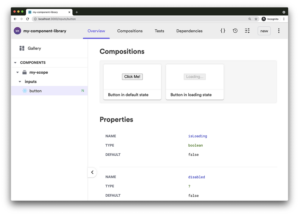
Component documentation: button.docs.mdx
This is a Bit-flavored MDX documentation file that allows us to integrate JSX with Markdown, and add Bit-specific frontmatter (metadata) properties. The docs file is loaded by Bit and rendered on the component’s ‘Overview’ page.
The doc file is already importing the button component into it, to make it available for the doc’s live examples. All that’s left is to change the documentation to better describe our modified component:
---
description: 'A basic button component.'
labels: ['react', 'input']
---
import { Button } from './button';This a basic button with a *'loading'* state.
### Using the button
```js
<Button>Submit</Button>
```
### Live example: Setting the button to 'loading' state
Add and remove `isLoading` to change its state.
```js live
<Button isLoading>Submit</Button>
```

Component testing: button.spec.tsx
Our current test tries to use the previously removed compositions.
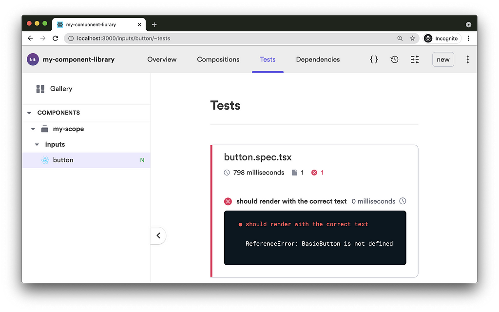
Let’s update our test file with the relevant tests, using the new compositions:
We’ll check our test status again in the workspace UI:

Tagging a component with a release version + running the component CI
Now that our button component is complete, let’s tag it with its first release version.
$ bit tag inputs/button 1.0.0 --message "first release version"
...
new components
(first version for components)
     > inputs/button@1.0.0
The tagging process is automatically preceded by a series of build tasks that are determined by Bit’s various extensions and the component development environment. Once these tasks are done, the generated artifacts are versioned along with the component's source files. The versioned artifacts include:
- A distributable Node package (including a package.json that was auto-generated by Bit)
- Bundled component previews (‘compositions’) and documentation
- Build logs
- Development configurations and dependency graph
- And more.
The release version is stored as git-like objects in the .bit / .git/bit directory (a.k.a, the “local scope”).
‘Exporting’: Pushing and publishing components
Now that we have our component’s immutable release version ready, we can export it to share it with other consumers and collaborators.
$ bit export
exported the following 1 component(s):
our-org.my-scope/inputs/button
The exporting process pushes the component’s release version (the git-like objects) to remote hosting and publishes the component’s package to Bit.dev’s registry.
Both the component hosting (used for component collaboration) and the package registry can be customized to your own preferences (for example, a self-hosted Bit server and NPM’s registry).
Pushing the workspace to Github (or a different git remote hosting)
We’ve talked about pushing independent components to bit.dev but what about the standard git workflow? Do we not collaborate on the workspace as well?
A Bit workspace should definitely be versioned and collaborated on as well. That’s how it’s done:
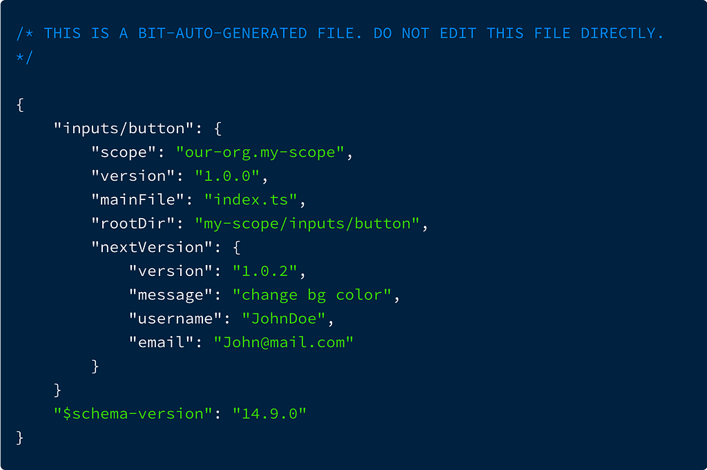
Instead of locally tagging a component with a new release version, we can use $ bit tag --soft <component-id> <new-version>to suggest a new release version. This will update the .bitmap file accordingly. Once we push the workspace to Github (along with the .bitmap file) others can review the suggested changes and your CI can “hard tag” the suggested components and export them. Learn more here.
$ bit tag --soft inputs/button 1.0.2 -m "change bg color"
1 component(s) soft-tagged
(use "bit tag --persist" to persist the changes")
(use "bit untag --soft" to remove the soft-tags)
soft-tagged changed components
(components that set to get a version bump)
     > our-org.my-scope/inputs/button@1.0.2
keep in mind that this is a soft-tag (changes recorded to be tagged), to persist the changes use --persist flag
The .bitmap file will be updated like so:
Unlike the .bitmap file, the .bit directory should not be tracked. Once you clone/pull a Bit workspace, run the $ bit install command to install and import all the workspace dependencies, both packages and independent components. This will keep your workplace up-to-date, even when changes made to a component when done from a different workspace.
Installing a component package
Published packages are installed in a Bit workspace using Bit. For example:
$ bit install @teambit/teaching.ui.elements.dots-loader
The package name can be found in the published registry. — In our case, on the component page in bit.dev.
Packages published to Bit.dev can also be installed using standard NPM clients (like npm and Yarn) by configuring the NPM client (.npmrc ).
Learn more, here.
As mentioned earlier, packages can also be published to NPM (and in that case, require no additional configurations). Learn more, here.
‘Importing’: Cloning a component into a workspace
Components exported from other workspaces can be ‘imported’ (cloned ) and developed, in your own workspace (in addition to being simply ‘installed’),
Let’s import the dots-loader component from the teaching remote scope, owned by teambit. For that, I’ll head over to the dots-loader component page, copy the import command, and run it.
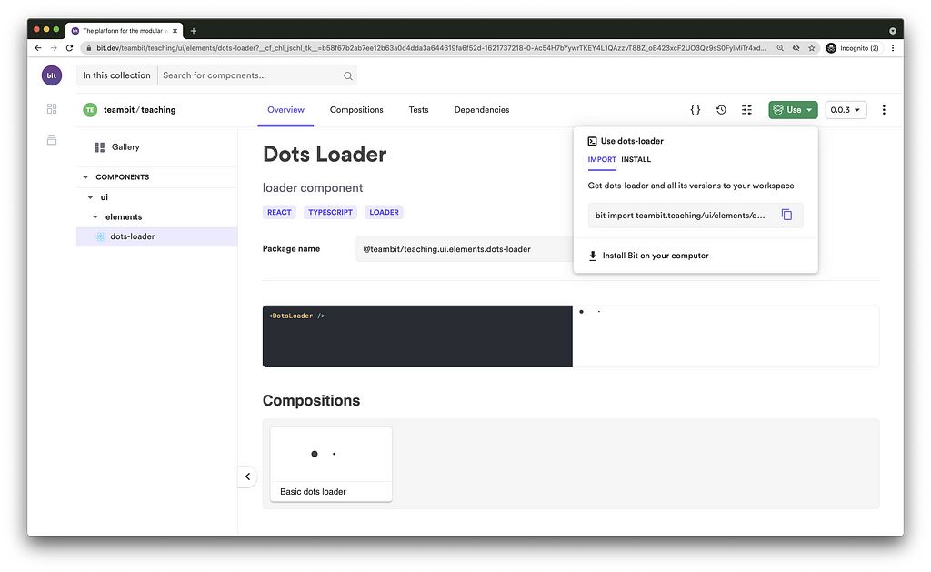
$ bit import teambit.teaching/ui/elements/dots-loader
...
successfully imported one component
- added teambit.teaching/ui/elements/dots-loader new versions: 0.0.1, 0.0.2, 0.0.3, currently used version 0.0.3
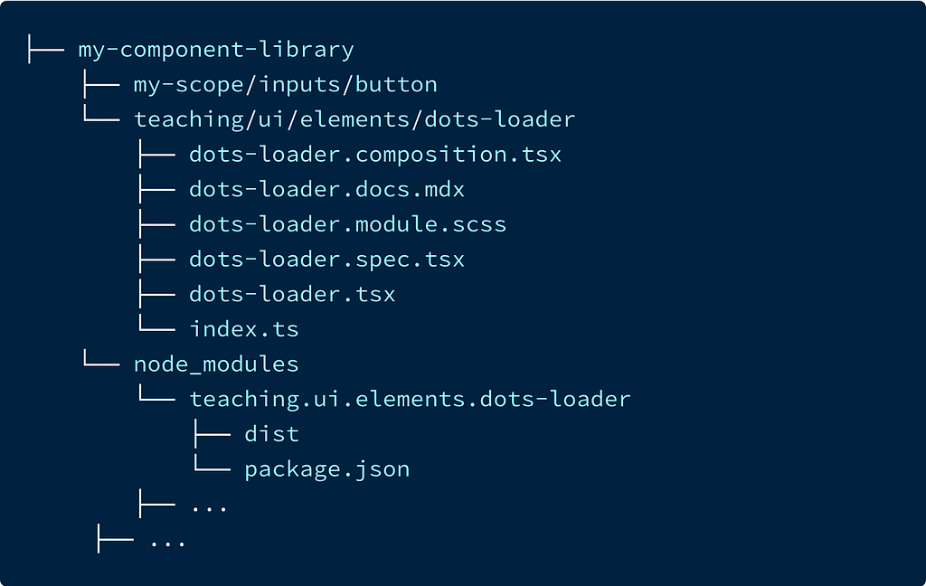
The imported component is now available in our local workspace. Its source files are under the teaching directory and its package is in our node_modules directory, under the owner’s name (teambit).
Changing the component’s source files will trigger re-compilation. That means you can keep using the component package (refer to the package name, and not the source files) while developing the component. That’s true for imported components as well as components authored in the same workspace.
To see the imported component configurations run:
$ bit show ui/elements/dots-loader

Handling component dependencies
Now that we have the dots-loader component, let’s use it to replace the ‘Loading...’ text in our button component (shown when in ‘loading’ state). We’ll do that by importing the component using its package name.
Head over to the workspace UI, to see the new component compositions:

We now have a component that is dependent on another component.
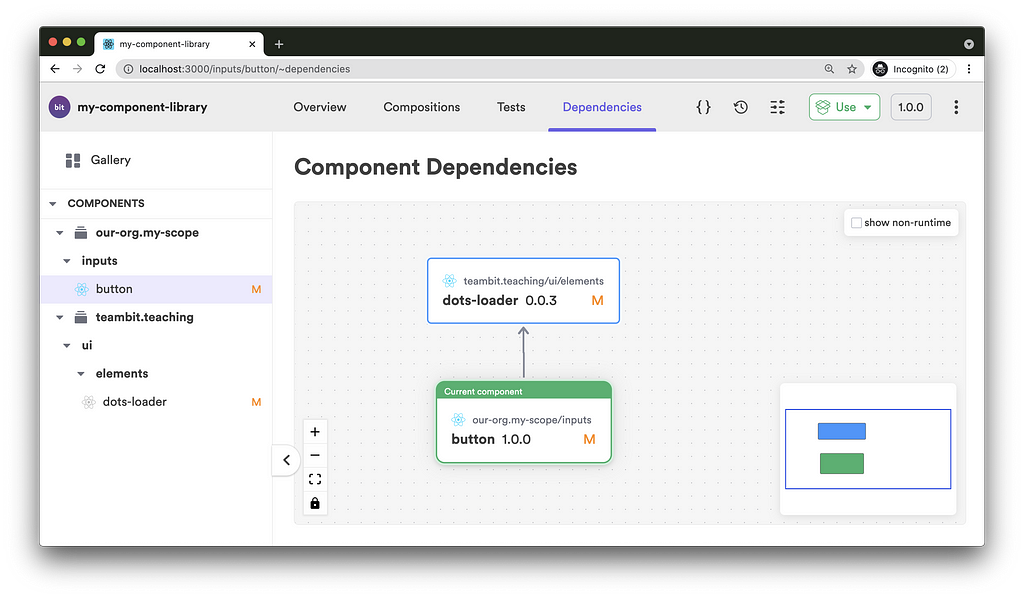
Once the dots-loader component gets modified and tagged with a new release version, Bit will automatically test, build and tag the dependent button component.
If there were any other direct or indirect dependent components, this build & tag propagation would reach them as well.
When using Bit together with Bit.dev, this ripple effect goes beyond the borders of the local workspace into all exported components, across all remote scopes.
Theming components
As with any well-designed component library, your components should only be loosely coupled to their theme. Doing so enables new styles to be easily created just by adding new theming components.
A consumer of that library will have the liberty to install just the right UI components with just the right theme component and have them all composed together, to form exactly what he or she needed. All that, without any redundant code or unexpected side-effects due to bad (and untested) overrides to styling.

Componentization is not exclusive to JavaScript. Styling assets, such as CSS files, fonts, icons, and more, should also be developed with Bit as components. That way they can be versioned, shared, and consumed independently, making the entire “library” far more composable and easy to maintain.
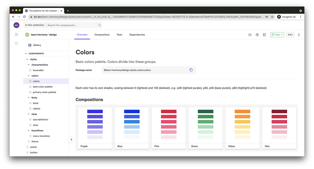
The above colors component can be used similarly to the way other components are used with Bit.
Conclusion
Component libraries are used to accelerate and standardize development by enabling cross-project code reuse.
Building a component library as a monolith naturally restricts the number of shared components and by that the gamut of scale and complexity. This, in turn, limits the rate at which development is accelerated as it takes longer to create new compositions out of very simple components (which is the result of such limitations).
Using Bit, the number of shared components is unlimited. That translates into having components of all levels of complexity and concreteness, enabling consumers of components to create their compositions out of components that are closer to their desired end result.
Learn More
- Building a React Design System for Adoption and Scale
- Independent Components: The Web’s New Building Blocks
- 9 Reasons You Should Use Bit for Designer Developer Collaboration
Building a React Component Library was originally published in Bits and Pieces on Medium, where people are continuing the conversation by highlighting and responding to this story.
This content originally appeared on Bits and Pieces - Medium and was authored by Eden Ella
Eden Ella | Sciencx (2021-05-25T18:05:35+00:00) Building a React Component Library. Retrieved from https://www.scien.cx/2021/05/25/building-a-react-component-library/
Please log in to upload a file.
There are no updates yet.
Click the Upload button above to add an update.