This content originally appeared on DEV Community and was authored by kevbosaurus
Many websites and applications use checkboxes as a critical way to help users select more than one option—whether they’re filling out a form, adding their preferences, or searching for the perfect product.
If you’re using React, you have a lot of options when it comes to building checkboxes into your application.
You can build a React checkbox natively, but libraries like Bootstrap and Material-UI come with checkbox components that are easily implemented, and the excruciating pain of styling is already handled for the most part. In addition to these larger libraries, there are also several standalone components you can choose from.
With all the possible options, it might take a while to research, identify, and evaluate which checkbox component might work better for a particular solution. Rather than sink all the time and effort into doing this painful research yourself, we’ve compiled several common checkbox use cases and helpful suggests for the React checkbox components that best fit the use case.
Simple checkboxes
Best for: Straightforward form requests
Recommended Component: DIY
The native React checkbox component is a good choice when your application only has a few checkboxes and styling is not a priority. But once things get more complicated, you should definitely consider your options.
It can be challenging to style the native React checkbox component (i.e., vanilla JavaScript) due to how many scenarios need to be taken into account. Does it need a disabled state? Does it need an error state? A success state? Can multiple boxes be checked at once?
Not to mention, the native checkbox doesn’t respond well to CSS customization. This is such a problem that a common technique used to style native checkboxes is to hide them, replace them with labels, and style the labels.
Checkboxes can also have complicated presentation, error handling, and validation requirements. This could be a tree of checkboxes or requirements for one group of checkboxes be dependent on other values throughout the site.
You also need to think about whether your checkbox component will be handled through React or the DOM. When there are complicated requirements like this, you are on your own managing that complexity and handling the UI states in a native component solution.
Solving for these problems, especially if you need multiple checkboxes in an application, can result in having to write a massive amount of repetitive boilerplate code.
Folks use Bootstrap and similar libraries because it makes their lives easier, and one of the primary ways these libraries do this is by providing an integrated, uniform system of components.
If you’re using a library that includes a checkbox component, it’s a better choice than the native component because there will be less development lift in terms of styling and browser compatibility.
It varies per library, but library checkbox components can alleviate many disadvantages of the native component.
So, before choosing to use a standalone component, check your library’s documentation to make sure it doesn’t have the feature you’re looking for. In particular, library checkbox components are usually easier to style across browsers.
Trees of checkboxes
Best for: Multi-level configuration options
Recommended Component: react-checkbox-tree
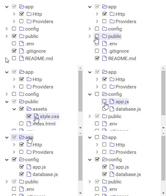
Sometimes, a simple group of checkboxes will not suffice, and you need a multi-level tree of checkboxes. For example, you might need to have the user enable or disable a lot of configuration options.
You could definitely implement a tree of React checkboxes yourself, but using the react-checkbox-tree component does a lot of the heavy lifting for you.
One note, this component does require the use of the font-awesome library, which makes this solution the largest option (38.9kb minified for react-checkbox-tree and 30.2kb minified for font-awesome) and therefore the slowest to load.
Groups of checkboxes
Best for: Simulating relational checkbox options
Recommended Component: react-checkbox-group
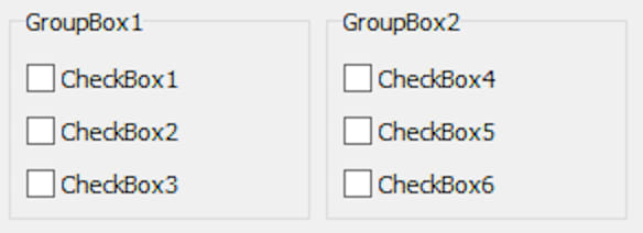
Usually, several checkboxes are logically grouped into one multiple-choice question, and you have to write some boilerplate code to make individual checkboxes appear related.
For example, if you want the user to select fruits from one list and vegetables from another list, you have to present the checkboxes that way, validate the user’s selections, and then provide a way to obtain both results. The more of these checkbox groups you have, the more tedious it is to maintain the code and the longer it takes to download your application.
It is fairly arbitrary to determine when application code becomes difficult to read or the application is loading too slowly, but using the react-checkbox-group component (1.1kb minified) can help alleviate both of those problems.
Indeterminate checkboxes
Best for: Non-boolean options
Recommended Component: react-input-checkbox
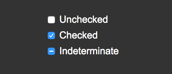
A checkbox usually indicates a true or false situation, but sometimes, you want to allow no value to be selected at all for a checkbox; in other words, you need the checkbox to have a third indeterminate state.
This situation might arise in nested checkboxes, where if all children checkboxes are checked, so is the parent, but if they are not all checked, the parent will remain in the indeterminate state.
You also might want to force the user to explicitly choose a true or false option. If you’re using a framework, you should check to see if your framework’s checkbox already has an indeterminate status option. Otherwise, the react-input-checkbox component (2.8kb minified) allows you to have an indeterminate option.
Pretty checkboxes
Best for: Out of the ordinary, custom UIs
Recommended Component: pretty-checkbox-react
While the styling of a React checkbox is important, the main concern is usually providing a way for the user to select from multiple options. But if you’re especially concerned about the styling of your checkboxes or you’re looking for a checkbox-related feature not mentioned here, then pretty-checkbox-react (5.5kb minified) might just be the component you are looking for.
Some of the highlights for this component are radio buttons (single selections), display options (icons, scaling, sliders), property forwarding, and internationalization. You can also use hooks to abstract the presentation code from the logic code.
Choosing the right React checkbox depends on your needs
You can build a React checkbox natively or use any of the myriad libraries where components are available in order to address different use cases, styling options, and browser compatibility.
If you’re already using a JavaScript library, then your first move should be to check out what checkbox solution is already available to you. If it meets your needs, there’s no reason to weigh down your project with more packages.
If you aren’t already using a library or your library doesn’t have a checkbox component, then you should check if the native checkbox component is enough for your needs.
But if your use case requires many checkbox groups, trees of checkboxes, checkboxes with intermediate states, or significant styling, then using one of the standalone React checkbox components mentioned in this article is a good path to take.
Best library for checkbox trees: react-checkbox-tree
Best library for styling checkboxes: pretty-checkbox-react
Best library for checkbox groups: react-checkbox-group
Best all-around checkbox implementation: react-input-checkbox
This content originally appeared on DEV Community and was authored by kevbosaurus
kevbosaurus | Sciencx (2021-05-27T04:59:02+00:00) Finding the perfect React checkbox component. Retrieved from https://www.scien.cx/2021/05/27/finding-the-perfect-react-checkbox-component/
Please log in to upload a file.
There are no updates yet.
Click the Upload button above to add an update.


