This content originally appeared on DEV Community and was authored by Yao-Hui Chua
Telltale's The Wolf Among Us was released in 2013 and is arguably one of the company's strongest entries in its catalog of story-driven games. The series isn't perfect, but it does have a very cinematic quality to it. The art design and narrative elements blend together really well to create a world which oscillates between fantasy and reality.
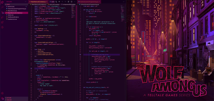
The game's thoughtful use of colors, in particular, stood out to me so much that I felt compelled to port some of its neo-noir vibes over to my workspace. A brand new VSCode theme was the perfect way to capture the spirit of this masterpiece.
You can find the final product on the VSCode Marketplace and its corresponding repository on GitHub.
Helpful Resources
Before I started working on my new theme, I searched for tutorials that could lead me through this process.
To save you time, the best guide out there at this moment is Sarah Drasner's article on CSS Tricks. It's a handy resource that walks you through the initial setup, configuration basics, and even some important points on accessibility. Alternatively, you can also take a peek at VSCode's official documentation for getting started with your first extension.
Throughout the theming process, I had some takeaways that I'll briefly share with you in this post.
Referencing Art
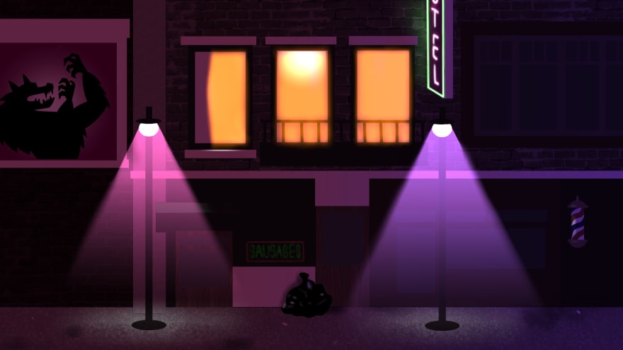
If you're basing your color palette on some art you've discovered, you might want to find a couple of expressive images that capture the look and feel you're gunning for. While working on my theme, I used the following piece of concept art pulled from ArtStation by Gray Rogers:
This depiction of the cityscape was important in helping me determine the kind of mood I wanted to evoke with my choice of colors. I understood that:
- The theme's backdrop had to be a mix of darker shades (variants of purple and red)
- Points of interest could be highlighted with bursts of neon (variants of blue and green) or yellow
This eventually led to combinations of colors like the one you see below:
Each time I spun up VSCode to iterate on my theme's colors, I adjusted my IDE's window and positioned it right next to my reference image:
This provided me with a sanity check of sorts. I was able to look at the current state of my theme and compare it to the art piece: If my theme felt like an extension of its source of inspiration, then I knew I was on the right track.
Calibrating Colors
As you might've noticed in some of the code snippets, not every noteworthy piece of syntax can be differentiated with single versions of blue, green, and yellow.
Thus, I had to expand my selection of colors by exploring different compositions of RGB values.
For example, I used #43BF90 for integers/floats and #7ACCC9 for strings. Both hex codes have a substantial amount of green in them (which makes them appear somewhat similar) but the latter also has a substantial amount of blue (which gives string primitives a more tealish glow and helps them stand out slightly from their numerical counterparts).
You can imagine extending this approach to type annotations as well. In my case, I used a darker orange for primitive type references (e.g. boolean, string) and used a color resembling gold for complex object types (e.g. Props).
To me, it makes sense to use RGB values that are slight variations of each other when coloring tokens that are functionally similar, because it feels like an intuitive way of classifying related chunks of information.
Theming the UI before the Syntax
To be clear, building a VSCode theme mostly just involves assigning hex values to keys in a JSON file that permits common violations such as trailing commas and comments:
{
    "name": "Werewolf",
    "type": "dark",
    "colors": {
        "activityBar.background": "#220033",
        "editor.background": "#1D0622",
        // ... VSCode interface colors
    },
    "tokenColors": [
        {
            "name": "Comment",
            "scope": [
                "comment",
                "punctuation.definition.comment"
            ],
            "settings": {
                "foreground": "#6464B3"
            }
        },
        // ... Syntax highlighting colors
    ]
}
There are two major sections here: colors and tokenColors. colors manages the different components in your VSCode interface (e.g. your editor, sidebar, terminal, etc), while tokenColors handles syntax highlighting.
My suggestion is to work through your preferred colors first by going through the list of available options in the VSCode docs. You can think of these color settings as being responsible for composing the "frame" within which your code will be displayed. Updating the background colors of your editor, sidebar, and terminal is enough to radically change the overall appearance of your IDE.
Configuring tokenColors, on the other hand, is a trickier task that I wouldn't want to front-load. Syntax highlighting can be as involved as you'd like it to be; you can easily find yourself tinkering with minor details that demand a lot of consideration (e.g. your preferred colors for brackets, comments, etc).
Looking Back
I named this theme Werewolf (after the main character of the series) and shared it publicly a few months ago. Some minor administration was required too; I had to set up proper channels and templates for submitting pull requests and issue reports on the GitHub repository.
Looking back, I'm not sure this project taught me substantial things about web development, but spending those hours playing around with a bunch of colors like a kid was a pretty fun and relaxing experience.
My only regret is not shipping this out earlier because The Wolf Among Us is a pretty dated game at this point. If there's a certain visual language out there that inspires you, I encourage you to take a couple of evenings off to give theming your VSCode a shot!
This content originally appeared on DEV Community and was authored by Yao-Hui Chua
Yao-Hui Chua | Sciencx (2021-06-02T18:48:33+00:00) Werewolf: A New Neo-Noir VSCode Theme. Retrieved from https://www.scien.cx/2021/06/02/werewolf-a-new-neo-noir-vscode-theme/
Please log in to upload a file.
There are no updates yet.
Click the Upload button above to add an update.


