This content originally appeared on DEV Community and was authored by Swastik Yadav
Flexbox gives you complete control over the boxes' alignment, direction, order, and size. It makes it very easy to build modern web page layouts.
In this post we will explore the most used Flexbox properties.
Container and Items
"Flex" is one of the value of CSS display property.
.container {
  display: flex;
}
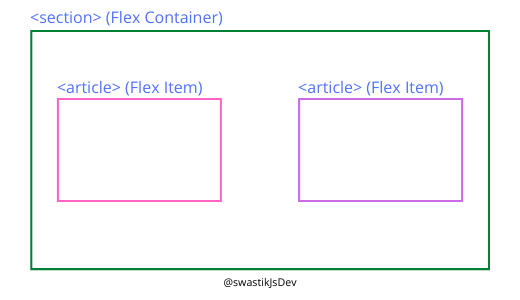
- Flex Container: The element with display property set to flex becomes the Flex Container.
- Flex Items: All direct child of container becomes flex items.
Flex container properties
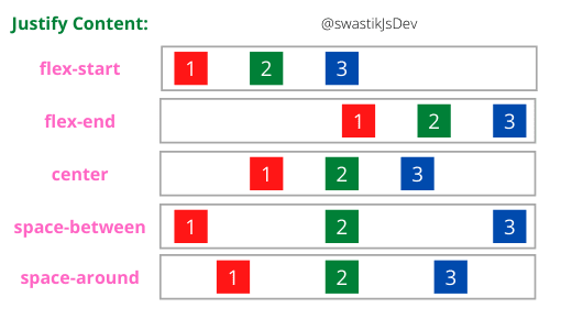
1. Justify Content: Horizontal alignment of items.
Values for Justify-Content.
- flex-start: Align items at row-start
- flex-end: Align items at the row-end
- center: Align items at row center
- space-between: Space between flex items
- space-around: Space around flex items
2. Align Items: Vertical alignment of items.
- Values for Align-Items are exactly the same as that for justify-content.
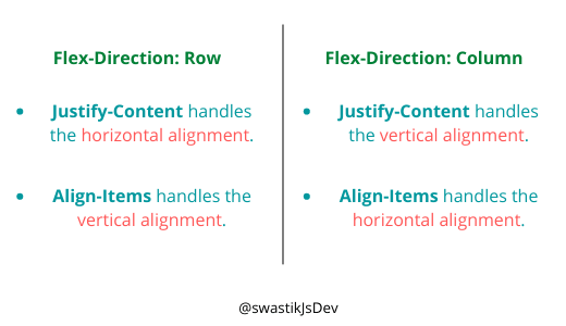
- The difference being Align-Items aligns the items vertically and Justify-Content aligns the items horizontally.
3. Flex Wrap: Create a grid layout
When flex-items row width exceeds the width of flex-container, flex-items flow off the edge of the container.
Flex Wrap has two values:
- no-wrap: Default value. Flex items flow off the page.
- wrap: Wraps the flex items on the next line.
4. Flex Direction: Row or Column
By default, flex containers align their flex items in a row. You can change the flex container direction with the flex-direction property.
It four values:
- row
- row-reverse: Reverses the row
- column
- column-reverse: Reverses the column
Justify-Content and Align-Items change their role when flex-direction is set to the column.
Flex Items property: Align Self
Align-Self is similar to align-items, the only difference is that align-items is applied on flex-container and align-self is applied on individual flex-item.
- flex-start
- flex-end
- center
- stretch
Thanks a lot for reading.
If you enjoyed and found it useful, consider subscribing my newsletter. I share weekly stuff on full-stack web development.
Thank You!
This content originally appeared on DEV Community and was authored by Swastik Yadav
Swastik Yadav | Sciencx (2021-06-07T07:12:19+00:00) Understanding The CSS FlexBox.. Retrieved from https://www.scien.cx/2021/06/07/understanding-the-css-flexbox/
Please log in to upload a file.
There are no updates yet.
Click the Upload button above to add an update.


