This content originally appeared on DEV Community and was authored by Tolu Agboola
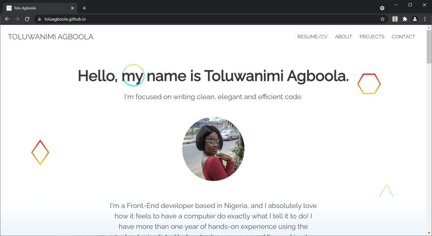
I recently took the time to improve my portfolio page, and I also had an opportunity to build a landing page for an open source project. This gave me the opportunity to learn a CSS framework, and pick up a few other useful skills along the way. I was able to build and deploy both sites, and I'm now writing about the lessons I learned during the course of working on both pages.
Choosing a framework
I made use of the Bulma framework for both projects. I chose Bulma because it's based on Flexbox, has no JavaScript (which I didn't need for either website) and is built with Sass which I wanted to learn. The class names in Bulma are also easy to understand and remember. It was amazing how much faster I was able to go with a framework. When I built my old portfolio page, I wrote the styles from start to finish and it took so long, but this time I didn't even spend up to half the time with much better results.
One issue I had at first was that whenever I wrote custom styles, the framework styles would overwrite them. As a result, I found myself using !important a lot. I later realised that it was because of the order in which I linked them in my HTML. In CSS, when rules on the same element have the same specificity (classes in my case), the styles that come last will take precedence. To solve my problem and stop fighting with the framework, all I did was link my CSS file after the Bulma stylesheet, like so:
<link
    rel="stylesheet"
    href="https://cdn.jsdelivr.net/npm/bulma@0.9.2/css/bulma.min.css"
/>
<link rel="stylesheet" type="text/css" href="main.css" />
As I progressed with my work, I realized that I was including the entire Bulma framework in my project, but I only used a small part of it for the page which didn't feel right to me. I did some research and discovered that Sass provided a much better way for me to include only what I needed from the framework. First I had to install bulma through npm:
npm install bulma
This command created a bulma folder within the node_modules folder in my project directory. I was then able to remove the CDN link from my HTML file and import the Bulma components I needed using the path to their specific files:
@import "node_modules/bulma/sass/components/navbar.sass";
@import "node_modules/bulma/sass/elements/button.sass";
@import "node_modules/bulma/sass/elements/container.sass";
@import "node_modules/bulma/sass/elements/image.sass";
// ...and any other part of the framework I need
Doing this reduced the size of the CSS bundle in one of the projects from 240KB to 160KB. Minifying the code reduced the file size further to 137KB which should translate to faster loading times.
Loading images
Whenever the pages were loading, I noticed that the images were causing the pages to shift because spaces were not reserved for them until they load which was not ideal. The solution was to set the width and height attributes for each image on the page so as maintain the layout of the page regardless of whether the images are loaded or not. With these attributes in place, layout shifting is prevented causing the page to behave more predictably.
<img
    loading="lazy"
    width="1500"
    height="975"
    src="image.png"
    class="project-img"
/>
Finding out the specific dimensions of an image can be done through the browser DevTools. All you need to do is hover the cursor on the image's src link and a popup will provide more details. When doing this, it's important to use the intrinsic size which is the actual size of the image and not the rendered size which is dependent on the device.
Another way I was able to improve the image loading experience was by lazy loading them. That means instructing the browser to delay the loading of off-screen images until the user scrolls near them. To achieve that, set the loading attribute on the img tag to lazy and that's it.
<img src="image.png" loading="lazy" />
Learning Sass and CSS variables
To up my styling skills a notch, I decided to learn how to use a CSS Preprocessor (SASS) and more advanced CSS features like variables (a.k.a. custom properties). I chose to learn Sass simply because it's the most popular one out there. It can be installed with this command:
npm install -g sass
To run Sass code in a web browser, it must first be transpiled to CSS. Every time a change is made in a styles.scss for example, the following command will compile it into styles.css which the browser can read. Link the compiled CSS file in your HTML file, and you're good to go.
sass --watch style.scss style.css
// Press `Ctrl + C` to cancel the operation
With Sass, I was able to make use of mixins and nesting. For example, I had several flex containers in my application. Instead of declaring the same styles every single time, I created a mixin for it. The advantage is that it helped to reduce repetition, and kept my code cleaner and shorter. I also made use of CSS variables over Sass variables for the sole reason of being able to access and manipulate them with JavaScript if necessary.
:root {
    --bg-color: #ffffff; // CSS variable
}

// Mixin declaration
@mixin flex-container {
    display: flex;
    align-items: center;
    justify-content: space-between;
}

.project {
    background: var(--bg-color); // CSS variable in use
    @include flex-container; // Mixin in use
}
Performance optimisation
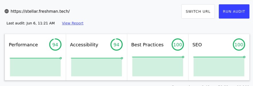
Before deploying the sites to GitHub pages, I ran both of them through Lighthouse to measure their performance. Lighthouse provides audit reports in several categories such as Accessibility, SEO etc. Here are the initial results for one of the sites:
I followed some suggestions from the report which include:
- Adding
altattributes to all images. - Sizing images properly with the
widthandheightattributes. - Eliminating render-blocking resources.
After improving my code based on the above recommendations and running the performance test again, my score on Accessibility went up from 75% to 94%. The remaining categories also went up in score:
While I was reading up on render-blocking resources, I realised that more than 90% of the CSS on my page was not being used despite my attempts to include only what I needed from Bulma. This insight was gained when I checked the Coverage tab in the Chrome DevTools.
In the process of trying to figure out how to remove the unused code, I found out about UnCSS, a tool that removes unused CSS from your stylesheets. It can be installed by running:
npm install uncss --save-dev
Then I created an uncss.js file and used the following code from the documentation:
const uncss = require("uncss");
const fs = require("fs");

// Your html files here
const files = ["index.html"];

uncss(files, (err, output) => {
    try {
        if (err) throw err;

        // Write output to a css file here
        fs.writeFile("main.css", output, (err) => {
            if (err) throw err;
            console.log("uncss: done!");
        });
    } catch (err) {
        console.error(err);
    }
});
UnCSS analyses each HTML file in the files array and provides the trimmed css in the callback function (as output). fs.WriteFile then creates a main.css file and appends the content of the output. The whole operation is wrapped in a try...catch block for efficient error handling. After saving the file, I updated the build script in my package.json file:
"scripts": {
    "test": "echo \"Error: no test specified\" && exit 1",
    "build": "npx sass --style compressed main.scss main.css && node uncss.js"
},
When I run npm run build, it converts the Sass file to minified CSS code, and subsequently runs the UnCSS script to remove the unused parts of my code thereby increasing performance and reducing loading time. It absolutely changed the game for me after I used it. The size of the CSS file in one of the projects went from 137KB to 11KB representing approximately a 2,000% reduction from the original 240KB stylesheet size without any visual differences! This ensures that I'm sending the smallest possible bundle to the users.
Takeaway
All in all, I learned a lot of new things during the process of building the both landing pages. They include:
- The value of CSS variables.
- Sass, its features and how to use them.
- Using only what is needed to increase performance.
- How to use the UnCSS tool to remove unused CSS code.
- Setting specific width and height for images to prevent layout shifting.
- Using Lighthouse to measure and improve site performance.
You can check and compare the old and new versions of the sites:
- Old Stellar Photos website and New Stellar Photos website.
- Old personal portfolio page and New personal portfolio page.
I hope you have gained some value from this article. Let me know your thoughts in the comments.
Thanks a lot for reading!
This content originally appeared on DEV Community and was authored by Tolu Agboola
Tolu Agboola | Sciencx (2021-06-08T21:22:00+00:00) Lessons learned from building landing pages. Retrieved from https://www.scien.cx/2021/06/08/lessons-learned-from-building-landing-pages/
Please log in to upload a file.
There are no updates yet.
Click the Upload button above to add an update.


