
This content originally appeared on Bits and Pieces - Medium and was authored by Eden Ella
Using Storybook to render React components in a Bit workspace

In this tutorial, we’ll use Storybook to render React components developed in a Bit workspace. But before we do so, we’ll briefly discuss their different roles in component-driven development.
If you’re unfamiliar with either, make sure to first go through their basic tutorials: Bit for React / Storybook for React.
The difference between Bit and Storybook
Bit transforms the way we structure our web projects and collaborate on code. It is a way to develop, version, and deliver components independently.
A ‘component’, in the context of Bit, could be any type of module, UI, and non-UI (React hooks, Node.JS modules, etc.)
Components developed and shared with Bit form a network of dependencies. That network is used by Bit to propagate updates from one modified component to all its dependents, in-and-across projects. This causes every dependent component to be tested, built, and released with a new version.
Learn more about Bit’s independent components, here:
Independent Components: The Web’s New Building Blocks
What all that means is that Bit should be seen as an alternative to the existing polyrepo and monorepo development strategies, and not as an alternative to Storybook, even though Bit also offers isolated component rendering and component documentation.
Storybook does not affect the way we structure our projects. It is a way to render and examine components independently, either in monolithic projects or in monorepos. It allows us to inspect each component in a full range of states and variations, unlimited by its “hosting” projects.
In a nutshell, Storybook helps in resolving the discrepancy between the way we design our frontend projects — as compositions of components, and the way we build, deliver, and render them in the browser — as monoliths.
Understanding Bit’s isolated component previews
Since Storybook and Bit aim to solve different problems, they offer isolated component previews as tools for different goals.
Bit’s ‘compositions’ feature for isolated component previews, could be used as a way to examine components in a context-free environment (much like Storybook is often used) but that is not its main goal.
Compositions are primarily used as simulated integration tests. They are a way to validate that a component will be able to integrate successfully in its future consuming projects (before sharing it).
Why do we need “simulations”?
Bit promotes effective collaboration by enabling teams to work autonomously and deliver their features (i.e, components) independently. However, for this to work, each team must also be responsible for the way their products, their components, affect all consumers in their organization. This is where ‘compositions’ play an important role.
Setting up Storybook in a Bit workspace
Initialize Storybook in a Bit workspace
A Storybook initialized in a Bit workspace is not able to determine the type of technologies or frameworks used in a project, by itself. This is because a single Bit workspace may have different components using different frameworks.
It’s also because Storybook has no package.json file to analyze, as Bit workspaces only use aworkspace.jsonc to set configurations on every component in the workspace and on the workspace itself.
We’ll manually initialize a Storybook for React components using the --type option:
$ npx sb init --type react
Manage Storybook’s dependencies in a Bit workspace
Since dependencies in a Bit workspace are managed in the workspace.jsonc configuration file, we’ll move the added dependencies from the generated package.json file (generated by Storybook) to the workspace.jsonc file, and place them under the dependencies property.
We will also add the **/*.stories.tsx pattern to the devFilesPattern property, to automatically make every dependency of a ‘stories’ file, a dev dependency.
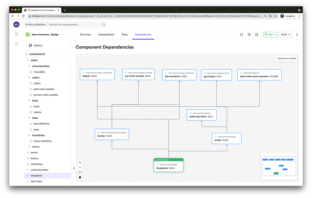
Bit auto-generates the dependency graph for each component by analyzing its files’ import / require statements.
The above dependency policy, in the workspace config root level, will only affect components that already have these dependencies listed in their auto-generated dependency graph.
This sort of dependency configuration allows us to run bit install to install all Storybook dependencies in our workspace but does not add these dependencies to each component’s dependency graph. That is the preferable way, as a Storybook setup is for the entire ptoject (in our case, the worksapce) and not for each individual component.
Configure Storybook to load stories from component directories
Each component in a Bit workspace should have all its files placed under a single directory. That includes a component’s ‘stories’ file. Files that are outside the directory will not be tracked by Bit as parts of the same component.
Set the .storybook/main.js file, in the workspace directory, to use a glob pattern that fits the way components are structured in a Bit workspace (i.e, one directory for each component).
module.exports = {
  "stories": [
    "../my-scope/**/*.stories.@(js|jsx|ts|tsx)"
  ],
  "addons": [
    "@storybook/addon-links",
    "@storybook/addon-essentials"
  ]
}
Create a ‘stories’ file
My workspace already has a tracked button component. Let’s, add a ‘stories’ file to it:
$ cd my-scope/inputs/button
$ touch button.stories.tsx
Now, our button component directory looks like so:
├── my-component-library
    └── my-scope/inputs/button
       ├── button.composition.tsx   # (Bit's) component previews
       ├── button.docs.mdx          # component documentation
       ├── button.module.css        # styles
       ├── button.spec.tsx          # tests
       ├── button.stories.tsx       # stories
       ├── button.tsx               # implementation file
       └── index.ts                 # the component's entry file
Create ‘stories’
This part has nothing new. Stories are written as they normally are.
For example:
import React from 'react';
import { Meta } from '@storybook/react';
export default {
  title: 'inputs/Button',
  component: Button,
} as Meta;
const Template = (args) => <Button {...args} />;export const InDefaultState = Template.bind({});InDefaultState.args = {
children: 'Click Me!',
isLoading: false,
};
Use ‘stories’ in Bit ‘compositions’
As you might expect, ‘args’, ‘templates’, and so on, are unique to Storybook and are not compatible with Bit compositions.
To use a story in a Bit composition, create a component with no additional [Storybook] metadata.
For example, the following story will show the button component in a dark theme context. We’ll achieve that using two other components in our workspace, the theme-provider (a React component) and the dark-palette (a CSS component).
// button.stories.tsx
import React from 'react';
import { Meta } from '@storybook/react';
import { ThemeProvider } from '@my-scope/themes.theme-provider';
import { darkPalette } from '@my-scope/themes.dark-palette';
import { Button } from './button';
export default {
  title: 'inputs/Button',
  component: Button,
} as Meta;
const Template = (args) => <Button {...args} />;export const UsingDarkTheme = () => {
return (
<ThemeProvider className={darkPalette}>
<Button>Click Me!</Button>
</ThemeProvider>
);
};
Now, we are able to import that story into our button.composition.tsx file, just like any other component.
// button.composition.tsx
import React from 'react';
import { UsingDarkTheme } from './button.stories';
export const ButtonInDarkMode = () => <UsingDarkTheme />;

Limitations
As mentioned earlier Bit does not offer Storybook integration. The two tools work in parallel, with separate dev servers and configurations.
It’s important to realize that a Bit workspace is not a standard project. It is a temporary local hub for distributed independent components.
Since Storybook is designed to work with ‘projects’, either monoliths or monorepos, we are forced to limit our use of Bit so that a Bit workspace would act more like a standard project. That’s done in a few ways.
1. Use a single component dev environment in each Bit workspace
Components developed in the same Bit workspace may use different component development environments (using different frameworks).
Storybook is expecting to find just a single development setup. So, for a successful coupling of the two tools, make sure to use just a single framework in a single Bit workspace.
2. Collaborate on independent components using (only) their original workspace
Once a component is ‘exported’ (pushed and published) from its authoring Bit workspace, it can be updated from any other Bit workspace.
However, your Storybook setup will not be part of your components’ data (unlike other dev environment configs set by Bit). It will remain a workspace-level setup. For that reason, it is advisable to maintain these components only in a single Bit workspace.
Conclusion
Bit and Storybook are two very different tools for component-driven development. They are able to work together but (almost) only in parallel and only when using Bit in a limited way.
However, the recommended limitations are quite reasonable when using the two tools for single projects, like a set of components developed for a single “component library” or design system.
Learn More
- Building a React Component Library — The Right Way
- Building a React Design System for Adoption and Scale
- Independent Components: The Web’s New Building Blocks
Using Storybook with Bit was originally published in Bits and Pieces on Medium, where people are continuing the conversation by highlighting and responding to this story.
This content originally appeared on Bits and Pieces - Medium and was authored by Eden Ella
Eden Ella | Sciencx (2021-06-09T17:08:54+00:00) Using Storybook with Bit. Retrieved from https://www.scien.cx/2021/06/09/using-storybook-with-bit/
Please log in to upload a file.
There are no updates yet.
Click the Upload button above to add an update.