5 React Material UI Features You Might Have Missed

These features will change the way you work with Material UI

As a frontend engineer, Material-UI is my favorite styling option for React Components. Its sleek design and elegance made it stand out from the rest.

That being said, I recently found some interesting facts about Material-UI while using it in practice. In this article, I want to bring those into your light as I found them very interesting.

Pre-requisite: Familiarity with Material-UI basics will be beneficial to fully grasp the content of this article.

1. Automatic color changes

Whether you build a website or a mobile application, having a dark mode is crucial for modern applications. You wouldn’t want to blind the users with a white screen when they use the application at night.

Implementing dark mode with Material UI is very easy since it comes with two palettes for a light and dark theme. You can switch to the dark theme by setting the type to dark .

const darkTheme = createMuiTheme({
palette: {
type: 'dark',
},
});

Most of us are aware of this feature. So some of you might wonder, what’s so special about it?

Let’s say you have a button with a black foreground. In a scenario as such, if you change the app theme preference to dark, where the background color will also be black by default, Material UI adjusts the button color so that it contrasts with the background.

Let me explain a bit more,

If the background and the foreground color of an element (E.g.: Button) are black, Material UI adjusts the button foreground color accordingly.

Amazing isn’t it?

Because of this feature, we don’t have to worry too much about non-contrasting elements in the dark mode in our application.

Point to note: This automatic adjustment won’t happen if you forcefully override button colors.

2. Interoperability

Material UI inherently offers a JSS based styling system to style your components. However,

Do you know that Material UI can be combined with styling mechanisms such as Plain CSS, Global CSS, Styled-Components, CSS modules, Emotion, etc.?

Yes, it is possible! You can find detailed information about this here.

Just to give you an overview, Material UI doesn’t limit you to only JSS based styling. If you love using Styled-Components or CSS modules, you have the freedom to use it with Material UI. In my opinion, this sort of flexibility is very important to widen the usage of a styling library.

There are a few things you should keep in mind if you are combining JSS based styling with Material UI.

1. Controlling Priority

JSS usually injects styles to the <head> . In order to make sure your custom styling does not get overridden you need to define the injecting order of CSS when you use either Plain CSS, Global CSS, Styled-Components, CSS modules, etc.

Let’s look at an example of how to change CSS injecting order when you combine styled-components with Material UI.

import { StylesProvider } from '@material-ui/core/styles';

<StylesProvider injectFirst>
{/* Your component tree.
Now, you can override Material-UI styles. */}
</StylesProvider>

Another method to override Material UI styles is to use the !important keyword to your custom styles. However, this method may look less clean than changing the injection order.

2. Portals

Portals provide a way to render children into a DOM node that exists outside the DOM hierarchy. However, if you combine Material UI with styled-components, due to scoping of styles, the component rendered through the Portal will not have proper styling rendered.

Material UI provides a solution for this issue as well.

import React from 'react';
import styled from 'styled-components';
import Menu from '@material-ui/core/Menu';
import MenuItem from '@material-ui/core/MenuItem';

const StyledMenu = styled(({ className, ...props }) => (
<Menu {...props} classes={{ paper: className }} />
))`
box-shadow: none;
border: 1px solid #d3d4d5;

li {
padding-top: 8px;
padding-bottom: 8px;
}
`;

The className will have to be passed along to the Menu which is rendered through the Portal. You can find the full reference in the Material UI documentation.

3. Switch Between RTL and Non-RTL

Material UI has the capability to support RTL languages such as Arabic, Persian, etc. If you have been working with Material UI for a while, you are probably aware of this.

However, did you know that switching between RTL and Non-RTL is very easy with Material UI?

If you want a specific ruleset to opt-out of RTL while the rest uses RTL, you just have to do the following. (Source: Material-UI documentation)

import React from 'react';
import { makeStyles } from '@material-ui/core/styles';

const useStyles = makeStyles((theme) => ({
root: {
width: '100%',
marginTop: theme.spacing(4),
marginRight: theme.spacing(2),
},
affected: {
textAlign: 'right',
},
unaffected: {
flip: false,
textAlign: 'right',
},
}));

export default function RtlOptOut() {
const classes = useStyles();

return (
<div className={classes.root}>
<div className={classes.affected}>Affected</div>
<div className={classes.unaffected}>Unaffected</div>
</div>
);
}

When your entire application uses RTL, if you want one element to be LTR, you just have to use “flip: false” for that particular style.

4. Integration with Design Kits

With recent releases, Material UI has enabled support for various design kits. Some of those are as follows.

They aim to achieve maximum developer efficiency through the integration of these design kits with Material UI.

Material UI has promised to keep feature parity between these tools.

These design kit integrations are a paid feature of Material UI. However, it only requires a one-time payment. Once purchased, you can use it for a lifetime.

5. Unstyled components

Unstyled components by Material UI is an upcoming feature, but definitely worth keeping tabs on.

What are Unstyled components?

Let’s say you need to have a fully customized design in your application, but you need the benefits provided by Material UI as well. In that case, overriding all the styles provided by Material UI will be cumbersome as you will have to override so many styles.

Material UI provides a solution to this in an upcoming release by providing Unstyled components. The Unstyled components weigh 5.2KB gzipped as opposed to the 26KB of styled-components. Therefore, this will be an improvement to your bundle size as well if you require a completely customized design and theme.

You can download the Unstyled package of Material UI using the following command.

yarn add @material-ui/unstyled@next

If you want to import the Unstyled package, use your custom theme on all components except a few, you can easily do that. All you have to do is use styled() on your Unstyled component to apply Material UI core styling on the few components.

This will convert the Unstyled component to a styled component which is in the Material UI core. However, this is still in the alpha version. If you are interested in knowing the upcoming features of Material UI, you can follow this space.

Summary

Material UI has a lot of cool features and interesting upcoming features as well. I found most of these features very useful, especially features like automatic color changes. Let me know your experience with Material UI too and any interesting facts that you would like to share with the community.

Thanks for reading!

Build & share React components with Bit

Bit is an ultra-extensible tool that lets you create truly modular applications with independently authored, versioned, and maintained components.

Use it to build modular apps & design systems, author and deliver micro frontends, or simply share components between applications.

A remote Bit scope with Material UI based components, each source-controlled and shared individually

Bit: The platform for the modular web

Learn More


5 React Material UI Features You Might Have Missed was originally published in Bits and Pieces on Medium, where people are continuing the conversation by highlighting and responding to this story.


This content originally appeared on Bits and Pieces - Medium and was authored by Viduni Wickramarachchi

These features will change the way you work with Material UI
As a frontend engineer, Material-UI is my favorite styling option for React Components. Its sleek design and elegance made it stand out from the rest.

That being said, I recently found some interesting facts about Material-UI while using it in practice. In this article, I want to bring those into your light as I found them very interesting.

Pre-requisite: Familiarity with Material-UI basics will be beneficial to fully grasp the content of this article.

1. Automatic color changes

Whether you build a website or a mobile application, having a dark mode is crucial for modern applications. You wouldn’t want to blind the users with a white screen when they use the application at night.

Implementing dark mode with Material UI is very easy since it comes with two palettes for a light and dark theme. You can switch to the dark theme by setting the type to dark .

const darkTheme = createMuiTheme({
palette: {
type: 'dark',
},
});
Most of us are aware of this feature. So some of you might wonder, what’s so special about it?

Let’s say you have a button with a black foreground. In a scenario as such, if you change the app theme preference to dark, where the background color will also be black by default, Material UI adjusts the button color so that it contrasts with the background.

Let me explain a bit more,

If the background and the foreground color of an element (E.g.: Button) are black, Material UI adjusts the button foreground color accordingly.

Amazing isn’t it?

Because of this feature, we don’t have to worry too much about non-contrasting elements in the dark mode in our application.

Point to note: This automatic adjustment won’t happen if you forcefully override button colors.

2. Interoperability

Material UI inherently offers a JSS based styling system to style your components. However,

Do you know that Material UI can be combined with styling mechanisms such as Plain CSS, Global CSS, Styled-Components, CSS modules, Emotion, etc.?

Yes, it is possible! You can find detailed information about this here.

Just to give you an overview, Material UI doesn’t limit you to only JSS based styling. If you love using Styled-Components or CSS modules, you have the freedom to use it with Material UI. In my opinion, this sort of flexibility is very important to widen the usage of a styling library.

There are a few things you should keep in mind if you are combining JSS based styling with Material UI.

1. Controlling Priority

JSS usually injects styles to the <head> . In order to make sure your custom styling does not get overridden you need to define the injecting order of CSS when you use either Plain CSS, Global CSS, Styled-Components, CSS modules, etc.

Let’s look at an example of how to change CSS injecting order when you combine styled-components with Material UI.

import { StylesProvider } from '@material-ui/core/styles';

<StylesProvider injectFirst>
{/* Your component tree.
Now, you can override Material-UI styles. */}
</StylesProvider>

Another method to override Material UI styles is to use the !important keyword to your custom styles. However, this method may look less clean than changing the injection order.

2. Portals

Portals provide a way to render children into a DOM node that exists outside the DOM hierarchy. However, if you combine Material UI with styled-components, due to scoping of styles, the component rendered through the Portal will not have proper styling rendered.

Material UI provides a solution for this issue as well.

import React from 'react';
import styled from 'styled-components';
import Menu from '@material-ui/core/Menu';
import MenuItem from '@material-ui/core/MenuItem';

const StyledMenu = styled(({ className, ...props }) => (
<Menu {...props} classes={{ paper: className }} />
))`
box-shadow: none;
border: 1px solid #d3d4d5;

li {
padding-top: 8px;
padding-bottom: 8px;
}
`;

The className will have to be passed along to the Menu which is rendered through the Portal. You can find the full reference in the Material UI documentation.

3. Switch Between RTL and Non-RTL

Material UI has the capability to support RTL languages such as Arabic, Persian, etc. If you have been working with Material UI for a while, you are probably aware of this.

However, did you know that switching between RTL and Non-RTL is very easy with Material UI?

If you want a specific ruleset to opt-out of RTL while the rest uses RTL, you just have to do the following. (Source: Material-UI documentation)

import React from 'react';
import { makeStyles } from '@material-ui/core/styles';

const useStyles = makeStyles((theme) => ({
root: {
width: '100%',
marginTop: theme.spacing(4),
marginRight: theme.spacing(2),
},
affected: {
textAlign: 'right',
},
unaffected: {
flip: false,
textAlign: 'right',
},
}));

export default function RtlOptOut() {
const classes = useStyles();

return (
<div className={classes.root}>
<div className={classes.affected}>Affected</div>
<div className={classes.unaffected}>Unaffected</div>
</div>
);
}
When your entire application uses RTL, if you want one element to be LTR, you just have to use "flip: false" for that particular style.

4. Integration with Design Kits

With recent releases, Material UI has enabled support for various design kits. Some of those are as follows.

They aim to achieve maximum developer efficiency through the integration of these design kits with Material UI.

Material UI has promised to keep feature parity between these tools.

These design kit integrations are a paid feature of Material UI. However, it only requires a one-time payment. Once purchased, you can use it for a lifetime.

5. Unstyled components

Unstyled components by Material UI is an upcoming feature, but definitely worth keeping tabs on.

What are Unstyled components?

Let’s say you need to have a fully customized design in your application, but you need the benefits provided by Material UI as well. In that case, overriding all the styles provided by Material UI will be cumbersome as you will have to override so many styles.

Material UI provides a solution to this in an upcoming release by providing Unstyled components. The Unstyled components weigh 5.2KB gzipped as opposed to the 26KB of styled-components. Therefore, this will be an improvement to your bundle size as well if you require a completely customized design and theme.

You can download the Unstyled package of Material UI using the following command.

yarn add @material-ui/unstyled@next
If you want to import the Unstyled package, use your custom theme on all components except a few, you can easily do that. All you have to do is use styled() on your Unstyled component to apply Material UI core styling on the few components.

This will convert the Unstyled component to a styled component which is in the Material UI core. However, this is still in the alpha version. If you are interested in knowing the upcoming features of Material UI, you can follow this space.

Summary

Material UI has a lot of cool features and interesting upcoming features as well. I found most of these features very useful, especially features like automatic color changes. Let me know your experience with Material UI too and any interesting facts that you would like to share with the community.

Thanks for reading!

Build & share React components with Bit

Bit is an ultra-extensible tool that lets you create truly modular applications with independently authored, versioned, and maintained components.

Use it to build modular apps & design systems, author and deliver micro frontends, or simply share components between applications.
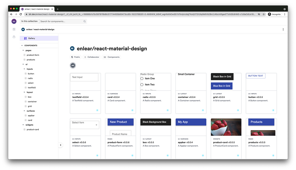
A remote Bit scope with Material UI based components, each source-controlled and shared individually

Bit: The platform for the modular web

Learn More


5 React Material UI Features You Might Have Missed was originally published in Bits and Pieces on Medium, where people are continuing the conversation by highlighting and responding to this story.


This content originally appeared on Bits and Pieces - Medium and was authored by Viduni Wickramarachchi


Print Share Comment Cite Upload Translate Updates
APA

Viduni Wickramarachchi | Sciencx (2021-06-15T20:42:37+00:00) 5 React Material UI Features You Might Have Missed. Retrieved from https://www.scien.cx/2021/06/15/5-react-material-ui-features-you-might-have-missed/

MLA
" » 5 React Material UI Features You Might Have Missed." Viduni Wickramarachchi | Sciencx - Tuesday June 15, 2021, https://www.scien.cx/2021/06/15/5-react-material-ui-features-you-might-have-missed/
HARVARD
Viduni Wickramarachchi | Sciencx Tuesday June 15, 2021 » 5 React Material UI Features You Might Have Missed., viewed ,<https://www.scien.cx/2021/06/15/5-react-material-ui-features-you-might-have-missed/>
VANCOUVER
Viduni Wickramarachchi | Sciencx - » 5 React Material UI Features You Might Have Missed. [Internet]. [Accessed ]. Available from: https://www.scien.cx/2021/06/15/5-react-material-ui-features-you-might-have-missed/
CHICAGO
" » 5 React Material UI Features You Might Have Missed." Viduni Wickramarachchi | Sciencx - Accessed . https://www.scien.cx/2021/06/15/5-react-material-ui-features-you-might-have-missed/
IEEE
" » 5 React Material UI Features You Might Have Missed." Viduni Wickramarachchi | Sciencx [Online]. Available: https://www.scien.cx/2021/06/15/5-react-material-ui-features-you-might-have-missed/. [Accessed: ]
rf:citation
» 5 React Material UI Features You Might Have Missed | Viduni Wickramarachchi | Sciencx | https://www.scien.cx/2021/06/15/5-react-material-ui-features-you-might-have-missed/ |

Please log in to upload a file.


There are no updates yet.
Click the Upload button above to add an update.

You must be logged in to translate posts. Please log in or register.