This content originally appeared on DEV Community and was authored by Mads Stoumann
This is a post about CSS Logical Properties, with basic and advanced usage examples. If you think you don't need CSS Logical Properties, think again!
If you've ever worked on a website for a global client, you'd come across the terms “left-to-right” (ltr) and “right-to-left” (rtl).
“left-to-right”-languages include most Western languages, like English or French, while “right-to-left”-languages include Arabic, Farsi and Hebrew.
On a website, you switch the (language)-direction by using dir="ltr" (or rtl) in HTML, or by using the direction-property in CSS.
So which properties will be affected, when you switch direction?
Basically all properties, that include the words left or right.
To get a quick overview, paste this in your console:
const logical = ['right', 'left'];
const props = [...getComputedStyle(document.body)].filter(entry => logical.some(key => entry.includes(`-${key}`)));
console.table(props);
But that's not all! Some languages are written vertically, using the CSS writing-mode-property. That means we need to include top and bottom to our snippet as well:
const logical = ['top', 'right', 'bottom', 'left'];
As well as most properties containing the words height or width.
If you position an element with position: absolute; and left: 0;, that will not work when you change the direction — or: it will work, but not as intended — since the element will stay left, while all the other content change direction.
To fix it, you could write some extra CSS for rtl, like:
[dir="rtl"] .selector {
  left: auto;
  right: 0;
}
But … that would be way too much work for a website with many components, and just add a lot of unnessecary CSS to the solution.
Luckily, there's a smarter way.
CSS Logical Properties
From MDN:
CSS Logical Properties and Values is a module of CSS introducing logical properties and values that provide the ability to control layout through logical, rather than physical, direction and dimension mappings
With Logical Properties, left and right are inline, while top and bottom are block.
To indicate direction within this “box”, we use the words start and end.
So, for positioning, the new values are:
| Value | Logical Value |
|---|---|
| left | inset-inline-start |
| right | inset-inline-end |
| top | inset-block-start |
| bottom | inset-block-end |
With logical properties, you can also set all of them in one go, something that was not possible before:
.before {
  position: fixed;
  top: 0;
  right: 0;
  bottom: 0;
  left: 0;
}
.after {
  position: fixed;
  inset: 0;
}
margin-top becomes margin-block-start, while margin-bottom becomes margin-block-end.
margin-left becomes margin-inline-start, and margin-right becomes margin-inline-end.
Etcetera: border-block, border-inline, padding-block …
The only properties that deviate from this format, are the “border-radii”:
| Value | Logical Value |
|---|---|
| border-top-left-radius | border-start-start-radius |
| border-top-right-radius | border-start-end-radius |
| border-bottom-left-radius | border-end-start-radius |
| border-bottom-right-radius | border-end-end-radius |
But enough talking. The documentation is here, now, let's look at some examples!
Examples
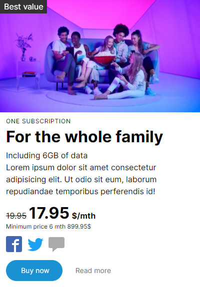
Here's a product-card, with a dir="ltr":

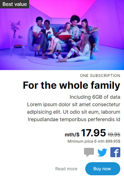
Here's the same card, but with dir="rtl":

Hmm, that “Best value”-caption is placed with position: absolute and left: 0;, and it will stay there, even if we change the direction.
Let's change that to:
.caption {
  inset-inline-start: 0;
  position: absolute;
}
Much better! Now, let's add a splash with inset-inline-end: 0:
Looks good, but it could do with some spacing. Let's not hardcode the spacing, as an editor might want to position this splash as s/he wants, using Custom Properties translate-x: var(--S-tx, -10%) and translate-y: var(--S-ty, 10%):
Now, what happens when we switch direction?
Hmm, not good - the translated values persist. And — as I mentioned — if the editors can dynamically change the position, we cannot hardcode the values.
Unfortunately, translate-inline or translate-block does not exist, so let's add a property for scaleX, --S-sx, with a default value of 1:
.splash {
  transform:
    scaleX(var(--S-sx, 1))
    translateX(var(--S-tx, 0%))
    translateY(var(--S-ty, 0%))
}
Then, with dir="rtl", we can simply update that property:
[dir="rtl"] .splash { --S-sx: -1; }
That works! scaleX(1) becomes scaleX(-1) — but it will also flip the text-lines! To fix this, we'll add a wrapper around the text-lines, and flip that too:
[dir="rtl"] .splash-lines { transform: scaleX(-1) translateX(-100%); }
In this example, you could also have used margin-inline-end: -10%; and margin-block-start: 10%; — but I use the translate and scaleX- method, so the splash can have different shapes, that will then be flipped:
Here's another example in ltr:

As a final example, let's add an image (and a wrapper) using:
.image {
  transform:
    scaleX(var(--I-sx, 1))
    translateX(var(--I-tx, 0))
    translateY(var(--I-ty, 0));
}
.image-wrapper {
  inset-block-end: 0;
  inset-inline-end: 0;
  transform: scaleX(var(--IW-sx, 1)) translateX(var(--IW-tx, 0));
}
We'll translate it like the splash, and add a drop-shadow:
Using the same principle as before, but using a variable from the .image in a calc()-ulated property on the .image-wrapper, we can flip and adjust the position like this:
[dir="rtl"] .image { --I-sx: -1; }
[dir="rtl"] .image-wrapper { --IW-sx: -1; --IW-tx: calc(-1% * var(--I-tx)); }
If we add a perspective-variable and a rotateY-variable, we can go even further:
And then just update the variables for rtl:
Conclusion
Should you use CSS Logical Properties even though your website is only ltr now? Yes! You have nothing to lose, and your website is future-proof if you want to add international support later.
Thanks for reading!
This content originally appeared on DEV Community and was authored by Mads Stoumann
Mads Stoumann | Sciencx (2021-06-16T13:57:47+00:00) A Quick Guide To CSS Logical Properties. Retrieved from https://www.scien.cx/2021/06/16/a-quick-guide-to-css-logical-properties/
Please log in to upload a file.
There are no updates yet.
Click the Upload button above to add an update.


