This content originally appeared on DEV Community and was authored by Chris Bongers
Don't get me wrong, until a couple of days ago. My blog didn't leverage the :visited pseudo-class. But I'm here to change your mind and use it hopefully.
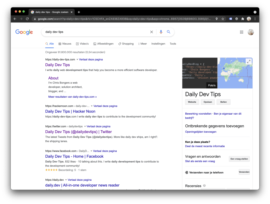
Let's take a look at Google search results to see it in action.
Can you spot which ones I visited before?
Yes, correct, it's my website (#1) and Twitter (#3).
This is a superb way to showcase to the user what he has already seen.
I'm one of those people who follow many blogs and sometimes forgot if I've read an article or not, so I decided to change my blog around to introduce the :visited state.
CSS :visited pseudo-class
Unfortunately, the visited state is minimal these days since it uses your browser's history to determine if you clicked a link or not.
I guess they were afraid people would use this information for the worse to detect other links you might have visited.
So I do get it from one side, but it's super helpful to help the visitor by showing what he has already seen or not as a site owner.
So what can we leverage?
- color
- background-color
- border-color
- outline color
- column-rule-color
- fill and stroke color
Wait, so just colors?
And yes, that's all we can do ?.
First, let's set up a list with some links for users to click.
<ul>
  <li>
    <a href="https://daily-dev-tips.com/?new">Daily dev tips</a>
  </li>
  <li>
    <a href="https://twitter.com/DailyDevTipsBlog/?new">Twitter</a>
  </li>
  <li>
    <a href="https://daily-dev-tips.com/posts/css-visited-state-why-we-should-use-it/?new"
      >Read more about this</a
    >
  </li>
  <li>
    <a href="https://codepen.io/?new">Codepen</a>
  </li>
</ul>
There's nothing crazy there, so let's add some super basic styling to make it look a bit more appealing.
body {
  display: flex;
  align-items: center;
  justify-content: center;
  min-height: 100vh;
  font-family: Roboto, 'Helvetica Neue', Arial, sans-serif;
  background: #efefef;
}
ul {
  background: #404040;
  padding: 1rem 2rem;
  list-style: none;
  li {
    margin-bottom: 0.5rem;
    a {
      text-decoration: none;
      color: #8bb8df;
    }
  }
}
I'm using SCSS formatting to have the code linked together.
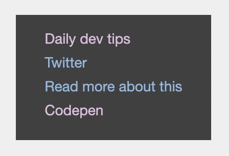
This so far will give us a list that looks like this:
However, when we now click a link, it keeps the same color, and that's not really what we want.
So let's change that by using the :visited state.
We can use this as a pseudo-class on the a line.
a {
  text-decoration: none;
  color: #8bb8df;
  &:visited {
    color: #debfde;
  }
}
And now click the links will make it visible which ones we have seen before:
You can try this out on the following Codepen.
Thank you for reading, and let's connect!
Thank you for reading my blog. Feel free to subscribe to my email newsletter and connect on Facebook or Twitter
This content originally appeared on DEV Community and was authored by Chris Bongers
Chris Bongers | Sciencx (2021-06-16T05:57:29+00:00) CSS :visited state, why we should use it. Retrieved from https://www.scien.cx/2021/06/16/css-visited-state-why-we-should-use-it/
Please log in to upload a file.
There are no updates yet.
Click the Upload button above to add an update.


