This content originally appeared on Telerik Blogs and was authored by Nadya Karaivanova
Let’s see what’s new with the R2 2021 Service Pack!
It's been just over a month since we shipped the second release for 2021 and we are already coming up with an R2 Service Pack edition of Telerik UI for WinForms! This release brings RadSyntaxEditor indicators, new Office 2019 themes blending mechanism, .NET 6 support as well as over 40 bug fixes in other controls and improvements in our Demo App.
RadSyntaxEditor Indicators
You can now customize the look of RadSyntaxEditor and design it in such a manner to achieve more efficient and intuitive UI for your code editor control. Want to know how? Check below!
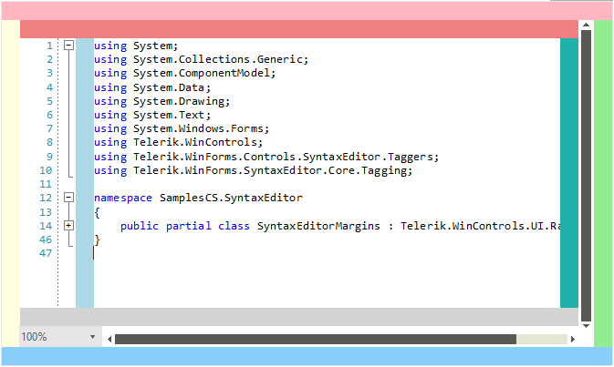
RadSyntaxEditorElement exposes the Margins collection where you can add elements to predefined containers: Left, Top, Bottom, Right, as well as ScrollableLeft, ScrollableTop, ScrollableRight, ScrollableBottom. Here is a picture demonstrating the default panel location that can be added around RadSyntaxEditor:

Now, you can add indicators to particular lines of the RadSyntaxEditor control similar as you can in Visual Studio. Indicators are special regions that are displayed via the IndicatorsMargin<T> class in the indicator margin. It also can highlight the text range with specified styles. I would like to inform you that you can define the following indicator types:
- Breakpoints indicator
- Bookmarks indicator
- Stars indicator
- SVG indicator
Here is how you can add a breakpoint indicator and highlighting the text line:
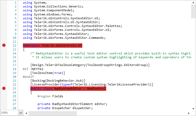
private LineHighlightTagger breakpointsTagger;private BreakpointsMargin breakpointsMargin;public RadForm1(){ InitializeComponent(); CSharpTagger languageTagger = new CSharpTagger(this.radSyntaxEditor1.SyntaxEditorElement); this.radSyntaxEditor1.TaggersRegistry.RegisterTagger(languageTagger); breakpointsTagger = new LineHighlightTagger(this.radSyntaxEditor1.SyntaxEditorElement,LineHighlightTagger.LineHighlightFormatDefinition); this.radSyntaxEditor1.TaggersRegistry.RegisterTagger(breakpointsTagger); SetupBreakPoints(); this.radSyntaxEditor1.TextFormatDefinitions.AddLast(LineHighlightTagger.LineHighlightFormatDefinition,new TextFormatDefinition(null, (SolidBrush)this.breakpointsMargin.IndicatorBrush, null,new Telerik.WinForms.Controls.SyntaxEditor.UI.Pen(this.breakpointsMargin.IndicatorBrush, 2)));} private void SetupBreakPoints(){ breakpointsMargin = new BreakpointsMargin(this.radSyntaxEditor1.SyntaxEditorElement); this.radSyntaxEditor1.SyntaxEditorElement.Margins.ScrollableLeft.Insert(0, breakpointsMargin); breakpointsMargin.Indicators.CollectionChanged += this.Indicators_CollectionChanged;} private void Indicators_CollectionChanged(object sender, System.Collections.Specialized.NotifyCollectionChangedEventArgs e){ breakpointsTagger.HighlightLines(this.breakpointsMargin.Indicators);}public class BreakpointsMargin : IndicatorsMargin<Ellipse>{ public BreakpointsMargin(RadSyntaxEditorElement syntaxEditor) : base(syntaxEditor) { this.IndicatorBrush = new SolidBrush(System.Drawing.Color.FromArgb(255, 210, 47, 47)); } protected override void UpdateIndicator(Ellipse ellipse, int lineNumber) { if (ellipse.Width != this.Editor.EditorFontSize) { ellipse.Width = this.Editor.EditorFontSize; } if (ellipse.Height != this.Editor.EditorFontSize) { ellipse.Height = this.Editor.EditorFontSize; } if (ellipse.Background != this.IndicatorBrush) { ellipse.Background = this.IndicatorBrush; } }}All set! To add a breakpoint, just click in the far left margin next to a line of code. The breakpoint appears as a red dot in the left margin:

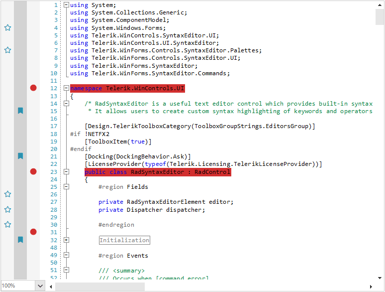
You can customize further RadSyntaxEditor by adding SVG elements or text blocks supporting glyphs—the bookmarks and the stars in the below screenshot:

Office 2019 Themes Blending in Visual Style Builder
As you may have already known, we have just shipped the new Office 2019 themes in three variations: Light, Gray and Dark. Now, I am happy to announce that we provide a blending mechanism for all the Office2019 themes. So, you can customize the accent colors to any color of your choice using our theme modification tool—Visual Style Builder.
Office2019LightGreen Theme Variation

RadPanorama: Save and Load Layout
Another useful feature that we have introduced in this release is Save/Load layout functionality in RadPanorama. This functionality gives you the opportunity to preserve user settings such as tile elements size, order, location, etc. and restore them later. The layout settings are written in an XML file.
.NET 6.0 Support
I am glad to share that Telerik UI for WinForms controls are build for .NET 6.0 so you can try the latest development platform. The.NET 6 Designer should be ready in a few weeks. Stay tuned!
Improvements to Telerik UI for WinForms Demo App
Our Demo Application now uses the RadSyntaxEditor as a code viewer for the presented examples in C#/VB. Another thing that we have changed in order to make the app consistent is that the theme in the separate examples is synced with the globally selected theme. For example, if you prefer a dark mode for the demo app, all the examples that support themes will be loaded with the dark theme variation. Check this out directly in our Demo.
Try It Out and Share Your Feedback
Feel free to drop us a comment below sharing your thoughts. We would love to hear how all this works for you. You can visit our UI for Winforms Feedback Portal and let us know if you have any suggestions for particular features/controls.
This content originally appeared on Telerik Blogs and was authored by Nadya Karaivanova
Nadya Karaivanova | Sciencx (2021-06-23T10:20:00+00:00) Telerik UI for WinForms R2 2021 Service Pack. Retrieved from https://www.scien.cx/2021/06/23/telerik-ui-for-winforms-r2-2021-service-pack/
Please log in to upload a file.
There are no updates yet.
Click the Upload button above to add an update.
