This content originally appeared on DEV Community and was authored by Roden
Introduction
Link to the DEMO at the end
Today I would like to share with you my experience in developing a personal portfolio. I understand that many of you immediately wondered after reading the title. And why spend so much time developing a portfolio at all? After all, you just need to create a small one-page website and add all the information about yourself and your works there. And here I definitely agree with you that if you are developing a business card website, then this is quite a working option. You don't even have to spend a few days developing such a site. Such a site can be developed in 4-6 hours.
But I set myself a different task. I wanted to create a portfolio that would show with its appearance what kind of developer I am and what I am capable of. I wanted to use animations, build complex objects using HTML and CSS, make smooth transitions between pages, choose bright colors for the site. But at the same time, of course, I did not want to make a site from the nineties, which usually caused users to have epilepsy.
I wanted my portfolio to be something like a picture that I painted like an artist.
I didn't want to fill my site with boring and monotonous text content. Let's be honest. No one cares what you like to eat in the morning and for dinner, no one cares what TV shows and movies are your favorite, what games you play and how you spend your time. The employer is not even interested in whether you watch anime? This is assumed by default.
So I decided to focus on the appearance of the site. Therefore, the first thing we will discuss with you is the design.
Design
1. Colors
The first step is to discuss the colors that I decided to use in my project.
This is:
Vinous: #9b2d30

I have long dreamed of using these colors together, but unfortunately I could not do it at work and so finally I decided to use them in my personal portfolio.
I think that these colors are very well in harmony with each other. And in the future we will have to use many more colors, but more on this later in the following chapters.
2. Pages
As for the pages, I decided to make them only 2. This is the home page where my photo, brief information about me and links to my social networks will be placed so that people can contact me. On the second page, I decided to arrange my works, which can be viewed with the help of a special presentation (more on this later).
3. Style
I decided to design the appearance of the site in a minimalistic style. I didn't want a large number of unnecessary photos and the like to be present on the site. I wanted the site to look seasoned and concise. Therefore, I decided to use Flat design as the design of the portfolio elements.
4. Animation
As for animations, here is the same approach as with the style of elements. Animations should look appropriate, and be combined with all their surrounding elements. Animations and static elements on the site should look like a single whole.
Technologies
Before we go any further, I should tell you what tools I used for development.
1. HTML
To create a DOM structure, I decided to use the PUG preprocessor. It significantly helped me reduce the amount of code due to the ability to use loops and mixins.
2. CSS
To create styles for elements, I preferred to use the SASS preprocessor with SCSS syntax. I did this for the same reason as with the PUG preprocessor.
3. JavaScript
To create animations, I needed to use three JS libraries:
TweenMax.jsAnime.jsRevealer.js
Home Page
Finally, we can start analyzing the pages of the portfolio itself directly.
When I started working through the DOM structure and it came to the section where my photo should have been, I thought for a while and asked myself this question. Why would I just insert my photo? I thought it was too easy for me. Is it really impossible to use this place more effectively, instead of just occupying this place with a photo?
Moreover, I do not like to be photographed.
And here I would like to return to my recent quote.
I wanted my portfolio to be something like a picture that I painted like an artist.
I thought that I would be able to apply my own knowledge of HTML and CSS in order to simply draw myself.
And I started a difficult job. ?
1. Step One
At first it was not easy, but the most important thing is to find an avatar layout on the Internet that you could be inspired by when creating your own CSS portrait. (CSS portrait - sounds strange)
And here's what happened:
CodePen:
It took me about 6 - 7 hours to create it. This is taking into account the fact that I had to spend a lot of time searching for good examples of avatars on the Internet.
2. Step Two
In general, I was satisfied with the result, but the avatar itself, as you can see, is small in size, and the image that the avatar was intended to replace was large in size.
Moreover, the avatar merged colors with the background. ?

Therefore, I decided to create a special environment around the avatar to fill the empty space in the place of which the photo should have been.
And later I decided to animate this very environment to make the picture look more lively.
And here's what happened:
CodePen: (See in the format 0.5x)
I have already posted this work on my very first post.
3. Step Three
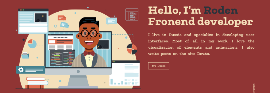
Next, I needed to create a text with brief information about myself (who I am and where I live). Here I decided to use a straight font, because it fit very well into the overall style.
It's already coming out well and it pleases.
4. Step Four
Next, I needed to implement navigation, with which I could switch between the pages of the site. I decided to make it minimalistic and unfixed so that it doesn't follow the window when scrolling. It wasn't necessary.
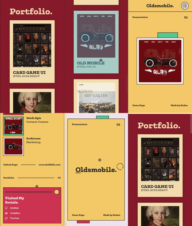
But do not forget about adaptability, because what looks good on the desktop will not look good on the phone.
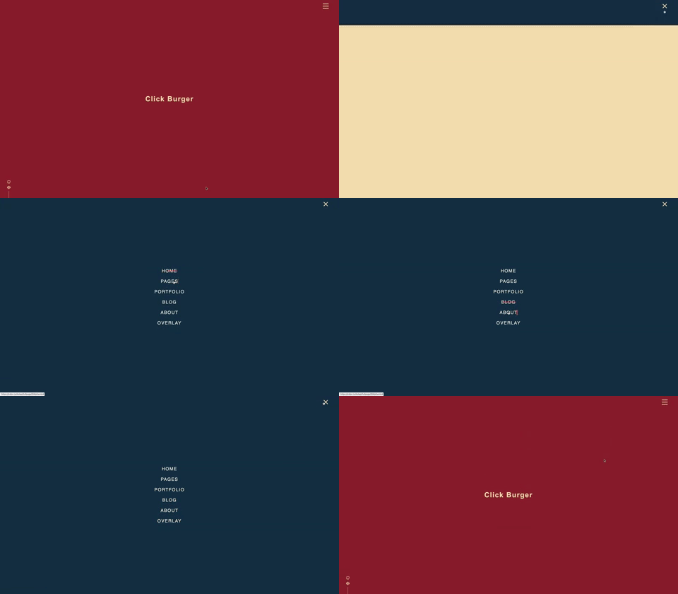
Therefore, I decided to make text links to pages disappear on screens less than 900px and a burger menu appears.
And when you click on the burger menu button, a Popup menu appears in which the necessary links to pages and social networks are located.
I have a separate article about this burger menu.
CodePen:
5. Step Five
I decided to attach links to my social networks and email to the lower edges of the screen. I also added position: fixed; to them so that they follow the screen when scrolling.
6. Step Six
And the last thing I decided to do on the home page is to describe my personal qualities.
To do this, I decided to use icons. Quite a logical action. Describing your personal qualities, visualizing it all with icons.
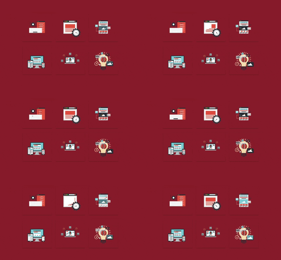
But here, too, I later wondered. I told myself. So stop, stop, stop, stop, wait a minute? Can't you draw such icons yourself? Yes, it will not be easy, but it is possible, right? Aren't you tired of these static images that you can find on a million other sites?
After thinking about all this a little more, I still decided to get down to business.
And I started drawing again, but this time icons. ?

And here's what I got. Oh, I forgot to add that I also wanted to animate them. I love doing this.
I also did a separate article about them.
CodePen:
It remained only to add the text to them and that was all. The home page will be finished.
7. Step Seven
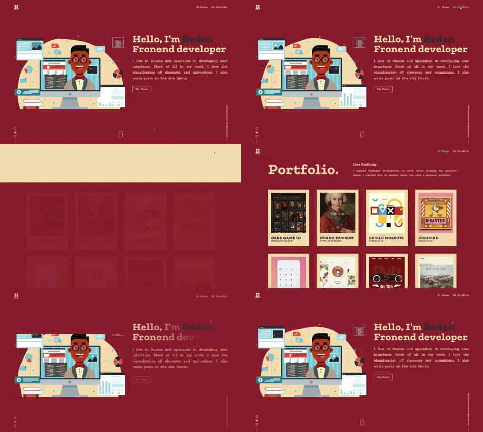
Well, the end of creating a home page has come. It took me a little less than three weeks to create it. Yes, yes, do not be surprised, because it is not so easy to create everything that has been described from the first time. And before we go to the second page, I suggest you take a look at the result.
Home Page CodePen Demo:
Oh my God
, `6500` lines of `SCSS` code, and this is taking into account `loops` and `mixins` that shorten the code. Without them, there would probably be `7500` or `8000` lines of code. But there is still a portfolio page ahead.Portfolio Page
With the portfolio page, everything was simpler, it was no longer necessary to come up with a style for the pages. But there was another problem. You see, when demonstrating my works, I planned that each work would have its own page separately. But I quickly realized that I don't want to produce a large number of identical html files. And what will happen in a couple of years when the number of works will become significantly more?
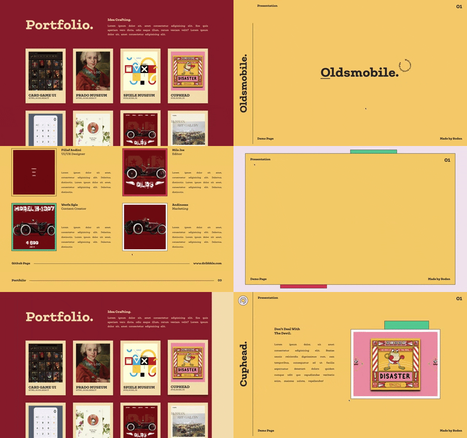
And I decided to create a section for the presentation of my works right on the page with my exhibited projects.
This section of the presentation was supposed to work according to the following principle:
1. You click on a special card for any project;
2. The presentation opens according to the principle of the Popup menu, only in the case of a presentation it opens on the right, not on top;
3. The content of the presentation itself is filled in depending on the project that you selected by clicking on the card, and all data about the project is stored in an array
To close the presentation, click on the round button in the upper-left corner.
I have already created a separate article about this presentation.

?Awesome Developer Portfolio Page for your Projects ? (responsive)
Roden ・ Jun 6 ・ 5 min read
Mini CodePen Demo:
Finishing touches
Well, that's it, the portfolio is ready. It remains only to add small details. Namely, the preloader. You see, what's the matter, there are a huge number of elements on the site that need a little time to load, and in order not to observe the loading of elements, a small preloader is needed.
And also add a small animation of the elements surfacing to give the site a light elegance.

Initially, I made a preloader on which the word "Welcome" appears using SVG, but I quickly realized that this may look good, but it certainly won't work as a preloader for my site. Because it's a very long time. 10 seconds!!!

Therefore, I decided to abandon the word animation, and reduce the preloader animation to one second on both pages.
Well that's it.
Responsive
The site is adapted for screen resolutions such as:
@media 1728px
@media 1600px
@media 1440px
@media 1300px
@media 1180px
@media 1080px
@media 960px
@media 890px
@media 830px
@media 720px
@media 642px
@media 576px
@media 414px
@media 375px
@media 320px
@media iPad (min-width: 415px) and (max-width: 1025px) (portrait)
@media iPad (min-width: 415px) and (max-width: 910px) (portrait)
@media iPad (min-width: 415px) and (max-width: 834px) (portrait)
@media iPad (min-width: 415px) and (max-width: 768px) (portrait)
@media iPad (min-width: 415px) and (max-width: 685px) (portrait)
@media iPad (min-width: 415px) and (max-width: 595px) (portrait)
@media iPad (min-width: 415px) and (max-width: 490px) (portrait)
@media (min-width: 1601px) and (max-width: 5000px) and (max-height: 940px)
@media (min-width: 1441px) and (max-width: 1600px) and (max-height: 700px)
@media (min-width: 1301px) and (max-width: 1440px) and (max-height: 670px)
@media (min-width: 1181px) and (max-width: 1300px) and (max-height: 615px)
@media (min-width: 1081px) and (max-width: 1180px) and (max-height: 540px)
@media (min-width: 961px) and (max-width: 1080px) and (max-height: 515px)
@media (min-width: 891px) and (max-width: 960px) and (max-height: 470px)
@media (min-width: 720px) and (max-width: 890px) and (max-height: 425px)
@media (min-width: 376px) and (max-width: 414px) and (max-height: 730px)
@media (min-width: 321px) and (max-width: 375px) and (max-height: 660px)
@media (max-width: 320px) and (max-height: 560px)
Unfortunately, there were too many @media queries, this is due to the fact that I used the value vh for height, these are viewports for height. Because of this, some elements had to be trimmed sometimes, but don't be too scared.
Summing up the results
Friends, now it's time to take stock, and calculate how much time it took me to create each individual element and why it ends up being about a month.
1. Design: It took me about 3-4 days of long wanderings on such sites as Behance and Dribbble to think about how I want to see my portfolio
2. CSS Illustration: It took me about a week to create CSS Illustration, well, maybe a little more
3. Navigation: I spent 2 days creating the navigation
4. Icons: I spent a week and a half creating animated icons, it was not easy
5. Portfolio Presentation: And I spent a week creating a portfolio and presentations for projects
6. Preloader: I also spent 2 days creating preloaders
This results in approximately 33 days.
During all this time, 900 lines of code were written on the PUG preprocessor, 9000 lines of code on SCSS and 565 lines of code on JS.
Comrades, don't think about it, I'm not bragging. There's nothing to brag about here. I just decided to summarize it in terms of the amount of code.
But remember, quantity does not mean quality.
The End
Friends, it's time to say goodbye. Thank you for paying attention to my post. My God, I wrote it for about five hours!!! And it feels like no more than two hours have passed. Well, okay, it's not scary. Below is the promised link to the full demo portfolio.
You can also download it from my repository
I can advise you to subscribe to my Twitter, I also post my work there.
And finally, I want to say, friends, make such portfolios as you like. If you want to make a business card website without any extraneous elements, animations and other things, then please do it. Or on the contrary, you want to make some highly animated portfolio, or even make a 3d website on three.js then it is completely your right. There are no serious rules that you must follow here. The most important thing is that you like it first of all. And your employer should like your resume.
You can also check out my recent article on the topic of a portfolio for developers.

10 Examples of a Good ???? Developer Portfolio ? for Your Inspiration ?
Roden ・ Jun 18 ・ 4 min read
This content originally appeared on DEV Community and was authored by Roden
Roden | Sciencx (2021-06-24T23:30:41+00:00) ?? How I developed my portfolio for a month ? + Demo ?. Retrieved from https://www.scien.cx/2021/06/24/%f0%9f%a7%91%e2%80%8d%f0%9f%92%bb-how-i-developed-my-portfolio-for-a-month-%f0%9f%97%93-demo-%f0%9f%8d%bf/
Please log in to upload a file.
There are no updates yet.
Click the Upload button above to add an update.

