This content originally appeared on DEV Community and was authored by Oliwia Połeć
Matching colors to achieve the minimum WCAG contrast score might be perceived as a simple task. After all, there are plenty of free tools available — from websites like colourcontrast to design tool plugins for Figma or Sketch — that can help you calculate the proper color contrast for your designs. In our case the challenge was to solve contrast problems when colors can be customized by the users. In this article we want to share what we have learned and how we build accessible color palettes.
Where to start?
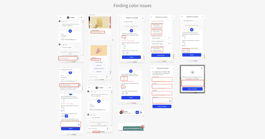
Start by doing an audit using Google Lighthouse, or you can find a tool that will fit your needs in this article. Gathering together issues related to low color contrast and grouping them into those which can be fixed quickly and those which will require special solutions was very helpful and speeded up the whole process. The low-hanging fruit was fixing the contrast between elements that don't inherit a primary color and also fixing the contrast between surfaces.
They were easy to resolve because we decided that some components will always have a set of fixed color values, and thanks to that we can easily predict the contrast in relation to the different surfaces. By doing an audit and refining each element individually, we recreated our new grayscale palette.
Do an audit using specialized tools, and group issues based on their level of difficulty.
Performance over Preference
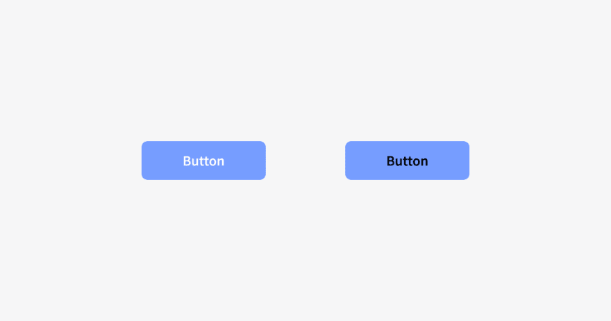
Take a look at these two buttons:
Which one is more appealing to you?
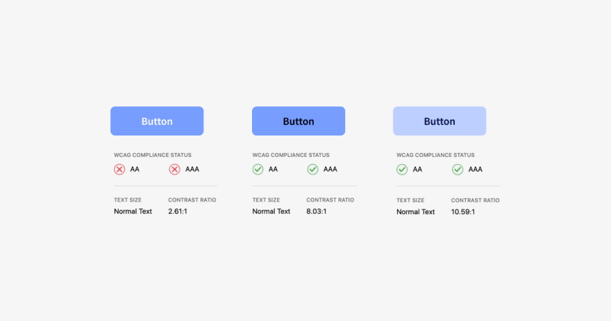
I assume that the button on the left might look more appealing to most respondents; however, working with accessibility in mind is not a matter of preferences — it’s simply down to performance. If I want to measure the button's performance, my question should be: Do you have a problem reading any of those buttons? Then filter out everyone who can read both and focus only on people who have a hard time reading any of the buttons. There is a thin line in matching colors for the button such that they fulfill WCAG guidelines and the button still looks the way most people expect to see it. Those expectations of specific color combinations might exist because people just get used to them, but changing the combinations to have a contrast score of at least 4:5:1 won't bother anyone that much, and it might help others to better perceive the interface. Our eyes and vision change over time, just like the rest of our bodies. Some people experience age-related vision changes that interfere with their ability to see clearly for reading and other close vision tasks. We don't know what the exact demographic of chat widget end-users is. However, the chats' scale is approximately 1.5 million per day; so there was a risk that a significant number of users might have problems when interacting with the LiveChat Widget.
It's important not to rely solely on the WCAG math for calculating contrast. You can strive for the best score and readability by tweaking colors, but at the end of the day, testing it with real users or doing the accredited accessibility audit is a must.
Eliminate your personal bias on preferred color combinations and remember that you are designing it for ALL users.
Framer + polished.js to the rescue
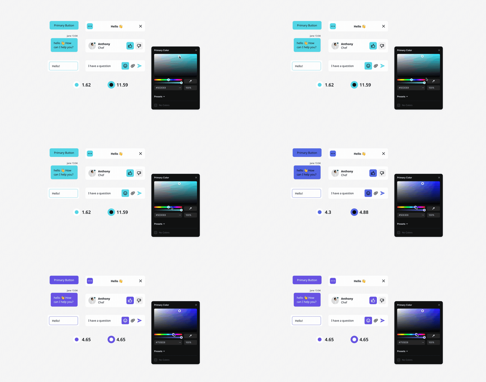
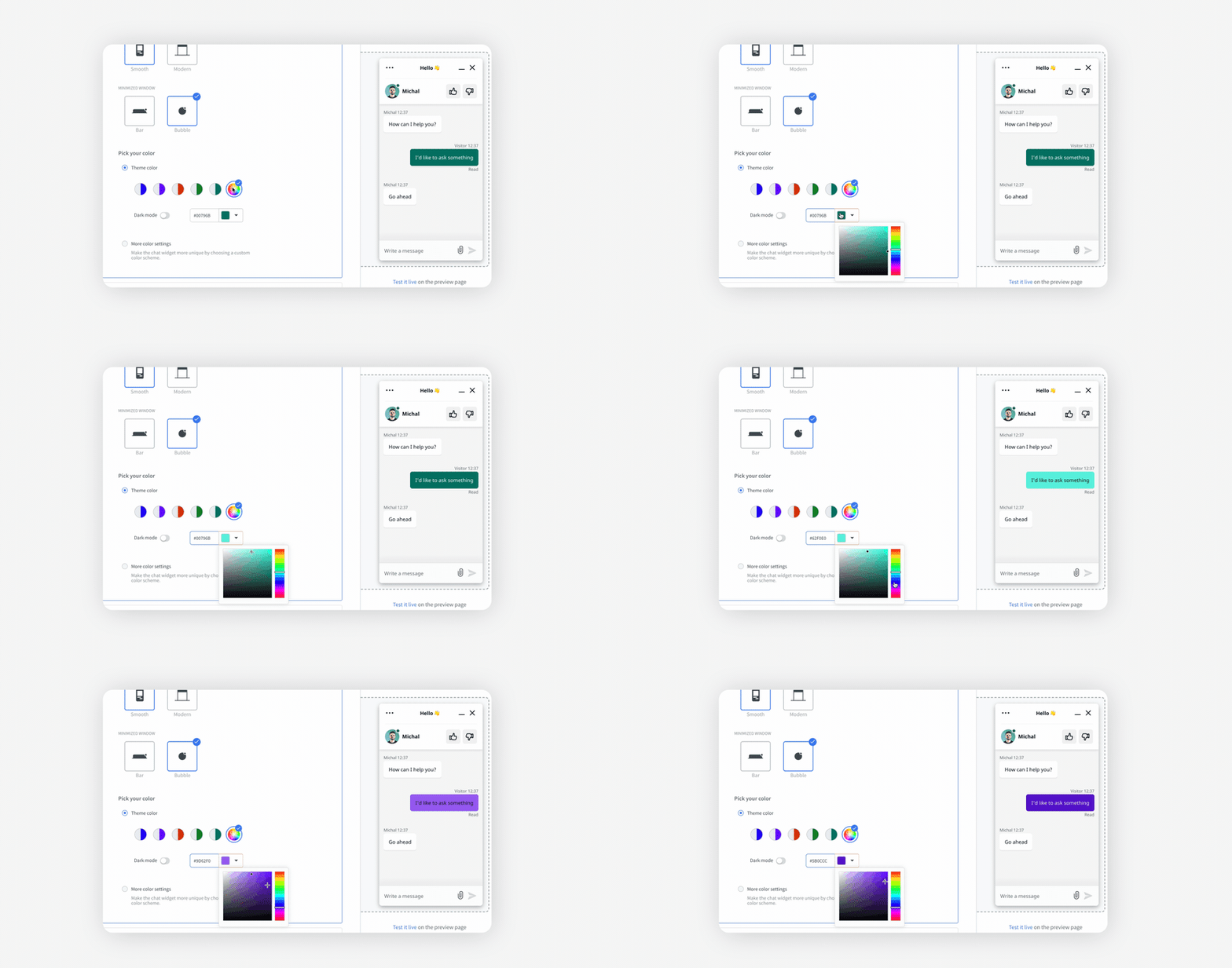
Nowadays, design tools offer several ways to solve inaccessible color problems. You can install a plugin to your favorite design tool and test many color combinations one by one. However, it might be a time-consuming task, especially if you provide color customization in your app, so why not automate this process? Framer, a tool that combines both code and design, was a lifesaver when designing elements that inherit primary colors. The tool allows you to use mechanisms that function in the actual code environment. We've used one of those available mechanisms, from the polished.js package. Thanks to this package, we could test for accessible colors on many components simultaneously.
You can see how the components and the contrast score changes when tweaking the primary color. It speeds up the whole process dramatically. The cool thing is that we have also implemented this package inside the Chat Widget code, so the design and production are based on the same environment. The important thing is that when the user customizes the primary color of the widget, the system relies on the polished.js mechanism. This matches whichever text or icon color (black or white) scores the highest. Because of this, users might even get black text on a blue button if white text would only achieve a minimum 4:5:1 contrast ratio for that particular blue background. The way we measure combination contrast is not perfect, because the WCAG guidelines, as the name suggests, are just recommendations, and I believe that the proper math for color calculation that mirrors human perception is yet to be invented. Still, we think it’s better to have this automation than always having white be the foreground to a primary color.
Do accessible colors have to be ugly?
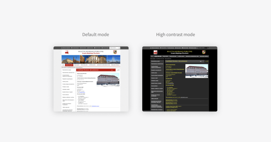
Statements about ugly accessible colors might be a consequence of the high contrast modes you may have seen over time on various websites.
It's easy to make a false assumption about accessible colors if you're just starting with the topic and you've seen too many of those websites. Another thing is that perceiving color is a subjective matter. When we think about the color being beautiful, it only exists in our heads as a pleasant feeling. However, a fairly useful method would be to observe the most popular colors on the web. I think that for the sake of argument, we can call popular colors appealing. After all, they are popular for a reason. Gather and refine those colors by increasing or decreasing their lightness so they will have a minimum 4:5:1 foreground to background contrast ratio. For example, if you want to fix an inaccessible color, decide whether you want to darken the background and lighten the foreground or do the opposite — lighten the background and darken the foreground. Both ways are good; use whatever works for your design to achieve a good contrast score.
We have decided to make the theme colors slightly darker so that all our predefined theme colors work well as a background to a white foreground. We didn't want to include colors with high luminance, like yellow or orange, in a predefined set of colors because combining them with white surfaces results in low contrast. Users still have a choice if none of those five colors meet their expectations. They can pick whatever color they want as a primary color, and we will adjust the text color on the messages and buttons. Achieving the proper text color is done automatically by the polished.js library. In short, whatever color you pick, polished will match the text color, white or black, depending on which combination contrast score is the highest.
Two problems at once
Working on accessible colors in LiveChat Widget was an excellent opportunity to tidy up the code and create a single source of truth for design tokens. The term “design tokens” refers to properties like colors, font sizes, spacings, and even transitions. The main premise of having organized design tokens, especially colors, is to maintain consistency within the application. Synchronizing colors between design and code will also help you keep the product palette accessible (automated checks) and predictable; so if you have the opportunity to do that, go for it!
Pay attention to :focus
You are probably familiar with that blue border that appears from time to time when you scroll through websites. Those elements are called focus indicators. Some people don't like that browsers add them by default to components like inputs or buttons because it interferes with their website/app design, so they remove them in the CSS. If you want to build an inclusive product, you should not use { outline: none; } on focusable elements globally for the whole website or app. Instead of deleting the outline completely, you can show a focus indicator that originates from keyboard interaction but that is not present with pointer device interaction. Also, make sure that the color you use for the focus indicator properly contrasts with the backgrounds. It is also good to add a small gap between the focused element and the component using the { outline-offset } property for better visibility.
Wrap-up
You may be overwhelmed by the number of color issues the audit can reveal; but don’t worry, very often the same color relations are repeated across the app. Like in any other case, planning is very important. Break down all issues into groups and categorize them based on similarity and difficulty. Choose your tools when it comes to design, development, and testing. There are plenty of tools and libraries which can speed up the whole process.
Key takeaways:
Start with an audit
Eliminate personal bias toward preferred colors
Don’t rely solely on the WCAG math for contrast calculations. Test the combinations with real users
Accessible color palettes can be appealing
Working on accessible colors is an opportunity to tidy up your design system
Create a proper focus indicator and show it when needed
This content originally appeared on DEV Community and was authored by Oliwia Połeć
Oliwia Połeć | Sciencx (2021-06-24T12:48:58+00:00) How we made the chat widget accessible for people with visual impairments. Retrieved from https://www.scien.cx/2021/06/24/how-we-made-the-chat-widget-accessible-for-people-with-visual-impairments/
Please log in to upload a file.
There are no updates yet.
Click the Upload button above to add an update.

