This content originally appeared on DEV Community and was authored by Rick Viscomi
The technologies you use to build your website can have an effect on your ability to deliver good user experiences. Good UX is key to performing well with Core Web Vitals (CWV), a topic which is probably top of mind for you, as it is for many other web developers now that these metrics play a role in Google Search ranking. While web developers have had tools like Search Console and PageSpeed Insights to get data on how their sites are performing, the web community has been lacking a tool that has operated at the macro level, giving us something more like WebSpeed Insights. By combining the powers of real-user experiences in the Chrome UX Report (CrUX) dataset with web technology detections in HTTP Archive, we can get a glimpse into how architectural decisions like choices of CMS platform or JavaScript framework play a role in sites' CWV performance. The merger of these datasets is a dashboard called the Core Web Vitals Technology Report.
This dashboard was developed for the web community to have a shared source of truth for the way websites are both built and experienced. For example, the CWV Technology Report can tell you what percentage of websites built with WordPress pass the CWV assessment. While a number like this on its own is interesting, what's more useful is the ability to track this over time and compare it to other CMSs. And that's exactly what the dashboard offers; it's an interactive way to view how websites perform, broken down by nearly 2,000 technologies.
This post is a show-and-tell. First I'd like to walk you through the dashboard and show you how to use it, then I'll tell you more about the data methodology behind it.
Using the dashboard
There are three pages in the dashboard:
Technology drilldown
Technology comparison
Settings
The drilldown page lets you see how desktop and mobile experiences change over time for a single technology. The default metric is the percent of origins having good CWV, and it also supports individual CWV metrics (see the "Optional metrics" section below).
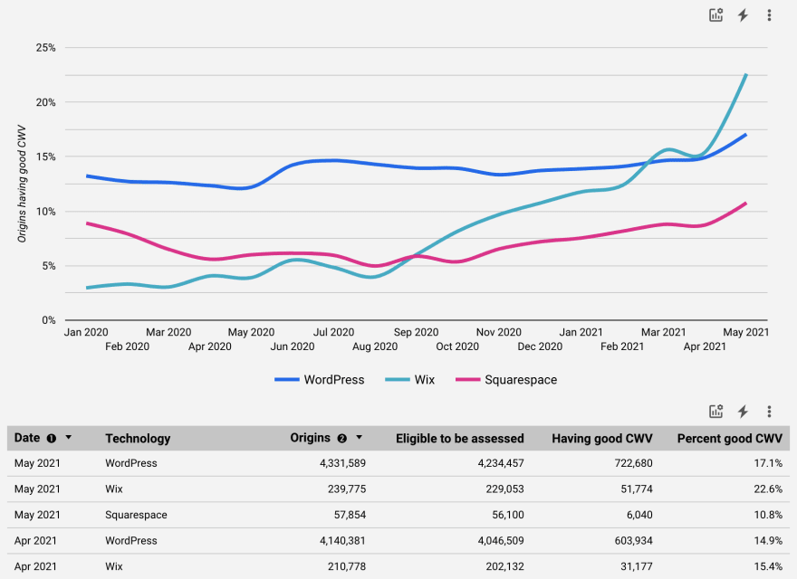
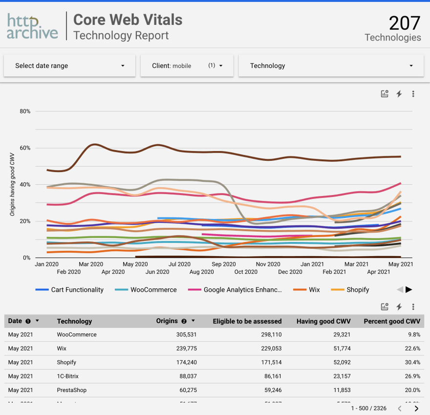
The comparison page lets you compare desktop OR mobile experiences for any number of technologies over time. Similar to the drilldown page, you can select overall CWV compliance or individual CWV metrics. Additionally, this page supports visualizing the number of origins per technology.
The settings page is where you can configure report-level preferences. There are currently two settings: categories and number of origins. Refer to Wappalyzer for the list of possible categories. Use this setting to limit the related technologies in the dropdown list. You can also restrict the technologies to those with a minimum level of adoption, for example those used by at least 100 websites. This can be helpful to reduce noisiness.
By default, the CWV Technology Report is configured to drill down into WordPress performance and compare WordPress, Wix, and Squarespace. This is to demonstrate the kinds of insights that are possible out-of-the-box without having to know how to configure the dashboard yourself. The full URL for the vanilla version of the dashboard is https://datastudio.google.com/reporting/55bc8fad-44c2-4280-aa0b-5f3f0cd3d2be/page/M6ZPC.
Optional metrics
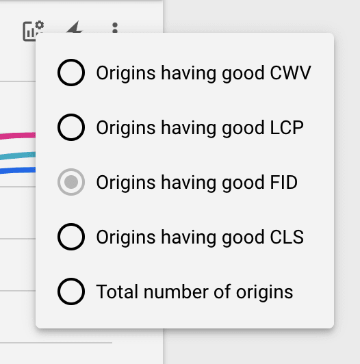
You can also use the "optional metrics" feature of Data Studio to customize the dashboard and select specific CWV stats in the charts/tables as needed. The icon that looks like a chart with a gear icon is the button to select optional metrics. In the timeseries chart, you can toggle between the percent of origins having good CWV overall or specifically those with good LCP, FID, or CLS. On the table views, you can use this feature to add or remove columns, for example to see all CWV metrics separately or to focus on just one.
Data Studio also enables you to share deep links into the dashboard for specific configurations. For example, here's a leaderboard of the top 10 most popular CMSs ordered by CWV performance as of May 2021:
| Date | Technology | Origins | Percent good CWV |
|---|---|---|---|
| May 2021 | 1C-Bitrix | 35,385 | 56.30% |
| May 2021 | TYPO3 CMS | 24,060 | 54.39% |
| May 2021 | Drupal | 115,280 | 45.11% |
| May 2021 | Zendesk | 34,713 | 43.26% |
| May 2021 | Weebly | 15,920 | 33.35% |
| May 2021 | Squarespace | 60,316 | 33.32% |
| May 2021 | Joomla | 44,459 | 32.19% |
| May 2021 | Wix | 54,604 | 31.52% |
| May 2021 | Adobe Experience Manager | 15,276 | 27.65% |
| May 2021 | WordPress | 1,731,010 | 24.53% |
Here are some other configurations to help you explore the data:
- Leaderboard of all 14 technologies that are in the CMS or Blogs categories having more than 10,000 origins
- Comparison of all JavaScript frameworks and libraries with "jQuery" in their name
- A year-to-date drilldown into React CWV performance
Feature roadmap
There are two features missing from the dashboard that I would love to add in the near future: segmenting by CrUX rank magnitude and comparing Lighthouse audit compliance. Origin popularity would be a really interesting way to slice the data and the rank magnitude dimension would enable us to see how technology adoption and CWV performance change at the head, torso, and tail of the web. Adding data from Lighthouse would enable us to get some clues into why a particular technology may be better or worse with CWV. For example, if a group of websites tend to have poor LCP performance, it'd be interesting to see what loading performance audits they also tend to fail. Of course there are so many variables at play and we can't determine cause and effect, but these results could give us something to think about for further exploration.
Methodology
The CWV Technology Report is a combination of two data sources: CrUX and HTTP Archive. They are similar datasets in that they measure millions of websites, but they have their own strengths and weaknesses worth exploring.
CrUX is a field tool, meaning that it measures real-user experiences. It's also a public dataset, so you could see how users experience any one of over 8 million websites. This is really cool, to put it loosely, because we (as a community) have visibility into how the web as a whole is being experienced.
The CrUX dataset is powered by Chrome users who enable usage statistics reporting. Their experiences on publicly discoverable websites are aggregated together over 28-day windows and the results are published in queryable monthly data dumps on BigQuery and via the CrUX API, updated daily. CrUX measures users' experiences for each of the CWV metrics: LCP, FID, and CLS. Using this data, we can evaluate whether the website passes the CWV assessment if 75 percent of experiences for each metric are at least as good as thresholds set by the Web Vitals program.
HTTP Archive is a lab tool, meaning that it measures how individual web pages are built. Like CrUX, it's a public dataset, and it's actually based on the same websites in the CrUX corpus, so we have perfect parity when combining the two sources together. HTTP Archive is powered by WebPageTest, which integrates with other lab tools like Lighthouse and Wappalyzer to extract fine-grained data about the page. Lighthouse runs audits against the page to determine how well-optimized it is, for example if it takes advantage of web performance best practices. Wappalyzer is an open-source tool that detects the use of technologies like an entire CMS, a specific JavaScript library, and even what programming languages are probably used on the backend. These detections are what we use in the CWV Technology Report to segment the real-user experience data from CrUX.
Confession time! This isn't the first tool to look at CrUX data through the lens of how websites are built. Perf Track is a report built by Houssein Djirdeh that slices CrUX data by JavaScript frameworks. The annual CMS chapter of the Web Almanac slices CrUX data by (you guessed it) CMSs. What makes the CWV Technology Dashboard different is that it facilitates exploration of the data by making all 1,950 technologies across 71 categories discoverable in a single, browseable UI. You can choose your own adventure by filtering technologies to a single category, like Ecommerce, and comparing platforms head-to-head to see which has more websites passing the CWV assessment.
The CrUX dataset on BigQuery is aggregated at the origin level. An origin is a way to identify an entire website. For example, https://httparchive.org is the origin for the HTTP Archive website and it's different from https://almanac.httparchive.org, which is a separate origin for the Web Almanac website.
HTTP Archive measures individual web pages, not entire websites. And due to capacity limitations, HTTP Archive is limited to testing one page per website. The most natural page to test for a given website is its home page, or the root page of the origin. For example, the home/root page of the HTTP Archive website is https://httparchive.org/ (note the trailing slash). This introduces an important assumption that we make in the CWV Technology Dashboard: an entire website's real-user experiences are attributed to the technologies detected only on its home page. It's entirely possible that many websites we test use different technologies on their interior pages, and some technologies may even be more or less likely to be used on home pages. These biases are worth acknowledging in the methodology for full transparency, but to be honest there's not a lot we at HTTP Archive can do to mitigate them without becoming a full-blown web crawler!
Core Web Vitals
There may be different approaches to measure how well a website or group of websites performs with CWV. The approach used by this dashboard is designed to most closely match the CWV assessment in PageSpeed Insights. CWV metrics and thresholds may change annually, but we'll do our best to keep the dashboard in sync with the state of the art.
Each individual CWV metric has a threshold below which user experiences are considered "good". For example, LCP experiences under 2.5 seconds are good. A website must have at least 75% of its LCP experiences in the "good" category to be considered as having good LCP overall. If all of the CWV metrics are good, the website is said to pass the CWV assessment. Refer to the official CWV documentation for the latest guidance on the set of metrics and thresholds.
FID is an exception worth mentioning. Because it relies on user input to be measured, it doesn't occur on as many page loads as metrics like LCP and CLS. That makes it less likely to have sufficient data for pages that may not have many interactive UI elements or websites with low popularity. So the CWV Technology Dashboard replicates the behavior in PageSpeed Insights and assesses a website's CWV, even in the absence of FID data. In that case, if LCP and CLS are good, the website passes, otherwise it doesn't. In the rare case that a website is missing LCP or CLS data, it's not eligible to be assessed at all.
When evaluating a group of origins, like those in the dashboard that all use the same technology, we quantify them in terms of the percentage of origins that pass the CWV assessment. This is not to be confused with the percentage of users or the percentage of experiences. Origins are aggregated in CrUX in a way that doesn't make it meaningful to combine their distributions together. So instead, we count origins as a unit: those that use jQuery, pass the CWV assessment, have sufficient FID data, have good LCP, etc.
The CrUX dataset includes a form_factor dimension representing the type of device the user was on. We segment all of the data in the dashboard by this dimension and call it the "Client", with values of either desktop or mobile.
Querying the raw data
The dashboard is implemented in Data Studio with a BigQuery connector to power all of the technology and CWV insights. The underlying table on BigQuery is made publicly available at httparchive.core_web_vitals.technologies. Feel free to query this table directly to extract information about specific technology trends, or even to build your own custom dashboards or visualizations.
For reference, this is the query that generated the core_web_vitals.technologies table:
CREATE TEMP FUNCTION IS_GOOD(good FLOAT64, needs_improvement FLOAT64, poor FLOAT64) RETURNS BOOL AS (
  good / (good + needs_improvement + poor) >= 0.75
);

CREATE TEMP FUNCTION IS_NON_ZERO(good FLOAT64, needs_improvement FLOAT64, poor FLOAT64) RETURNS BOOL AS (
  good + needs_improvement + poor > 0
);

WITH unique_categories AS (
SELECT
  ARRAY_AGG(DISTINCT LOWER(category)) AS categories
FROM
  `httparchive.technologies.2021_05_01_mobile`
)

SELECT
  date,
  ARRAY_TO_STRING(ARRAY_AGG(DISTINCT category IGNORE NULLS ORDER BY category), ', ') AS categories,
  app,
  client,
  COUNT(DISTINCT url) AS origins,
  COUNT(DISTINCT IF(good_fid, url, NULL)) AS origins_with_good_fid,
  COUNT(DISTINCT IF(good_cls, url, NULL)) AS origins_with_good_cls,
  COUNT(DISTINCT IF(good_lcp, url, NULL)) AS origins_with_good_lcp,
  COUNT(DISTINCT IF(any_fid, url, NULL)) AS origins_with_any_fid,
  COUNT(DISTINCT IF(any_cls, url, NULL)) AS origins_with_any_cls,
  COUNT(DISTINCT IF(any_lcp, url, NULL)) AS origins_with_any_lcp,
  COUNT(DISTINCT IF(good_cwv, url, NULL)) AS origins_with_good_cwv,
  COUNT(DISTINCT IF(any_lcp AND any_cls, url, NULL)) AS origins_eligible_for_cwv,
  SAFE_DIVIDE(COUNTIF(good_cwv), COUNTIF(any_lcp AND any_cls)) AS pct_eligible_origins_with_good_cwv
FROM (
  SELECT
    date,
    CONCAT(origin, '/') AS url,
    IF(device = 'desktop', 'desktop', 'mobile') AS client,
    IS_NON_ZERO(fast_fid, avg_fid, slow_fid) AS any_fid,
    IS_GOOD(fast_fid, avg_fid, slow_fid) AS good_fid,
    IS_NON_ZERO(small_cls, medium_cls, large_cls) AS any_cls,
    IS_GOOD(small_cls, medium_cls, large_cls) AS good_cls,
    IS_NON_ZERO(fast_lcp, avg_lcp, slow_lcp) AS any_lcp,
    IS_GOOD(fast_lcp, avg_lcp, slow_lcp) AS good_lcp,
    (IS_GOOD(fast_fid, avg_fid, slow_fid) OR fast_fid IS NULL) AND
    IS_GOOD(small_cls, medium_cls, large_cls) AND
    IS_GOOD(fast_lcp, avg_lcp, slow_lcp) AS good_cwv
  FROM
    `chrome-ux-report.materialized.device_summary`
  WHERE
    date >= '2020-01-01'
) JOIN (
  SELECT DISTINCT
    CAST(REGEXP_REPLACE(_TABLE_SUFFIX, r'(\d)_(\d{2})_(\d{2}).*', r'202\1-\2-\3') AS DATE) AS date,
    IF(category != '' AND LOWER(category) IN UNNEST((SELECT categories FROM unique_categories)), category, NULL) AS category,
    app,
    IF(ENDS_WITH(_TABLE_SUFFIX, 'desktop'), 'desktop', 'mobile') AS client,
    url
  FROM
    `httparchive.technologies.202*`
  WHERE
    app IS NOT NULL AND
    app != ''
) USING (date, url, client)
GROUP BY
  date,
  app,
  client
The most idealistic goal for this dashboard is to empower influencers in the web community to make improvements to swaths of websites at scale. Web transparency projects like this one are meant to inform and inspire, whether that's instilling a sense of competitiveness with other related technologies to climb the leaderboard or giving them actionable data to make meaningful improvements to technologies under their control. Please leave a comment if you have any suggestions to help make the CWV Technology Report better!
This content originally appeared on DEV Community and was authored by Rick Viscomi
Rick Viscomi | Sciencx (2021-06-24T16:02:56+00:00) Introducing the Core Web Vitals Technology Report. Retrieved from https://www.scien.cx/2021/06/24/introducing-the-core-web-vitals-technology-report/
Please log in to upload a file.
There are no updates yet.
Click the Upload button above to add an update.


